Why Responsive Website

Today everyone wants a mobile version of their website. Obviously it’s essential because day by day Mobile Devices is takeover Desktop/Laptop usage. Responsive Web Design is very important for today’s business and web traffic point of view. Now a day web design and responsive web design are the same thing.

What is Responsive Web Design?

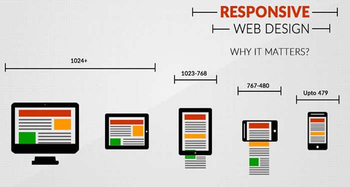
Is Responsive Design just a marketing buzzword? No, The constantly rising popularity of smart devices (tablets, phones etc.) has created a serious demand for websites that are viewable on small displays. If you open a nonresponsive websites in mobile device, most of smart devices can display regular websites, the content is difficult to read and even harder to navigate. Responsive Web Design is a collection of techniques to building a website suitable to work on every device and every screen size, no matter how large or small, mobile or desktop. A website created with RWD will display a different interface depending on what device is used to access the site. For example, a responsive website may appear one way on a laptop, another way on a tablet, and still another way on smartphone.

Why Responsive Website?

Now, let us check the reasons of why Responsive website is important.

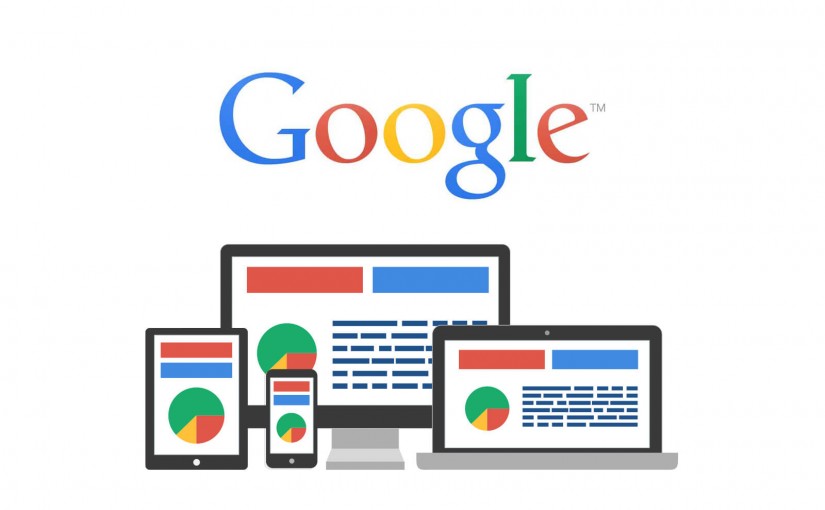
Recommended By Google

google-responsive-website-design-even-more-important


Google Will Punish You
If You Don’t Have a Mobile-Friendly Website.

Google made an announcement regarding their mobile search algorithm “From 21 April 2015 Mobile-Friendly Websites Get Better Rank in Mobile Search”, this means

  1. if you don’t have a mobile friendly or responsive website yet, it is difficult to rank in Google mobile search results.
  2. Desktop and/or tablet ranking is not affected by this change. It’s effect only on searches from mobile devices.
  3. Mobile-friendly pages show a “Mobile-friendly” label in mobile search results.

Mobile use takeover Desktop / Laptop

mobile-use-takeover-desktop


Mobile is everywhere
By 2014 mobile takeover desktop internet browsing

Day by Day more and more people using smartphones and tablets. With mobile use naturally, mobile internet usage is steadily increasing. 7 out of 10 adults use mobile devices to access the internet. Check your analytics report, you will find that 10% to 30% of your visitors are coming from mobile/tablets

So if you are not offering mobile friendly version of your website, you are losing customers.

One Website, Many Devices: SAVE TIME + MONEY

save-time-and-money

If you don’t go with responsive website, then

  1. You need to create two separate websites one for desktop/laptop and one for mobile/tablet.
  2. When you have multiple websites for different devices, updating and testing becomes more time consuming and costly.
  3. Need to run two separate SEO campaign. It’s difficult to maintain links and traffic of multiple sites. Also there is risk of getting duplicate content issues.

Definitely One responsive website for every possible device costs less than two.

Excellent User Experience

excellent-user-experience


  1. No pinching, zooming and panning required: No matter which device your visitor is using, responsive design offer an excellent viewing experience across all devices.
  2. Consistent and streamline: Users can access your site across devices and expect a similar feel, navigation, and experience regardless.
  3. Easy sharing and linking: One URL for all devices makes it easy to link to and share your site.

Decrease Bounce Rate

less-bounce-rate


74% of users would return to a site which has been responsive.

Now user use multiple device to access your website. In fact, over half of online consumers use multiple devices when shopping for a product. It’s possible they search your product or service from a mobile device and then return to your to your site later to make a purchase or contact you from desktop. what happen if your desktop site look and feel doesn’t match with your mobile site? It’s possible you might lose your customer. With responsive design, you ensure your customers will get a consistent experience across all devices.

Bootstrap 4 Alpha 5

Alpha 5 has arrived just over a month after Alpha 4 with some major feature improvements and a boat load of bug fixes. We still have a lot of work to do, but we’re closing the gap and getting more stable with each release. Keep reading for the highlights and plans for Alpha 6.

New CSS bundles

We’ve updated our build process to include compiled versions of all our CSS bundles. In addition to the longstanding default compiled and minified bundles, we now include compiled CSS files for our flexbox mode, grid system only, and Reboot only bundles. Each bundle includes a compiled, minified, and Sass map, just like the default compiled CSS.

Grid updates

Our grid system has been updated and is more flexible than ever. New in Alpha 5 are breakpoint specific grid gutters. That’s right, now you can customize the width of your gutters across each and every grid tier by modifying the Sass map.

The .container behaviors have changed slightly in Alpha 5. We now set the width of each container alongside a max-width: 100%; to ensure proper rendering across browsers in both our default and flexbox modes. Similarly, we fixed a bug in our flexbox grid where columns didn’t properly collapse at lower breakpoints.

Lastly, we’ve changed a few breakpoint and container dimensions. The sm tier’s container is now smaller than it’s viewport dimensions and the lg tier has changed from 940px to 960px for grid columns that more cleanly by 12.

Utilities overhaul

Utility classes got a ton of attention with Alpha 5 and will continue to in Alpha 6. Major changes in this release include:

  • Simpler margin and padding syntax (e.g., now mx-auto instead of m-x-auto).
  • Renamed .pull-*-left and .pull-*-right to their CSS properties (e.g., now .float-*-left and .float-*-right).
  • Separated background and color utilities for more explicit styling.
  • Renamed image utilities, moving from .img-rounded and .img-circle to .rounded and .rounded-circle, respectively.
  • Removed the display: block; from .img-fluid as it’s unnecessary for creating responsive images (the inline-block default works great as-is).
  • Added new vertical-align utilities with .align-top, .align-middle, and more.

Be sure to scope out the open issues in the Alpha 6 milestone. There are more updates coming to utilities to add more responsive variations, more consistent naming, and more.

We’ve put a ton of time into the navbar for Alpha 5, but honestly it’s still not done. Rather than hold back the progress we’ve made for it until Alpha 6, we’re including a somewhat half-baked iteration.

Here’s a look at what’s new, how it works, and what might change in our next release.

  • First up, the navbar has a brand new toggler that features a customizable SVG-based background-image. With the power of Sass variables, that allows us to easily change the color of those hamburger menu icons.
  • Second, the default styles for the brand and navigation have largely been tweaked. There’s less custom styling overall and an emphasis on positioning and flexibility.
  • Building on that, we overhauled the collapse plugin integration for responsive navbars. With the help of some utility classes and collapse classes for each grid tier, you can easily pick the breakpoint for collapsing your navbar without having to recompile your Sass. Also included is the auto restyling of dropdown menus for mobile so they no longer hide other navbar content when toggled.
  • Lastly, we’ve updated the styling and documentation for various navbar subcomponents. There’s more flexibility and examples of the .navbar-brand, better form control support, higher nav contrast, themed responsive toggles, and more.

The navbar is a tricky one—there’s so much functionality and styling that can go into them. We’ve outlined the next major pieces for the navbar, but there’s likely more we’re missing. Be sure to give the updated component a whirl and report back with your feedback.

Getting to Alpha 6

We’re planning on one more major alpha release before getting into the slightly more stable beta ships. There’s still more to do around our major components—the navbar, flexbox variants, utilities, and accessibilty—before we button things up.

Once done, we’ll review all on our docs and update all our example templates to the latest and greatest. From there we’ll need your help to test these changes and report bugs. Stay tuned for more updates as we get closer to that release.

Until then, have at it with Alpha 5!

Bootstrap 3 Responsive Grid Photoshop Templates (PSD)

With the new Bootstrap 3 grid you have gutter width and column width different from the ones in Bootstrap 2, and the container width includes two half gutter padding on the sides. Also, in each breakpoint, the columns have uneven width since they are set by percentages, and the width of the container doesn’t match perfectly with even width.

In the download above you can find the grid templates for the three main breakpoints of bootstrap 3 (1170px, 970px, 750px), plus two grids for mobile (480px, 320px), all with the default 30px gutter. Also included the retina versions.

On the mobile grids (480px, 320px) the minimum column size is col-xs-2, because col-xs-1 breaks the grid in the browser with a viewport of 320px.