Today everyone wants a mobile version of their website. Obviously it’s essential because day by day Mobile Devices is takeover Desktop/Laptop usage. Responsive Web Design is very important for today’s business and web traffic point of view. Now a day web design and responsive web design are the same thing.
What is Responsive Web Design?
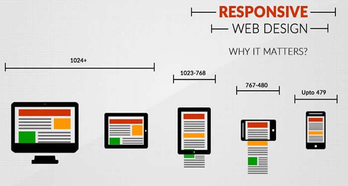
Is Responsive Design just a marketing buzzword? No, The constantly rising popularity of smart devices (tablets, phones etc.) has created a serious demand for websites that are viewable on small displays. If you open a nonresponsive websites in mobile device, most of smart devices can display regular websites, the content is difficult to read and even harder to navigate. Responsive Web Design is a collection of techniques to building a website suitable to work on every device and every screen size, no matter how large or small, mobile or desktop. A website created with RWD will display a different interface depending on what device is used to access the site. For example, a responsive website may appear one way on a laptop, another way on a tablet, and still another way on smartphone.
Why Responsive Website?
Now, let us check the reasons of why Responsive website is important.
Recommended By Google
Google Will Punish You
If You Don’t Have a Mobile-Friendly Website.
Google made an announcement regarding their mobile search algorithm “From 21 April 2015 Mobile-Friendly Websites Get Better Rank in Mobile Search”, this means
- if you don’t have a mobile friendly or responsive website yet, it is difficult to rank in Google mobile search results.
- Desktop and/or tablet ranking is not affected by this change. It’s effect only on searches from mobile devices.
- Mobile-friendly pages show a “Mobile-friendly” label in mobile search results.
Mobile use takeover Desktop / Laptop

Mobile is everywhere
By 2014 mobile takeover desktop internet browsing
Day by Day more and more people using smartphones and tablets. With mobile use naturally, mobile internet usage is steadily increasing. 7 out of 10 adults use mobile devices to access the internet. Check your analytics report, you will find that 10% to 30% of your visitors are coming from mobile/tablets
So if you are not offering mobile friendly version of your website, you are losing customers.
One Website, Many Devices: SAVE TIME + MONEY

If you don’t go with responsive website, then
- You need to create two separate websites one for desktop/laptop and one for mobile/tablet.
- When you have multiple websites for different devices, updating and testing becomes more time consuming and costly.
- Need to run two separate SEO campaign. It’s difficult to maintain links and traffic of multiple sites. Also there is risk of getting duplicate content issues.
Definitely One responsive website for every possible device costs less than two.
Excellent User Experience

- No pinching, zooming and panning required: No matter which device your visitor is using, responsive design offer an excellent viewing experience across all devices.
- Consistent and streamline: Users can access your site across devices and expect a similar feel, navigation, and experience regardless.
- Easy sharing and linking: One URL for all devices makes it easy to link to and share your site.
Decrease Bounce Rate

74% of users would return to a site which has been responsive.
Now user use multiple device to access your website. In fact, over half of online consumers use multiple devices when shopping for a product. It’s possible they search your product or service from a mobile device and then return to your to your site later to make a purchase or contact you from desktop. what happen if your desktop site look and feel doesn’t match with your mobile site? It’s possible you might lose your customer. With responsive design, you ensure your customers will get a consistent experience across all devices.