Why Responsive Website

Today everyone wants a mobile version of their website. Obviously it’s essential because day by day Mobile Devices is takeover Desktop/Laptop usage. Responsive Web Design is very important for today’s business and web traffic point of view. Now a day web design and responsive web design are the same thing.

What is Responsive Web Design?

Is Responsive Design just a marketing buzzword? No, The constantly rising popularity of smart devices (tablets, phones etc.) has created a serious demand for websites that are viewable on small displays. If you open a nonresponsive websites in mobile device, most of smart devices can display regular websites, the content is difficult to read and even harder to navigate. Responsive Web Design is a collection of techniques to building a website suitable to work on every device and every screen size, no matter how large or small, mobile or desktop. A website created with RWD will display a different interface depending on what device is used to access the site. For example, a responsive website may appear one way on a laptop, another way on a tablet, and still another way on smartphone.

Why Responsive Website?

Now, let us check the reasons of why Responsive website is important.

Recommended By Google

google-responsive-website-design-even-more-important


Google Will Punish You
If You Don’t Have a Mobile-Friendly Website.

Google made an announcement regarding their mobile search algorithm “From 21 April 2015 Mobile-Friendly Websites Get Better Rank in Mobile Search”, this means

  1. if you don’t have a mobile friendly or responsive website yet, it is difficult to rank in Google mobile search results.
  2. Desktop and/or tablet ranking is not affected by this change. It’s effect only on searches from mobile devices.
  3. Mobile-friendly pages show a “Mobile-friendly” label in mobile search results.

Mobile use takeover Desktop / Laptop

mobile-use-takeover-desktop


Mobile is everywhere
By 2014 mobile takeover desktop internet browsing

Day by Day more and more people using smartphones and tablets. With mobile use naturally, mobile internet usage is steadily increasing. 7 out of 10 adults use mobile devices to access the internet. Check your analytics report, you will find that 10% to 30% of your visitors are coming from mobile/tablets

So if you are not offering mobile friendly version of your website, you are losing customers.

One Website, Many Devices: SAVE TIME + MONEY

save-time-and-money

If you don’t go with responsive website, then

  1. You need to create two separate websites one for desktop/laptop and one for mobile/tablet.
  2. When you have multiple websites for different devices, updating and testing becomes more time consuming and costly.
  3. Need to run two separate SEO campaign. It’s difficult to maintain links and traffic of multiple sites. Also there is risk of getting duplicate content issues.

Definitely One responsive website for every possible device costs less than two.

Excellent User Experience

excellent-user-experience


  1. No pinching, zooming and panning required: No matter which device your visitor is using, responsive design offer an excellent viewing experience across all devices.
  2. Consistent and streamline: Users can access your site across devices and expect a similar feel, navigation, and experience regardless.
  3. Easy sharing and linking: One URL for all devices makes it easy to link to and share your site.

Decrease Bounce Rate

less-bounce-rate


74% of users would return to a site which has been responsive.

Now user use multiple device to access your website. In fact, over half of online consumers use multiple devices when shopping for a product. It’s possible they search your product or service from a mobile device and then return to your to your site later to make a purchase or contact you from desktop. what happen if your desktop site look and feel doesn’t match with your mobile site? It’s possible you might lose your customer. With responsive design, you ensure your customers will get a consistent experience across all devices.

Get PSD to Bootstrap 4 with Outstanding Features

Bootstrap is the most popular JS, HTML and CSS framework that creates responsive plus mobile websites on the web to give an alluring feel to the users. Bootstrap 4 holds a strong position in the market as the latest version with fresh features like new customization options, dropped IE8 support, improved grid system and a remarkable journey from Less to Sass.

onlypsd2html, a leading name in the web development offers rich PSD to Bootstrap 4 conversion for making bespoke website solutions. There is a continuous improvement with better features in Bootstrap framework, such as flexbox options, grid layout, alignment utility classes, and better utilities and components.

Bootstrap 4 framework has extensive features and single code base for every device. With PSD to Bootstrap 4 conversion, these features can be easily built into the design for better design and performance.

Striking Features of Bootstrap 4

  • Use of Sass
    Bootstrap 4 will compile easily and rapidly because of the Sass preprocessor as compared to previous Less. With a vast contributor base, there are chances of much more functionality.
  • Opt-in Flexbox
    The CSS is recompiled here in Bootstrap 4 to get flexbox grid system and components. It makes use of float and implement a fluid layout to showcase these CSS properties. With a flexible container, this design can be flexible enough to be used in the responsive designs in the best way.
  • Updated Grid System
    With an enhanced grid system, Bootstrap 4 focuses largely on smaller screen devices to better target mobile devices.
  • Newer Customization Options
    There is a wide variety of customization level for colors, link styles, typography, gutter width, spacing, column numbers, etc.
  • Better Documentation
    There are few handy plugins with code snippets for easy working of the documents and also enable easy searching.
  • Dropped IE8 Support
    With the dropping of IE8, the best parts of the CSS can be efficiently utilized. With the responsive typography, it also enables easy component sizing.
  • Refactored JavaScript Plugins
    The JavaScript Plugins also contain features like option type checking, UMD support, generic methods, and many more.
  • Auto Placement
    Auto placement of popovers and tooltips in an improved way through a library known as Tether.
  • HTML Resets With The Module Reboot
    It allows more expanded resets like border box, margin tweaks, and other options, all with a single Sass file.
  • Cards For Panels And Thumbnails
    Cards are the new and useful component of Bootstrap 4, which offer the same features like panels do.

Conclusion

Bootstrap 4 is an easy platform for all kind of the skill levels, all shapes devices and projects of the varied sizes. It allows front-end web development to be much faster and easier, which is the reason that millions of adorable websites across the web are made with PSD to Bootstrap 4 conversion. onlypsd2html can be a one stop solution if you also want to use Bootstrap 4 framework for the boosted results.M

PSD To HTML Using Bootstrap Responsive

Why Should You Convert PSD To HTML Using Bootstrap Responsive ?


Why Should You Convert PSD To HTML Using Bootstrap Responsive ?

If you are a web designer, you already know what PSD is and how your life depends on it; for those who do not, just consider PSD the basic unit of web designing. PSD is a Photoshop design file. This proprietary file from Adobe is commonly used in web designing through design to code process.

Using the PSD file format you can still edit the image layers. But when a designer completes the image and flattens it to convert it into formats such as .GIF, .JPEG or .TIFF then the designer cannot further edit the layers of the image when it is converted and saved into a non-propriety file.

All those web designers who want to create an innovative and responsive website, convert PSD to HTML . And this conversion gives them more elaborated and easy way to make the site more approachable if they do this conversion using CSS Code.

Writing CSS code is not an easy job. You need an efficient framework to do it. The good news is now you can use Twitter Bootstrap to make your job very easy. This effective creation by Twitter is done by combining HTML, JavaScript and CSS. Now using this Bootstrap you are able to create responsive, user friendly and cross browser compatible website with no trouble.

Conversion of PSD to HTML is one of the most crucial parts of the web designing and according to latest market trends you can see Bootstrap is winning the hearts of the web designers all over the globe. So all you need to do is to find out a reliable, experienced and authentic PSD to HTML conversion services provider.

You need to make sure they are reliable because it is the core part of your website. Do your homework and see the reviews before hiring any company.

Using Bootstrap you can scale the desired images in accord with your customized requirements. It facilitates its users with Fluid Grid feature which makes image scaling much easier and hassle free. The 12 Column Grid helps you putting together responsive features to your website.

It is compatible with all image modes taking account of Bitmap, Duotone, Grayscale, Lab, Multichannel, RGB, Indexed Color, and CMYK. From clipping paths to transparency levels, from channels to multilevel information, it supports all of these.

Now you can ask the question that why should you choose Twitter Bootstrap over others. The answer is simple, it is much easier and much more responsive with many other awesome features. You can get well documented and detailed CSS code when you use Twitter Bootstrap.

Compatibility with browsers is not an issue, it is even equally good for mobile phone users. You do not need to worry about any up gradation thing. You can reproduce the codes easily by understanding the code patterns.

So set your goals first then look for a reliable company because you need it. Take the opportunity today and make a website which is pixel perfect, user friendly and very responsive.

A reliable service provider is helpful in converting PSD to HTML files using Bootstrap. ONLY PSD 2 HTML is best frontend development services provider that provides faster turnaround time and expert conversion services.

Responsive Web Design Principles

Responsive web design is a great solution to our multi-screen problem, but getting into it from the print perspective is difficult. No fixed page size, no millimetres or inches, no physical constraints to fight against. Designing in pixels for Desktop and Mobile only is also the past, as more and more gadgets can open up a website. Therefore, let’s clarify some basic principles of responsive web design here to embrace the fluid web, instead of fighting it. To keep it simple we’ll focus on layouts (yes, responsive goes way deeper than that and if you want to learn more this is a good start).

Responsive vs Adaptive web design

It might seem the same but it isn’t. Both approaches complement each other, so there is no right or wrong way to do it. Let the content decide.

The flow

As screen sizes become smaller, content starts to take up more vertical space and anything below will be pushed down, it’s called the flow. That might be tricky to grasp if you are used to design with pixels and points, but makes total sense when you get used to it.

Relative units

The canvas can be a desktop, mobile screen or anything in between. Pixel density can also vary, so we need units that are flexible and work everywhere. That’s where relative units like percents come in handy. So making something 50% wide means it will always take half of the screen (or viewport, which is the size of the opened browser window).

Breakpoints

Breakpoints allow the layout to change at predefined points, i.e. having 3 columns on a desktop, but only 1 column on a mobile device. Most CSS properties can be changed from one breakpoint to another. Usually where you put one depends on the content. If a sentence breaks, you might need to add a breakpoint. But use them with caution – it can get messy quickly when it’s difficult to understand what is influencing what.

Max and Min values

Sometimes it’s great that content takes up the whole width of a screen, like on a mobile device, but having the same content stretching to the whole width of your TV screen often makes less sense. This is why Min/Max values help. For example having width of 100% and Max width of 1000px would mean that content will fill the screen, but don’t go over 1000px.

Nested objects

Remember the relative position? Having a lot of elements depending on each other would be difficult to control, therefore wrapping elements in a container keeps it way more understandable, clean and tidy. This is where static units like pixels can help. They are useful for content that you don’t want to scale, like logos and buttons.

Mobile or Desktop first

Technically there isn’t much of a difference if a project is started from a smaller screen to a bigger (mobile first) or vice versa (desktop first). Yet it adds extra limitations and helps you make decisions if you start with mobile first. Often people start from both ends at once, so really, go and see what works better for you.

Webfonts vs System fonts

Wanna have a cool looking Futura or Didot on your website? Use webfonts! Although they will look stunning, remember that each will be downloaded and the more you’ll have, the longer it will take to load the page. System fonts on the other hand are lightning fast, except when the user doesn’t have it locally, it will fall back to a default font.

Bitmap images vs Vectors

Does your icon have lot of details and some fancy effects applied? If yes, use a bitmap. If not, consider using a vector image. For bitmaps use a jpg, png or a gif, for vectors the best choice would be a SVG or an icon font. Each has some benefits and some drawbacks. However keep in mind the size — no pictures should go online without optimization. Vectors on the other hand often are tiny, but some older browsers won’t support it. Also, if it has lots of curves, it might be heavier than a bitmap, so choose wisely.

Only PSD 2 HTML Offer PSD To Responsive HTML Conversion At Best Rate. Feel that we left out something important? Let us know in the comments!

PSD to HTML Conversion Features

Websites serve as the perfect business drivers both for small and mid-sized firms. In order to transform the business acumen in every aspect, businesses need to have a website that is interactive, responsive and stays in prominence in this competitive scenario. PSD to HTML conversion is probably one of the finest ways to create such sites that function properly both on the desktop as well as mobile, thereby resulting in an expanded global reach. Other than just designing a responsive site, PSD to HTML conversion brings along added advantages like the convenience and quick site navigation to attract a large number of audiences.

Some of the most useful features you get on converting PSD to HTML are:

Quick loading speed:

By eliminating the need for unnecessary coding, PSD to HTML conversion allows loading up your website with increased visibility, functionality, usability and accessibility. The lesser the use of codes, the enhanced is the presentation pattern and loading speed.

Increased web traffic:

The process of PSD to HTML conversion allows your website to attain the right visibility on search engines. This, in turn, affects your ranking and consequently improves traffic in all proportions.

Semantic coding:

The semantic coding techniques implemented during the conversion process allow a site to be search engine friendly. The use of semantic and search engine friendly codes allow the site to get easily crawled, taking the site to higher rankings.

Multiple browser support:

Another advantage of incorporating PSD to HTML conversion is making the content of website accessible on different browsers like Chrome, Firefox and Opera. This conversion supports accessibility on multiple browsers like Chrome, Firefox, Mozilla, IE and so on. In short, it makes the site not only user-friendly but also readable.

On-page SEO flexibility:

SEO plays a crucial role when it comes to improving search engine ranking on the web. The conversion process makes it possible to flexibly manipulate your web pages.

Inexpensive and Time-saving:

PSD to HTML conversion is a tedious process but is less time-consuming. When you hire a reliable conversion service provider, their expert team of professionals provides the best services in a short span of time. They will be able to design a site with effective features and functionality possible.

Increased user experience:

Websites which are attractive and offer a remarkable user experience are the ones which capture the most of the audience attention. Therefore, it is important to design a unique, interactive and user-friendly website that enhances traffic and increases sale conversion.

Conclusion:

The conversion process, i.e PSD to HTML improves the efficiency of a website by including top-notch features that provide immense flexibility and control to the presentation of a website. However, it is always a better idea to hire a professional firm for reliable results. Only PSD 2 HTML Offer PSD To Bootstrap Conversion Service in best Rates

PSD to HTML – New Trends in the Web Building

PSD to HTML – New Trends in the Web Building

PSD to HTML – New Trends in the Web Building

For many years the essence of the website building process has been described in 3 short words: PSD to HTML. It means that you design a web page layout in Photoshop (or GIMP, or any other similar software suite) as a .PSD file, then slice it and code in HTML, CSS and JavaScript. You can code yourself, or use automated tools, or hire an independent provider of conversion services – such details don’t affect the production work order and are up to you.

The “PSD to HTML” workflow has been one of the most popular (and de facto standard) ways to create websites. But now more and more people say about new trends in web design and that the PSD to HTML approach is dead.

Let’s consider these [PSD to HTML] trends in more detail


PSD Movement

The origins of this trend are related to the emergence and dissemination of responsive web design (RWD), as well as to attempts to make design a more organic and integrated part of the web development process, in particular, when the Agile / Lean development methodology is used.

We’ve collected some important articles on designing websites without Photoshop in the post To Design or not to Design in the Browser – 20 Pros vs. 6 Cons in which you can find a detailed description of the concept and recommendations how to use it correctly, as well as opinions and thoughts, and a list of special tools. Yet here I’d like to quote Continuous Design and the PSD Movement by Only PSD 2HTML.

So, Photoshop doesn’t “die”, it just plays a more modest role as one of the tools for image editing, wireframing and sketching, rather than the main and ultimate instrument for web design.

HTML

The current versions of the hypertext mark-up language and cascading style sheets – HTML5 and CSS3 – have a lot of impressive possibilities and powerful features. At the same time, the problem of cross-browser coding still exists and requires front end developers to write additional browser-specific code. The responsive web design adds a fair amount of complexity too. As a result, today HTML/CSS coding is more sophisticated than 15 or 20 years ago, and many designers would prefer to use auxiliary tools to facilitate it.

One of the ways to simplify and accelerate HTML/CSS coding is to utilize CSS and HTML preprocessors and frameworks (for example, Saas, LESS, Bootstrap and many others), code generators and/or JavaScript libraries (jQuery and so forth) (for more information see the roundup 20+ Thoughts on CSS/HTML Preprocessors and Frameworks). These tools can speed up the development process very much and help you not to bother about cross-browserability and responsibility.

However, not all designers are happy with these tools and recommend to use them carefully.

Another way to avoid HTML/CSS coding is online automatic (free or paid) converters. In order to generate correct code they often require your .PSD file to be prepared in accordance with some rules. Also, there are plugins to transform .PSD files into HTML/CSS code.

At last but not least, you can take advantage of the opportunity to hire PSD to HTML services such as HTMLcut.com (sorry for self-promotion). It will cost you some money but the quality is better and requirements to your .PSD file and your knowledge of HTML and CSS are minimal.

A real dream for many web designers is to have a possibility to create ready-to-use websites with the help of a single easy-to-use tool (or a suite of related tools) with as less coding as possible.

One of the first attempts in this direction was Adobe Dreamweaver. The next prominent step was Flash which “let designers reliably produce fabulous design work with either little or no programming. And if a designer could muster the spirit to learn a little bit of Flash’s ActionScript code language, well then, almost anything was possible”

Today Adobe offers Muse for designing sites without writing code. Muse gives designers hundreds of fonts, a lot of widgets (drag-and-drop custom navigation, slideshows, forms, etc.), and possibility of in-browser editing. Muse allows creating websites that will render well across multiple browsers and devices.

Another popular way to build sites is WordPress, in both wordpress.com and wordpress.org versions. With the powerful WordPress’ community you can create professional websites with little or no HTML/CSS/PHP coding too.

The list of similar tools and services goes on and on and on. They differ in the idea and approach behind them, their functionality and features, and have some restrictions and shortcomings. However, quite a few people (both professional web designers and amateurs) can find among them one or several tools to satisfy their needs in the website building now.

If at least sometimes you value creativity in web design and want it to be a craft, you should go back to origins. One more quote, this time from the article How to become a Perfect Coder on your own:

– Say no to developer tools
– Avoid the code generators
– Write by hand

In other words, at least sometimes don’t follow fashionable trends, use simple and original tools, as well as experiment with new HTML5/CSS3 features, test case studies and let the process to flow in a natural way.

Get better PSD Design for easy PSD To HTML Conversion

If you have a PSD file that you need converted to HTML or WordPress, how you create the file will heavily determine the speed and accuracy of conversion into a working website. As experts in PSD to HTML conversion service, we have encountered thousands of PSD files, and a good number took too long in conversion because designers of the layouts did not follow some basic design and layout principles. This in turn means that such clients will be charged more according to the production time. However, you can read these tips to learn how to hand in the best file for conversion.

1.Avoid merging layers

It is common practice for designers to merge layers in order to maintain smaller file sizes. Usually this presents no problem when designing for print, but for PSD conversion, it is important to provide all adjustment, textual and/or graphics layers intact. These layers usually have vital information needed for accurate development. The font layer, for instance, informs about font sizes, colors, families and lines heights as well as letter spacing and text transformation.

2.Submit well-organized files

When your PSD is well organized, named and structured, development becomes easier and even more accurate. A well-organized PSD file not only serves the interests of the web developer; it also reduces the designer’s and coder’s production time, improving cost efficiency. Remember that every minute spent trying to locate the correct text layer, graphics layer or other section increases production time and ultimately your cost.

3.Practice consistent design

It is essential to maintain consistency of design elements across website layouts in multiple appearances. Universally employed elements such as headers, footers, buttons and rounded boxes should have a consistent look/feel for all pages of the layout. This means having the same heights, padding, border radius, etc. Remember that having different properties will necessitate individual HTML and CSS coding for each element and hence increase development time.

4.Put elements on grid

The design grid is a virtual set of guidelines applied to decide the placement and shape of items/elements and hence the overall appearance of the website. Using the grid will help you to position your website elements in a well-balanced and proportional manner to enhance the aesthetics of the site. Placing elements off-grid creates additional work during development. Ensure that everything is aligned within the grid, whether explicit or implicit.

5.Create rollover states

During design preparation, consider link and call-to-action elements and how they will function: images, buttons, boxes, etc. Standard practice is to add hover states in these elements so that they can be distinguished from other action states. Many times, if you avoid doing this at the beginning, you’ll find that you have to define them much later once you start using live templates, and this will increase development time. Planning for the hover/rollover state allows for it to be coded right at the beginning.

6.Ensure submitted material is consistent

Any hands-off material that you submit, from Jpeg reviews and PSD files to specification write-ups and fonts as necessary, should have the final versions of your work, ready for development. Any inconsistency between these will cause confusion with your conversion team and can lead to unnecessary work, including unnecessary double work, communication delays and increased production time as a result. Before submission, make a last run through assets to ensure you’re handing in the correct font families, design elements, colors and font sizes among other properties. It helps to save files with the different names and rename the final file so as to not get confused with other drafts created in the design process.

7.Account for rendering differences

This applies especially when using modern fonts. Different operating systems and browsers render fonts differently. This is because the way fonts are displayed in Photoshop may differ from browser displays because of font tracking and anti-aliasing capabilities or letter spacing property in CSS. You can first check how your font looks like in different browsers before settling on it for your live website. Do not blindly trust the sub pixel values for your letter spacing.

8.Avoid blending modes

Blending modes are one of the CSS creations that are not possible to create using CSS. In Photoshop, they are popularly used to produce aesthetically pleasing effects and to reduce image processing time. However, their eventual effect is to produce unwanted results once PSD files are converted to CSS and HTML codes. If you must, you can use them for the previews, but remember to restore normal blending mode before submitting the file for development.

9.Consider content flexibility

Depending on the design, you may have a fixed volume of text allowed for a particular area (like a graphic element or image) such that one cannot add any more text to that area. This may work sometimes, but providing for content flexibility will make it easier to add text once the website goes live and it is found that more text is necessary for functional or aesthetic purposes. Therefore, consider how your design will be affected if it becomes necessary to either add or remove any content. If you don’t know what the final content is, such as when using placeholder content (“lorem ipsum”), content flexibility is a must.

10.Build for common resolutions

What is considered common browser resolution has been the subject of many discussions, especially since the advent of responsive web design that has redefined our understanding of design versus screen resolutions. Nonetheless, the most frequently-applied screen resolution is 1366×768 pixels. If you’re not building for responsive web development, ensure that you have accounted for this resolution. In addition, factor in as many other common resolutions. This means designing a layout that doesn’t exceed 1300 pixels so that visitors can access content without the oh-so-annoying horizontal scroll.

Detailed Overview Responsive Web Design

The wind of advancement has affected the scenario of single desktop screen with the expansion of mobile websites at each nook and corner of the web. Site owners need to have a keen eye on how their work is showcased across various devices. Responsive website design is the ultimate solution to safeguard them from the chances of losing visitors from one device so as to gain visitors from another. RWD offers a perfect compatibility as correspondent to each screen size and devices like for mobile, tablet, iPhone and iPad, along with laptops and desktops.

Running a successful web design company means never standing still, constantly learning about web design and mastering new web technologies as they become available. Lately, you may have heard the term Responsive Web Design thrown around in your marketing meetings. One of the latest buzz words, Responsive Web Design signifies a total paradigm shift in the design process. Similar to the impact that CSS had on the web design world, Responsive Web Design will alter the way we view and use sites. Smart web designers and and companies will quickly become familiar with it and put it into play.

In recent years, the internet has experienced a drastic rise in mobile website traffic. According to research firm Gartner, browser-equipped phones will outnumber traditional computers at some point during the year 2013. And although cellphones are yet to be users primary browsing device, Gartner projects users to make that transition by 2017.

This transition has propelled most companies in-the-know, to build versions of their website dedicated to mobile devices. The internet provides users with plenty of options, and website visitors now expect a positive experience. Oftentimes, elements of a desktop website are misaligned, unavailable, or are simply too small when browsed on a mobile device. This is not a knock on the original design, but visitors quickly translate this poor user experience with a company’s website. And thus the level of service or product-satisfaction they expect to receive.

Why Responsive Web Design?

With an ever-growing number and types of web-enabled devices, web designers must ensure an optimal user experience. Essentially there are two approaches for solving the multiple-devices dilemma.

The traditional method was to create multiple versions of a website, and then serve the appropriate versions based on the type of device being used by the visitor. This approach is relatively simple, as each version of the website exists independently of the others. Due to this separation, changes can be made to each version without affecting the others. However, this freedom comes at a fairly high price. First, designers have to design and build each version of the website. This isn’t just time-consuming for designers, but more expensive for clients. Additionally, as the number and types of devices continues to grow, it is becoming exceedingly difficult to address each one appropriately.

The new and improved approach to tackling the multiple-devices issue is responsive web design. When you boil down the differences between each web-enabled device, the most significant is screen resolution. This method allows for one website to, literally, transform itself based on the device on which it is being rendered.

What is Responsive Web Design

The principles of responsive web design can be understood from a saying that defines“content is like water.” It means that it can take the shape of the device in which it is placed.

Responsive web design is a worthful approach which demands that the design and development of a website must respond to the user’s behavior and environment, as per the platform, screen size and orientation. It employs a fair combination of images, adjustable grids and layouts and a smart use of CSS media queries.

With the release of the CSS3 specification, W3C created media queries which allow us to target various characteristics of the device being used, and conditionally apply certain styles based on those characteristics. Previously, some designers tested Javascript-dependent implementations of resolution-aware layouts. However, the advantage of the current CSS3 technology is that it allows us to look at more than one property in a single query. We are now able to test multiple property values and chain them into one query.

We can now serve different styles based on a set of defined rules. This ability gave rise to Responsive Web Design, as we can now have one website, respond to specific conditions and present itself in a way that promises optimal user experience. Images can be now be re-sized, columns moved and reordered, elements hidden, font-size altered, and more, all on the fly.

As we know, with great power comes great responsibility and this new flexibility is no different. We must now plan ahead and decide how we use fluid grids, flexible images and media queries to allow our layout to be molded with each viewing context.

Why is Responsive Design So Important?

Responsive web design concept is not merely about adjusting screen resolutions and automatic resizable images, but it is a very broad approach about thinking for a design differently. In the recent times, the ultimate solution is to create such design that can work and must respond to the multiple browser versions. You have open doors for testing your website on various devices.

Some Important Credentials of RWD:

  • Know Your Audience: RWD is the answer to most of the businesses which helps them in knowing their audiences and the device that they are using.
  • A Prompt UX: User experience is the key to RWD and it goes much beyond translating a desktop site into mobile screen. Here, the points to be taken into consideration are user experience, necessary content they are looking for and their interaction.
  • Focus on Content: To design the site as per the content is a good habit to follow during responsive designing instead of a specific screen dimension.
  • Limited Space Consumption: The mobile view is much more focused as compared to the desktop with limited amount space usage.
  • Easy Navigation: The design needs to be flexible enough for a relaxing UX and the complex designs must need to adapt to the simple intuitive UI for small mobile screens.

What Website Dimensions Should be Used ?

We cannot specify a standard website size as there are hundreds of devices available along with plentiful screen resolutions out there. Each user works on the different device as per the usage, like an individual may explore something on your mobile while on the way or may even use the laptop while working on some task in office. So, the best approach here is to design multiple versions as per the different browsers’ widths.

Mobilegeddon: Google’s New Update for Mobile-friendly Sites

Responsive web design is an important aspect for the mobile traffic. For this, Google announced an important update Mobilegeddon on 21 April 2015. Each business of varying size will catch Google’s attention if their site follows friendliness with the mobile devices. This approach is followed by keeping in mind the fact that the mobile device users are increasing at a rapid rate and to keep them in reach, it is crucial to have mobile friendly web pages for offering a sound user experience.

Elements of RWD

An RWD site adapts the layout to the viewing environment via using fluid, flexible images, proportion-based grids, and CSS3 media queries (an extension of the @media rule) in the following ways:

  • The Fluid Grid concept allows page element sizing in relative units such as percentages, instead of absolute units i.e pixels or points.
  • Flexible images also follow sizing in relative units so that they can be prevented from showcasing outside the containing element.

Media queries enables a page to use different CSS style rules in accordance with the features of the device on which a website is being displayed, like the width of the browser.

Fluid Grids

They follow percentage values instead of set pixels while designing a website. After following this concept, the elements in the mobile screen layout will be resized in relation to each other. It tends to render content in the same order as it appears in the DOM, and it prompts reflow of content during its resizing. Fluid layouts also counts for relative resizing of both content and containers which allows the text and content to be enlarged and shift other content automatically at the bottom of the page.

Media Queries

It is the code which has been implemented to a website while it is being made, to set the conditions in a design that will adapt to the screen size. Media queries are used to provide different CSS as per the device properties.
Like for say, specifically for iPad, there is a unique media query property known as orientation. The values vary for landscape and portrait.

@media screen and (orientation: landscape) {
.iPadLandscape {
width: 30%;
float: right;
}
}

@media screen and (orientation: portrait) {
.iPadPortrait {
clear: both;
}
}

Google’s Resizer

It is a useful approach to preview your website with ease on multiple devices. Resizer is made to simply test the viewability of a website. It can be understood as a tool to check the responsiveness of the website by changing the dimensions of a web page. Being a browser based tool, you have with you a series of predefined icons, once it has been activated.

Flexible Images

Images with utmost flexibility are really important for designing a responsive website.
There are several points to consider including image scaling, how will it appear on different devices including large desktop, tablet and a small mobile screen. The code Images are allowed to scale with the code through a percentage value to the width of the browser window.

Image resizing can be efficiently incorporated with the below code-

<meta name=”viewport” content=”width=device-width; initial-scale=1.0″>

Inspiration

As with any design project, find other websites that execute responsive web design in creative ways.

This can be as simple as thinking about the following questions:

  • Which websites or apps you frequently use on your mobile phone or other portable devices?
  • Why do you prefer one site over others that might provide similar services?
  • Do you prefer their mobile experience or desktop experience?

Finding answers to these questions can help you find pain points that you may have never noticed during your everyday browsing.

The future of responsive design for mobile

We now know that Google is requiring the following optimized elements for an effective mobile-friendly user experience:

  • Text that is at a readable size, without the need for zooming
  • Content which fits a device’s screen, without the need for horizontal scrolling
  • Links & buttons which are adequately spaced out, so that tapping is not difficult
  • Reasonable load times for pages
  • No use of Flash!

The rise in mobile devices is only the beginning of a shift to more convenient web usage. As wearables such as smart watches become more popular, it’s necessary to make sure your website can be viewed anywhere by your users on any device.

Reasons to Convert your HTML to WordPress Theme

In the beginning (of the web) all websites were made with nothing but text and static HTML. Now though, over 20 years later, the web is a much different place. Websites are much more complex. They provide richer and more enjoyable experiences for site creators and visitors alike.

This is in large part thanks to open source projects like WordPress. Which, over the last ten years or so, has succeeded in its core mission to democratize online publishing (and a lot more in the process) so that anyone with a WordPress install and the right theme/plugins can have a modern website with advanced design and functionality. No coding–not even HTML!–required.

If you’re thinking to develop a website with static HTML code, then it is too old fashioned to think of. Unlike following this traditional way of designing a website, HTML to WordPress conversion is considered the most. The common problem with HTML sites was the style and the scripts. These were coded with HTML frameworks and makes the website slow.

The web developers in past few years have accosted this problem with an innovative idea of HTML to WordPress theme conversion. This translation will change the static HTML website into dynamic WordPress platform which further bring in a large number of benefits. WordPress platform is worth considering platform for developing websites because it offers a plethora of benefits when considered for website creation.

Here in this article, we’re presenting five reasons to switch to WordPress website over Static HTML website.

1. A Dynamic Content Management System

The HTML websites are not flexible. They’ve static pages surrounded with hardcore codes, and each of these pages is equivalent to HTML file, with the same layout and designs. On the other hand, WordPress website is easy to create, manage and upgrade as per choice. WordPress was originally developed for publishing purpose with inbuilt functionalities which make it more powerful and dynamic.

2. Easy to Work

WordPress is relatively easy to use as a broad community backs it 24×7. It offers an exceptional content management platform with a plethora of plugins and themes. This makes web development job easier and flexible. The WordPress theme offers a definite look to the websites and plugins. Apart from this, they also offer a number of comprehensive features to the websites. WordPress offers the website development an easy coding and less of technical. This one of the major reason why most of the people prefer to choose WordPress.

3. Search Engine Optimization

This is the major benefit of WordPress; that will hold your interest. Search engines highly recognize WordPress websites. It implements a number of search engine friendly techniques and principle. Apart from this, there are a number of extensions which keeps your WordPress website more search engine friendly.

Yoast, All-in-one SEO pack, etc. are few excellent SEO WordPress plugins which improve the performance with the caching plugins, enhances user experience with the responsive theme.

4. Backed with Huge community of Users

The vibrant community behind WordPress supports the beginners to guide them with issues. The best thing about WordPress is that it is an open source platform and its users constantly keep on contributing to the platform. The developers also keep on releasing new updates and keeps the users updated with the latest happenings in the WordPress arena. This content management system grows bigger and better every single day as thousands of people support it from all across the globe.

5.  Customizable According to your Design

The WordPress offers the freedom of customizing the website in accordance with the design by choosing a related theme. Initially, the theme customization may appear to be messy, but it will be easy to accomplish with the support of the exceptional WordPress community. WordPress can be useful to create websites depending upon the business preferences. For websites customization, users have the option of choosing them either from free as well as premium themes.

There are a plethora of benefits of using WordPress. This exceptional platform is always useful for web developers for a wide range of reasons. A developer can build a dynamic WordPress website and can provide the ultimate solution for your business growth. Only PSD 2 HTML Offer PSD To HTML, PSD To Bootstrap & PSD to WordPress Conversion Service at Affordable Rates

PSD To Responsive HTML Tutorial

Here We start Basic Step for PSD to HTML Conversion Tutorial

Welcome to our Basic Web Design tutorial where you will learn how to completely code a website from scratch. In this short course we will walk you through the very basic steps on what to do and what to learn before, and during, building a basic website. We Make deff. Devision for psd to bootstrap html conversion tutorial are as under.

  1. Download PSD Design Template
  2. PSD Analyze
  3. Get Bootstrap
  4. Download Font Awesome
  5. Start with Header Part.
  6. Start with Navigation Part.
  7. Start with Welcome Part.
  8. Start with Products Part.
  9. Start with Bottom Part Products List.
  10. Start with Footer Part.

————————————————————————————————————————–

Download PSD Design Template

Here We attach some example for downloading Web page PSD Template free Either Paid.

Free PSD Design Template

  1. Freepik
  2. Free Bies Bug
  3. Os Template

Premium PSD Design Template

  1. Theme Forest
  2. Template Monster

For Example We take design from Our Client Website.

Company Name = Harsiddh Engineering Co.

URL = http://www.ampoulefillingmachine.net

new-chaitali
————————————————————————————————————————–

PSD Analyze

One of the most important website page creation skills you will learn in Photoshop is how LAYERS constitute the entire structure of website. It is valuable to see an image in relation to the layers used to construct it.

A technical analysis is the examination of an PSD file to actually see how the design  was constructed using layers. In order to do this, you need to have the actual .psd file for the image. These .psd files are located below and can be downloaded to your Desktop for this activity.

TECHNICAL ANALYSIS

  1. Make sure Photoshop is launched.
  2. Inside Photoshop, go to the TOP MENU BAR – OPEN. A window will open.
  3. Use this window to locate the proper .psd file on your Desktop. Click OPEN.
  4. The image file will open. Make sure the Layers palette is showing.
  5. Look at the document window (the image) and then look at the Layers palette. See the relationship between the two.
  6. Go to the Layers palette and start hiding and showing layers. See the effect on the main image.
  7. Click on the MOVE tool. Now play with moving Layers around.
  8. Play. Get a feel of how the image was put together using Layers.

Untitled-3
————————————————————————————————————————–

Get Bootstrap

Bootstrap is the most popular HTML, CSS, and JS framework for developing responsive, mobile first projects on the web.

Download Bootstrap

Start with this basic HTML template, or modify these examples. We hope you’ll customize our templates and examples, adapting them to suit your needs.

<!DOCTYPE html>
<html lang="en">
<head>
<meta charset="utf-8">
<meta http-equiv="X-UA-Compatible" content="IE=edge">
<meta name="viewport" content="width=device-width, initial-scale=1">
<!-- The above 3 meta tags *must* come first in the head; any other head content must come *after* these tags -->
<title>Bootstrap 101 Template</title>
<!-- Bootstrap -->
<link href="css/bootstrap.min.css" rel="stylesheet">
<!-- HTML5 shim and Respond.js for IE8 support of HTML5 elements and media queries -->
<!-- WARNING: Respond.js doesn't work if you view the page via file:// -->
<!--[if lt IE 9]>
<script src="https://oss.maxcdn.com/html5shiv/3.7.3/html5shiv.min.js"></script>
<script src="https://oss.maxcdn.com/respond/1.4.2/respond.min.js"></script>
<![endif]-->
</head>
<body>
<h1>Hello, world!</h1>
<!-- jQuery (necessary for Bootstrap's JavaScript plugins) -->
<script src="https://ajax.googleapis.com/ajax/libs/jquery/1.12.4/jquery.min.js"></script>
<!-- Include all compiled plugins (below), or include individual files as needed -->
<script src="js/bootstrap.min.js"></script>
</body>

You Can Check components

Over a dozen reusable components built to provide iconography, dropdowns, input groups, navigation, alerts, and much more.

get
————————————————————————————————————————–

Download Font Awesome

Font Awesome :- The iconic font and CSS toolkit
Font Awesome gives you scalable vector icons that can instantly be customized — size, color, drop shadow, and anything that can be done with the power of CSS.

Download & Customize Easy Font Awesome

Want to manage and host Font Awesome assets yourself? You can download, customize, and use the icons and default styling manually. Both CSS and CSS Preprocessor (Sass and Less) formats are included.

Using CSS

  1. Copy the entire font-awesome directory into your project.
  2. In the <head> of your html, reference the location to your font-awesome.min.css.
  3. <link rel=”stylesheet” href=”path/to/font-awesome/css/font-awesome.min.css”>
  4. Check out the examples to start using Font Awesome!

fone-awesome
————————————————————————————————————————–

Start with Header Part.

We start with header background & contact detail header

bg

Here’s HTML

<body class="bg-banner">

<header>
<div class="header">
<div class="container">
<div class="row">
<div class="col-md-2 col-sm-4 col-xs-12">
<div class="top-left"> <i class="fa fa-phone"></i><span>+91-9825033692</span> </div>
</div>
<div class="col-md-4 col-sm-4 col-xs-12">
<div class="top-left"><i class="fa fa-envelope"></i><span><a href="mailto:info@ampoulefillinmachine.net">info@ampoulefillinmachine.net</a></span></div>
</div>
<div class="col-md-6 col-sm-4 col-xs-12">
<div class="top-right"><a href="https://www.facebook.com/ampoulefillingmachine" target="_blank"><i class="fa fa-facebook"></i></a>
<a href=" https://twitter.com/ampoule_filling" target="_blank"><i class="fa fa-twitter"></i></a>
<a href="https://www.pinterest.com/ampoulefilling " target="_blank"><i class="fa fa-pinterest"></i></a>
<a href="https://www.youtube.com/channel/UCUvQWEsPH2u6-EY45SaHyvw" target="_blank"><i class="fa fa-youtube"></i></a></div>
</div>
</div>
</div>
</div>
</header>

CSS

.bg-banner{ background:url(../images/bg1.jpg) no-repeat; z-index:0; background-size:100% 26%;}
.bg-bannerinner{ background:url(../images/inner-banner.jpg) no-repeat; z-index:0; width:100%; background-size: contain;}
.header  {width:100%;}
.header .top-left {padding:10px 0 0 10px; color:#666666; font-size:14px;}
.header .top-left span {padding:0 10px 0 10px;}
.header .top-left span a{ text-decoration:none; color:#666666;}
.header .top-header span a {color:#666666; text-decoration:none;}
.header .top-header span a:hover {color:#bebeba; text-decoration:none;}
.header .top-right {color:#FFFFFF; font-size:14px; float:right;}
.header .top-right a {height:30px; width:30px; margin:6px 1px 6px 1px; line-height:28px; text-align:center; vertical-align:middle; display:inline-block; color:#FFFFFF;}
.header .top-right a:hover {color:#eae8e8;}
.fa-phone::before {color:#d7d8d2;}
.fa-envelope::before {color:#d7d8d2;}

Responsive Media Query

@media(max-width:320px) {
.header  {width:100%; height:40%; text-align:center;}
.menu {width:100%; height:40%; background-color:#f9fafa;  box-shadow:1px 6px 6px #c9c9c9;}
.navbar-default {  background-color: #4377a6;
border-color: #0000;}
.bg-banner{ background:url(../images/bg1.jpg) no-repeat; z-index:0; background-size:100% 8%;}
}

@media(min-width:320px) and (max-width:768px) {
.header  {width:100%; height:40%; text-align:center;}
header .top-right a {height:30px; width:30px; margin:6px 1px 6px 1px; line-height:28px; text-align:center; vertical-align:middle; display:inline-block; color:#666666;}
}

————————————————————————————————————————–

Start with Navigation Part.

We start with Navigation

header

Here’s HTML

<div class="menu">

<div class="container">
<div class="row">
<div class="col-md-4 col-sm-6 col-xs-12">
<div class="logo"><a href="index.html"> <img class="img-responsive" src="images/logo.png" alt="Ampoule Filling Machine"></a> </div>
</div>
<div class="col-md-8 col-sm-6 col-xs-12">
<nav class="navbar">
<div class="container-fluid">
<!-- Brand and toggle get grouped for better mobile display -->
<div class="navbar-header navbar-default">
<button type="button" class="navbar-toggle collapsed" data-toggle="collapse" data-target="#bs-example-navbar-collapse-1" aria-expanded="false"> <span class="sr-only">Toggle navigation</span> <span class="icon-bar"></span> <span class="icon-bar"></span> <span class="icon-bar"></span> </button>
</div>
<!-- Collect the nav links, forms, and other content for toggling -->
<div class="collapse navbar-collapse" id="bs-example-navbar-collapse-1">
<ul class="nav navbar-nav navbar-right">
<li class="active"><a href="index.html">HOME<span class="sr-only">(current)</span></a></li>
<li><a href="about-us.html">ABOUT US</a></li>
<li class="dropdown"> <a href="products.html" class="dropdown-toggle" data-toggle="dropdown" role="button" aria-haspopup="true" aria-expanded="false">PRODUCTS<span class="caret"></span></a>
<ul class="dropdown-menu">
<li><a href="semi-automatic-multijet-ampoule-washing-machine.html">Semi Automatic Multijet Ampoule Washing Machine</a></li>
<li role="separator" class="divider"></li>
<li><a href="automatic-rotary-ampoule-washing-machine.html">Automatic Rotary Ampoule Washing Machine</a></li>
<li role="separator" class="divider"></li>
<li><a href="single-head-amoule-filling-sealing-machine.html">Single Head Ampoule Filling & Sealing Machine</a></li>
<li role="separator" class="divider"></li>
<li><a href="single-head-closed-ampoule-filling-and-sealing-machine.html">Single Head Closed Ampoule Filling And Sealing Machine</a></li>
<li role="separator" class="divider"></li>
<li><a href="single-head-onion-skin-tube-filling-and-sealing-machine.html">Single Head Onion Skin Tube Filling and Sealing Machine</a></li>
<li role="separator" class="divider"></li>
<li><a href="two-head-ampoule-filling-and-sealing-machine.html">Two Head Ampoule Filling And Sealing Machine</a></li>
<li role="separator" class="divider"></li>
<li><a href="four-head-ampoule-filling-sealing-machine.html">Four Head Ampoule Filling & Sealing Machine</a></li>
<li role="separator" class="divider"></li>
<li><a href="four-head-closed-ampoule-filling-and-sealing-machine.html">Four Head Closed Ampoule Filling and Sealing Machine</a></li>
<li role="separator" class="divider"></li>
<li><a href="four-head-onion-skin-tube-filling-and-sealing-machine.html">Four Head Onion Skin Tube Filling and Sealing Machine</a></li>
<li role="separator" class="divider"></li>
<li><a href="six-head-ampoule-filling-and-sealing-machine.html">Six Head Ampoule Filling And Sealing Machine</a></li>
<li role="separator" class="divider"></li>
<li><a href="six-head-closed-ampoule-filling-and-sealing-machine.html">Six Head Closed Ampoule Filling and Sealing Machine</a></li>
<li role="separator" class="divider"></li>
<li><a href="eight-head-ampoule-filling-&-sealing-machine.html">Eight Head Ampoule Filling & Sealing Machine</a></li>
<li role="separator" class="divider"></li>
<li><a href="ampoule-visual-inspection-machine.html">Automatic Ampoule Visual Inspection Machine</a></li>
<li role="separator" class="divider"></li>
<li><a href="horizontal-ampoule-sticker-labeling-machine.html">Horizontal Ampoule Sticker Labeling Machine</a></li>
</ul>
</li>
<li><a href="services.html">SERVICES</a></li>
<li><a href="inquiry.php">INQUIRY</a></li>
<li><a href="contact-us.html">CONTACT US</a></li>
</ul>
</div>
<!-- /.navbar-collapse -->
</div>
<!-- /.container-fluid -->
</nav>
</div>
</div>
</div>
</div>

CSS

.menu {width:100%; height:80px; background-color:#f9fafa; box-shadow:2px 3px 3px #c9c9c9; position:relative; z-index:59;}

.menu .logo {margin:10px;}
.nav {padding-left:32px;}
.nav > li {padding-left:8px; font-size:15px; font-weight:400; margin:16px 0px 0px 20px;}
.nav > li > a:hover, .nav > li > a:focus { background:none;}
.nav .open > a, .nav .open > a:focus, .nav .open > a:hover {color:#000000;}
.nav .open > a, .nav .open > a:hover, .nav .open > a:focus {background-color:#f9fafa; border-color: #337ab7;}
.nav > li > a {color:#666869;}
.nav > li > a:focus, .nav > li > a:hover {color:#185e9f;}
.dropdown-menu {background-color:#316a4a; }
.dropdown-menu > li > a {color:#FFFFFF;}
.dropdown-menu > li > a:focus, .dropdown-menu > li > a:hover {background-color:#316a4a; color:#000000}
.navbar-right .dropdown-menu {right:auto;}
.nav > li > a {display: block; padding: 10px 0px 0px 8px;}

Responsive Media Query

@media(max-width:320px) {

.menu {width:100%; height:40%; background-color:#f9fafa;  box-shadow:1px 6px 6px #c9c9c9;}
.navbar-default { background-color: #4377a6;  border-color: #0000; }
.bg-banner{ background:url(../images/bg1.jpg) no-repeat; z-index:0; background-size:100% 8%;}
.navbar-nav > li > .dropdown-menu {width:100%;}
}

@media(min-width:320px) and (max-width:768px) {
.navbar-nav {background-color: #4377a6;  margin: 7.5px -15px; }
.nav > li > a {color: #000; }
.navbar-nav .open .dropdown-menu {background-color: #316a4a; border: 0 none; box-shadow: none; float: none; margin-top: 0; position: static; width:100%;}
.nav {padding-left: 0;}
}

————————————————————————————————————————–

Start with Welcome Part.

We start coding for company welcome part here

welcome

Here’s HTML

<section>

<div class="welcome">
<div class="container">
<div class="row">
<div class="col-md-5 col-sm-4 col-xs-12">
<div class="productimage"><img class="img-responsive" src="images/products1.jpg" alt="Products 1"></div>
</div>
<div class="col-md-7 col-sm-6 col-xs-12">
<h2>Welcome to Harsiddh Engineering Co.</h2>
<p>An ISO 9001:2008 Certified Company</p>
<p>Harsiddh Engineering Co. manufacturer of Pharmaceutical Machinery and Sparessuch as Eight Head Ampoule Filling Sealing Machine,Six Head Ampoule Filling & Sealing Machine, Four Head Ampoule Filling & Sealing Machine, Two Head Ampoule Filling &Sealing Machine, Single Head Ampoule Filling & Sealing Machine,Ampoule Washing Machine etc.Our focus never deters from the aim to offer total satisfaction toour clients.</p>
<div class="line"></div>
</div>
</div>
</div>
</div>
</section>

CSS

.welcome {width:100%; background-color:#f7f7f7;}

.welcome p {text-align:justify; color:#535252; font-size:15px; line-height:25px;}
.welcome h2 {margin-top:20px; padding-top:15px;}
.welcome .productimage {margin:20px 0px 30px 0px; padding:20px 0px 20px 0px;}
.welcome .line {width:43%; background-color:#000000; height:2px; margin-bottom:20px; margin-top:30px;}

————————————————————————————————————————–

Start with Products Part.

We start coding for Products part here

products

Here’s HTML

<section>

<div class="product">
<div class="container">
<div class="row">
<div class="col-md-12 col-sm-12 col-xs-12">
<h2>Feature Products</h2>
<p>Manufacturere of Pharmaceutical Machinery & Spares</p>
<div class="line2"></div>
</div>
</div>
<div class="row">
<div class="col-md-4 col-sm-4 col-xs-12">
<div class="box"><a href="eight-head-ampoule-filling-&-sealing-machine.html"> <img class="img-responsive" src="images/eight-head-ampoule-filling-sealing-machine.jpg" alt="Eight Head Ampoule Filling Sealing Machine"></a>
<h2><a href="eight-head-ampoule-filling-&-sealing-machine.html">Eight Head Ampoule Filling Sealing Machine</a> <span class="triangle-bottomright"></span> </h2>
</div>
</div>
<div class="col-md-4 col-sm-4 col-xs-12">
<div class="box"><a href="six-head-ampoule-filling-and-sealing-machine.html"> <img class="img-responsive" src="images/six-head-ampoule-filling-sealing-machine.jpg" alt=" Six Head Ampoule Filling Sealing Machine"></a>
<h2><a href="six-head-ampoule-filling-and-sealing-machine.html">Six Head Ampoule Filling Sealing Machine</a> <span class="triangle-bottomright"></span> </h2>
</div>
</div>
<div class="col-md-4 col-sm-4 col-xs-12">
<div class="box"><a href="four-head-ampoule-filling-sealing-machine.html"> <img class="img-responsive" src="images/four-head-ampoule-filling-sealing-machine.jpg" alt="Four Head Ampoule Filling Sealing Machine"></a>
<h2><a href="four-head-ampoule-filling-sealing-machine.html">Four Head Ampoule Filling Sealing Machine</a> <span class="triangle-bottomright"></span> </h2>
</div>
</div>
</div>
</div>
</div>
</section>

CSS

.product {width:100%; background-color:#f8f8f8;}

.product h2 {color:#414141;}
.product .line2 {width:30%; background-color:#194c79; height:2px; margin-bottom:20px; margin-top:20px;}
.product .box {border:1px solid #cecece; padding-top:20px; background-color:#FFFFFF; height:auto; width:100%; margin:10px 10px 40px 0; box-shadow: 19px 15px 5px 0px rgba(224,221,221,1);}
.product .box .img-responsive {text-align:center; vertical-align:middle; margin:0 auto;}
.product .box h2 {line-height:25px; font-size:19px; font-weight:600;  background-color:#194c79; color:#FFFFFF; padding:10px 12px 10px 12px; margin-bottom:0px;}
.product .box h2 a {color:#FFFFFF; text-decoration:none; line-height:30px;}
.product .box h2 a:hover {color:#99CCFF; text-decoration:none;}
.triangle-bottomright {width: 0; height: 0;  border-bottom: 100px solid #316a4a;  border-left: 100px solid transparent; float:right; margin:-50px -28px 30px 0px;}

————————————————————————————————————————–

Start with Bottom Part Products List.

We start coding for Products List Part here

list

Here’s HTML

<section>

<div class="spares">
<div class="container">
<div class="row">
<div class="col-md-12 col-sm-12 col-xs-12">
<h2>Our Products List</h2>
<p>Manufacturere of Pharmaceutical Machinery & Spares</p>
<div class="line3"></div>
</div>
<div class="col-md-4 col-sm-4 col-xs-12">
<ul class="list">
<li><a href="single-head-onion-skin-tube-filling-and-sealing-machine.html">Single Head Onion Skin Tube Filling and Sealing Machine</a></li>
<li><a href="single-head-closed-ampoule-filling-and-sealing-machine.html">Single Head Closed Ampoule Filling And Sealing Machine</a></li>
<li><a href="single-head-amoule-filling-sealing-machine.html">Automatic Single Head Ampoule Filling & Sealing Machine</a></li>
<li><a href="two-head-ampoule-filling-and-sealing-machine.html">Automatic Two Head Ampoule Filling And Sealing Machine</a></li>
</ul>
</div>
<div class="col-md-4 col-sm-4 col-xs-12">
<ul class="list">
<li><a href="four-head-onion-skin-tube-filling-and-sealing-machine.html">Four Head Onion Skin Tube Filling and Sealing Machine</a></li>
<li><a href="four-head-closed-ampoule-filling-and-sealing-machine.html">Four Head Closed Ampoule Filling and Sealing Machine</a></li>
<li><a href="four-head-ampoule-filling-sealing-machine.html">Automatic Four Head Ampoule Filling & Sealing Machine</a></li>
<li><a href="six-head-ampoule-filling-and-sealing-machine.html">Automatic Six Head Ampoule Filling And Sealing Machine</a></li>
</ul>
</div>
<div class="col-md-4 col-sm-4 col-xs-12">
<ul class="list">
<li><a href="six-head-closed-ampoule-filling-and-sealing-machine.html">Automatic Six Head Closed Ampoule Filling and Sealing Machine</a></li>
<li><a href="eight-head-ampoule-filling-&-sealing-machine.html">Automatic Eight Head Ampoule Filling & Sealing Machine</a></li>
<li><a href="horizontal-ampoule-sticker-labeling-machine.html">Automatic Horizontal Ampoule Sticker Labeling Machine</a></li>
<li><a href="ampoule-visual-inspection-machine.html">Automatic Ampoule Visual Inspection Machine</a></li>
</ul>
</div>
</div>
</div>
</div>
</section>

CSS

.spares {width:100%; background-color:#f7f7f7;}

.spares .line3 {width:30%; background-color:#194c79; height:2px; margin-bottom:20px; margin-top:20px;}
.spares ul .list {border:1px solid #e9e7e7; padding:10px 0px 10px 10px; margin-bottom:5px;}
.spares ul {padding-left:0px; margin-bottom:30px;}
.spares ul li a {text-decoration:none; color:#414141; }
.spares ul li  {list-style:outside none none; line-height:30px; border:1px solid #e9e7e7; padding: 5px 0 5px 30px; margin-bottom:10px;}
.spares li a:hover {color:#194c79;}
.spares ul li:before {content: "\f105"; /* FontAwesome Unicode */ font-family: FontAwesome; display: inline-block;  margin-left: -1.3em; /* same as padding-left set on li */ width: 1.3em; /* same as padding-left set on li */ color:#414141;  padding:0px 15px 0px 0px; }

————————————————————————————————————————–

Start with Footer Part.

footer

Here’s HTML

<section>

<div class="footer">
<div class="container">
<div class="row">
<div class="col-md-4 col-sm-4 col-xs-12">
<div class="logo2"><img class="img-responsive" src="images/footerlogo.png" alt="Ampoule Filling Machine"></div>
<p>Harsiddh Engineering Co. manufacturer of Pharmaceutical Machinery and Sparessuch as Eight Head Ampoule Filling Sealing Machine,Six Head Ampoule Filling & Sealing Machine, Four Head Ampoule Filling & Sealing Machine,</p>
<div class="social-icon"> <a href="https://www.facebook.com/ampoulefillingmachine" target="_blank"><i class="fa fa-facebook"></i></a> <a href=" https://twitter.com/ampoule_filling" target="_blank"><i class="fa fa-twitter"></i></a> <a href="https://www.pinterest.com/ampoulefilling " target="_blank"><i class="fa fa-pinterest"></i></a> <a href="https://www.youtube.com/channel/UCUvQWEsPH2u6-EY45SaHyvw" target="_blank"><i class="fa fa-youtube"></i></a></div>
</div>
<div class="col-md-4 col-sm-4 col-xs-12">
<h2>Contact Us</h2>
<ul>
<li>Harsiddh Engineering Co.</li>
<li>D-81, Zaveri Industrial Estate, Near Kathwada GIDC,</li>
<li>Kathwada Road,Kathwada,</li>
<li>Ahmedabad - 382430 , Gujarat, INDIA.</li>
<li>Phone : +91- 9825033692 , +91-79-65241112</li>
<li>E-mail : <a href="mailto:info@ampoulefillingmachine.net">info@ampoulefillingmachine.net</a></li>
</ul>
</div>
<div class="col-md-4 col-sm-4 col-xs-12">
<h2>Certification</h2>
<div class="iso"> <img class="img-responsive" src="images/iso-image.jpg" alt="ISO Registered"> </div>
<div class="iso"> <img class="img-responsive" src="images/certification-image.jpg" alt="Certification Image"> </div>
</div>
</div>
</div>
</div>
</section>
<div class="bottom">
<div class="container">
<div class="row">
<div class="col-md-7 col-sm-6 col-xs-12">
<ul class="menu2">
<li><a href="index.html">HOME</a></li>
<li><a href="products.html">PRODUCTS</a></li>
<li><a href="services.html">SERVICES</a></li>
<li><a href="inquiry.php">INQUIRY</a></li>
<li><a href="contact-us.html">CONTACT US</a></li>
</ul>
</div>
<div class="col-md-5 col-sm-6 col-xs-12">
<p>Copyright © 2016, Harsiddh Engineering Co. ( India) All Rights reserved.<br>
Website Design & Seo By :<a href="http://www.vainfotech.com/"> VA Infotech</a></p>
</div>
</div>
</div>
</div>

CSS

.footer {width:100%; background-color:#302f2f;}

.footer .logo2{margin:23px 0px 23px 0px;}
.footer p {color:#FFFFFF; text-align:justify;}
.footer .social-icon {color:#FFFFFF; font-size:30px; margin:10px 30px 20px 0px;}
.footer .social-icon a {height:20px; width:20px; margin:0px 20px 20px 0px; line-height:47px; vertical-align:middle; display:inline-block; color:#FFFFFF;}
.footer .social-icon a:hover {color:#eae8e8;}
.footer h2 {color:#FFFFFF;}
.footer ul {color:#FFFFFF; text-decoration:none; padding:14px 0px 0px 31px; margin:30px 0 0 -30px; line-height:28px;}
.footer ul li a {color:#FFFFFF; text-decoration:none; margin:0px 20px 0px 0px;}
.footer ul li {list-style:outside none none;}
.footer .iso {float:left; margin:34px 10px 0px 0px;}
.bottom {width:100%; background-color:#1c1b1b;}
.bottom .menu2 {list-style:outside none none; padding:30px 0px 20px 0px;}
.bottom ul li a {color:#FFFFFF; text-decoration:none; padding:0px 30px 0px 0px;}
.bottom li {display:inline;}
.bottom .menu2 a:hover{color:#CCCCCC;}
.bottom p {color:#FFFFFF; margin:15px 0px 0px 0px;}
.bottom a{text-decoration:none;}

PSD To HTML Conversion Tutorials

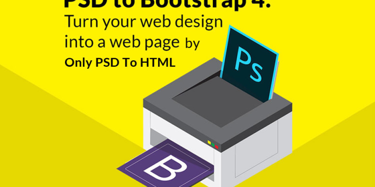
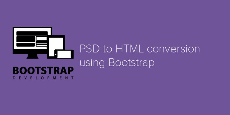
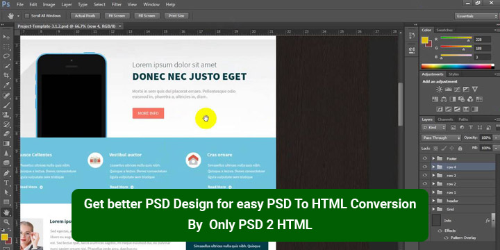
Once again we have gathered a very useful and helpful collection of detailed tutorial for PSD to HTML conversion. Today, every designers, web developers or blogger should know how to convert PSD files to HTML code. This technique is very important for them because with this technique they can easily convert their designs into active blogs or websites. And also this technique makes their work easy and save their valuable time too.

In this round up, we have collected some useful, free and professionally created tutorials on PSDs to HTML conversion only for you so that you can take help from this collection. So enjoy browsing through this collection and collect useful tutorials that will be helpful for you in your future projects. Do share with us what you feel about this compilation. Enjoy and have fun everyone!!

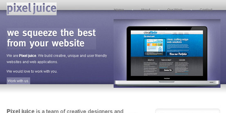
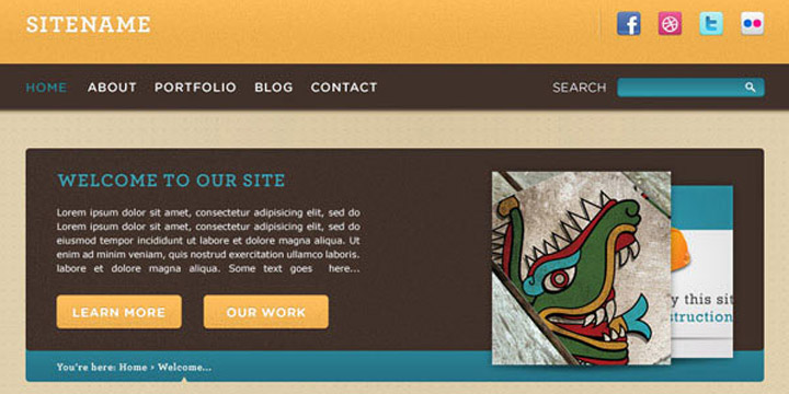
1. Coding a Clean Web 20 Style Web Design From Photoshop

PSD-To-HTML-Conversion-Tutorials-01

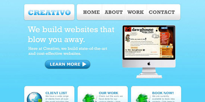
In this tutorial, you will learn how to convert your Photoshop designs into standards-compliant (X) HTML web design.

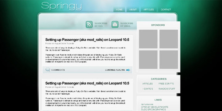
2. Elegant and Simple CSS3 Web Layout

PSD-To-HTML-Conversion-Tutorials-02

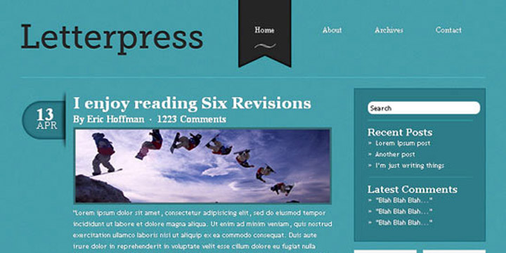
With this tutorial you can easily convert your PSD designs into simply elegant and fully functional CSS3 web layout without wasting any time. Enjoy!!!

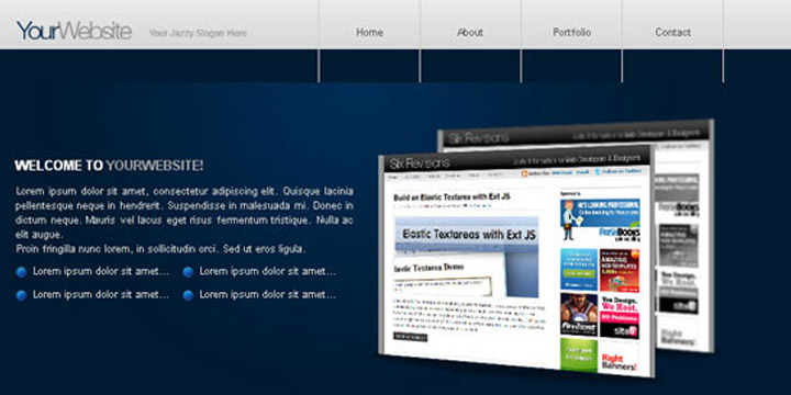
3. How to Code Up a Web Design From PSD to HTML

PSD-To-HTML-Conversion-Tutorials-03

In this tutorial you will learn how to code up a web design from PSD to HTML. You will see in this tutorial all codes are semantic and standards compliant.

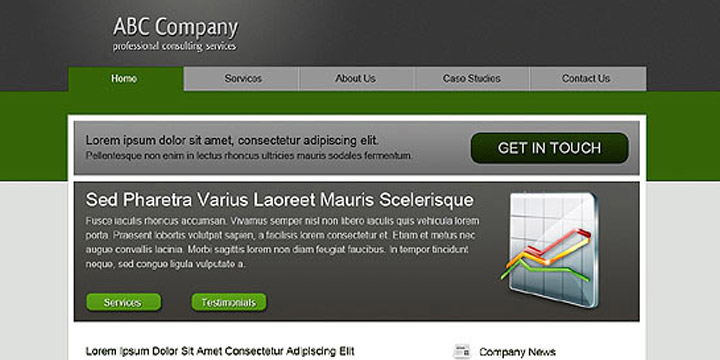
4. Minimal and Modern Layout

PSD-To-HTML-Conversion-Tutorials-04

If you want to convert your beautiful Photoshop mockups into working HTML or CSS templates then you should see this tutorial.

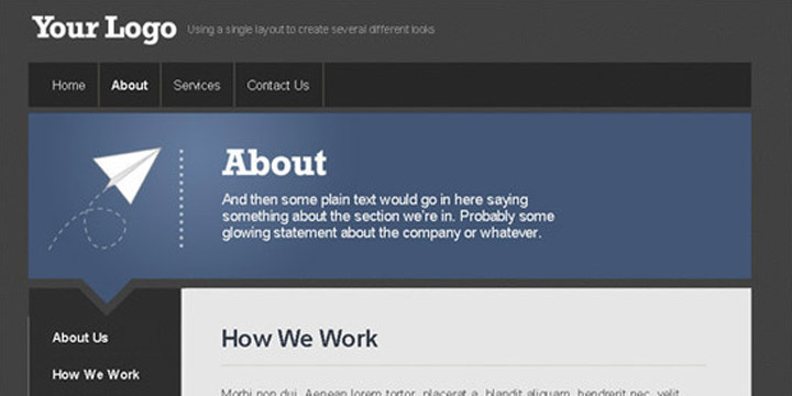
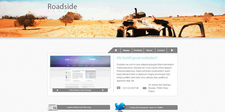
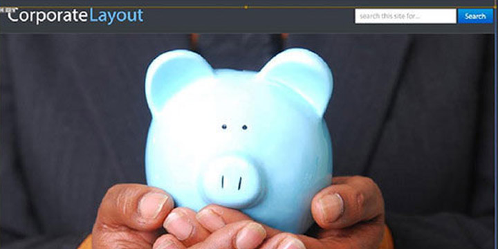
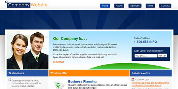
5. Code a Corporate Website from a Photoshop Design

PSD-To-HTML-Conversion-Tutorials-05

If you do not know the process of coding then this tutorial will teach you the process of coding to convert your designs into HTML and CSS.

6. Code an Awesome Minimal Design from PSD to XHTML & CSS

PSD-To-HTML-Conversion-Tutorials-06

This tutorial will teach you that how you can convert your PSD design into XHTML and CSS for creating an amazing and visually appealing minimal design.

7. Converting a Design From PSD to HTML

PSD-To-HTML-Conversion-Tutorials-07

In this tutorial we will learn how to convert a Design From PSD to HTML.

8. Sleek Coming Soon Page Design

PSD-To-HTML-Conversion-Tutorials-08

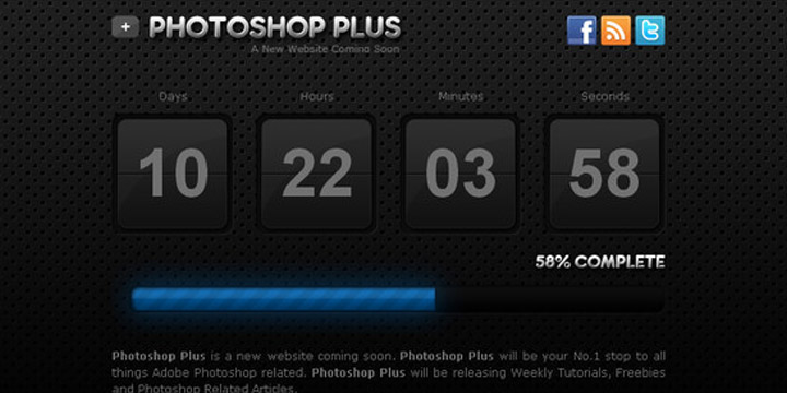
In this tutorial we will be talking you through the process of coding the PSD file into a working CSS template.

9. Design and Code a Slick Website From Scratch

PSD-To-HTML-Conversion-Tutorials-09

With this tutorial you can easily code your designs into a standards-compliant, cross-browser XHTML, CSS and JavaScript / jQuery layout.

10. Corporate WordPress Style Layout

PSD-To-HTML-Conversion-Tutorials-10

In this tutorial you will learn how to code the Corporate WordPress Style Layout into xhtml and css.

11. Encoding a Photoshop Mockup into XHTML & CSS

PSD-To-HTML-Conversion-Tutorials-11

This detailed tutorial will teach you how you can encode your Photoshop mockups into XHTML and CSS. In this tutorial you will see the working example that helps you.

12. Create a Website using UI Packs (PSD to HTML)

PSD-To-HTML-Conversion-Tutorials-12

In this tutorial we will code a PSD template using HTML, CSS and JavaScript.

13. How to Code a Grunge Web Design from Scratch

PSD-To-HTML-Conversion-Tutorials-13

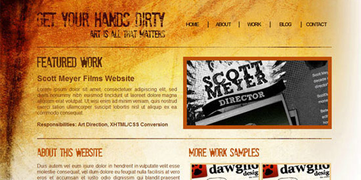
If you are searching how to code a Grunge web design from Scratch then this well detailed tutorial will definitely help you. With this tutorial you can easily code your grunge theme into working HTML and CSS template.

14. WaterColored Portfolio Coded

PSD-To-HTML-Conversion-Tutorials-14

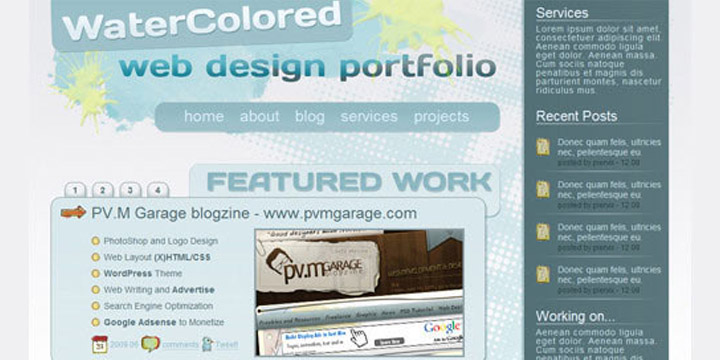
With this tutorial you can convert PSDs to a suitable and standards compliant XHTML and CSS template.

15. Code a Clean Business Website Design

PSD-To-HTML-Conversion-Tutorials-15

If you want to create a fresh and professional business website design by converting your PSDs into HTML conversion then this tutorial will help you in this purpose.

16. How to Create a Dark and Sleek Web Design from Photoshop

PSD-To-HTML-Conversion-Tutorials-16

In this web development tutorial, you will learn, step-by-step, how to create a beautiful dark and sleek web layout using standards-based HTML and CSS.

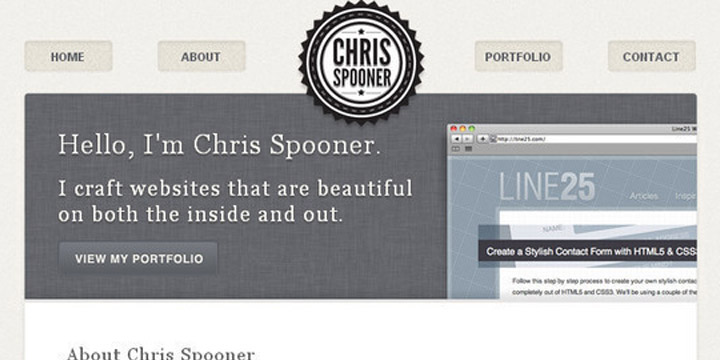
17. Coding Up a Web Design Concept into HTML & CSS

PSD-To-HTML-Conversion-Tutorials-17

With this tutorial you can easily convert your web design concept into HTML and CSS mockup completely along with clean and valid codes.

18. DesignSchool Coded

PSD-To-HTML-Conversion-Tutorials-18

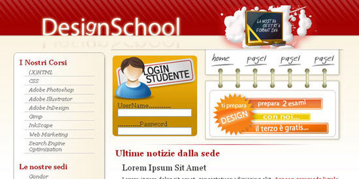
In this tutorial you will learn how to convert PSD file to HTML web pages.

19. Building a Set of Website Designs Step by Step

PSD-To-HTML-Conversion-Tutorials-19

If you want to convert your superb and wonderful Photoshop designs into HTML and also want to learn how to convert your PSD files into a complete functional WordPress theme then check out this well-detailed tutorial.

20. Build a Sleek Portfolio Site from Scratch

PSD-To-HTML-Conversion-Tutorials-20

If you use this tutorial, you can create awesome and sleek portfolio website by converting your PSD files into HTML and CSS.

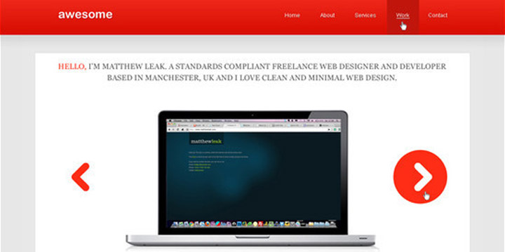
21. Coding a Clean and Professional Web Design

PSD-To-HTML-Conversion-Tutorials-21

This is a detailed tutorial and this tutorial will teach you gradually how you can code for a clean and professional web design. In this tutorial you will see a layout is created in Photoshop then it is converted into a standards-compliant (X) HTML web design.

22. How to Convert a Photoshop Mockup to XHTML/CSS

PSD-To-HTML-Conversion-Tutorials-22

With this tutorial you can easily code up a graphical website layout because this tutorial will teach you the process of converting a Photoshop mockup to XHTML / CSS.

23. Design Lab TV Styled Layout

PSD-To-HTML-Conversion-Tutorials-23

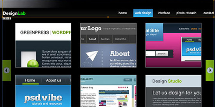
If you want a tutorial that will teach you how you can Design Lab TV Styled layout into XHTML and CSS then this tutorial is perfect for you check this out.

24. From PSD to CSS/HTML in Easy Steps

PSD-To-HTML-Conversion-Tutorials-24

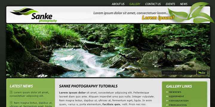
In this tutorial you will find that how a fully working Photography website is built by using XHTML and CSS. Because this tutorial will teach you how you can convert PSD files into HTML or CSS in easy steps.

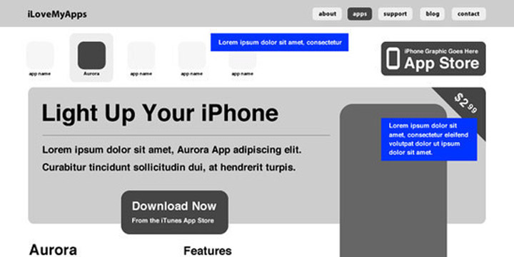
25. Design & Code a Cool iPhone App Website in HTML5

PSD-To-HTML-Conversion-Tutorials-25

With this tutorial, you can design and code a cool iPhone app website in HTML5, and visual styling with some CSS3 effects. Check out this tutorial.

26. Design and Code Your First Website in Easy to Understand Steps

PSD-To-HTML-Conversion-Tutorials-26

This tutorial is a treat for those people who are designing their first website. This tutorial will teach you in a very simple and easy way that how you can code and design your very first website. Enjoy!!!

27. Slicing and Coding a Sleek, Corporate PSD to HTML and CSS

PSD-To-HTML-Conversion-Tutorials-27

This is a well detailed tutorial that teaches you how you can build a professional web design for a corporate website in HTML and CSS code.

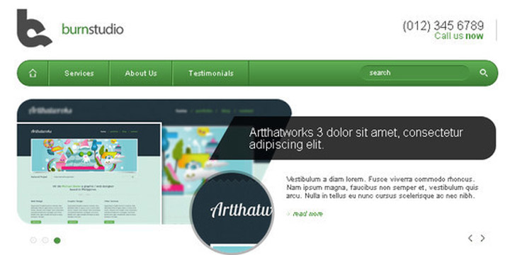
28. Convert Burnstudio from PSD to HTML

PSD-To-HTML-Conversion-Tutorials-28

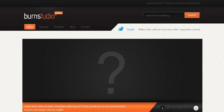
With this tutorial, you can convert BurnStudio from PSD to HTML. In this tutorial CSS framework, some CSS styles as well as JavaScript are used.

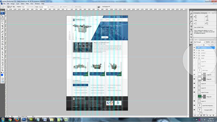
29. Convert Your Product Landing Page From PSD to HTML

PSD-To-HTML-Conversion-Tutorials-29

This tutorial will teach you that how you can convert your product landing page design (PSD format) into fully functional HTML. In this tutorial CSS framework, some CSS styles as well as JavaScript are used too.

30. Converting Dezign Folio From PSD to HTML

PSD-To-HTML-Conversion-Tutorials-30

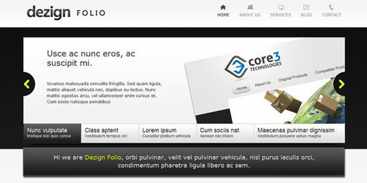
This is a detailed tutorial that will teach you gradually how to convert Dezign Folio from PSD to HTML. Again in this tutorial CSS framework, some CSS styles as well as JavaScript is used too.

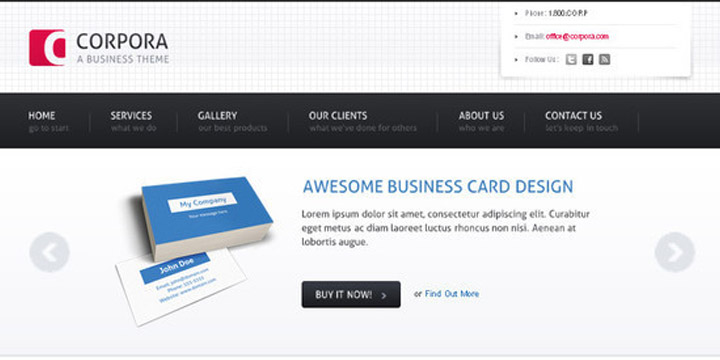
31. Convert Business PSD template to HTML/CSS tutorial

PSD-To-HTML-Conversion-Tutorials-31

With the use of this tutorial you can convert your business PSD template to HTML and CSS.

32. From PSD to HTML the Easy Way

PSD-To-HTML-Conversion-Tutorials-32

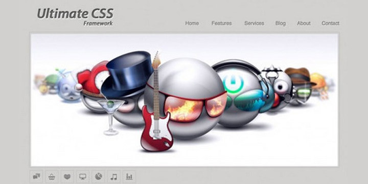
With this tutorial, you can learn how to convert PSD files to HTML in the easy and simply way. In this tutorial Ultimate CSS Framework is used.

33. How to Code a Clean Minimalist HTML CSS Website Layout

PSD-To-HTML-Conversion-Tutorials-33

With this tutorial, you will learn how to code a clean and minimalist HTML and CSS website layout.

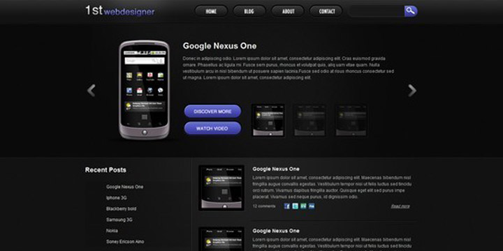
34. Convert 1stDelicious Portfolio Layout From PSD to HTML

PSD-To-HTML-Conversion-Tutorials-34

If you want to convert 1stDelicious portfolio layouts from Photoshop PSD to HTML then use this tutorial. In this tutorial CSS framework, CSS Sprites and CSS3 are used to transform your PSD designs into a valid HTML/CSS and cross browser compatible layout.

35. Convert a 3D Portfolio Dark Layout From PSD to HTML

PSD-To-HTML-Conversion-Tutorials-35

This is another detailed tutorial that will teach you how you can convert a 3D portfolio dark layout by converting PSD files to HTML. This tutorial will show you the use of CSS framework, some CSS styles and JavaScript as well to create a valid HTML/CSS, cross browser compatible and dynamic layout.

36. Code a Modern Design Studio from PSD to HTML

PSD-To-HTML-Conversion-Tutorials-36

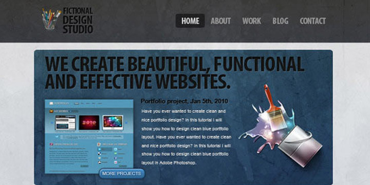
If you want to create a modern design studio in HTML then use this tutorial.

37. Simple & Cloudy Portfolio Layout

PSD-To-HTML-Conversion-Tutorials-37

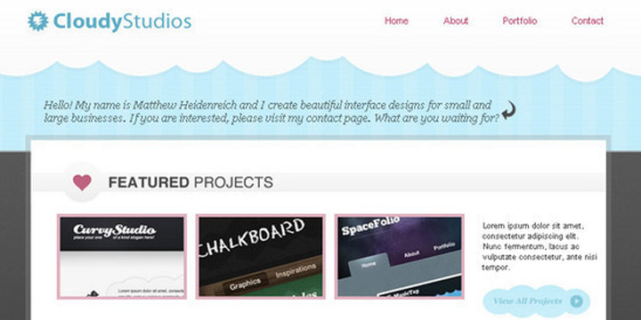
With this tutorial, you can easily generate simple and cloudy portfolio layout in XHTML.

38. Designing a Highly-professional website, from the sketch to the code

PSD-To-HTML-Conversion-Tutorials-38

With this tutorial, you will learn through the process of designing a highly-professional website from the sketch.

39. Create a Lovely Textured web Design from Photoshop to HTML/CSS

PSD-To-HTML-Conversion-Tutorials-39

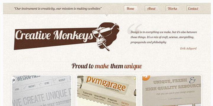
If you want to create a lovely and textured web design by converting Photoshop designs into HTML and CSS then use this tutorial.

40. Create a Comic Book Themed Web Design, Photoshop to HTML + CSS

PSD-To-HTML-Conversion-Tutorials-40

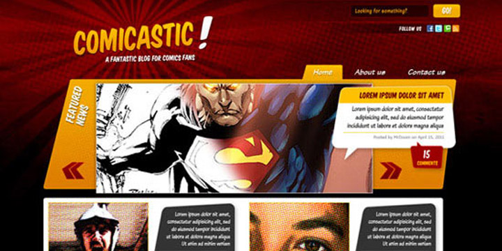
With this tutorial you will learn how to create a comic book themed web design by using your Photoshop PSD files and then converting them to HTML and CSS.

41. Convert a Warm, Cheerful Web Design to HTML and CSS

PSD-To-HTML-Conversion-Tutorials-41

With the use of this tutorial you can easily convert a warm and cheerful web design by converting PSD files to HTML and CSS. This tutorial is all about that.

42. Creating a Design and Converting it to HTML and CSS

PSD-To-HTML-Conversion-Tutorials-42

You can convert your PSD files into a nicely coded HTML and CSS website with the use of this detailed and easy tutorial.

43. Code a Photoshop File to a Working Website

PSD-To-HTML-Conversion-Tutorials-43

This tutorial will teach you how to code a Photoshop PSD file into an awesome and full functional working websites.

44. Learn How To Convert Artthatworks From PSD To HTML

PSD-To-HTML-Conversion-Tutorials-44

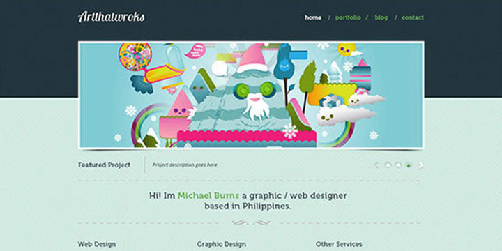
With this tutorial, you can easily convert Artthatworks from PSD to HTML using Skeleton Boilerplate and make it approachable with media queries.

45. Coding a Band Website Created in Photoshop

PSD-To-HTML-Conversion-Tutorials-45

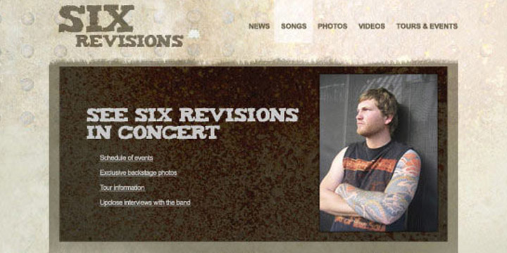
If you want to code a band website by taking a PSD file and after that you want to convert this file into a clean and working XHTML or CSS code then you should see this tutorial.

46. From Photoshop to HTML

PSD-To-HTML-Conversion-Tutorials-46

If you want to know how professionals convert their designs from Photoshop to CSS and HTML, then you should use this tutorial because this tutorial is all about that.

47. How to Convert a PSD to XHTML

PSD-To-HTML-Conversion-Tutorials-47

This tutorial will teach you in a simple and easy way that how you can convert a PSD to XHTML.

48. Converting a Clean Magazine-style PSD Template to HTML/CSS

PSD-To-HTML-Conversion-Tutorials-48

If you want to convert a clean magazine style PSD template to HTML or CSS layout, then check out this another well detailed tutorial that will teach you step by step.

49. How to Code a Stylish Portfolio Design in HTML/CSS

PSD-To-HTML-Conversion-Tutorials-49

With this tutorial, you can easily learn the process of coding up the design into a fully working HTML and CSS website.

50. Coding The PSD File Into CSS and HTML

PSD-To-HTML-Conversion-Tutorials-50

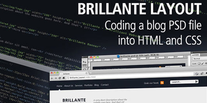
This tutorial teaches you the process of coding the PSD file into CSS and HTML so that you can easily generate a Brilliant blog design. In this tutorial you will see the PSD slicing, HTML/CSS coding, custom fonts embedding and some handy cool tips to improve your website performance.

Why You have to Create your Website in WordPress?

WordPress is the most popular content management system today, powering over a quarter of the web. If you’ve ever considered switching to a new program to manage your site, WordPress should be at the top of your list. No matter what website-building platform you’re currently using—from using website builders to hiring a professional developer—here are seven reasons you should consider switching to WordPress.

  • You’ll Have Full Control Over Your Content
    WordPress has a unique advantage over hiring a web developer. Instead of contacting your developer for every little change you want done to your site, WordPress gives you access to your backend so you can make layout and content tweaks, add blog posts, and monitor comments all on your own. You can always hire a WordPress consultant to help you with more complicated tasks, but for everyday tasks, you’ll want access to your backend, and WordPress makes that easy. Plus, you can update your content at any time, even if it’s already published. Since it’s browser-based, you can log in from any computer to manage your site.

It’s not just the content you have access to, either. Through your web hosting dashboard, you’ll also have access to your site’s files, can add new domains and email addresses as you please, and can complete a variety of other web-related tasks.

  • Customization Options are Endless
    WordPress is well-known for its endless customization options. Most themes have built-in theme options so you can easily tweak your layout, logo, text, colors, and more without ever touching a line of code. If your theme can’t handle the heavy lifting, then there are plenty of plugins that will expand your site’s functionality to help you get the features you need.

That said, if you do need to perform more complicated tasks, WordPress provides access to your site files so a developer can go in and change anything to your specifications. That means you have the power of a developer with the accessibility of DIY website builders.

  • WordPress is SEO-Friendly
    Google likes WordPress because the system is designed to comply with Google’s algorithms. It’s easy for Google to index WordPress sites, which means they tend to rank well in search results. In general, the better you rank, the more traffic you get, the more conversions you see, and the better your business does overall. This is all thanks to a clean code, SEO-friendly URL structures, and SEO plugins like Yoast that help maximize the potential of your SEO strategy.
  • WordPress is Fast
    If you’re using the right tools and a good web host like eHost, you can be sure your site loads fast and experiences nearly flawless uptime. That’s not to say all WordPress sites are quick. Poorly written themes and too many plugins can slow your site, as can shared hosting plans that put your site on a slow server. With a great host, theme, and plugins, you shouldn’t have a problem with speed, and that means good news for your business. A fast site can help with your search engine rankings and boost overall conversions.
  • A Blog Is Built In
    If you want to start a blog on your website, you’ll have no problem if you’re using WordPress. It’s built for blogging, meaning it has all the tools you need to get started, including adding blog posts, enabling commenting, using social share buttons, and adding recent posts to other pages on the site. That doesn’t mean it only works for bloggers. You can add as many pages to your site you like, including a custom home page. Of course, having a blog on your site comes with its own benefits. Chief among them, blog content helps drive traffic to your site by earning you backlinks, helping you rank higher in search engines, and giving you content to spread across social media.
  • WordPress is Scalable
    One of WordPress’s most notable benefits is that it allows you to grow your site as your business grows. Big-name sites like BBC America and Best Buy are running their sites on WordPress, showing that WordPress can accommodate sites of any size. It helps that you can add an unlimited amount of pages and blog posts, but you’ll also be able to scale with the right web host.

If you get started with a cheap web host, you can upgrade your hosting account to acquire more resources as your site grows, or you can switch hosts altogether while preserving the website you’ve built. There are plenty of web hosts that work with WordPress and feature dedicated hosting options, which means if your site does grow to huge proportions, you’ll have the resources you need to run it.

  • You Can Have Multiple Users
    If you need separate accounts for multiple administrators, editors, content writers, or subscribers, WordPress can accommodate. You can even use WordPress to set up a membership site or forums. As an administrator, you can assign a role to each user, limiting their capabilities on what they can do with their account.

Not sure you want to go through the work to get your site on a new platform? Only PSD 2 HTML can help you transfer your website to WordPress to minimize the hassle. We Offer PSD To WordPress Conversion Service At Very Affordable rates


Why W3C Validation Is Important at Time Of PSD To HTML Conversion

The competency and expertise of a developer set him/her apart from others in the industry. A developer clearly understands the process and work accordingly to deliver the effectual results. Right from developing codes to validating and integrating them are best managed by a professional developer who’s experienced in this domain. Every developer knows the necessity to inculcate validated codes in each development process and this is where W3C validation comes handy. Here in this blog, let us discuss more about W3C validation and its importance for a website.

What is W3C validation

We in the “web world” tend to use scary words and acronyms when talking about what we do and it is very possible you have heard of “W3C” or “W3C standards” or maybe even “W3C validation” and wondered what in the world a this strange jumble of letters and numbers has to do with your website! I’ll translate this from “Tech” into English for you.

Validation is one of the major factors that influence the quality of a web design. It mainly refers to comparing formatted HTML and XHTML documents/files with the defined W3C standards. W3C is referred to as World Wide Web Consortium which is being defined as a set of standard coding guidelines. All markups and coding are subject to abide by W3C in order to run along future business aspects.

It is same like checking your sentence in accordance with the general grammar rules of a language in which it has been written in. Just like there are rules in grammar language, similarly in computer programming, there is a set of rules & guidelines which must be followed during every web project.

Why W3C Validation On A Site Is Important?

W3C validation is a process of analyzing the codes of the website in order to check if it conforms to the formatting standards. However, it should also be noted that a website which is not based on W3C standards may suffer the consequences of poor formatting resulting in less readability amongst the audience.

Here are some key reasons why W3C validation is essentially done:

  • Escalates Ranking on SERP’s
    Undoubtedly, errors in markup can affect the performance of a site leading a huge impact on a site’s SEO. It is known to all that search engines use HTML or XHTML codes of the website to rank them. So if the codes are invalid and do not comply to the standards, this may lead to an inefficient crawling on your site leading to a drop in ranking.
  • Validation Promotes Ethical Programming Practices
    Using techniques like validation, one can get used to practicing ethical web designing conventions. Following such practices promotes the creation of error-free codes and viable web solutions, which helps in creating futuristic websites and themes.
  • Improved User Experience
    W3C validated website can be easily accessed over multiple browsers efficiently. The usability and functionality automatically get improved when a website is fully based on error-free coding. Such a website can be uniformly viewed over dynamic browsers on different range of devices. Moreover, the validation process provides an extensive support to developers to help them minimize and correct the formatting errors. Web page with zero to less errors in coding loads faster as compared to the ones that are not validated.
  • Ensures Multi-browser Compatible Site
    Introducing multi-browser compatibility in the sites got easier with the use of W3C validated codes. It is seen that websites that are not validated are difficult to open in multiple browser which affects its proximity amongst audience. W3C validated sites get displayed seamlessly on browsers without any errors; on the contrary, non-validated sites face formatting and display problems.
  • Device-agnostic Feature
    Due to technological advancement, there has been a significant rise in the number of smart hand-held devices. These changing scenarios have sparked the popularity of mobile commerce among the web audience. Various sectors like marketing, education, hospitality, etc. have been extensively covered by business owners to escalate the usability of their site on new devices. So if you are looking forward to enhancing your reach in business realm, you must consider making your business accessible across multiple devices.
  • Validation Works As A Debugging Tool
    It is already mentioned above that validating is mainly referred to initiating error-free coding, which is checked by the validating components. The validating components highlight the errors and may even give you the cause of problem. Moreover, if the invalid code is displayed on any other documents, these validators do check them too.

How Is W3C Validation Done?

There are numerous tools available online that are specifically built to authenticate your codes in compliance with W3C validation standards. The commonly used tool is W3C Markup Validation Service that is popular for its simplified processing.


Quick Tips To Using This Tool:

  • Enter your site’s URL in the address box and click on check button. The list of existing HTML errors would be shown.
  • You can directly upload your file to see the results.
  • Or you can choose the direct validate option of putting all markups of your file in the box given. Click on check to get results.

Best Provider Of HTML Markup Validation Service

Thinking of getting your site validate and have yet not decided whom to approach? Well! No worries, this is wher Only PSD 2 HTML comes to your rescue. This reliable mainstay is competent enough to provide all HTML-specific services. The skilled developers employed at this company possess years of experience in creating dynamic HTML/CSS markups along with delivering advanced W3C validated HTML5/CSS3 markup services globally. We are laced with advanced technologies that helps webmasters to create pixel-perfect HTML markups creating improved user-experience.

And for the ones who are stuck at the nascent level of web designing, looking forward to transforming their PSD designs into advanced HTML markups, can also get in touch and avail our PSD To HTML conversion services. All the markups coded by our experts are both W3C validated and written in compliance with the advanced web conventions. We, at Only PSD 2 HTML strive to deliver note-worthy W3C valid HTML markups creating exclusive web solutions. To know more about our special offers and services, feel free to Contact Us

PSD to HTML5 Conversion – Best Solution to Advance Your Website Performance

If you have a business website, then your main goal would be to attract as many potential customers, in order to achieve your business goals. Therefore, it is of the utmost importance to have your website upgraded to the latest W3C standards for web design and development.

Features of HTML5 websites:

HTML5 is one of the most advanced web standards, which has revolutionized and simplified the process of creating effective websites. Unlike in the PSD based websites, you won’t need to have the whole web pages made of various images, because they will simply slow down the page loading, and annoy your visitors.

On the other hand, HTML5 uses CSS3 codes which eliminate the use of images in unwanted parts of the pages. That helps in making your web pages load faster, thereby creating an enjoyable experience for your web visitors.

Of course, you can use images in places where you need them, but it still does not mean that you will need to create whole pages in PSD image formats.

You could also use videos with the help of ’<video> </video>’ tags, which means that you will not need to specially develop flash based videos. Similarly, there are many other tags which have been included in HTML5 to create robust web pages. Also, some of the old and redundant tags have been removed.

Now let us look at some of the reasons why conversion of PSD to HTML5 can help you in improving the performance of your business websites.

Compatibility across all different browsers and screen sizes:

Most websites are being converted from PSD to html5, because these websites are responsive, and can adjust to the varying screen sizes of tablet PCs and smartphones. In addition to making your website responsive, the web pages which are developed with HTML5 offer seamless compatibility across all different types of browsers.

If your business website has to be effective and attract more customers, then it is of prime importance to ensure that it runs smoothly on any browsers, which your customers will be using, be it on their computers or on their smartphones.

Choose right Content Management System:

You can gather a lot of useful data about your customers, and about their shopping patterns, by collecting data from your websites. It means that your website has to be integrated with an effective CMS system. It helps you in managing you database more effectively.

Such data can be very invaluable, especially when you are analyzing your business performance, and planning newer strategies. If your website is still working on the old PSD format, then it becomes imperative for you to get it converted from PSD to HTML5.

In addition to the above mentioned reasons, there are various other technical reasons which clearly a put the websites with HTML5 on the driver’s seat.

You could contact any dependable service provider who specializes in PSD to HTML5 conversions to help you in improving the experience of your visitors on your business website. Make your move today, and enjoy the benefits of increased customers. Only PSD 2 HTML Offer PSD To HTML Conversion Service in $59 USD


PSD To HTML Conversion Using Bootstrap 4

Bootstrap is a front-end framework used for websites and web application development. It has HTML and CSS-based design templates, which can be used for typography, buttons, navigation, forms and various interface components. It also has optional JavaScript extensions.

Bootstrap is a popular mobile first, HTML, CSS and JS framework for developing responsive, mobile first projects on the web. It was first developed as Twitter Blueprint to assist Twitter developers in working more efficiently and consistently. The name was then changed to Bootstrap and was launched for developers to use for front-end web development that helps in improving the user experience for the web projects. Follow our previous blog for preliminary information on creating websites with Bootstrap.

Benefits of Using Bootstrap for WordPress

With the evolution of mobile products, people are looking for alternatives for conventional web platforms. WordPress is the most common type of web platform that has been used for development of many sites. It allows easy usage, dynamic visual flow with interactive blogging and SEO. Bootstrap is comparatively new but rapidly growing website style, which works to make your website compatible with any device. Benefits of theming with Bootstrap are:

  • It is responsive and mobile first
  • It uses clean, attractive and modern designs
  • It plays well with HTML5.
  • It gives easy access to scripts.

For tablet or computer, WordPress is good enough and has more visually appealing and conceptual themes as compared to Bootstrap. WordPress websites use more memory while loading, due to the high-end designs of WordPress, which slows down the loading speed of the website on phone or other mobile devices.

Bootstrap, being equally good, best suited for mobile phones and all small screen devices. Based on the size of the viewing window, Bootstrap’s dynamic design allows text and the page changes. So you don’t need to use side scroll while using the site on the phone, but scrolling up and down is there to browse the site completely. As Bootstrap uses less memory for loading as compared to WordPress, it helps in better loading performance on mobile devices.

Free Bootstrap themes and templates

Start Bootstrap provides open source and easy to use the collection of Bootstrap themes and templates, which can be used for website development and can also be used commercially. It provides themes in various categories such as full websites, one-page websites, landing pages, blogs, portfolios, e-commerce, admin and dashboard, starter template and many more.

Wrap Bootstrap

Wrap Bootstrap is a marketplace for premium templates and themes of Bootstrap. It provides you a single but solid foundation for developing impressive and responsive websites and web applications. It also allows designers to upload and sell their customized default styles and earn the percentage on each sale.

Material Design for Bootstrap

Material Design for Bootstrap (MDB) is a powerful Material Design UI kit for the Bootstrap framework. MDB is a theme built using Bootstrap 3, which implements Google’s material design. The latest version for MDB is version 4.2.0. It offers Bootstrap elements dipped in material design that includes navbars, tabs, buttons, typography, sliders, progress bars, bootstrap ready to use layout, responsive CSS3, grid system and other things which are material design. No need to build the website from the scratch, you get a ready theme to customize and you will have the material design based UX/UI.

Responsive Bootstrap flat design

Bootflat is an open source Flat UI kit based on Bootstrap CSS version 3.3.0 framework. It offers easier and faster ways for designers and developers to create elegant web apps. It was visioned as a stunning flat design and built with Sass 3.4.9.

Highlights of Bootflat:
  • Bootflat uses lightweight, high-function plugins for optimum performance and keeps down the CSS and JS file sizes.
  • Bootflat, built with mobile-first in mind, provides off screen navigation and all the widgets are compatible with all the screen sizes.
  • Bootflat UI kit is PSD Interface Pack that includes a set of beautiful components that can be used to create beautiful websites as well as iOS/Android apps.
Plugins for bootstrap

Bootstrap’s plugins and extensions are not really limited. There are numerous free and premium extensions and add-ons available for extending Bootstrap. It comes with bundles of jQuery plugins and reusable components. Also, it gives you the choice, whether you want to use it or not. Access all the Bootstrap resources and plugins here.

Latest Bootstrap 4 Alpha 5 Release

Alpha 5 arrived just over a month after Alpha 4 with some major feature improvements and loads of bug fixes. Bootstrap 4 is getting more stable with each alpha release. Alpha 5 release brought following updates:

  • New CSS bundles
  • Grid updates
  • Navbar updates
  • More utilities
On the way to Alpha 6 release

Bootstrap has revealed that one more major alpha release, alpha 6, before getting into the slightly more stable beta ships. There’s still more to expect around major components — the navbar, flexbox variants, utilities, and accessibility.

Confused about choosing the best suited web platform for your business? Feel free to Only PSD 2 HTML. Our expert Business Analysts will help you choose the best platform to PSD to HTML for your Website. We offer customised psd to html5 Conversion services at competitive pricing. We have already associated with many of the startup organizations and helped them to get their business on world wide web. Navigate through our portfolio to have a look on our previous website development works. Only PSD 2 HTML Offer PSD To Bootstrap Converion Service in $99 USD

Bootstrap 4 Alpha 5

Alpha 5 has arrived just over a month after Alpha 4 with some major feature improvements and a boat load of bug fixes. We still have a lot of work to do, but we’re closing the gap and getting more stable with each release. Keep reading for the highlights and plans for Alpha 6.

New CSS bundles

We’ve updated our build process to include compiled versions of all our CSS bundles. In addition to the longstanding default compiled and minified bundles, we now include compiled CSS files for our flexbox mode, grid system only, and Reboot only bundles. Each bundle includes a compiled, minified, and Sass map, just like the default compiled CSS.

Grid updates

Our grid system has been updated and is more flexible than ever. New in Alpha 5 are breakpoint specific grid gutters. That’s right, now you can customize the width of your gutters across each and every grid tier by modifying the Sass map.

The .container behaviors have changed slightly in Alpha 5. We now set the width of each container alongside a max-width: 100%; to ensure proper rendering across browsers in both our default and flexbox modes. Similarly, we fixed a bug in our flexbox grid where columns didn’t properly collapse at lower breakpoints.

Lastly, we’ve changed a few breakpoint and container dimensions. The sm tier’s container is now smaller than it’s viewport dimensions and the lg tier has changed from 940px to 960px for grid columns that more cleanly by 12.

Utilities overhaul

Utility classes got a ton of attention with Alpha 5 and will continue to in Alpha 6. Major changes in this release include:

  • Simpler margin and padding syntax (e.g., now mx-auto instead of m-x-auto).
  • Renamed .pull-*-left and .pull-*-right to their CSS properties (e.g., now .float-*-left and .float-*-right).
  • Separated background and color utilities for more explicit styling.
  • Renamed image utilities, moving from .img-rounded and .img-circle to .rounded and .rounded-circle, respectively.
  • Removed the display: block; from .img-fluid as it’s unnecessary for creating responsive images (the inline-block default works great as-is).
  • Added new vertical-align utilities with .align-top, .align-middle, and more.

Be sure to scope out the open issues in the Alpha 6 milestone. There are more updates coming to utilities to add more responsive variations, more consistent naming, and more.

We’ve put a ton of time into the navbar for Alpha 5, but honestly it’s still not done. Rather than hold back the progress we’ve made for it until Alpha 6, we’re including a somewhat half-baked iteration.

Here’s a look at what’s new, how it works, and what might change in our next release.

  • First up, the navbar has a brand new toggler that features a customizable SVG-based background-image. With the power of Sass variables, that allows us to easily change the color of those hamburger menu icons.
  • Second, the default styles for the brand and navigation have largely been tweaked. There’s less custom styling overall and an emphasis on positioning and flexibility.
  • Building on that, we overhauled the collapse plugin integration for responsive navbars. With the help of some utility classes and collapse classes for each grid tier, you can easily pick the breakpoint for collapsing your navbar without having to recompile your Sass. Also included is the auto restyling of dropdown menus for mobile so they no longer hide other navbar content when toggled.
  • Lastly, we’ve updated the styling and documentation for various navbar subcomponents. There’s more flexibility and examples of the .navbar-brand, better form control support, higher nav contrast, themed responsive toggles, and more.

The navbar is a tricky one—there’s so much functionality and styling that can go into them. We’ve outlined the next major pieces for the navbar, but there’s likely more we’re missing. Be sure to give the updated component a whirl and report back with your feedback.

Getting to Alpha 6

We’re planning on one more major alpha release before getting into the slightly more stable beta ships. There’s still more to do around our major components—the navbar, flexbox variants, utilities, and accessibilty—before we button things up.

Once done, we’ll review all on our docs and update all our example templates to the latest and greatest. From there we’ll need your help to test these changes and report bugs. Stay tuned for more updates as we get closer to that release.

Until then, have at it with Alpha 5!

PSD To Responsive HTML

A responsive website is the demand of every business, these days, that wishes to engage with customers. Bootstrap is an effective solution for getting rid of the tangle of designing a responsive website. It is a combination of HTML, JavaScript, and CSS developed by Twitter. This open source framework can let you create user interface components and add some advanced featured to your site. It uses a dynamic style sheet language called LESS. With an impressive website, it can get easy to impress the visitors too.

There are few css framework that help you to create responsive websites.

  • – Twitter bootstrap
  • – Responsive 960 grid system
  • – Gumby Framework
  • – Foundation

These are best CSS framework that help to create responsive web pages.

For many developers, converting PSD To Bootstrap HTML websites that are highly responsive and cross platform compatible is not an easy task. A maculate written CSS code is required but with bootstrap that requirement can end. It can let you create a CSS code that can provide the exact level of responsiveness to your website. PSD to HTML is a common phrase used for explaining the process of taking the design of a website in any common format preferred by the web designer and converting into a code so that it may be functional on other web browsers. This is all what PSD To Bootstrap HTML conversion do.

Reasons to choose Bootstrap

  • Bootstrap lets you create responsive layouts in a better and easier way than any other tool
  • Provides cross browser compatibility
  • Makes the code pattern easy to reproduce and understand
  • No complicated setup required for upgrading the framework
  • Provides an elaborately documented CSS code

Bootstrap can let you build a responsive website. It is much more than a collection of tools and templates. It can let you develop any type of website whether it supports Content Management System, customer CSS, Joomla, Word Press, Drupal, etc. or not. The best part is that this framework is supported by all major web browsers.

PDS to HTML conversion with Bootstrap
Bootstrap has all major HTML components within that can be used in any website. These components include navigational tabs, dropdowns, tool tips, button groups, typehead, accordion, progress bars, and more. The language written in bootstrap is JavaScript so it is easier to understand this language.This is one of the benefits of Bootstrap. Neat functions from the language can be used for making better designs.

Creating responsive website is not easy. Responsive HTML experts are readily offering PSD To Bootstrap HTML services to develop the most flexible and responsive framework for the website. For those, who wish to convert PSD To Bootstrap HTML, might need professional assistance and Responsive HTML experts can provide everyone that assistance.

PSD To HTML Conversion Tips

It is significant to convert your PSD design to HTML to develop an elegant and broadly functional website. The conversion process involves technical know-how which appears to be little challenging. However, designing and creating mock-ups of your website via Photoshop and then converting into actual functional website is particularly effective.

For best results of PSD to HTML conversion, certain important things are to be kept in mind. Here are few important tips that will help you get the best out of that process:

1. preserve consistency in Design

Maintaining consistency throughout your design is crucial. Such design elements make your website look professional but takes a long way in making the coding process a breeze. The consistent designs like buttons, headers, margins, footers, etc. helps in the conversion process flow and reduces the chances of generating bugs.

2. Avoid Blending modes

Using blending modes is a great option in photoshop. But they’re found to be very hard to recreate in cascading style sheet (CSS). They produces very beautiful eye pleasing effects in the raster graphics editor but results in an undesirable outcomes when turned into HTML.  Therefore, it can be used to preview your photoshop design but should be avoided while converting PSD files to HTML.

3. use cross-browser compatibility

There are a plethora of browsers which are available on internet, as obviously, you must be looking to access your website on maximum number of browsers. So it is essential to ensure that the conversion and coding process keeps in mind these differences and provide for them.

4. Consider general Screen Resolution

You should consider designing a page layout screen resolution of 1366px by 768px while incorporating the responsive design techniques. As a website owner, you always want to offer the bets experience to your visitors and therefore limit the need of scrolling your website from users view point.

5. Have well-organized PSD files

If you’re going through a well-organized PSD file, it will make it possible for users to understand and keep in mind everything that concerns to the website. It will also lessen the time and effort that will be required to put for the whole process since all the things on website appears to be neat and clean.

6. achieve the conversion manually

There are plenty of soft wares that are available online and can assist you to go ahead with powerful conversion of PSD to HTML. As much as they appear like the answers to meet the website’s development needs, you will do good to avoid them entirely. Their ambiguous processes and lack of a human hand makes them prone to bugs and hitches that will most certainly results in an unusable site.

Conclusion

Once you have that knowledge to convert PSD to HTML process, it becomes easy to facilitate the conversion process. The outcomes of well-converted conversions are often outstanding and the rewards really rich. The tips mentioned above will help you to develop an exceptional website in no time.

To get the best results, you may also take the help of the experts. These professionals help to develop your website as good as you envisioned.

Successful ways of PSD to HTML Conversion

Due to the drastic change in internet technology over the past few years, there has been an increase in the demand for highly personalized and user-friendly website designing modules. One of the major tasks associated with this part of web development is the PSD to HTML Conversion. PSD files are Adobe Photoshop files which need to be converted into a more web-compatible language like HTML.

Optimizing of PSD Photoshop files into HTML coding is becoming increasingly popular for web designers, and there are multiple reasons behind it.

Let us have a quick glance on some of the benefits of PSD to HTML conversion, apart from the high-profit levels to companies:

  • SEO Friendliness
  • Easy User Navigation
  • Reduction in Costs
  • Cross-Browser Compatibility
  • High levels of Customer Satisfaction

The conversion of PSD files into HTML can be a little laborious. There are still some effective ways that make the whole process easier.

  1. Manually: Manual conversion is the basic and oldest method of converting data from PSD to HTML. This process involves coding manually (in case you are technically proficient) and hence, takes a lot of time to complete. This manual conversion is the most difficult way of markup conversion.
  2. Use of automated tools: One of the best options you are looking for is the use of numerous software which converts PSD to HTML online. There are also trial versions of some tools that you can try before buying the full version. The software can be easily downloaded and installed on your PC, which makes the whole task convenient.
  3. Online conversion companies: If you are looking for a professional conversion company, there are many websites you can try such as Only PSD 2 HTML, which offers the best markup conversion services and a seamless communication to their clients.

If you are technically sound, then you can adopt any of the above methods for PSD to HTML conversion. However, it is advisable always to hire a professional service or a good conversion company to achieve the goal effortlessly.

10 Benefits of PSD To Responsive HTML Conversion

PSD To Responsive HTML Conversion  is the approach to building a website so that it responds to the end user’s viewing environment, platform, screen-size and viewing orientation. The practice consists of a mix of flexible grids and layouts, images and an intelligent use of CSS media queries.

Now a day’s users view websites on a multitude of devices including PCs, Tablets, Laptops, Smart Phones and even their TV therefore a Responsive Website should now be the default mode.

Over the last few years, Bootstrap has become an increasingly popular front-end development framework. More and more developers and designers continue to get on board. Evidently, there’s a reason for that.Most of developer is using bootstrap for Convert PSD To HTML.

1. Increasing Tablet and Mobile Audience

With 40%+ traffic on a majority of our customers’ websites now coming from mobile devices you would be excluding a large proportion of your potential new customers from having an enjoyable browsing experience with your website.

Traditionally users have been redirected to separate mobile websites however the latest web technologies allow us to serve different resolution-specific content without having to reload the web page or redirect the user.

2. Return on Investment

Well, actually with Hostpipe’s packages, there is no additional investment for making your website responsive.

Our core philosophy surrounds ensuring that we adhere to Web Standards Compliance, and with the addition of a simple plug-in (BootStrap) and a few tweaks to the code it can be as simple as producing a different stylesheet for print.

3. Increase Sales and Conversions

Your website is a sales tool and in many cases will provide the first impression of your company to potential new clients, therefore a well polished, responsive website will ensure that you give the best first impression.

Not only that but when the client visits your full website they will see a consistent brand and image, with the resulting positive impact leaving a trustworthy imprint.

4. Search Engine Friendliness

There’s no doubting that Search Engines now grade websites on how responsive they are, and so with well organised content being served to the search engines through a well equipped responsive framework you are more than likely to get a few bonus points from the Search Engine’s complicated algorithms.

Not only that but Search Engines are more likely to display mobile content when you are on the move and viewing searching for stuff via 3G, so if it receives a search query from a mobile device it is more likely to give preference to mobile enabled websites in its search results.

5. Save time Managing Site Content

A truly responsive website means that you can create one set of content within your content management system (CMS) and then leave it down to the template your website developer has created to determine how that is handled. No more writing two sets of content for mobile and web.

At the end of the day why should you have to change your marketing and business logic just because the website framework doesn’t allow it? One product = one page of content. Shimples!

6. Stay Ahead of the Competition

Many websites are still not paying attention to the changing requirements and the need for responsive design. Therefore if your website is responsive, the likelihood is you will be one step ahead of your competition.

7. It will Future Proof your Website

Basically a truly responsive website will adapt the content to fit on any screen size and resolution, therefore your website is likely to work on the next new-fangled, crazy device which Apple or Google throw at us.

8. Keep your Analytics in one place

Simple really, a single URL means a single set of analytics to look at and decipher making it easier to examine the goals you’ve set and the funnels your site visitors have travelled through to reach those goals.

9. Additional Features of Mobile Devices

Mobile devices make great use of their in-built technology such as cameras, compass, geolocation GPS and accelerometer. The benefits of responsive website design in relation to this is that your company can use these features to enhance the mobile user’s experience.

10. Daft not to Take Advantage of any of the above

OK, so I couldn’t actually come up with a tenth benefit because all of the above benefits collectively will have such an impact on your website it simply seems daft for you not to make your website Responsive.

Only PSD 2 HTML Offer PSD To Bootstrap Conversion in $99 USD & PSD To HTML5 Conversion in $79 USD.