Here We start Basic Step for PSD to HTML Conversion Tutorial
Welcome to our Basic Web Design tutorial where you will learn how to completely code a website from scratch. In this short course we will walk you through the very basic steps on what to do and what to learn before, and during, building a basic website. We Make deff. Devision for psd to bootstrap html conversion tutorial are as under.
- Download PSD Design Template
- PSD Analyze
- Get Bootstrap
- Download Font Awesome
- Start with Header Part.
- Start with Navigation Part.
- Start with Welcome Part.
- Start with Products Part.
- Start with Bottom Part Products List.
- Start with Footer Part.
————————————————————————————————————————–
Download PSD Design Template
Here We attach some example for downloading Web page PSD Template free Either Paid.
Free PSD Design Template
- Freepik
- Free Bies Bug
- Os Template
Premium PSD Design Template
- Theme Forest
- Template Monster
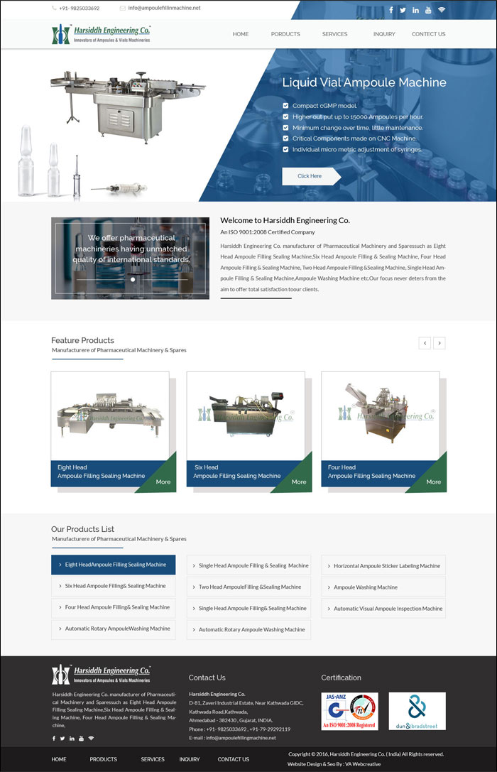
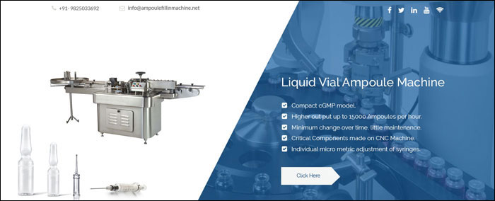
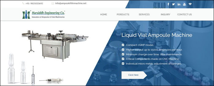
For Example We take design from Our Client Website.
Company Name = Harsiddh Engineering Co.
URL = http://www.ampoulefillingmachine.net
————————————————————————————————————————–
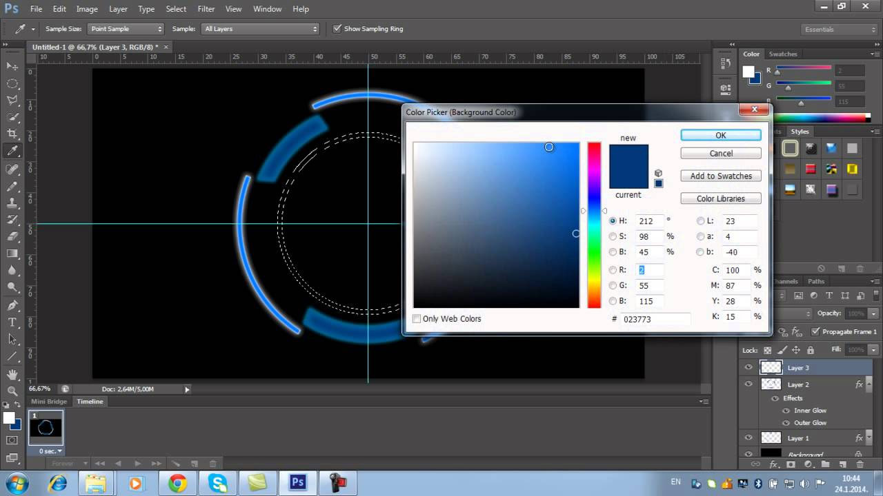
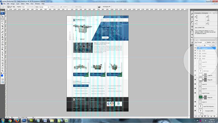
PSD Analyze
One of the most important website page creation skills you will learn in Photoshop is how LAYERS constitute the entire structure of website. It is valuable to see an image in relation to the layers used to construct it.
A technical analysis is the examination of an PSD file to actually see how the design was constructed using layers. In order to do this, you need to have the actual .psd file for the image. These .psd files are located below and can be downloaded to your Desktop for this activity.
TECHNICAL ANALYSIS
- Make sure Photoshop is launched.
- Inside Photoshop, go to the TOP MENU BAR – OPEN. A window will open.
- Use this window to locate the proper .psd file on your Desktop. Click OPEN.
- The image file will open. Make sure the Layers palette is showing.
- Look at the document window (the image) and then look at the Layers palette. See the relationship between the two.
- Go to the Layers palette and start hiding and showing layers. See the effect on the main image.
- Click on the MOVE tool. Now play with moving Layers around.
- Play. Get a feel of how the image was put together using Layers.
————————————————————————————————————————–
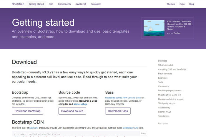
Get Bootstrap
Bootstrap is the most popular HTML, CSS, and JS framework for developing responsive, mobile first projects on the web.
Start with this basic HTML template, or modify these examples. We hope you’ll customize our templates and examples, adapting them to suit your needs.
<!DOCTYPE html>
<html lang="en">
<head>
<meta charset="utf-8">
<meta http-equiv="X-UA-Compatible" content="IE=edge">
<meta name="viewport" content="width=device-width, initial-scale=1">
<!-- The above 3 meta tags *must* come first in the head; any other head content must come *after* these tags -->
<title>Bootstrap 101 Template</title>
<!-- Bootstrap -->
<link href="css/bootstrap.min.css" rel="stylesheet">
<!-- HTML5 shim and Respond.js for IE8 support of HTML5 elements and media queries -->
<!-- WARNING: Respond.js doesn't work if you view the page via file:// -->
<!--[if lt IE 9]>
<script src="https://oss.maxcdn.com/html5shiv/3.7.3/html5shiv.min.js"></script>
<script src="https://oss.maxcdn.com/respond/1.4.2/respond.min.js"></script>
<![endif]-->
</head>
<body>
<h1>Hello, world!</h1>
<!-- jQuery (necessary for Bootstrap's JavaScript plugins) -->
<script src="https://ajax.googleapis.com/ajax/libs/jquery/1.12.4/jquery.min.js"></script>
<!-- Include all compiled plugins (below), or include individual files as needed -->
<script src="js/bootstrap.min.js"></script>
</body>
Over a dozen reusable components built to provide iconography, dropdowns, input groups, navigation, alerts, and much more.
————————————————————————————————————————–
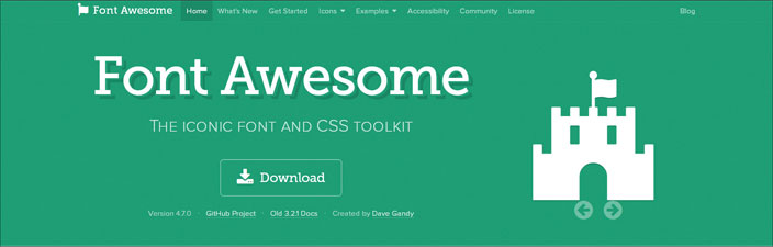
Font Awesome :- The iconic font and CSS toolkit
Font Awesome gives you scalable vector icons that can instantly be customized — size, color, drop shadow, and anything that can be done with the power of CSS.
Download & Customize Easy Font Awesome
Want to manage and host Font Awesome assets yourself? You can download, customize, and use the icons and default styling manually. Both CSS and CSS Preprocessor (Sass and Less) formats are included.
Using CSS
- Copy the entire font-awesome directory into your project.
- In the <head> of your html, reference the location to your font-awesome.min.css.
- <link rel=”stylesheet” href=”path/to/font-awesome/css/font-awesome.min.css”>
- Check out the examples to start using Font Awesome!
————————————————————————————————————————–
Start with Header Part.
We start with header background & contact detail header
Here’s HTML
<body class="bg-banner">

<header>
<div class="header">
<div class="container">
<div class="row">
<div class="col-md-2 col-sm-4 col-xs-12">
<div class="top-left"> <i class="fa fa-phone"></i><span>+91-9825033692</span> </div>
</div>
<div class="col-md-4 col-sm-4 col-xs-12">
<div class="top-left"><i class="fa fa-envelope"></i><span><a href="mailto:info@ampoulefillinmachine.net">info@ampoulefillinmachine.net</a></span></div>
</div>
<div class="col-md-6 col-sm-4 col-xs-12">
<div class="top-right"><a href="https://www.facebook.com/ampoulefillingmachine" target="_blank"><i class="fa fa-facebook"></i></a>
<a href=" https://twitter.com/ampoule_filling" target="_blank"><i class="fa fa-twitter"></i></a>
<a href="https://www.pinterest.com/ampoulefilling " target="_blank"><i class="fa fa-pinterest"></i></a>
<a href="https://www.youtube.com/channel/UCUvQWEsPH2u6-EY45SaHyvw" target="_blank"><i class="fa fa-youtube"></i></a></div>
</div>
</div>
</div>
</div>
</header>
CSS
.bg-banner{ background:url(../images/bg1.jpg) no-repeat; z-index:0; background-size:100% 26%;}
.bg-bannerinner{ background:url(../images/inner-banner.jpg) no-repeat; z-index:0; width:100%; background-size: contain;}
.header  {width:100%;}
.header .top-left {padding:10px 0 0 10px; color:#666666; font-size:14px;}
.header .top-left span {padding:0 10px 0 10px;}
.header .top-left span a{ text-decoration:none; color:#666666;}
.header .top-header span a {color:#666666; text-decoration:none;}
.header .top-header span a:hover {color:#bebeba; text-decoration:none;}
.header .top-right {color:#FFFFFF; font-size:14px; float:right;}
.header .top-right a {height:30px; width:30px; margin:6px 1px 6px 1px; line-height:28px; text-align:center; vertical-align:middle; display:inline-block; color:#FFFFFF;}
.header .top-right a:hover {color:#eae8e8;}
.fa-phone::before {color:#d7d8d2;}
.fa-envelope::before {color:#d7d8d2;}
Responsive Media Query
@media(max-width:320px) {
.header  {width:100%; height:40%; text-align:center;}
.menu {width:100%; height:40%; background-color:#f9fafa;  box-shadow:1px 6px 6px #c9c9c9;}
.navbar-default {  background-color: #4377a6;
border-color: #0000;}
.bg-banner{ background:url(../images/bg1.jpg) no-repeat; z-index:0; background-size:100% 8%;}
}

@media(min-width:320px) and (max-width:768px) {
.header  {width:100%; height:40%; text-align:center;}
header .top-right a {height:30px; width:30px; margin:6px 1px 6px 1px; line-height:28px; text-align:center; vertical-align:middle; display:inline-block; color:#666666;}
}
————————————————————————————————————————–
Start with Navigation Part.
We start with Navigation
Here’s HTML
<div class="menu">

<div class="container">
<div class="row">
<div class="col-md-4 col-sm-6 col-xs-12">
<div class="logo"><a href="index.html"> <img class="img-responsive" src="images/logo.png" alt="Ampoule Filling Machine"></a> </div>
</div>
<div class="col-md-8 col-sm-6 col-xs-12">
<nav class="navbar">
<div class="container-fluid">
<!-- Brand and toggle get grouped for better mobile display -->
<div class="navbar-header navbar-default">
<button type="button" class="navbar-toggle collapsed" data-toggle="collapse" data-target="#bs-example-navbar-collapse-1" aria-expanded="false"> <span class="sr-only">Toggle navigation</span> <span class="icon-bar"></span> <span class="icon-bar"></span> <span class="icon-bar"></span> </button>
</div>
<!-- Collect the nav links, forms, and other content for toggling -->
<div class="collapse navbar-collapse" id="bs-example-navbar-collapse-1">
<ul class="nav navbar-nav navbar-right">
<li class="active"><a href="index.html">HOME<span class="sr-only">(current)</span></a></li>
<li><a href="about-us.html">ABOUT US</a></li>
<li class="dropdown"> <a href="products.html" class="dropdown-toggle" data-toggle="dropdown" role="button" aria-haspopup="true" aria-expanded="false">PRODUCTS<span class="caret"></span></a>
<ul class="dropdown-menu">
<li><a href="semi-automatic-multijet-ampoule-washing-machine.html">Semi Automatic Multijet Ampoule Washing Machine</a></li>
<li role="separator" class="divider"></li>
<li><a href="automatic-rotary-ampoule-washing-machine.html">Automatic Rotary Ampoule Washing Machine</a></li>
<li role="separator" class="divider"></li>
<li><a href="single-head-amoule-filling-sealing-machine.html">Single Head Ampoule Filling & Sealing Machine</a></li>
<li role="separator" class="divider"></li>
<li><a href="single-head-closed-ampoule-filling-and-sealing-machine.html">Single Head Closed Ampoule Filling And Sealing Machine</a></li>
<li role="separator" class="divider"></li>
<li><a href="single-head-onion-skin-tube-filling-and-sealing-machine.html">Single Head Onion Skin Tube Filling and Sealing Machine</a></li>
<li role="separator" class="divider"></li>
<li><a href="two-head-ampoule-filling-and-sealing-machine.html">Two Head Ampoule Filling And Sealing Machine</a></li>
<li role="separator" class="divider"></li>
<li><a href="four-head-ampoule-filling-sealing-machine.html">Four Head Ampoule Filling & Sealing Machine</a></li>
<li role="separator" class="divider"></li>
<li><a href="four-head-closed-ampoule-filling-and-sealing-machine.html">Four Head Closed Ampoule Filling and Sealing Machine</a></li>
<li role="separator" class="divider"></li>
<li><a href="four-head-onion-skin-tube-filling-and-sealing-machine.html">Four Head Onion Skin Tube Filling and Sealing Machine</a></li>
<li role="separator" class="divider"></li>
<li><a href="six-head-ampoule-filling-and-sealing-machine.html">Six Head Ampoule Filling And Sealing Machine</a></li>
<li role="separator" class="divider"></li>
<li><a href="six-head-closed-ampoule-filling-and-sealing-machine.html">Six Head Closed Ampoule Filling and Sealing Machine</a></li>
<li role="separator" class="divider"></li>
<li><a href="eight-head-ampoule-filling-&-sealing-machine.html">Eight Head Ampoule Filling & Sealing Machine</a></li>
<li role="separator" class="divider"></li>
<li><a href="ampoule-visual-inspection-machine.html">Automatic Ampoule Visual Inspection Machine</a></li>
<li role="separator" class="divider"></li>
<li><a href="horizontal-ampoule-sticker-labeling-machine.html">Horizontal Ampoule Sticker Labeling Machine</a></li>
</ul>
</li>
<li><a href="services.html">SERVICES</a></li>
<li><a href="inquiry.php">INQUIRY</a></li>
<li><a href="contact-us.html">CONTACT US</a></li>
</ul>
</div>
<!-- /.navbar-collapse -->
</div>
<!-- /.container-fluid -->
</nav>
</div>
</div>
</div>
</div>
CSS
.menu {width:100%; height:80px; background-color:#f9fafa; box-shadow:2px 3px 3px #c9c9c9; position:relative; z-index:59;}

.menu .logo {margin:10px;}
.nav {padding-left:32px;}
.nav > li {padding-left:8px; font-size:15px; font-weight:400; margin:16px 0px 0px 20px;}
.nav > li > a:hover, .nav > li > a:focus { background:none;}
.nav .open > a, .nav .open > a:focus, .nav .open > a:hover {color:#000000;}
.nav .open > a, .nav .open > a:hover, .nav .open > a:focus {background-color:#f9fafa; border-color: #337ab7;}
.nav > li > a {color:#666869;}
.nav > li > a:focus, .nav > li > a:hover {color:#185e9f;}
.dropdown-menu {background-color:#316a4a; }
.dropdown-menu > li > a {color:#FFFFFF;}
.dropdown-menu > li > a:focus, .dropdown-menu > li > a:hover {background-color:#316a4a; color:#000000}
.navbar-right .dropdown-menu {right:auto;}
.nav > li > a {display: block; padding: 10px 0px 0px 8px;}
Responsive Media Query
@media(max-width:320px) {

.menu {width:100%; height:40%; background-color:#f9fafa;  box-shadow:1px 6px 6px #c9c9c9;}
.navbar-default { background-color: #4377a6;  border-color: #0000; }
.bg-banner{ background:url(../images/bg1.jpg) no-repeat; z-index:0; background-size:100% 8%;}
.navbar-nav > li > .dropdown-menu {width:100%;}
}

@media(min-width:320px) and (max-width:768px) {
.navbar-nav {background-color: #4377a6;  margin: 7.5px -15px; }
.nav > li > a {color: #000; }
.navbar-nav .open .dropdown-menu {background-color: #316a4a; border: 0 none; box-shadow: none; float: none; margin-top: 0; position: static; width:100%;}
.nav {padding-left: 0;}
}
————————————————————————————————————————–
Start with Welcome Part.
We start coding for company welcome part here
Here’s HTML
<section>
<div class="welcome">
<div class="container">
<div class="row">
<div class="col-md-5 col-sm-4 col-xs-12">
<div class="productimage"><img class="img-responsive" src="images/products1.jpg" alt="Products 1"></div>
</div>
<div class="col-md-7 col-sm-6 col-xs-12">
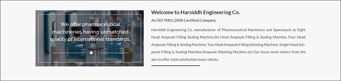
<h2>Welcome to Harsiddh Engineering Co.</h2>
<p>An ISO 9001:2008 Certified Company</p>
<p>Harsiddh Engineering Co. manufacturer of Pharmaceutical Machinery and Sparessuch as Eight Head Ampoule Filling Sealing Machine,Six Head Ampoule Filling & Sealing Machine, Four Head Ampoule Filling & Sealing Machine, Two Head Ampoule Filling &Sealing Machine, Single Head Ampoule Filling & Sealing Machine,Ampoule Washing Machine etc.Our focus never deters from the aim to offer total satisfaction toour clients.</p>
<div class="line"></div>
</div>
</div>
</div>
</div>
</section>
CSS
.welcome {width:100%; background-color:#f7f7f7;}

.welcome p {text-align:justify; color:#535252; font-size:15px; line-height:25px;}
.welcome h2 {margin-top:20px; padding-top:15px;}
.welcome .productimage {margin:20px 0px 30px 0px; padding:20px 0px 20px 0px;}
.welcome .line {width:43%; background-color:#000000; height:2px; margin-bottom:20px; margin-top:30px;}
————————————————————————————————————————–
Start with Products Part.
We start coding for Products part here
Here’s HTML
<section>
<div class="product">
<div class="container">
<div class="row">
<div class="col-md-12 col-sm-12 col-xs-12">
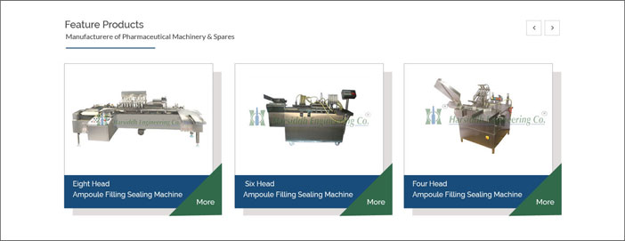
<h2>Feature Products</h2>
<p>Manufacturere of Pharmaceutical Machinery & Spares</p>
<div class="line2"></div>
</div>
</div>
<div class="row">
<div class="col-md-4 col-sm-4 col-xs-12">
<div class="box"><a href="eight-head-ampoule-filling-&-sealing-machine.html"> <img class="img-responsive" src="images/eight-head-ampoule-filling-sealing-machine.jpg" alt="Eight Head Ampoule Filling Sealing Machine"></a>
<h2><a href="eight-head-ampoule-filling-&-sealing-machine.html">Eight Head Ampoule Filling Sealing Machine</a> <span class="triangle-bottomright"></span> </h2>
</div>
</div>
<div class="col-md-4 col-sm-4 col-xs-12">
<div class="box"><a href="six-head-ampoule-filling-and-sealing-machine.html"> <img class="img-responsive" src="images/six-head-ampoule-filling-sealing-machine.jpg" alt=" Six Head Ampoule Filling Sealing Machine"></a>
<h2><a href="six-head-ampoule-filling-and-sealing-machine.html">Six Head Ampoule Filling Sealing Machine</a> <span class="triangle-bottomright"></span> </h2>
</div>
</div>
<div class="col-md-4 col-sm-4 col-xs-12">
<div class="box"><a href="four-head-ampoule-filling-sealing-machine.html"> <img class="img-responsive" src="images/four-head-ampoule-filling-sealing-machine.jpg" alt="Four Head Ampoule Filling Sealing Machine"></a>
<h2><a href="four-head-ampoule-filling-sealing-machine.html">Four Head Ampoule Filling Sealing Machine</a> <span class="triangle-bottomright"></span> </h2>
</div>
</div>
</div>
</div>
</div>
</section>
CSS
.product {width:100%; background-color:#f8f8f8;}

.product h2 {color:#414141;}
.product .line2 {width:30%; background-color:#194c79; height:2px; margin-bottom:20px; margin-top:20px;}
.product .box {border:1px solid #cecece; padding-top:20px; background-color:#FFFFFF; height:auto; width:100%; margin:10px 10px 40px 0; box-shadow: 19px 15px 5px 0px rgba(224,221,221,1);}
.product .box .img-responsive {text-align:center; vertical-align:middle; margin:0 auto;}
.product .box h2 {line-height:25px; font-size:19px; font-weight:600;  background-color:#194c79; color:#FFFFFF; padding:10px 12px 10px 12px; margin-bottom:0px;}
.product .box h2 a {color:#FFFFFF; text-decoration:none; line-height:30px;}
.product .box h2 a:hover {color:#99CCFF; text-decoration:none;}
.triangle-bottomright {width: 0; height: 0;  border-bottom: 100px solid #316a4a;  border-left: 100px solid transparent; float:right; margin:-50px -28px 30px 0px;}
————————————————————————————————————————–
Start with Bottom Part Products List.
We start coding for Products List Part here
Here’s HTML
<section>
<div class="spares">
<div class="container">
<div class="row">
<div class="col-md-12 col-sm-12 col-xs-12">
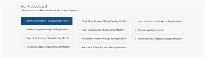
<h2>Our Products List</h2>
<p>Manufacturere of Pharmaceutical Machinery & Spares</p>
<div class="line3"></div>
</div>
<div class="col-md-4 col-sm-4 col-xs-12">
<ul class="list">
<li><a href="single-head-onion-skin-tube-filling-and-sealing-machine.html">Single Head Onion Skin Tube Filling and Sealing Machine</a></li>
<li><a href="single-head-closed-ampoule-filling-and-sealing-machine.html">Single Head Closed Ampoule Filling And Sealing Machine</a></li>
<li><a href="single-head-amoule-filling-sealing-machine.html">Automatic Single Head Ampoule Filling & Sealing Machine</a></li>
<li><a href="two-head-ampoule-filling-and-sealing-machine.html">Automatic Two Head Ampoule Filling And Sealing Machine</a></li>
</ul>
</div>
<div class="col-md-4 col-sm-4 col-xs-12">
<ul class="list">
<li><a href="four-head-onion-skin-tube-filling-and-sealing-machine.html">Four Head Onion Skin Tube Filling and Sealing Machine</a></li>
<li><a href="four-head-closed-ampoule-filling-and-sealing-machine.html">Four Head Closed Ampoule Filling and Sealing Machine</a></li>
<li><a href="four-head-ampoule-filling-sealing-machine.html">Automatic Four Head Ampoule Filling & Sealing Machine</a></li>
<li><a href="six-head-ampoule-filling-and-sealing-machine.html">Automatic Six Head Ampoule Filling And Sealing Machine</a></li>
</ul>
</div>
<div class="col-md-4 col-sm-4 col-xs-12">
<ul class="list">
<li><a href="six-head-closed-ampoule-filling-and-sealing-machine.html">Automatic Six Head Closed Ampoule Filling and Sealing Machine</a></li>
<li><a href="eight-head-ampoule-filling-&-sealing-machine.html">Automatic Eight Head Ampoule Filling & Sealing Machine</a></li>
<li><a href="horizontal-ampoule-sticker-labeling-machine.html">Automatic Horizontal Ampoule Sticker Labeling Machine</a></li>
<li><a href="ampoule-visual-inspection-machine.html">Automatic Ampoule Visual Inspection Machine</a></li>
</ul>
</div>
</div>
</div>
</div>
</section>
CSS
.spares {width:100%; background-color:#f7f7f7;}

.spares .line3 {width:30%; background-color:#194c79; height:2px; margin-bottom:20px; margin-top:20px;}
.spares ul .list {border:1px solid #e9e7e7; padding:10px 0px 10px 10px; margin-bottom:5px;}
.spares ul {padding-left:0px; margin-bottom:30px;}
.spares ul li a {text-decoration:none; color:#414141; }
.spares ul li  {list-style:outside none none; line-height:30px; border:1px solid #e9e7e7; padding: 5px 0 5px 30px; margin-bottom:10px;}
.spares li a:hover {color:#194c79;}
.spares ul li:before {content: "\f105"; /* FontAwesome Unicode */ font-family: FontAwesome; display: inline-block;  margin-left: -1.3em; /* same as padding-left set on li */ width: 1.3em; /* same as padding-left set on li */ color:#414141;  padding:0px 15px 0px 0px; }
————————————————————————————————————————–
Start with Footer Part.
Here’s HTML
<section>
<div class="footer">
<div class="container">
<div class="row">
<div class="col-md-4 col-sm-4 col-xs-12">
<div class="logo2"><img class="img-responsive" src="images/footerlogo.png" alt="Ampoule Filling Machine"></div>
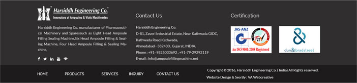
<p>Harsiddh Engineering Co. manufacturer of Pharmaceutical Machinery and Sparessuch as Eight Head Ampoule Filling Sealing Machine,Six Head Ampoule Filling & Sealing Machine, Four Head Ampoule Filling & Sealing Machine,</p>
<div class="social-icon"> <a href="https://www.facebook.com/ampoulefillingmachine" target="_blank"><i class="fa fa-facebook"></i></a> <a href=" https://twitter.com/ampoule_filling" target="_blank"><i class="fa fa-twitter"></i></a> <a href="https://www.pinterest.com/ampoulefilling " target="_blank"><i class="fa fa-pinterest"></i></a> <a href="https://www.youtube.com/channel/UCUvQWEsPH2u6-EY45SaHyvw" target="_blank"><i class="fa fa-youtube"></i></a></div>
</div>
<div class="col-md-4 col-sm-4 col-xs-12">
<h2>Contact Us</h2>
<ul>
<li>Harsiddh Engineering Co.</li>
<li>D-81, Zaveri Industrial Estate, Near Kathwada GIDC,</li>
<li>Kathwada Road,Kathwada,</li>
<li>Ahmedabad - 382430 , Gujarat, INDIA.</li>
<li>Phone : +91- 9825033692 , +91-79-65241112</li>
<li>E-mail : <a href="mailto:info@ampoulefillingmachine.net">info@ampoulefillingmachine.net</a></li>
</ul>
</div>
<div class="col-md-4 col-sm-4 col-xs-12">
<h2>Certification</h2>
<div class="iso"> <img class="img-responsive" src="images/iso-image.jpg" alt="ISO Registered"> </div>
<div class="iso"> <img class="img-responsive" src="images/certification-image.jpg" alt="Certification Image"> </div>
</div>
</div>
</div>
</div>
</section>
<div class="bottom">
<div class="container">
<div class="row">
<div class="col-md-7 col-sm-6 col-xs-12">
<ul class="menu2">
<li><a href="index.html">HOME</a></li>
<li><a href="products.html">PRODUCTS</a></li>
<li><a href="services.html">SERVICES</a></li>
<li><a href="inquiry.php">INQUIRY</a></li>
<li><a href="contact-us.html">CONTACT US</a></li>
</ul>
</div>
<div class="col-md-5 col-sm-6 col-xs-12">
<p>Copyright © 2016, Harsiddh Engineering Co. ( India) All Rights reserved.<br>
Website Design & Seo By :<a href="http://www.vainfotech.com/"> VA Infotech</a></p>
</div>
</div>
</div>
</div>
CSS
.footer {width:100%; background-color:#302f2f;}

.footer .logo2{margin:23px 0px 23px 0px;}
.footer p {color:#FFFFFF; text-align:justify;}
.footer .social-icon {color:#FFFFFF; font-size:30px; margin:10px 30px 20px 0px;}
.footer .social-icon a {height:20px; width:20px; margin:0px 20px 20px 0px; line-height:47px; vertical-align:middle; display:inline-block; color:#FFFFFF;}
.footer .social-icon a:hover {color:#eae8e8;}
.footer h2 {color:#FFFFFF;}
.footer ul {color:#FFFFFF; text-decoration:none; padding:14px 0px 0px 31px; margin:30px 0 0 -30px; line-height:28px;}
.footer ul li a {color:#FFFFFF; text-decoration:none; margin:0px 20px 0px 0px;}
.footer ul li {list-style:outside none none;}
.footer .iso {float:left; margin:34px 10px 0px 0px;}
.bottom {width:100%; background-color:#1c1b1b;}
.bottom .menu2 {list-style:outside none none; padding:30px 0px 20px 0px;}
.bottom ul li a {color:#FFFFFF; text-decoration:none; padding:0px 30px 0px 0px;}
.bottom li {display:inline;}
.bottom .menu2 a:hover{color:#CCCCCC;}
.bottom p {color:#FFFFFF; margin:15px 0px 0px 0px;}
.bottom a{text-decoration:none;}