Get PSD to Bootstrap 4 with Outstanding Features

Bootstrap is the most popular JS, HTML and CSS framework that creates responsive plus mobile websites on the web to give an alluring feel to the users. Bootstrap 4 holds a strong position in the market as the latest version with fresh features like new customization options, dropped IE8 support, improved grid system and a remarkable journey from Less to Sass.

onlypsd2html, a leading name in the web development offers rich PSD to Bootstrap 4 conversion for making bespoke website solutions. There is a continuous improvement with better features in Bootstrap framework, such as flexbox options, grid layout, alignment utility classes, and better utilities and components.

Bootstrap 4 framework has extensive features and single code base for every device. With PSD to Bootstrap 4 conversion, these features can be easily built into the design for better design and performance.

Striking Features of Bootstrap 4

  • Use of Sass
    Bootstrap 4 will compile easily and rapidly because of the Sass preprocessor as compared to previous Less. With a vast contributor base, there are chances of much more functionality.
  • Opt-in Flexbox
    The CSS is recompiled here in Bootstrap 4 to get flexbox grid system and components. It makes use of float and implement a fluid layout to showcase these CSS properties. With a flexible container, this design can be flexible enough to be used in the responsive designs in the best way.
  • Updated Grid System
    With an enhanced grid system, Bootstrap 4 focuses largely on smaller screen devices to better target mobile devices.
  • Newer Customization Options
    There is a wide variety of customization level for colors, link styles, typography, gutter width, spacing, column numbers, etc.
  • Better Documentation
    There are few handy plugins with code snippets for easy working of the documents and also enable easy searching.
  • Dropped IE8 Support
    With the dropping of IE8, the best parts of the CSS can be efficiently utilized. With the responsive typography, it also enables easy component sizing.
  • Refactored JavaScript Plugins
    The JavaScript Plugins also contain features like option type checking, UMD support, generic methods, and many more.
  • Auto Placement
    Auto placement of popovers and tooltips in an improved way through a library known as Tether.
  • HTML Resets With The Module Reboot
    It allows more expanded resets like border box, margin tweaks, and other options, all with a single Sass file.
  • Cards For Panels And Thumbnails
    Cards are the new and useful component of Bootstrap 4, which offer the same features like panels do.

Conclusion

Bootstrap 4 is an easy platform for all kind of the skill levels, all shapes devices and projects of the varied sizes. It allows front-end web development to be much faster and easier, which is the reason that millions of adorable websites across the web are made with PSD to Bootstrap 4 conversion. onlypsd2html can be a one stop solution if you also want to use Bootstrap 4 framework for the boosted results.M

Convert Your PSD to HTML/CSS/XHTML to Make it User Friendly

The degree of the creativity skills is evaluated when you create a design. However, Proper coding is required to build up a complete and functional website. The PSD could be amazingly good, but it is the coding part, which puts the time in the web design and makes it functional. That is why PSD to HTML plays an important role in making a website design user-friendly and functional.

Who is PSD TO HTML expert?

PSD to HTML service providers are the skilled people who have the complete knowledge of coding. They assist the designers in their work and help to complete the projects on time. These days, Implementation of CMSs and shopping carts are very much trending. So, most PSD to XHTML conversion experts also offer PSD to WordPress and PSD to Joomla integration services. Content management systems, such as Joomla and WordPress are very easy to use.

Why do we need PSD to HTML service providers?

Designs could be in any format i.e. PSD, AI, PNG, JPEG, and others. And you need to convert the designs invalid and semantic codes. Although, designers ought to have the knowledge of coding. But PSD to HTML conversion is very skillful and tiring task. It is a time-consuming job.

Designers do get overburdened with work if they code the web design themselves. This decreases their efficiency and hence the productivity of the work. This even causes the delay in the delivery of the projects. To avoid this kind of situation, PSD to HTML service providers come into play and save the designers from getting over stressed with work.

Second main reason to go for PSD to HTML conversion service is that we can’t code HTML page directly because you need a proper graphic representation of the design first. It will then help you to code less with minimum efforts and also give perfection to your website. Photoshop is a great tool for creative designs which also give the benefit of trying different color schemes. This may save your time too before creating HTML version of your website.

It is very important to check its usability and know how search engine friendly it is, before launching a website. It is always recommended to take the guidance of the expert PSD to HTML conversion professionals.

What makes PSD to XHTML/HTML/CSS user-friendly?

Due to high competition in the online business market, Integration with the CMS and e-commerce platforms allow the non-geeks to manage and update their websites very frequently without the help of designers and developers. Because of this user-friendly feature, you can easily upload content, images and update services and products in your website.

Moreover, PSD to XHTML/HTML/CSS plays an important part in web development. Because it accounts for the cross browser compatibility and accessibility issues of the websites. These days, most PSD to XHTML conversion service providers offer cross browser compatibility feature and W3C standard valid CSS/XHTML conversion services that make your website easily searchable.

ow PSD TO  XHTML/HTML/CSS conversion is done?

There are mainly two approaches for converting PSD to XHTML/HTML/CSS. It is necessary to understand well these two options before conversion process.

1) Automated Tools:

layout-3

If you are not good at coding or not having time to master HTML coding then you can use PSD to HTML conversion tools. With these tools, you can’t expect a pixel perfect web design. Either you have to comprise on the quality due to such issues with it. It is better to hire conversion experts from trusted companies.

2) Self-coding: 

layout-4

If you are expert at coding then you can easily code the HTML page. This only demands core technical skills from you to handle your own conversion job.

Wrapping Up:

As now we have seen that PSD to HTML template promises W3C validation, smooth pixel perfection, cross browser compatible compassionate, Light Weight Table-less, CSS Layout and SEO friendly.

Anyhow, if you are looking for PSD to HTML service providers, then you have come to the right place. At onlypsd2html, we are a team of conversion experts who convert your designs into high quality, cross-browser compatible valid XHTML/ CSS onlypsd2html. We have successfully completed 7200+ projects in past 12 years. Contact us for any further queries.

Get better PSD Design for easy PSD To HTML Conversion

If you have a PSD file that you need converted to HTML or WordPress, how you create the file will heavily determine the speed and accuracy of conversion into a working website. As experts in PSD to HTML conversion service, we have encountered thousands of PSD files, and a good number took too long in conversion because designers of the layouts did not follow some basic design and layout principles. This in turn means that such clients will be charged more according to the production time. However, you can read these tips to learn how to hand in the best file for conversion.

1.Avoid merging layers

It is common practice for designers to merge layers in order to maintain smaller file sizes. Usually this presents no problem when designing for print, but for PSD conversion, it is important to provide all adjustment, textual and/or graphics layers intact. These layers usually have vital information needed for accurate development. The font layer, for instance, informs about font sizes, colors, families and lines heights as well as letter spacing and text transformation.

2.Submit well-organized files

When your PSD is well organized, named and structured, development becomes easier and even more accurate. A well-organized PSD file not only serves the interests of the web developer; it also reduces the designer’s and coder’s production time, improving cost efficiency. Remember that every minute spent trying to locate the correct text layer, graphics layer or other section increases production time and ultimately your cost.

3.Practice consistent design

It is essential to maintain consistency of design elements across website layouts in multiple appearances. Universally employed elements such as headers, footers, buttons and rounded boxes should have a consistent look/feel for all pages of the layout. This means having the same heights, padding, border radius, etc. Remember that having different properties will necessitate individual HTML and CSS coding for each element and hence increase development time.

4.Put elements on grid

The design grid is a virtual set of guidelines applied to decide the placement and shape of items/elements and hence the overall appearance of the website. Using the grid will help you to position your website elements in a well-balanced and proportional manner to enhance the aesthetics of the site. Placing elements off-grid creates additional work during development. Ensure that everything is aligned within the grid, whether explicit or implicit.

5.Create rollover states

During design preparation, consider link and call-to-action elements and how they will function: images, buttons, boxes, etc. Standard practice is to add hover states in these elements so that they can be distinguished from other action states. Many times, if you avoid doing this at the beginning, you’ll find that you have to define them much later once you start using live templates, and this will increase development time. Planning for the hover/rollover state allows for it to be coded right at the beginning.

6.Ensure submitted material is consistent

Any hands-off material that you submit, from Jpeg reviews and PSD files to specification write-ups and fonts as necessary, should have the final versions of your work, ready for development. Any inconsistency between these will cause confusion with your conversion team and can lead to unnecessary work, including unnecessary double work, communication delays and increased production time as a result. Before submission, make a last run through assets to ensure you’re handing in the correct font families, design elements, colors and font sizes among other properties. It helps to save files with the different names and rename the final file so as to not get confused with other drafts created in the design process.

7.Account for rendering differences

This applies especially when using modern fonts. Different operating systems and browsers render fonts differently. This is because the way fonts are displayed in Photoshop may differ from browser displays because of font tracking and anti-aliasing capabilities or letter spacing property in CSS. You can first check how your font looks like in different browsers before settling on it for your live website. Do not blindly trust the sub pixel values for your letter spacing.

8.Avoid blending modes

Blending modes are one of the CSS creations that are not possible to create using CSS. In Photoshop, they are popularly used to produce aesthetically pleasing effects and to reduce image processing time. However, their eventual effect is to produce unwanted results once PSD files are converted to CSS and HTML codes. If you must, you can use them for the previews, but remember to restore normal blending mode before submitting the file for development.

9.Consider content flexibility

Depending on the design, you may have a fixed volume of text allowed for a particular area (like a graphic element or image) such that one cannot add any more text to that area. This may work sometimes, but providing for content flexibility will make it easier to add text once the website goes live and it is found that more text is necessary for functional or aesthetic purposes. Therefore, consider how your design will be affected if it becomes necessary to either add or remove any content. If you don’t know what the final content is, such as when using placeholder content (“lorem ipsum”), content flexibility is a must.

10.Build for common resolutions

What is considered common browser resolution has been the subject of many discussions, especially since the advent of responsive web design that has redefined our understanding of design versus screen resolutions. Nonetheless, the most frequently-applied screen resolution is 1366×768 pixels. If you’re not building for responsive web development, ensure that you have accounted for this resolution. In addition, factor in as many other common resolutions. This means designing a layout that doesn’t exceed 1300 pixels so that visitors can access content without the oh-so-annoying horizontal scroll.

Detailed Overview Responsive Web Design

The wind of advancement has affected the scenario of single desktop screen with the expansion of mobile websites at each nook and corner of the web. Site owners need to have a keen eye on how their work is showcased across various devices. Responsive website design is the ultimate solution to safeguard them from the chances of losing visitors from one device so as to gain visitors from another. RWD offers a perfect compatibility as correspondent to each screen size and devices like for mobile, tablet, iPhone and iPad, along with laptops and desktops.

Running a successful web design company means never standing still, constantly learning about web design and mastering new web technologies as they become available. Lately, you may have heard the term Responsive Web Design thrown around in your marketing meetings. One of the latest buzz words, Responsive Web Design signifies a total paradigm shift in the design process. Similar to the impact that CSS had on the web design world, Responsive Web Design will alter the way we view and use sites. Smart web designers and and companies will quickly become familiar with it and put it into play.

In recent years, the internet has experienced a drastic rise in mobile website traffic. According to research firm Gartner, browser-equipped phones will outnumber traditional computers at some point during the year 2013. And although cellphones are yet to be users primary browsing device, Gartner projects users to make that transition by 2017.

This transition has propelled most companies in-the-know, to build versions of their website dedicated to mobile devices. The internet provides users with plenty of options, and website visitors now expect a positive experience. Oftentimes, elements of a desktop website are misaligned, unavailable, or are simply too small when browsed on a mobile device. This is not a knock on the original design, but visitors quickly translate this poor user experience with a company’s website. And thus the level of service or product-satisfaction they expect to receive.

Why Responsive Web Design?

With an ever-growing number and types of web-enabled devices, web designers must ensure an optimal user experience. Essentially there are two approaches for solving the multiple-devices dilemma.

The traditional method was to create multiple versions of a website, and then serve the appropriate versions based on the type of device being used by the visitor. This approach is relatively simple, as each version of the website exists independently of the others. Due to this separation, changes can be made to each version without affecting the others. However, this freedom comes at a fairly high price. First, designers have to design and build each version of the website. This isn’t just time-consuming for designers, but more expensive for clients. Additionally, as the number and types of devices continues to grow, it is becoming exceedingly difficult to address each one appropriately.

The new and improved approach to tackling the multiple-devices issue is responsive web design. When you boil down the differences between each web-enabled device, the most significant is screen resolution. This method allows for one website to, literally, transform itself based on the device on which it is being rendered.

What is Responsive Web Design

The principles of responsive web design can be understood from a saying that defines“content is like water.” It means that it can take the shape of the device in which it is placed.

Responsive web design is a worthful approach which demands that the design and development of a website must respond to the user’s behavior and environment, as per the platform, screen size and orientation. It employs a fair combination of images, adjustable grids and layouts and a smart use of CSS media queries.

With the release of the CSS3 specification, W3C created media queries which allow us to target various characteristics of the device being used, and conditionally apply certain styles based on those characteristics. Previously, some designers tested Javascript-dependent implementations of resolution-aware layouts. However, the advantage of the current CSS3 technology is that it allows us to look at more than one property in a single query. We are now able to test multiple property values and chain them into one query.

We can now serve different styles based on a set of defined rules. This ability gave rise to Responsive Web Design, as we can now have one website, respond to specific conditions and present itself in a way that promises optimal user experience. Images can be now be re-sized, columns moved and reordered, elements hidden, font-size altered, and more, all on the fly.

As we know, with great power comes great responsibility and this new flexibility is no different. We must now plan ahead and decide how we use fluid grids, flexible images and media queries to allow our layout to be molded with each viewing context.

Why is Responsive Design So Important?

Responsive web design concept is not merely about adjusting screen resolutions and automatic resizable images, but it is a very broad approach about thinking for a design differently. In the recent times, the ultimate solution is to create such design that can work and must respond to the multiple browser versions. You have open doors for testing your website on various devices.

Some Important Credentials of RWD:

  • Know Your Audience: RWD is the answer to most of the businesses which helps them in knowing their audiences and the device that they are using.
  • A Prompt UX: User experience is the key to RWD and it goes much beyond translating a desktop site into mobile screen. Here, the points to be taken into consideration are user experience, necessary content they are looking for and their interaction.
  • Focus on Content: To design the site as per the content is a good habit to follow during responsive designing instead of a specific screen dimension.
  • Limited Space Consumption: The mobile view is much more focused as compared to the desktop with limited amount space usage.
  • Easy Navigation: The design needs to be flexible enough for a relaxing UX and the complex designs must need to adapt to the simple intuitive UI for small mobile screens.

What Website Dimensions Should be Used ?

We cannot specify a standard website size as there are hundreds of devices available along with plentiful screen resolutions out there. Each user works on the different device as per the usage, like an individual may explore something on your mobile while on the way or may even use the laptop while working on some task in office. So, the best approach here is to design multiple versions as per the different browsers’ widths.

Mobilegeddon: Google’s New Update for Mobile-friendly Sites

Responsive web design is an important aspect for the mobile traffic. For this, Google announced an important update Mobilegeddon on 21 April 2015. Each business of varying size will catch Google’s attention if their site follows friendliness with the mobile devices. This approach is followed by keeping in mind the fact that the mobile device users are increasing at a rapid rate and to keep them in reach, it is crucial to have mobile friendly web pages for offering a sound user experience.

Elements of RWD

An RWD site adapts the layout to the viewing environment via using fluid, flexible images, proportion-based grids, and CSS3 media queries (an extension of the @media rule) in the following ways:

  • The Fluid Grid concept allows page element sizing in relative units such as percentages, instead of absolute units i.e pixels or points.
  • Flexible images also follow sizing in relative units so that they can be prevented from showcasing outside the containing element.

Media queries enables a page to use different CSS style rules in accordance with the features of the device on which a website is being displayed, like the width of the browser.

Fluid Grids

They follow percentage values instead of set pixels while designing a website. After following this concept, the elements in the mobile screen layout will be resized in relation to each other. It tends to render content in the same order as it appears in the DOM, and it prompts reflow of content during its resizing. Fluid layouts also counts for relative resizing of both content and containers which allows the text and content to be enlarged and shift other content automatically at the bottom of the page.

Media Queries

It is the code which has been implemented to a website while it is being made, to set the conditions in a design that will adapt to the screen size. Media queries are used to provide different CSS as per the device properties.
Like for say, specifically for iPad, there is a unique media query property known as orientation. The values vary for landscape and portrait.

@media screen and (orientation: landscape) {
.iPadLandscape {
width: 30%;
float: right;
}
}

@media screen and (orientation: portrait) {
.iPadPortrait {
clear: both;
}
}

Google’s Resizer

It is a useful approach to preview your website with ease on multiple devices. Resizer is made to simply test the viewability of a website. It can be understood as a tool to check the responsiveness of the website by changing the dimensions of a web page. Being a browser based tool, you have with you a series of predefined icons, once it has been activated.

Flexible Images

Images with utmost flexibility are really important for designing a responsive website.
There are several points to consider including image scaling, how will it appear on different devices including large desktop, tablet and a small mobile screen. The code Images are allowed to scale with the code through a percentage value to the width of the browser window.

Image resizing can be efficiently incorporated with the below code-

<meta name=”viewport” content=”width=device-width; initial-scale=1.0″>

Inspiration

As with any design project, find other websites that execute responsive web design in creative ways.

This can be as simple as thinking about the following questions:

  • Which websites or apps you frequently use on your mobile phone or other portable devices?
  • Why do you prefer one site over others that might provide similar services?
  • Do you prefer their mobile experience or desktop experience?

Finding answers to these questions can help you find pain points that you may have never noticed during your everyday browsing.

The future of responsive design for mobile

We now know that Google is requiring the following optimized elements for an effective mobile-friendly user experience:

  • Text that is at a readable size, without the need for zooming
  • Content which fits a device’s screen, without the need for horizontal scrolling
  • Links & buttons which are adequately spaced out, so that tapping is not difficult
  • Reasonable load times for pages
  • No use of Flash!

The rise in mobile devices is only the beginning of a shift to more convenient web usage. As wearables such as smart watches become more popular, it’s necessary to make sure your website can be viewed anywhere by your users on any device.

Reasons to Convert your HTML to WordPress Theme

In the beginning (of the web) all websites were made with nothing but text and static HTML. Now though, over 20 years later, the web is a much different place. Websites are much more complex. They provide richer and more enjoyable experiences for site creators and visitors alike.

This is in large part thanks to open source projects like WordPress. Which, over the last ten years or so, has succeeded in its core mission to democratize online publishing (and a lot more in the process) so that anyone with a WordPress install and the right theme/plugins can have a modern website with advanced design and functionality. No coding–not even HTML!–required.

If you’re thinking to develop a website with static HTML code, then it is too old fashioned to think of. Unlike following this traditional way of designing a website, HTML to WordPress conversion is considered the most. The common problem with HTML sites was the style and the scripts. These were coded with HTML frameworks and makes the website slow.

The web developers in past few years have accosted this problem with an innovative idea of HTML to WordPress theme conversion. This translation will change the static HTML website into dynamic WordPress platform which further bring in a large number of benefits. WordPress platform is worth considering platform for developing websites because it offers a plethora of benefits when considered for website creation.

Here in this article, we’re presenting five reasons to switch to WordPress website over Static HTML website.

1. A Dynamic Content Management System

The HTML websites are not flexible. They’ve static pages surrounded with hardcore codes, and each of these pages is equivalent to HTML file, with the same layout and designs. On the other hand, WordPress website is easy to create, manage and upgrade as per choice. WordPress was originally developed for publishing purpose with inbuilt functionalities which make it more powerful and dynamic.

2. Easy to Work

WordPress is relatively easy to use as a broad community backs it 24×7. It offers an exceptional content management platform with a plethora of plugins and themes. This makes web development job easier and flexible. The WordPress theme offers a definite look to the websites and plugins. Apart from this, they also offer a number of comprehensive features to the websites. WordPress offers the website development an easy coding and less of technical. This one of the major reason why most of the people prefer to choose WordPress.

3. Search Engine Optimization

This is the major benefit of WordPress; that will hold your interest. Search engines highly recognize WordPress websites. It implements a number of search engine friendly techniques and principle. Apart from this, there are a number of extensions which keeps your WordPress website more search engine friendly.

Yoast, All-in-one SEO pack, etc. are few excellent SEO WordPress plugins which improve the performance with the caching plugins, enhances user experience with the responsive theme.

4. Backed with Huge community of Users

The vibrant community behind WordPress supports the beginners to guide them with issues. The best thing about WordPress is that it is an open source platform and its users constantly keep on contributing to the platform. The developers also keep on releasing new updates and keeps the users updated with the latest happenings in the WordPress arena. This content management system grows bigger and better every single day as thousands of people support it from all across the globe.

5.  Customizable According to your Design

The WordPress offers the freedom of customizing the website in accordance with the design by choosing a related theme. Initially, the theme customization may appear to be messy, but it will be easy to accomplish with the support of the exceptional WordPress community. WordPress can be useful to create websites depending upon the business preferences. For websites customization, users have the option of choosing them either from free as well as premium themes.

There are a plethora of benefits of using WordPress. This exceptional platform is always useful for web developers for a wide range of reasons. A developer can build a dynamic WordPress website and can provide the ultimate solution for your business growth. Only PSD 2 HTML Offer PSD To HTML, PSD To Bootstrap & PSD to WordPress Conversion Service at Affordable Rates

Why You have to Create your Website in WordPress?

WordPress is the most popular content management system today, powering over a quarter of the web. If you’ve ever considered switching to a new program to manage your site, WordPress should be at the top of your list. No matter what website-building platform you’re currently using—from using website builders to hiring a professional developer—here are seven reasons you should consider switching to WordPress.

  • You’ll Have Full Control Over Your Content
    WordPress has a unique advantage over hiring a web developer. Instead of contacting your developer for every little change you want done to your site, WordPress gives you access to your backend so you can make layout and content tweaks, add blog posts, and monitor comments all on your own. You can always hire a WordPress consultant to help you with more complicated tasks, but for everyday tasks, you’ll want access to your backend, and WordPress makes that easy. Plus, you can update your content at any time, even if it’s already published. Since it’s browser-based, you can log in from any computer to manage your site.

It’s not just the content you have access to, either. Through your web hosting dashboard, you’ll also have access to your site’s files, can add new domains and email addresses as you please, and can complete a variety of other web-related tasks.

  • Customization Options are Endless
    WordPress is well-known for its endless customization options. Most themes have built-in theme options so you can easily tweak your layout, logo, text, colors, and more without ever touching a line of code. If your theme can’t handle the heavy lifting, then there are plenty of plugins that will expand your site’s functionality to help you get the features you need.

That said, if you do need to perform more complicated tasks, WordPress provides access to your site files so a developer can go in and change anything to your specifications. That means you have the power of a developer with the accessibility of DIY website builders.

  • WordPress is SEO-Friendly
    Google likes WordPress because the system is designed to comply with Google’s algorithms. It’s easy for Google to index WordPress sites, which means they tend to rank well in search results. In general, the better you rank, the more traffic you get, the more conversions you see, and the better your business does overall. This is all thanks to a clean code, SEO-friendly URL structures, and SEO plugins like Yoast that help maximize the potential of your SEO strategy.
  • WordPress is Fast
    If you’re using the right tools and a good web host like eHost, you can be sure your site loads fast and experiences nearly flawless uptime. That’s not to say all WordPress sites are quick. Poorly written themes and too many plugins can slow your site, as can shared hosting plans that put your site on a slow server. With a great host, theme, and plugins, you shouldn’t have a problem with speed, and that means good news for your business. A fast site can help with your search engine rankings and boost overall conversions.
  • A Blog Is Built In
    If you want to start a blog on your website, you’ll have no problem if you’re using WordPress. It’s built for blogging, meaning it has all the tools you need to get started, including adding blog posts, enabling commenting, using social share buttons, and adding recent posts to other pages on the site. That doesn’t mean it only works for bloggers. You can add as many pages to your site you like, including a custom home page. Of course, having a blog on your site comes with its own benefits. Chief among them, blog content helps drive traffic to your site by earning you backlinks, helping you rank higher in search engines, and giving you content to spread across social media.
  • WordPress is Scalable
    One of WordPress’s most notable benefits is that it allows you to grow your site as your business grows. Big-name sites like BBC America and Best Buy are running their sites on WordPress, showing that WordPress can accommodate sites of any size. It helps that you can add an unlimited amount of pages and blog posts, but you’ll also be able to scale with the right web host.

If you get started with a cheap web host, you can upgrade your hosting account to acquire more resources as your site grows, or you can switch hosts altogether while preserving the website you’ve built. There are plenty of web hosts that work with WordPress and feature dedicated hosting options, which means if your site does grow to huge proportions, you’ll have the resources you need to run it.

  • You Can Have Multiple Users
    If you need separate accounts for multiple administrators, editors, content writers, or subscribers, WordPress can accommodate. You can even use WordPress to set up a membership site or forums. As an administrator, you can assign a role to each user, limiting their capabilities on what they can do with their account.

Not sure you want to go through the work to get your site on a new platform? Only PSD 2 HTML can help you transfer your website to WordPress to minimize the hassle. We Offer PSD To WordPress Conversion Service At Very Affordable rates


Why W3C Validation Is Important at Time Of PSD To HTML Conversion

The competency and expertise of a developer set him/her apart from others in the industry. A developer clearly understands the process and work accordingly to deliver the effectual results. Right from developing codes to validating and integrating them are best managed by a professional developer who’s experienced in this domain. Every developer knows the necessity to inculcate validated codes in each development process and this is where W3C validation comes handy. Here in this blog, let us discuss more about W3C validation and its importance for a website.

What is W3C validation

We in the “web world” tend to use scary words and acronyms when talking about what we do and it is very possible you have heard of “W3C” or “W3C standards” or maybe even “W3C validation” and wondered what in the world a this strange jumble of letters and numbers has to do with your website! I’ll translate this from “Tech” into English for you.

Validation is one of the major factors that influence the quality of a web design. It mainly refers to comparing formatted HTML and XHTML documents/files with the defined W3C standards. W3C is referred to as World Wide Web Consortium which is being defined as a set of standard coding guidelines. All markups and coding are subject to abide by W3C in order to run along future business aspects.

It is same like checking your sentence in accordance with the general grammar rules of a language in which it has been written in. Just like there are rules in grammar language, similarly in computer programming, there is a set of rules & guidelines which must be followed during every web project.

Why W3C Validation On A Site Is Important?

W3C validation is a process of analyzing the codes of the website in order to check if it conforms to the formatting standards. However, it should also be noted that a website which is not based on W3C standards may suffer the consequences of poor formatting resulting in less readability amongst the audience.

Here are some key reasons why W3C validation is essentially done:

  • Escalates Ranking on SERP’s
    Undoubtedly, errors in markup can affect the performance of a site leading a huge impact on a site’s SEO. It is known to all that search engines use HTML or XHTML codes of the website to rank them. So if the codes are invalid and do not comply to the standards, this may lead to an inefficient crawling on your site leading to a drop in ranking.
  • Validation Promotes Ethical Programming Practices
    Using techniques like validation, one can get used to practicing ethical web designing conventions. Following such practices promotes the creation of error-free codes and viable web solutions, which helps in creating futuristic websites and themes.
  • Improved User Experience
    W3C validated website can be easily accessed over multiple browsers efficiently. The usability and functionality automatically get improved when a website is fully based on error-free coding. Such a website can be uniformly viewed over dynamic browsers on different range of devices. Moreover, the validation process provides an extensive support to developers to help them minimize and correct the formatting errors. Web page with zero to less errors in coding loads faster as compared to the ones that are not validated.
  • Ensures Multi-browser Compatible Site
    Introducing multi-browser compatibility in the sites got easier with the use of W3C validated codes. It is seen that websites that are not validated are difficult to open in multiple browser which affects its proximity amongst audience. W3C validated sites get displayed seamlessly on browsers without any errors; on the contrary, non-validated sites face formatting and display problems.
  • Device-agnostic Feature
    Due to technological advancement, there has been a significant rise in the number of smart hand-held devices. These changing scenarios have sparked the popularity of mobile commerce among the web audience. Various sectors like marketing, education, hospitality, etc. have been extensively covered by business owners to escalate the usability of their site on new devices. So if you are looking forward to enhancing your reach in business realm, you must consider making your business accessible across multiple devices.
  • Validation Works As A Debugging Tool
    It is already mentioned above that validating is mainly referred to initiating error-free coding, which is checked by the validating components. The validating components highlight the errors and may even give you the cause of problem. Moreover, if the invalid code is displayed on any other documents, these validators do check them too.

How Is W3C Validation Done?

There are numerous tools available online that are specifically built to authenticate your codes in compliance with W3C validation standards. The commonly used tool is W3C Markup Validation Service that is popular for its simplified processing.


Quick Tips To Using This Tool:

  • Enter your site’s URL in the address box and click on check button. The list of existing HTML errors would be shown.
  • You can directly upload your file to see the results.
  • Or you can choose the direct validate option of putting all markups of your file in the box given. Click on check to get results.

Best Provider Of HTML Markup Validation Service

Thinking of getting your site validate and have yet not decided whom to approach? Well! No worries, this is wher Only PSD 2 HTML comes to your rescue. This reliable mainstay is competent enough to provide all HTML-specific services. The skilled developers employed at this company possess years of experience in creating dynamic HTML/CSS markups along with delivering advanced W3C validated HTML5/CSS3 markup services globally. We are laced with advanced technologies that helps webmasters to create pixel-perfect HTML markups creating improved user-experience.

And for the ones who are stuck at the nascent level of web designing, looking forward to transforming their PSD designs into advanced HTML markups, can also get in touch and avail our PSD To HTML conversion services. All the markups coded by our experts are both W3C validated and written in compliance with the advanced web conventions. We, at Only PSD 2 HTML strive to deliver note-worthy W3C valid HTML markups creating exclusive web solutions. To know more about our special offers and services, feel free to Contact Us

PSD To HTML Conversion Using Bootstrap 4

Bootstrap is a front-end framework used for websites and web application development. It has HTML and CSS-based design templates, which can be used for typography, buttons, navigation, forms and various interface components. It also has optional JavaScript extensions.

Bootstrap is a popular mobile first, HTML, CSS and JS framework for developing responsive, mobile first projects on the web. It was first developed as Twitter Blueprint to assist Twitter developers in working more efficiently and consistently. The name was then changed to Bootstrap and was launched for developers to use for front-end web development that helps in improving the user experience for the web projects. Follow our previous blog for preliminary information on creating websites with Bootstrap.

Benefits of Using Bootstrap for WordPress

With the evolution of mobile products, people are looking for alternatives for conventional web platforms. WordPress is the most common type of web platform that has been used for development of many sites. It allows easy usage, dynamic visual flow with interactive blogging and SEO. Bootstrap is comparatively new but rapidly growing website style, which works to make your website compatible with any device. Benefits of theming with Bootstrap are:

  • It is responsive and mobile first
  • It uses clean, attractive and modern designs
  • It plays well with HTML5.
  • It gives easy access to scripts.

For tablet or computer, WordPress is good enough and has more visually appealing and conceptual themes as compared to Bootstrap. WordPress websites use more memory while loading, due to the high-end designs of WordPress, which slows down the loading speed of the website on phone or other mobile devices.

Bootstrap, being equally good, best suited for mobile phones and all small screen devices. Based on the size of the viewing window, Bootstrap’s dynamic design allows text and the page changes. So you don’t need to use side scroll while using the site on the phone, but scrolling up and down is there to browse the site completely. As Bootstrap uses less memory for loading as compared to WordPress, it helps in better loading performance on mobile devices.

Free Bootstrap themes and templates

Start Bootstrap provides open source and easy to use the collection of Bootstrap themes and templates, which can be used for website development and can also be used commercially. It provides themes in various categories such as full websites, one-page websites, landing pages, blogs, portfolios, e-commerce, admin and dashboard, starter template and many more.

Wrap Bootstrap

Wrap Bootstrap is a marketplace for premium templates and themes of Bootstrap. It provides you a single but solid foundation for developing impressive and responsive websites and web applications. It also allows designers to upload and sell their customized default styles and earn the percentage on each sale.

Material Design for Bootstrap

Material Design for Bootstrap (MDB) is a powerful Material Design UI kit for the Bootstrap framework. MDB is a theme built using Bootstrap 3, which implements Google’s material design. The latest version for MDB is version 4.2.0. It offers Bootstrap elements dipped in material design that includes navbars, tabs, buttons, typography, sliders, progress bars, bootstrap ready to use layout, responsive CSS3, grid system and other things which are material design. No need to build the website from the scratch, you get a ready theme to customize and you will have the material design based UX/UI.

Responsive Bootstrap flat design

Bootflat is an open source Flat UI kit based on Bootstrap CSS version 3.3.0 framework. It offers easier and faster ways for designers and developers to create elegant web apps. It was visioned as a stunning flat design and built with Sass 3.4.9.

Highlights of Bootflat:
  • Bootflat uses lightweight, high-function plugins for optimum performance and keeps down the CSS and JS file sizes.
  • Bootflat, built with mobile-first in mind, provides off screen navigation and all the widgets are compatible with all the screen sizes.
  • Bootflat UI kit is PSD Interface Pack that includes a set of beautiful components that can be used to create beautiful websites as well as iOS/Android apps.
Plugins for bootstrap

Bootstrap’s plugins and extensions are not really limited. There are numerous free and premium extensions and add-ons available for extending Bootstrap. It comes with bundles of jQuery plugins and reusable components. Also, it gives you the choice, whether you want to use it or not. Access all the Bootstrap resources and plugins here.

Latest Bootstrap 4 Alpha 5 Release

Alpha 5 arrived just over a month after Alpha 4 with some major feature improvements and loads of bug fixes. Bootstrap 4 is getting more stable with each alpha release. Alpha 5 release brought following updates:

  • New CSS bundles
  • Grid updates
  • Navbar updates
  • More utilities
On the way to Alpha 6 release

Bootstrap has revealed that one more major alpha release, alpha 6, before getting into the slightly more stable beta ships. There’s still more to expect around major components — the navbar, flexbox variants, utilities, and accessibility.

Confused about choosing the best suited web platform for your business? Feel free to Only PSD 2 HTML. Our expert Business Analysts will help you choose the best platform to PSD to HTML for your Website. We offer customised psd to html5 Conversion services at competitive pricing. We have already associated with many of the startup organizations and helped them to get their business on world wide web. Navigate through our portfolio to have a look on our previous website development works. Only PSD 2 HTML Offer PSD To Bootstrap Converion Service in $99 USD

Bootstrap 4 Alpha 5

Alpha 5 has arrived just over a month after Alpha 4 with some major feature improvements and a boat load of bug fixes. We still have a lot of work to do, but we’re closing the gap and getting more stable with each release. Keep reading for the highlights and plans for Alpha 6.

New CSS bundles

We’ve updated our build process to include compiled versions of all our CSS bundles. In addition to the longstanding default compiled and minified bundles, we now include compiled CSS files for our flexbox mode, grid system only, and Reboot only bundles. Each bundle includes a compiled, minified, and Sass map, just like the default compiled CSS.

Grid updates

Our grid system has been updated and is more flexible than ever. New in Alpha 5 are breakpoint specific grid gutters. That’s right, now you can customize the width of your gutters across each and every grid tier by modifying the Sass map.

The .container behaviors have changed slightly in Alpha 5. We now set the width of each container alongside a max-width: 100%; to ensure proper rendering across browsers in both our default and flexbox modes. Similarly, we fixed a bug in our flexbox grid where columns didn’t properly collapse at lower breakpoints.

Lastly, we’ve changed a few breakpoint and container dimensions. The sm tier’s container is now smaller than it’s viewport dimensions and the lg tier has changed from 940px to 960px for grid columns that more cleanly by 12.

Utilities overhaul

Utility classes got a ton of attention with Alpha 5 and will continue to in Alpha 6. Major changes in this release include:

  • Simpler margin and padding syntax (e.g., now mx-auto instead of m-x-auto).
  • Renamed .pull-*-left and .pull-*-right to their CSS properties (e.g., now .float-*-left and .float-*-right).
  • Separated background and color utilities for more explicit styling.
  • Renamed image utilities, moving from .img-rounded and .img-circle to .rounded and .rounded-circle, respectively.
  • Removed the display: block; from .img-fluid as it’s unnecessary for creating responsive images (the inline-block default works great as-is).
  • Added new vertical-align utilities with .align-top, .align-middle, and more.

Be sure to scope out the open issues in the Alpha 6 milestone. There are more updates coming to utilities to add more responsive variations, more consistent naming, and more.

We’ve put a ton of time into the navbar for Alpha 5, but honestly it’s still not done. Rather than hold back the progress we’ve made for it until Alpha 6, we’re including a somewhat half-baked iteration.

Here’s a look at what’s new, how it works, and what might change in our next release.

  • First up, the navbar has a brand new toggler that features a customizable SVG-based background-image. With the power of Sass variables, that allows us to easily change the color of those hamburger menu icons.
  • Second, the default styles for the brand and navigation have largely been tweaked. There’s less custom styling overall and an emphasis on positioning and flexibility.
  • Building on that, we overhauled the collapse plugin integration for responsive navbars. With the help of some utility classes and collapse classes for each grid tier, you can easily pick the breakpoint for collapsing your navbar without having to recompile your Sass. Also included is the auto restyling of dropdown menus for mobile so they no longer hide other navbar content when toggled.
  • Lastly, we’ve updated the styling and documentation for various navbar subcomponents. There’s more flexibility and examples of the .navbar-brand, better form control support, higher nav contrast, themed responsive toggles, and more.

The navbar is a tricky one—there’s so much functionality and styling that can go into them. We’ve outlined the next major pieces for the navbar, but there’s likely more we’re missing. Be sure to give the updated component a whirl and report back with your feedback.

Getting to Alpha 6

We’re planning on one more major alpha release before getting into the slightly more stable beta ships. There’s still more to do around our major components—the navbar, flexbox variants, utilities, and accessibilty—before we button things up.

Once done, we’ll review all on our docs and update all our example templates to the latest and greatest. From there we’ll need your help to test these changes and report bugs. Stay tuned for more updates as we get closer to that release.

Until then, have at it with Alpha 5!

PSD To Responsive HTML

A responsive website is the demand of every business, these days, that wishes to engage with customers. Bootstrap is an effective solution for getting rid of the tangle of designing a responsive website. It is a combination of HTML, JavaScript, and CSS developed by Twitter. This open source framework can let you create user interface components and add some advanced featured to your site. It uses a dynamic style sheet language called LESS. With an impressive website, it can get easy to impress the visitors too.

There are few css framework that help you to create responsive websites.

  • – Twitter bootstrap
  • – Responsive 960 grid system
  • – Gumby Framework
  • – Foundation

These are best CSS framework that help to create responsive web pages.

For many developers, converting PSD To Bootstrap HTML websites that are highly responsive and cross platform compatible is not an easy task. A maculate written CSS code is required but with bootstrap that requirement can end. It can let you create a CSS code that can provide the exact level of responsiveness to your website. PSD to HTML is a common phrase used for explaining the process of taking the design of a website in any common format preferred by the web designer and converting into a code so that it may be functional on other web browsers. This is all what PSD To Bootstrap HTML conversion do.

Reasons to choose Bootstrap

  • Bootstrap lets you create responsive layouts in a better and easier way than any other tool
  • Provides cross browser compatibility
  • Makes the code pattern easy to reproduce and understand
  • No complicated setup required for upgrading the framework
  • Provides an elaborately documented CSS code

Bootstrap can let you build a responsive website. It is much more than a collection of tools and templates. It can let you develop any type of website whether it supports Content Management System, customer CSS, Joomla, Word Press, Drupal, etc. or not. The best part is that this framework is supported by all major web browsers.

PDS to HTML conversion with Bootstrap
Bootstrap has all major HTML components within that can be used in any website. These components include navigational tabs, dropdowns, tool tips, button groups, typehead, accordion, progress bars, and more. The language written in bootstrap is JavaScript so it is easier to understand this language.This is one of the benefits of Bootstrap. Neat functions from the language can be used for making better designs.

Creating responsive website is not easy. Responsive HTML experts are readily offering PSD To Bootstrap HTML services to develop the most flexible and responsive framework for the website. For those, who wish to convert PSD To Bootstrap HTML, might need professional assistance and Responsive HTML experts can provide everyone that assistance.

10 Benefits of PSD To Responsive HTML Conversion

PSD To Responsive HTML Conversion  is the approach to building a website so that it responds to the end user’s viewing environment, platform, screen-size and viewing orientation. The practice consists of a mix of flexible grids and layouts, images and an intelligent use of CSS media queries.

Now a day’s users view websites on a multitude of devices including PCs, Tablets, Laptops, Smart Phones and even their TV therefore a Responsive Website should now be the default mode.

Over the last few years, Bootstrap has become an increasingly popular front-end development framework. More and more developers and designers continue to get on board. Evidently, there’s a reason for that.Most of developer is using bootstrap for Convert PSD To HTML.

1. Increasing Tablet and Mobile Audience

With 40%+ traffic on a majority of our customers’ websites now coming from mobile devices you would be excluding a large proportion of your potential new customers from having an enjoyable browsing experience with your website.

Traditionally users have been redirected to separate mobile websites however the latest web technologies allow us to serve different resolution-specific content without having to reload the web page or redirect the user.

2. Return on Investment

Well, actually with Hostpipe’s packages, there is no additional investment for making your website responsive.

Our core philosophy surrounds ensuring that we adhere to Web Standards Compliance, and with the addition of a simple plug-in (BootStrap) and a few tweaks to the code it can be as simple as producing a different stylesheet for print.

3. Increase Sales and Conversions

Your website is a sales tool and in many cases will provide the first impression of your company to potential new clients, therefore a well polished, responsive website will ensure that you give the best first impression.

Not only that but when the client visits your full website they will see a consistent brand and image, with the resulting positive impact leaving a trustworthy imprint.

4. Search Engine Friendliness

There’s no doubting that Search Engines now grade websites on how responsive they are, and so with well organised content being served to the search engines through a well equipped responsive framework you are more than likely to get a few bonus points from the Search Engine’s complicated algorithms.

Not only that but Search Engines are more likely to display mobile content when you are on the move and viewing searching for stuff via 3G, so if it receives a search query from a mobile device it is more likely to give preference to mobile enabled websites in its search results.

5. Save time Managing Site Content

A truly responsive website means that you can create one set of content within your content management system (CMS) and then leave it down to the template your website developer has created to determine how that is handled. No more writing two sets of content for mobile and web.

At the end of the day why should you have to change your marketing and business logic just because the website framework doesn’t allow it? One product = one page of content. Shimples!

6. Stay Ahead of the Competition

Many websites are still not paying attention to the changing requirements and the need for responsive design. Therefore if your website is responsive, the likelihood is you will be one step ahead of your competition.

7. It will Future Proof your Website

Basically a truly responsive website will adapt the content to fit on any screen size and resolution, therefore your website is likely to work on the next new-fangled, crazy device which Apple or Google throw at us.

8. Keep your Analytics in one place

Simple really, a single URL means a single set of analytics to look at and decipher making it easier to examine the goals you’ve set and the funnels your site visitors have travelled through to reach those goals.

9. Additional Features of Mobile Devices

Mobile devices make great use of their in-built technology such as cameras, compass, geolocation GPS and accelerometer. The benefits of responsive website design in relation to this is that your company can use these features to enhance the mobile user’s experience.

10. Daft not to Take Advantage of any of the above

OK, so I couldn’t actually come up with a tenth benefit because all of the above benefits collectively will have such an impact on your website it simply seems daft for you not to make your website Responsive.

Only PSD 2 HTML Offer PSD To Bootstrap Conversion in $99 USD & PSD To HTML5 Conversion in $79 USD.

PSD To Bootstrap 4 Features

Bootstrap is the most popular HTML, CSS, and JS framework which builds responsive, mobile first projects on the web with a striking user experience. Bootstrap 4 has knocked the market as the newest version with an improved grid system, new customization options, dropped IE8 support, and even moving from Less to Sass.

Only PSD 2 HTML, a leading name in the web development offers rich PSD to Bootstrap 4 conversion for making bespoke website solutions. There is a continuous improvement with better features in Bootstrap framework, such as flexbox options, grid layout, alignment utility classes, and better utilities and components.

Bootstrap 4 framework has extensive features and single code base for every device. With PSD to Bootstrap 4 conversion, these features can be easily built into the design for better design and performance.


Striking Features of Bootstrap 4

Use of Sass

Bootstrap 4 will compile easily and rapidly because of the Sass preprocessor as compared to previous Less. With a vast contributor base, there are chances of much more functionality.

Opt-in Flexbox
The CSS is recompiled here in Bootstrap 4 to get flexbox grid system and components. It makes use of float and implement a fluid layout to showcase these CSS properties. With a flexible container, this design can be flexible enough to be used in the responsive designs in the best way.

Updated Grid System
With an enhanced grid system, Bootstrap 4 focuses largely on smaller screen devices to better target mobile devices.

Newer Customization Options
There is a wide variety of customization level for colors, link styles, typography, gutter width, spacing, column numbers, etc.

Better Documentation
There are few handy plugins with code snippets for easy working of the documents and also enable easy searching.

Dropped IE8 Support
With the dropping of IE8, the best parts of the CSS can be efficiently utilized. With the responsive typography, it also enables easy component sizing.

Refactored JavaScript Plugins
The JavaScript Plugins also contain features like option type checking, UMD support, generic methods, and many more.

Auto Placement
Auto placement of popovers and tooltips in an improved way through a library known as Tether.

HTML Resets With The Module Reboot
It allows more expanded resets like border box, margin tweaks, and other options, all with a single Sass file.

Cards For Panels And Thumbnails
Cards are the new and useful component of Bootstrap 4, which offer the same features like panels do.


Conclusion

Bootstrap 4 is an easy platform for all kind of the skill levels, all shapes devices and projects of the varied sizes. It allows front-end web development to be much faster and easier, which is the reason that millions of adorable websites across the web are made with PSD to Bootstrap 4 conversion. Only PSD 2 HTML can be a one stop solution if you also want to use Bootstrap 4 framework for the boosted results.

30 Most Used Twitter Bootstrap Alternatives – CSS/UI Frameworks

Frameworks is one of useful front-end developers tool for faster and better development. With frameworks you can build a well structured, maintainable and up-gradable website. It also helps you save much on your time because there are plenty of readily available elements that you can use.

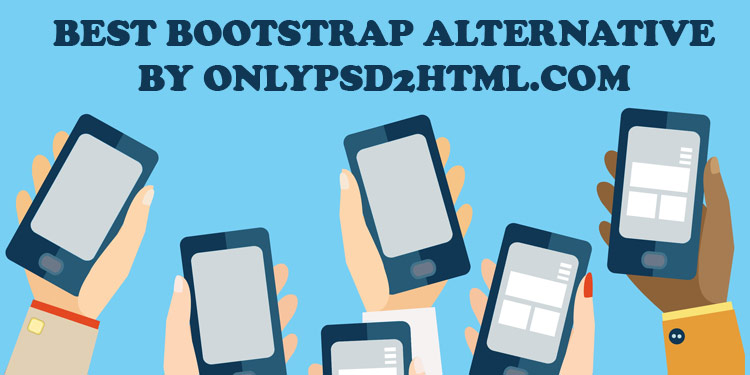
Nowadays, the number of frameworks have greatly increased, and as you may know, Bootstrap from Twitter is on the top standings. To help you pick the most appropriate framework to use, we have listed best frameworksavailable today for Bootstrap alternative. They offer unique and teasing features that differ from each other. Checkout!

1. Pure

purecss
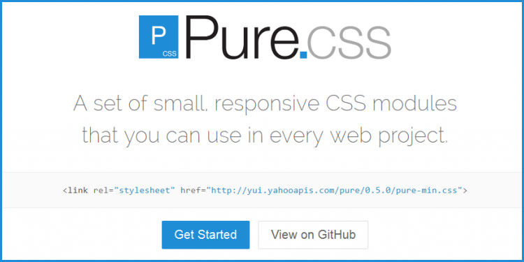
If you are planning to build a web app that works both on desktop and mobile, then you should consider of using Pure from Yahoo. Pure has much better performance when it comes to mobile devices than Bootstrap. As its name suggests, Pure comes as a pure CSS framework only.  Build on top of Normalize.css, Pure has an extremely small file size with just 4.5KB (minified and gzip).

2. UI Kit

uikitcss

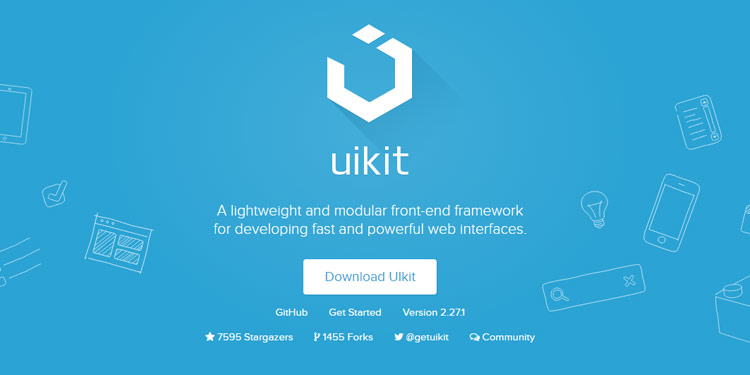
UIkit is a free, lightweight and modular front-end framework. Developed with LESS, UIkit has a well-structured, expandable and maintainable code. It also offers a grid system which is responsive, fluid and nestable. With UIkit you can build navigation, buttons, modals, dropdown and more responsively. Its comprehensive documentation will make you easier to get started with UIkit.

3. Groundwork

groundwork-css

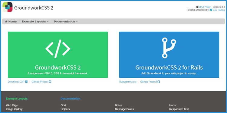
Groundwork is a lightweight, flexible and responsive front-end framework created & maintained by Gary Hepting. Built on top of Sass and Compass, Groundwork offers a great grid system which flexible,  fluid and nestable. With its grid system, you can build any layout type of layout that fit on any screen size.

4. Gumby

gumby-css

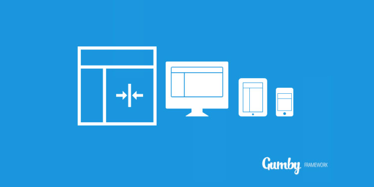
Gumby is a flexible and responsive framework built with the power of Sass for faster web development. Its customizer allows you to easily tweak and customize the entire UI kit design to meet your best preference. Gumby has multiple types of grids with different column variations, but by default, Gumby comes with 960 grid system.

5. HTML5 Boilerplate

html5-boilerplate
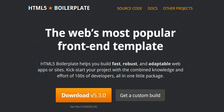
Just like its name, HTML5 Boilerplate provides you HTML5 ready template that has been optimized to meet the most standard of HTML new features. By using this template, you can create a fast, robust and responsive site that is able to adapt to any kind of browser, even the old ones like Internet Explorer.

6. Skeleton

skeleton

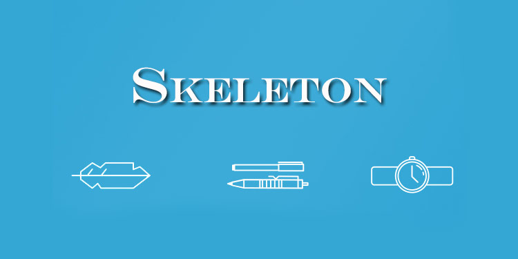
Skeleton is a lightweight CSS framework that uses a 12-column grid system. Unlike Bootstrap or Foundation, Skeleton provides you with some fundamentals components only like button, lists, table, forms which aimed to kick-start your development process.

7. Bootflat

bootflat

Bootflat is an open source CSS framework that is built with the powerful Bootstrap 3. Bootflat is designed to create a stunning flat web design with faster, easier and less repetitive way. Therefore, its UI Kit comes with beautiful PSD user interface pack that you can use on your website, iOS or Android project.

8. Inuit

inuitcss

Inuit.css is another great CSS famework that focuses on Mobile First approach and leave all the design to you. While many other framework are coming with their own built in design CSS, Inuit.css, however, don’t. Inuit.css works in OOCSS (Object Oriented CSS) manner which is a fast, scalable and maintainable method of writing reusable CSS.

9. 960 Grid System

960-grid-system

960 Grid System is a front-end framework that can streamline your web development workflow based on a 960px wide container. The container is then can be sliced up into 12, 16 or even 24 columns for easier laying out content.

10. Materialize

materialize

Built based on Google’s Material Design principles, Materialize has come as a modern responsive front-end framework. This framework is very suitable for those who want to implement Material Design look and feel into their website without any complexity. It features card design, ripple effect animation, Sass mixin, drag out mobile menu and many more.

11. Jeet

jeet-css

Jeet is a fast, flexible and most advance grid system available today.  Jeet helps you build grids on the fly in a very intuitive, clean, manner. It supports almost all modern and old browsers.

12. Susy

susy-css

Susy is an automated grid system that can help you build web layout in any kind of column you want. It gives you freedom and flexibility to build design of your choice. It’s able to handle whether your design has 5, 12, 24, 48 or unequal columns.

13. Metro UI

metro-ui-css-3-0

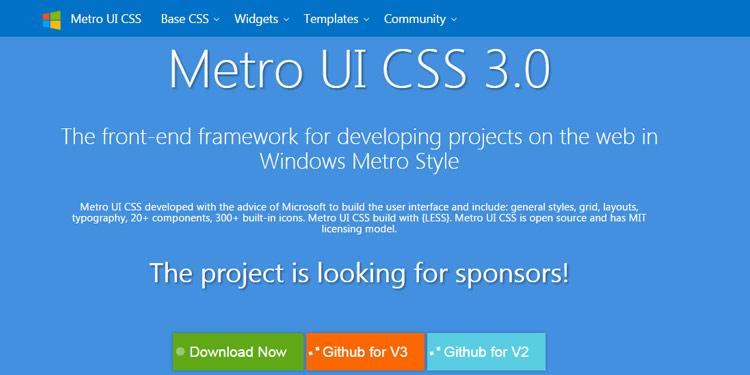
Metro UI is a 12-grid based framework that is inspired by the Windows 8 Metro style interface. It’s very easy to use and has style with a bunch of common components like button, tile, menu, date picker and much more. There is also a News Portal template to get you started easily.

14. HTML KickStart

html-kickstart

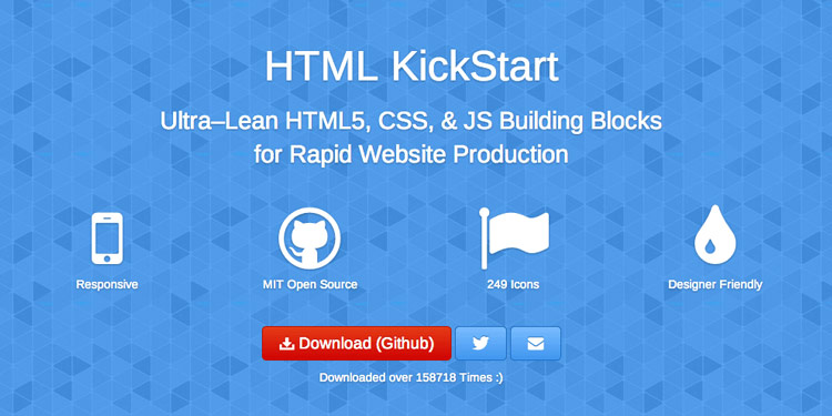
HTML KickStart is an ultra-lean HTML, CSS and Javascript boilerplate for extremely faster web development. HTML KickStart was developed based on Twitter Bootstrap with the icon support from Font Awesome. With its ready menu, list, tables, buttons, grid system, and many great elements, you will save the process of your web project creation up to 10 hours or even more.

15. Simple Grid

simple-grid

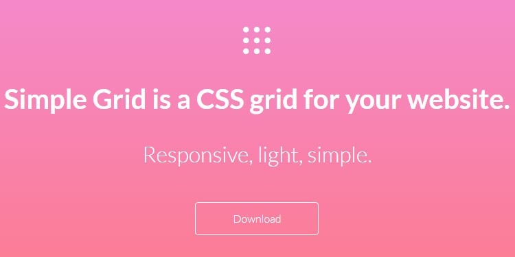
Simple Grid is a very lightweight, responsive grid system. It’s not like other frameworks that have that fancy button, menu, table, etc, Simple Grid offers only a pure grid. The grid feature is based on 1140 px screen size with 12 columns that you can customize to get your best layout.
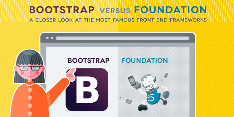
16. Foundation

foundation-6

Foundation is most likely the toughest rival for Twitter Bootstrap. It is very well documented, stable, flexible and open source front-end framework. It has many useful tools for creating responsive, mobile first web project faster. It supports almost all the available browser today, except for IE7. Although many developers are mostly using Foundation for HTML and CSS only, but you have option to port it with Sass and Rails.

17. Material UI

material-ui

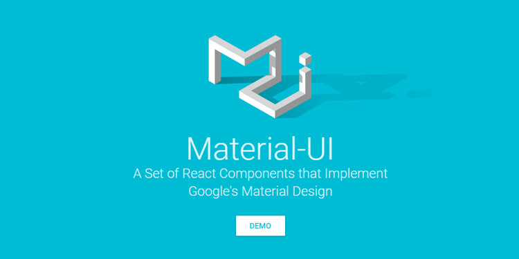
Material UI is another framework that implements Material Design specification. The only thing that differentiate it from Materialize is it’s built by the love of React Javascript library from Facebook. It has many beautiful UI components that you may use freely on your web page.

18. Topcoat

topcoat-css

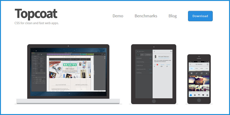
TopCoat is a robust front-end framework made by Adobe team for developing web application designed with speed in mind. Every single detail in TopCoat is optimized for performance priority. It also offers you with customizable theme, open source font and also PSD UI Kit to use with your project.

19. Ink

ink-interface-kit

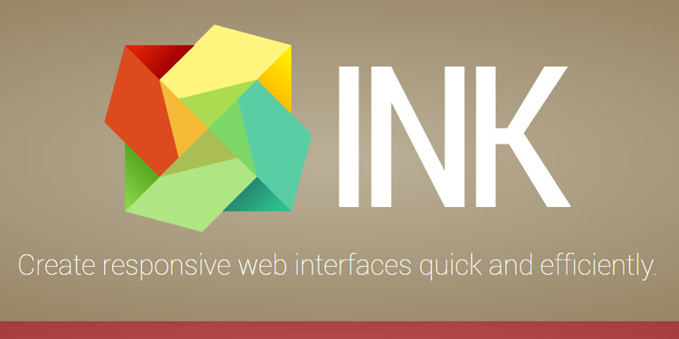
Ink is a front-end framework that is developed for quicker UI development using HTML, CSS and Javascript, just like Bootstrap does. You can create modern layout easily with some reusable interface elements like table, tabs, data picker, modal, sortable list, tree view, gallery, form validator and more. It also enables you to have DOM manipulation, communication facilities and fancy page effects with its JS Core engine.

20. Onsen UI

onsen-ui

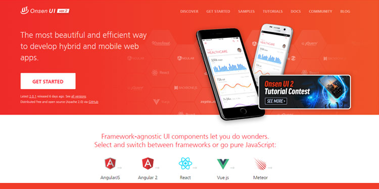
Onsen UI is a hybrid framework that works well with PhoneGap and Cordova. With AngularJS, jQuery, Font Awesome and TopCoat as the foundation, Onsen UI can be a promising tools for developing amazing mobile apps. Onsen UI can help you build mobile apps easily using the concept of Web Components.

21. CardinalCSS

cardinalcss

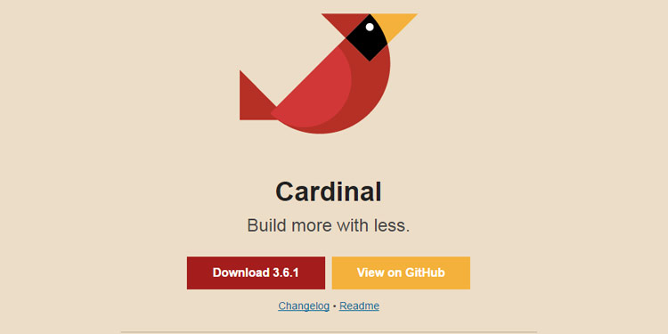
CardinalCSS is a CSS framework built with a focus on performance, readability and most importantly maintainability. CardinalCSS adopts some modern approaches such as mobile-first for shaping up the grid; and CSS Box Model that allows you to easily determine element width and height.

CardinalCSS also comes with a handful of helper classes that allow you to quickly apply styles upon an element, for example, the drop-cap which applies the drop-cap effect for the first character in the paragraph.

22. ConciseCSS

concisecss

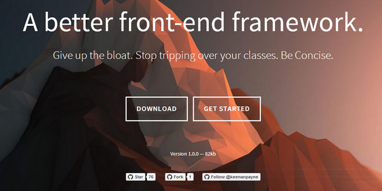
ConciseCSS is a CSS framework – without the bloat. It is a lean framework built on top of Sass, LESS, and Stylus which paves its golden path to CSS maintainability. But, if you prefer plain simple vanilla CSS, you can have that as well.

Similarly, ConciseCSS also comes with base styles for essential elements such as the headings, paragraphs, tables, forms, and a set of helpers class to create button UI.

23. Furtive

Furtive is a mobile-first CSS framework built around the cutting-edge web standards like the use of Flexbox for the grid and rem unit for sizing elements (including font size). Furtive retains a small CSS footprint by not supporting older browsers (*cough* Internet Explorer) since they require some CSS hacking. Hence Furtive is a perfect framework if you are designing a website for the future.

24. BassCSS

bass-css

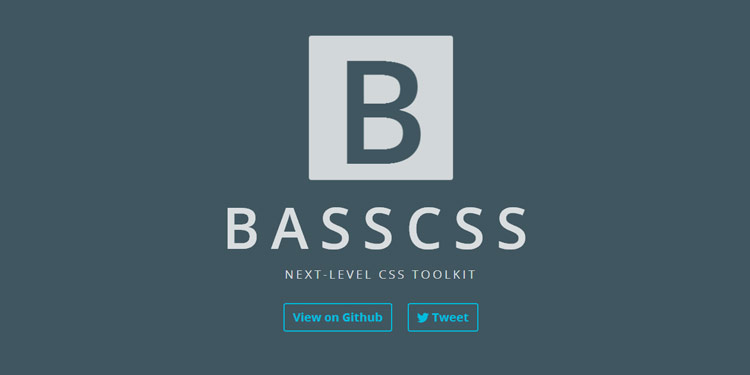
BassCSS offers a lightweight set of base element styles, utilities, layout and color styles, in modular form for buildilng a responsive web application. The SCSS files are included to customize the style easily. You can play with typography, white space, breakpoints, and UI elements.

25. Mueller

mueller

Mueller is a modular responsive grid system built on top of Sass and Compass. With Mueller, you can build the grid either by adding classes straight to the HTML elements, or if you prefer your HTML elements to be neat and clean, using the grid() function. Mueller grid can be used in tandem with the Masonry Javascript library to create a Pinterest-like layout.

26. Tuktuk

tuktuk-css

Tuktuk is a very unique name for a framework. Compared to Bootstrap or Foundation, Tuktuk is much lighter as it only comes with just the proper amount of components to build a presentable website including for the grid system, basic styling for typography, tables, and a couple of UI like navbar and modals.

27.Bulma

bulma-css

Bulma is based on flexbox and SASS. It offers everything you need for the creation of a web site or web app. It has a grid system, single elements and more complex components. There is no Javascript included, so if you are working with modals for example you have to come up with your own implementation. This makes it easy to integrate it in your react app for example.

28. Semantic UI

semantic-ui

Semantic UI is big. You should use this if you are looking for a framework with lots of features. It offers simple elements and components but also views and modules in various themes. You can also build your own themed version with only the features you need.

29.Miligram

milligram

Milligram is a “minimalist CSS framework”. There are no Javascript features included. It’s not an UI framework but more a starter kit for your website/ web app.

30.Mui

muicss

MUI also follows the guidelines of Google’s Material Design. What is special about this one is that it is also available as a REACT, Angular, WebComponents or HTML Email framework. The documentation says that it has an “extreme hackability”. I haven’t tried it out yet. But that’s a feature you might need 😉

What is Bootstrap

What is Bootstrap?

When Twitter was expanding, Mark Otto and Jacob Thornton realized the need for a standardized framework and tools that would facilitate consistency and ease of development in the expansion of the Twitter website. The project took a life of its own and we got an HTML and CSS toolkit, named Bootstrap or formerly Twitter Bootstrap, which made the process of web development a little easier. Bootstrap is currently used by many different types of web sites, including NASA and MSNBC, and is currently one of the most popular open source projects on GitHub.

To convert a PSD image design to a responsive HTML website, the most important step is to write the style CSS that ultimately dictates whether the site is responsive or not. Bootstrap helps in writing this CSS code. To be more precise- it’s the CSS code that could be used in creating a responsive website.?

Now, the question comes what exactly is bootstrap and how can we use it. To explain it in a single line- ‘Bootstrap is a collection of tools and HTML/CSS templates that could be used to build a website’. And since Bootstrap version 2.0 (the latest version of bootstrap), has support for responsive web development it can be used to build a responsive website. As for what it can be used for, well it can develop any type of website and could be used with any type of content management system (CMS) that has support of integrating custom CSS, such as WordPress, Joomla, Drupal etc. The best thing about this framework is that it is supported by every major web browser such as Chrome, Firefox, Internet Explorer, etc.

What is a responsive website?

A responsive website provides optimal viewing experience to a website even when viewed through different screen sizes. Here, optimal viewing means accessing website content with minimum to no left to right scrolling and good legibility of text, images, and other media. Therefore, for optimal viewing the website must automatically adjust its rendering width, images sizes, and text size according to viewing screen size.

How responsive websites are generally made?

To make a mobile compatible site, web developers generally use two major techniques. One is by using an altogether separate domain such as m.example.com or example.com/mobile, and redirecting the mobile traffic to this domain. Of course this domain contains the mobile optimized version of the site. This approach, though gets the job done, has a number of disadvantages related to search engine optimization of a site such as duplicate content, promotion of two separate domains, and diluting of link juice.

The other way is by creating a responsive website cleverly using CSS style sheets to render a different styled version of a website according to the screen size. The size of the screen is detected through Media Queries. The CSS used in this screen size loads a rendering style that most fits the screen. The only disadvantage is that the latest versions of CSS are not supported by old browsers such as Internet Explorer 6 thus they cannot display such CSS sites optimally. But this is also changing as more and more people are shifting to the newer versions of browsers.

Bootstrap: Making life easier for web developers

Bootstrap is a pre built CSS framework that could be used by web developers to create websites of any type. The framework provides tools that the developers can call from website’s HTML. Bootstrap has the basic style definition of all the major HTML components that you can use in your website such as alerts, modals, tool-tips, button dropdowns, dropdowns, button groups, navbar, navigational tabs, pills, lists, labels, page headers and hero unit, thumbnails, progress bars, accordion, carousel, and typeahead.

Bootstrap is based upon LESS, a dynamic style sheet language that is considered to be an extension of CSS. As such- LESS is considered to be way faster than other extensions such as SASS. And since it is written in JavaScript, it is easier to understand by a majority of web developers as most are well versed in JavaScript.

Though some professional web developers prefer to create custom code as much as possible, many uses Bootstrap CSS files to create their websites. The only disadvantage of Bootstrap is that it does not fully support HTML5 and is not completely built in CSS3. This is because only the latest browsers fully support these two technologies and most web users have not updated to these browser versions. So, to make a site completely compatible with most of the web browsers, some sacrifices have to be made.

Bootstrap Grid

Bootstrap comes with a 12 column grid and is available in both fixed and fluid grids. For those who don’t know, fixed grids use exact column width in pixels whereas fluid grids uses relative lengths that is represented in percentages.

To make the website responsive, Bootstrap uses the fliud grid system that modifies the width of the column in the grid and resizes the heading and the text accordingly. Similarly the fluid grid also resizes the images as image sizes are also entered in percentages. In addition to make a responsive site you have to use stack elements instead of float. Though you can make a responsive site using fixed width, but it is not generally preferred.

PSD To HTML Programming Habits Developers Should Adopt

Analysis of PSD

Mainly we Know that PSD to HTML Programming Got PSD from client.  Some Point to Analyze Design PSD.

  1. Check Complete Design PSD.
  2. Which Font is Using Design PSD?
  3. How many sections are there in Design PSD?
  4. How many Slider are there in Design PSD?
  5. Images used in Design PSD, It’s HD Images?(BG Image Size Should be 1920px X 1080px)

Planning Before Coding

You have an idea for an awesome design PSD you’re going to create. And you can’t wait to start coding.

Stop! It’s far better to plan a coding project than rush into it blindly. You can never be too prepared, and you’ll get a better end result.

To plan a coding project, there are several stages you must go through. You should decide what to make, design the end result, plan your code, identify extra things you need to set up, and formulate a schedule.

Begining to code without a clear procedure in mind will often lead to retries, burnouts and a depression loop.

Plan Your Code

So instead of problem solving and programming the parallel way, it’s far easier to figure out the procedure first, then write a solution. List out general steps

  1. Which framework you are using For PSD To HTML Conversion Like Bootstrap, Foundation or Other.
  2. Create navigation menu.
  3. Add .navbar-fixed-top to the menu.
  4. Create jQuery script to resize menu when user scrolls down for over 200px.
  5. If the user scrolls to the top, resize the menu once again.

Planning your code in this way will make it much clearer. As a result, you’ll know exactly what code to write.

No Extra Prototypes, Finish Current Project

Tedious coding and debugging can drain someone physically and emotionally. And some of us are inclined to prototype our work even before it is finished. While prototyping is a beneficial behavior in the long run, it doesn’t help when you do it to escape from work.

A better way to lose some steam is to enjoy something totally unrelated to the work, exercising, gaming, reading (perhaps?) — You have to keep your work life in balance. Anything but prototypes.

Use Debugging Tool.

Where there is code, there are bugs. It’s impossible to have a bug-free code solution, so debugging skills are highly sought after. The ancient trial-and-error method may work, but it is slow. Too slow. Plus, why torture yourself when there are already debuggers developed for you?

Take Firebug for JavaScript as example. It comes with error detection, breakpoint setting, expression tracking, performance checking, all for your debugging convenience.

However, a debugger won’t know your code inside out. When in doubt, put the log function into the code, like console.log for Firebug, and make sure it’s good with variable integration (instead of retyping variable names as string or simply ‘It works!’). The web is filled with more advanced and specific debugging methods for every language.

Responsive Test

There Are lot of tools Available in Market that do check Responsive test of your code.

  1. Responsive Test
  2. Red Jelly

W3C Markup Validation Check

This validator checks the markup validity of Web documents in HTML, XHTML, SMIL, MathML, etc. If you wish to validate specific content such as RSS/Atom feeds or CSS stylesheets, MobileOK content, or to find broken links, there are other validators and tools available. As an alternative you can also try our non-DTD-based validator.

Always Learn Something New

In this field, you can get phased out fairly quickly. Many developmental approaches and programming languages even are declared obsolete within the past 10 years alone. Even if you graduate from a top university with a degree in the subject does not ensure that you are still primed for employment.

The only way to survive and thrive is to keep learning. The best way to learn? Don’t just read, program. Challenge yourself with practical projects that require higher scalability. This forces you to think more efficiently. Explore, and enjoy the creation process. Practice is not something you can ignore in programming. The more you program, the better a programmer you become.

This Article Provided By Only PSD 2 HTML Which Offer PSD To HTML5, PSD To Bootstrap, PSD To Responsive HTML, PSD To WordPress & Many More..

PSD To Bootstrap Integration Service

What is Bootstrap?

Bootstrap is developed by the team at twitter, which is an open-source JavaScript framework. With the help of bootstrap you can impart additional superior functionality to your web site. You can create user interface components by using Bootstrap for the reason that it is a grouping of  HTML, CSS and JavaScript.

It is based upon LESS that is a dynamic style sheet language, which is painstaking to be an extension of CSS. LESS is written in JavaScript that is painstaking to be way faster than SASS that is an another extension similar to LESS. It is not complicated to comprehend by a popular of web developers as most of them are well familiar with JavaScript.

Only PSD 2 HTML follow certain standards for PSD to Bootstrap services such as:

  • integrate Pixel-perfect HTML and CSS code to get mobile first front-end framework.
  • Robust functionality of the applications and websites
  • Compatibility with all the major browsers
  • Code strictly abide by the guidelines of W3C Validation
  • SEO semantic codes

It is such a great framework because of the following reasons:-

Consistency

Twitter saw some inconsistencies regarding developer level and user level, so in order to remove those inconsistencies one central set of development code was developed.

Build with the latest libraries

Latest CSS3, HTML5 and jQuery libraries are used to built and develop Bootstrap. In addition to this, the CSS was developed on the LESS platform, which in turn saves time.

Responsive

Responsive design is used to code the bootstrap in order to cater to users with all different screen sizes. As it is responsive, it is set up for the future of internet use containing tablets, desktops and phones.

It is a powerful front-end framework, which is sleek and intuitive that results in faster and easier web development. The documentation of Bootstrap is robust along with a strong set of features. Indeed, the community support is the key reason to make it one of the best front-end development frameworks.

Remarkable features of Bootstrap

  • An open-source framework
  • Also supports responsive design
  • Cross-browser compatibility
  • Almost incomplete support for HTML5 and CSS3
  • Loaded with features
  • Look and behave great
  • Wide list of components
  • Grid system is great
  • Bundled JavaScript plugins

Why to choose Only PSD 2 HTML for PSD To Bootstrap Conversion Services?

Only PSD To HTML is filled with a remarkable team of Bootstrap developers that acquire a large number of years of experience of developing Bootstrap conversion solutions.

Bootstrap vs. Foundation: Which Framework is Better?

If you’re a web designer who’s looking for a sleek, simple and responsive front-end framework, you’ve probably heard of both Bootstrap and Foundation. That’s because these are the two most popular frameworks around right now.

In your mind, you’re probably also thinking…Bootstrap vs. Foundation…Bootstrap vs. Foundation! Which should I use? Which can get me to where I have a fully functioning, new website more efficiently? Relax—we’ve got you covered.

Before we dive into the details of each framework, know that each one has its pros and cons. At the end of this blog post, you’ll make a decision on which is better based on your unique situation, your needs and your familiarity with code in the first place.

That said, Bootstrap was created by former Twitter employees while Foundation is the brainchild of ZURB, an interaction design company that can boast a client list that includes eBay, Facebook and even the NYSE.

We want you to be armed with all of the latest information about each framework, so that you can make the best decision for your web-design projects. Let’s dive right in.

The Grid System

The most noticeable part of a front-end framework is its grid system. With a grid system, designers are able to prototype various layouts and then make any necessary adjustments as they see fit. Foundation initially made its name with the grid system, being the first of the two frameworks not just to go responsive, but also to really flesh out the mobile-first approach for a period of time.

However, after some time, Bootstrap caught up and has closed the gap. In other words, any slight advantage that Foundation had at the beginning with its grid system is pretty much gone now.

Still, there are a couple of specific grid features in Foundation worth mentioning. It’s called the block grid, and it empowers designers to efficiently divide the contents of unordered lists into a grid that’s evenly spaced. In addition, Foundation also makes it a cinch to quickly collapse columns as well as remove gutters because of the collapse class. Alternately, you can remove center columns by using the center columns syntax.

Designers have the ability to produce equivalent code snippets in both frameworks that function almost in the same way. Even so, the syntax for building grids can be a tad different, which means that personal preference will be the decider in the end.

Now let’s talk flexible and pre-defined grids. Both Bootstrap and Foundation come with a default grid system that’s totally in your hands to customize with Less and Sass, respectively. Bootstrap’s default grid mode is attached to breakpoints. This means that it’s going to give you static-sized widths that’ll recede when the viewport is at its limit. However, if designers use the class .row-fluid instead, the width relies on percentages (just like Foundation).

bootstrap-grid-system

Sizing Units

When it comes to calculating typography, widths and basically everything else, Bootstrap relies on pixels, but Foundation uses rems. There are clear differences between the two, yet both can create the same outcomes. Again, it’s a personal preference thing for web designers.

While pixels may feel more familiar to web designers and graphic artists without that much experience, rems help designers think more about proportions. Think of pixels as absolute units while rems are relative units. That’s something to consider, especially in this day and age of responsive design.

At the end of the day, though, don’t beat yourself up too much about the distinction between the two. It all comes down to personal preferences and comfort levels: If you’re a fan of working with pixels, then Bootstrap is the framework for you! When you use pixels, you’ll have to specifically set the width, height, padding and margin of components and their nested elements on each target device and screen size you’re working with.

Features

To someone just getting familiar with both front-end frameworks, it would seem that both have an almost identical collection of pre-built features. As always, looks can be deceiving, which is why there are actually small, but important differences between the two that you should familiarize yourself with.

Foundation comes with built-in form validation from Abide. Bootstrap doesn’t have this feature, but that’s not an issue by any means since, again, it all comes down to the designer’s personal preference and what he’s most comfortable working with. Interchange is another feature unique to Foundation: It relies on media queries to load responsive content that’s suitable for different browsers. Right-to-left support, off-canvas navigation, tours and pricing tables round out the features list of Foundation.

Bootstrap, on the other hand, comes with features that feel more complete and thought-out, from the standpoint of designers. Look at it this way: The features that come pre-built with Bootstrap are much more conducive to efficiently getting designers up and running with their objective of building a functional website with a theme. So if you value productivity, then Bootstrap has to be your framework of choice.

Bootstrap’s also added responsive embeds, which makes it a cinch to now incorporate responsiveness to different elements.

The Ability to Customize

Just by looking at the names of these two, front-end frameworks, you can glean something about the visual customization of each. Bootstrap removes friction from your path, so that you can create a website as efficiently as possible and have it up and running; Foundation tends to offer a few more customization options when it comes to visual appearance, which can slow you down a bit.

With Bootstrap, your websites tend to appear as though they were made with Bootstrap—that is to say that the default Bootstrap look, if you will, only goes away when you either add a theme or spend some time with custom styling. It’s all good, though: If you don’t want people to know off the bat that you built your site with Bootstrap, just explore the custom styling features to add more unique touches to your website’s appearance.

By the way, you can thank Bootstrap’s early popularity (it’s more popular than Foundation) for this so-called “Bootstrap look.” Foundation, by comparison, has a default appearance that looks a lot closer to how your browser would look, in many cases. As a result, it’s a bit simpler to tweak and shape into a more individualized and unique design look.

dragonfly-business-responsive-theme1

A quick word on themes: When it comes to sheer choice in the theme department, Bootstrap can’t be beat. It has a larger assortment of themes that are readily available. Sure, Foundation themes are available as well, but just know that they’re not available in as much abundance as Bootstrap themes are. And, unless you’re a designer who just wants to have all of your websites more or less look the same, you’ll naturally appreciate the greater variety and more choices that Bootstrap’s themes offer.

Mobile

Because of responsive design and the increasing popularity of mobile use, you’d be crazy not to design ANY site with mobile in mind. It’s interesting to point out how each front-end framework handles the mobile question.

Foundation’s approach is to encourage designers to tackle the mobile question head-on by its easy-to-follow rule:

Anything not under a media query is going to be considered as mobile

Now, should designers want something to look differently on a computer or tablet, then they’ll have to specify the media query. This is known as mobile-first CSS development.

foundation-grid-system

Bootstrap approaches the mobile question from a totally different angle. Should designers want to design for mobile, they’ll have to specify the media query for it. If designers don’t design for mobile first, their mobile users are simply going to have to contend with seeing the desktop view.

Designing elements with a desktop-first mentality means you’ll have to think a little bit harder to successfully arrange all your elements on a mobile screen, but it’s totally doable. On the other hand, Foundation’s mobile-first approach obviously lets designers focus more on what sort of content is relevant and interesting to the user while space considerations are secondary.

Browser Support and Performance

Browser support and performance are both very good on Bootstrap and Foundation, with one exception: Foundation does not support Internet Explorer 8. If that doesn’t bother you, then that’s your call, but some designers may feel restricted by that lack of support.

That said, when it comes down to sheer performance between Bootstrap vs. Foundation, the differences aren’t all that great…or even that noticeable. Sure, there will be some minimal performance gaps, but these are largely based on the specific features (framework components, browser environments, etc.) that support designers, as opposed to issues surrounding the front-end frameworks themselves.

Community and Support

If there’s one category that favors one framework over the other, it would have to be community, where Bootstrap clearly has the upper hand. Bootstrap has a huge following of designers and developers which means you’re more likely to get support if you run into issues.

In addition, there are a wealth of plugins and widgets that can be strapped onto the framework, which further extends Bootstrap’s functionality for more efficient web development.

Bootstrap vs. Foundation: Which Framework Wins?

When it’s all said and done, the question isn’t really that simple. As we’ve talked about, there are pros and cons to each front-end framework, and whether designers want to choose one over the other largely depends on their personal preference and comfort level.

If you enjoy having a large selection of themes, then Bootstrap is the way to go. No doubt about it. If you have a preference for rems over pixels, then maybe Foundation isn’t so bad after all. If you want to enjoy support for Internet Explorer 8, then better stick to Bootstrap. However, if designing for mobile first is important…well, Foundation puts an emphasis on that. Then again…if community support and more choice in the form of plugins and widgets are important, you can’t beat Bootstrap’s bigger following and larger selection.

At any rate, if you enjoy building stellar websites that live on the Internet, you can’t really go wrong with either front-end framework. So ask yourself what features of each are more useful to you. We hope we’ve helped make the decision for you a whole lot clearer!

If you already use one framework over the other, be sure to let us know why in the comments below.

PSD to HTML conversion using Bootstrap Responsive framework

When Twitter was expanding, Mark Otto and Jacob Thornton realized the need for a standardized framework and tools that would facilitate consistency and ease of development in the expansion of the Twitter website. The project took a life of its own and we got an HTML and CSS toolkit, named Bootstrap or formerly Twitter Bootstrap, which made the process of web development a little easier. Bootstrap is currently used by many different types of web sites, including NASA and MSNBC, and is currently one of the most popular open source projects on GitHub.

To convert a PSD image design to a responsive HTML website, the most important step is to write the style CSS that ultimately dictates whether the site is responsive or not. Bootstrap helps in writing this CSS code. To be more precise- it’s the CSS code that could be used in creating a responsive website.?

Now, the question comes what exactly is bootstrap and how can we use it. To explain it in a single line- ‘Bootstrap is a collection of tools and HTML/CSS templates that could be used to build a website’. And since Bootstrap version 2.0 (the latest version of bootstrap), has support for responsive web development it can be used to build a responsive website. As for what it can be used for, well it can develop any type of website and could be used with any type of content management system (CMS) that has support of integrating custom CSS, such as WordPress, Joomla, Drupal etc. The best thing about this framework is that it is supported by every major web browser such as Chrome, Firefox, Internet Explorer, etc.

What is a responsive website?

A responsive website provides optimal viewing experience to a website even when viewed through different screen sizes. Here, optimal viewing means accessing website content with minimum to no left to right scrolling and good legibility of text, images, and other media. Therefore, for optimal viewing the website must automatically adjust its rendering width, images sizes, and text size according to viewing screen size.

How responsive websites are generally made?

To make a mobile compatible site, web developers generally use two major techniques. One is by using an altogether separate domain such as m.example.com or example.com/mobile, and redirecting the mobile traffic to this domain. Of course this domain contains the mobile optimized version of the site. This approach, though gets the job done, has a number of disadvantages related to search engine optimization of a site such as duplicate content, promotion of two separate domains, and diluting of link juice.

The other way is by creating a responsive website cleverly using CSS style sheets to render a different styled version of a website according to the screen size. The size of the screen is detected through Media Queries. The CSS used in this screen size loads a rendering style that most fits the screen. The only disadvantage is that the latest versions of CSS are not supported by old browsers such as Internet Explorer 6 thus they cannot display such CSS sites optimally. But this is also changing as more and more people are shifting to the newer versions of browsers.

Bootstrap: Making life easier for web developers

Bootstrap is a pre built CSS framework that could be used by web developers to create websites of any type. The framework provides tools that the developers can call from website’s HTML. Bootstrap has the basic style definition of all the major HTML components that you can use in your website such as alerts, modals, tool-tips, button dropdowns, dropdowns, button groups, navbar, navigational tabs, pills, lists, labels, page headers and hero unit, thumbnails, progress bars, accordion, carousel, and typeahead.

Bootstrap is based upon LESS, a dynamic style sheet language that is considered to be an extension of CSS. As such- LESS is considered to be way faster than other extensions such as SASS. And since it is written in JavaScript, it is easier to understand by a majority of web developers as most are well versed in JavaScript.

Though some professional web developers prefer to create custom code as much as possible, many uses Bootstrap CSS files to create their websites. The only disadvantage of Bootstrap is that it does not fully support HTML5 and is not completely built in CSS3. This is because only the latest browsers fully support these two technologies and most web users have not updated to these browser versions. So, to make a site completely compatible with most of the web browsers, some sacrifices have to be made.

Getting started

Let’s get started with bootstrap now. But before we proceed to bootstrap it is important to note that no matter how easy using bootstrap may sound, you can never harness its full potential unless you have a complete idea of CSS and HTML. Also contrary to the popular belief, programming languages, or more specifically CSS and HTML programming languages, are not that difficult so you can easily master CSS and HTML in 3-4 months. Here’s a list of some great resources through which you can learn CSS and HTML on Internet.

For using Bootstrap first download the compiled version from http://twitter.github.com/bootstrap/index.html. The site has the facility to allow you to customize the Bootstrap framework according to your needs. This is the miniaturized and compiled version and therefore you can get started automatically with it. It does not include any source files. If you wish to download the source, visit here {https://github.com/twitter/bootstrap/zipball/master}. However to use it you have to first compile it.

Once you have downloaded the zip file extract it in a folder. Now you will have to initialize Bootstrap in the head section and the associated JavaScript in the body section

<head>

<meta name=”viewport” content=”width=device-width, initial-scale=1.0″>

<link href=”css/bootstrap.min.css” rel=”stylesheet” media=”screen”>

</head>

<body>

<script src=”http://code.jquery.com/jquery.js”></script>

<script src=”js/bootstrap.min.js”></script>

</body>

A thing to note here is that you don’t need to call JavaScript here as all the major components will work without it. But some functions such as alert and dropdown menus and buttons use JavaScript to give stylized animations and functions.

Bootstrap Grid

Bootstrap comes with a 12 column grid and is available in both fixed and fluid grids. For those who don’t know, fixed grids use exact column width in pixels whereas fluid grids uses relative lengths that is represented in percentages.

To make the website responsive, Bootstrap uses the fliud grid system that modifies the width of the column in the grid and resizes the heading and the text accordingly. Similarly the fluid grid also resizes the images as image sizes are also entered in percentages. In addition to make a responsive site you have to use stack elements instead of float. Though you can make a responsive site using fixed width, but it is not generally preferred.

Learn Bootstrap

Now as we said earlier, you cannot understand bootstrap completely until you have learned CSS and HTML. For those who have knowledge of these two languages, following are some great resources for learning Bootstrap and making a responsive websites.

  • The official GitHub site of Bootstrap :- This site is the best source of learning Bootstrap and all its components. It has detailed examples of every feature of the framework and how it can be used.
  • W3resources:-is really a comprehensive tutorial about bootstrap. It includes all there is to know about the framework including its working, its usage, and examples, along with its integration with JavaScript plugins and their usage.
  • Webdesign.TutsPlus:- It has a complete video tutorial series about Bootstrap. It contained detailed videos about uses of every major component of the framework.
  • One Extra Pixel:- This tutorial is for those who are proficient in CSS and HTML and are just gathering the basic idea of Bootstrap without delving much into the framework.

JavaScript and Bootstrap

Bootstrap comes with JavaScript files that have supported different components of the bootstrap framework and thus extends the abilities of these components. The best part is that all the plugins come in a single file and you can access all the plugins through simple mark API without writing a single line of JavaScript; though you can turn off this feature. The main components that use JavaScript in Bootstrap are affix, alerts, buttons, carousel, collapse, dropdowns, modal, scrollspy, popover, tab, tooltip, transitions, and typeahead.

Conclusion

Bootstrap makes life easier for programmers who want to create responsive websites. But they are not the only framework out there. There are other Responsive CSS frameworks such as Foundation, Intuit.css, LESS Framework 4, etc.In addition it is important to note that Bootstrap is an open source project that is constantly evolving and changing. So, it may not have a complete support for HTML5 and CSS3 at present, it may have in the future.

Bootstrap 3 Responsive Grid Photoshop Templates (PSD)

With the new Bootstrap 3 grid you have gutter width and column width different from the ones in Bootstrap 2, and the container width includes two half gutter padding on the sides. Also, in each breakpoint, the columns have uneven width since they are set by percentages, and the width of the container doesn’t match perfectly with even width.

In the download above you can find the grid templates for the three main breakpoints of bootstrap 3 (1170px, 970px, 750px), plus two grids for mobile (480px, 320px), all with the default 30px gutter. Also included the retina versions.

On the mobile grids (480px, 320px) the minimum column size is col-xs-2, because col-xs-1 breaks the grid in the browser with a viewport of 320px.

Why You Need to Convert PSD to HTML using Bootstrap?


If you are a web designer then you are aware of PSD and its importance in your life. And, if you do not know about PSD then just consider it as a basic tool of web designing. It is a proprietary file that is basically utilized in the design to code process of web designing.

It is easy to edit image layers while utilizing PSD file format. Designer can’t edit the layers of image after he/she completes the image and convert it into a non-propriety file such as .GIF, .JPEG or .TIFF.

Web designers whether beginner or experienced, must know how to convert PDF to HTML to design creative and responsive websites. If they do the conversion using CSS Code then this conversion provide them more detailed and easy ways to create site more accessible.

Writing CSS code is not at all a simple task and for that you need a competent framework. Now, it is easy for you to do this task through Twitter Bootstrap. It is an efficient combination of HTML, JS and CSS from Twitter. Bootstrap is a best invention of Twitter which is now widely used to create innovative and responsive, cross browser compatible and more user friendly websites without any problem.

Bootstrap is the latest, intuitive and most favorable framework in the current market trends among web designers all over the world because as you know that to convert PSD to HTML is very important part of website designing. So, you just need to search for professional, reliable and experienced company such as Only PSD 2 HTML to convert PSD to HTML.

You can extent your images by utilising Bootstrap with your customised requirement. Bootstrap provide a facility of Fluid Grid feature that makes image scaling much easier and hassle free to its users. You can use 12 Column Grid that helps you to put responsive features together to the site. It is compatible with almost all image modes like RGB, Duotone, Bitmap, Lab, Multichannel, Grayscale, Indexed Color, and CMYK. It supports from channels to multilevel information and from clipping paths to transparency levels.

Now, the question arise in your mind that why you should go with the Twitter Bootstrap than others. All the above benefits of bootstrap make it different from other frameworks. The main benefit of it is that it is more responsive, efficient and powerful mobile first front-end framework with some great features for fast and easy web development. Using Bootstrap, you can create well documented and detailed CSS code.

If you are looking to create the pixel perfect, user friendly and very responsive website then choose a reliable firm. Get a reliable PSD to HTML using Bootstrap or PSD to Bootstrap service provider company – Only PSD 2 HTML.