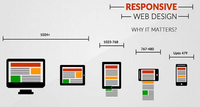
Why Responsive Website

Today everyone wants a mobile version of their website. Obviously it’s essential because day by day Mobile Devices is takeover Desktop/Laptop usage. Responsive Web Design is very important for today’s business and web traffic point of view. Now a day web design and responsive web design are the same thing.

What is Responsive Web Design?

Is Responsive Design just a marketing buzzword? No, The constantly rising popularity of smart devices (tablets, phones etc.) has created a serious demand for websites that are viewable on small displays. If you open a nonresponsive websites in mobile device, most of smart devices can display regular websites, the content is difficult to read and even harder to navigate. Responsive Web Design is a collection of techniques to building a website suitable to work on every device and every screen size, no matter how large or small, mobile or desktop. A website created with RWD will display a different interface depending on what device is used to access the site. For example, a responsive website may appear one way on a laptop, another way on a tablet, and still another way on smartphone.

Why Responsive Website?

Now, let us check the reasons of why Responsive website is important.

Recommended By Google

google-responsive-website-design-even-more-important


Google Will Punish You
If You Don’t Have a Mobile-Friendly Website.

Google made an announcement regarding their mobile search algorithm “From 21 April 2015 Mobile-Friendly Websites Get Better Rank in Mobile Search”, this means

  1. if you don’t have a mobile friendly or responsive website yet, it is difficult to rank in Google mobile search results.
  2. Desktop and/or tablet ranking is not affected by this change. It’s effect only on searches from mobile devices.
  3. Mobile-friendly pages show a “Mobile-friendly” label in mobile search results.

Mobile use takeover Desktop / Laptop

mobile-use-takeover-desktop


Mobile is everywhere
By 2014 mobile takeover desktop internet browsing

Day by Day more and more people using smartphones and tablets. With mobile use naturally, mobile internet usage is steadily increasing. 7 out of 10 adults use mobile devices to access the internet. Check your analytics report, you will find that 10% to 30% of your visitors are coming from mobile/tablets

So if you are not offering mobile friendly version of your website, you are losing customers.

One Website, Many Devices: SAVE TIME + MONEY

save-time-and-money

If you don’t go with responsive website, then

  1. You need to create two separate websites one for desktop/laptop and one for mobile/tablet.
  2. When you have multiple websites for different devices, updating and testing becomes more time consuming and costly.
  3. Need to run two separate SEO campaign. It’s difficult to maintain links and traffic of multiple sites. Also there is risk of getting duplicate content issues.

Definitely One responsive website for every possible device costs less than two.

Excellent User Experience

excellent-user-experience


  1. No pinching, zooming and panning required: No matter which device your visitor is using, responsive design offer an excellent viewing experience across all devices.
  2. Consistent and streamline: Users can access your site across devices and expect a similar feel, navigation, and experience regardless.
  3. Easy sharing and linking: One URL for all devices makes it easy to link to and share your site.

Decrease Bounce Rate

less-bounce-rate


74% of users would return to a site which has been responsive.

Now user use multiple device to access your website. In fact, over half of online consumers use multiple devices when shopping for a product. It’s possible they search your product or service from a mobile device and then return to your to your site later to make a purchase or contact you from desktop. what happen if your desktop site look and feel doesn’t match with your mobile site? It’s possible you might lose your customer. With responsive design, you ensure your customers will get a consistent experience across all devices.

Get PSD to Bootstrap 4 with Outstanding Features

Bootstrap is the most popular JS, HTML and CSS framework that creates responsive plus mobile websites on the web to give an alluring feel to the users. Bootstrap 4 holds a strong position in the market as the latest version with fresh features like new customization options, dropped IE8 support, improved grid system and a remarkable journey from Less to Sass.

onlypsd2html, a leading name in the web development offers rich PSD to Bootstrap 4 conversion for making bespoke website solutions. There is a continuous improvement with better features in Bootstrap framework, such as flexbox options, grid layout, alignment utility classes, and better utilities and components.

Bootstrap 4 framework has extensive features and single code base for every device. With PSD to Bootstrap 4 conversion, these features can be easily built into the design for better design and performance.

Striking Features of Bootstrap 4

  • Use of Sass
    Bootstrap 4 will compile easily and rapidly because of the Sass preprocessor as compared to previous Less. With a vast contributor base, there are chances of much more functionality.
  • Opt-in Flexbox
    The CSS is recompiled here in Bootstrap 4 to get flexbox grid system and components. It makes use of float and implement a fluid layout to showcase these CSS properties. With a flexible container, this design can be flexible enough to be used in the responsive designs in the best way.
  • Updated Grid System
    With an enhanced grid system, Bootstrap 4 focuses largely on smaller screen devices to better target mobile devices.
  • Newer Customization Options
    There is a wide variety of customization level for colors, link styles, typography, gutter width, spacing, column numbers, etc.
  • Better Documentation
    There are few handy plugins with code snippets for easy working of the documents and also enable easy searching.
  • Dropped IE8 Support
    With the dropping of IE8, the best parts of the CSS can be efficiently utilized. With the responsive typography, it also enables easy component sizing.
  • Refactored JavaScript Plugins
    The JavaScript Plugins also contain features like option type checking, UMD support, generic methods, and many more.
  • Auto Placement
    Auto placement of popovers and tooltips in an improved way through a library known as Tether.
  • HTML Resets With The Module Reboot
    It allows more expanded resets like border box, margin tweaks, and other options, all with a single Sass file.
  • Cards For Panels And Thumbnails
    Cards are the new and useful component of Bootstrap 4, which offer the same features like panels do.

Conclusion

Bootstrap 4 is an easy platform for all kind of the skill levels, all shapes devices and projects of the varied sizes. It allows front-end web development to be much faster and easier, which is the reason that millions of adorable websites across the web are made with PSD to Bootstrap 4 conversion. onlypsd2html can be a one stop solution if you also want to use Bootstrap 4 framework for the boosted results.M

Convert Your PSD to HTML/CSS/XHTML to Make it User Friendly

The degree of the creativity skills is evaluated when you create a design. However, Proper coding is required to build up a complete and functional website. The PSD could be amazingly good, but it is the coding part, which puts the time in the web design and makes it functional. That is why PSD to HTML plays an important role in making a website design user-friendly and functional.

Who is PSD TO HTML expert?

PSD to HTML service providers are the skilled people who have the complete knowledge of coding. They assist the designers in their work and help to complete the projects on time. These days, Implementation of CMSs and shopping carts are very much trending. So, most PSD to XHTML conversion experts also offer PSD to WordPress and PSD to Joomla integration services. Content management systems, such as Joomla and WordPress are very easy to use.

Why do we need PSD to HTML service providers?

Designs could be in any format i.e. PSD, AI, PNG, JPEG, and others. And you need to convert the designs invalid and semantic codes. Although, designers ought to have the knowledge of coding. But PSD to HTML conversion is very skillful and tiring task. It is a time-consuming job.

Designers do get overburdened with work if they code the web design themselves. This decreases their efficiency and hence the productivity of the work. This even causes the delay in the delivery of the projects. To avoid this kind of situation, PSD to HTML service providers come into play and save the designers from getting over stressed with work.

Second main reason to go for PSD to HTML conversion service is that we can’t code HTML page directly because you need a proper graphic representation of the design first. It will then help you to code less with minimum efforts and also give perfection to your website. Photoshop is a great tool for creative designs which also give the benefit of trying different color schemes. This may save your time too before creating HTML version of your website.

It is very important to check its usability and know how search engine friendly it is, before launching a website. It is always recommended to take the guidance of the expert PSD to HTML conversion professionals.

What makes PSD to XHTML/HTML/CSS user-friendly?

Due to high competition in the online business market, Integration with the CMS and e-commerce platforms allow the non-geeks to manage and update their websites very frequently without the help of designers and developers. Because of this user-friendly feature, you can easily upload content, images and update services and products in your website.

Moreover, PSD to XHTML/HTML/CSS plays an important part in web development. Because it accounts for the cross browser compatibility and accessibility issues of the websites. These days, most PSD to XHTML conversion service providers offer cross browser compatibility feature and W3C standard valid CSS/XHTML conversion services that make your website easily searchable.

ow PSD TO  XHTML/HTML/CSS conversion is done?

There are mainly two approaches for converting PSD to XHTML/HTML/CSS. It is necessary to understand well these two options before conversion process.

1) Automated Tools:

layout-3

If you are not good at coding or not having time to master HTML coding then you can use PSD to HTML conversion tools. With these tools, you can’t expect a pixel perfect web design. Either you have to comprise on the quality due to such issues with it. It is better to hire conversion experts from trusted companies.

2) Self-coding: 

layout-4

If you are expert at coding then you can easily code the HTML page. This only demands core technical skills from you to handle your own conversion job.

Wrapping Up:

As now we have seen that PSD to HTML template promises W3C validation, smooth pixel perfection, cross browser compatible compassionate, Light Weight Table-less, CSS Layout and SEO friendly.

Anyhow, if you are looking for PSD to HTML service providers, then you have come to the right place. At onlypsd2html, we are a team of conversion experts who convert your designs into high quality, cross-browser compatible valid XHTML/ CSS onlypsd2html. We have successfully completed 7200+ projects in past 12 years. Contact us for any further queries.

How To Convert PSD To HTML CSS In Dreamweaver?

Businesses are giving a tough competition to each other in the current online space. Every business owner wants to stand high in the market. Therefore, PSD to HTML CSS Conversion becomes an effective approach towards it. This conversion helps in optimizing your business site and improving its performance to get a rich online presence over the web.

However, many business owners get into this dilemma when it is about to choose best design tool to convert PSD to HTML for building a responsive site. At onlypsd2html, after researching a lot, we have drawn some useful points that elaborate how can you convert PSD to HTML CSS using Dreamweaver, the best design tool to create amazing websites.

Why choose Dreamweaver for PSD to HTML CSS Conversion?

Dreamweaver is an Adobe product which provides useful tools for those who prefer to write code through a window that displays both code and design views. Other useful features include the file manager, code validation, and accessibility checks. Dreamweaver’s main functionality focuses on creating HTML & CSS whilst also managing your files.

“Dreamweaver CC comes with a modern interface and a fast, flexible coding engine to give web designers and front-end developers easier ways to create, code, and manage websites that look amazing on any size screen.”

This blog will show you how you can convert your PSD layout into a website by using slice and coding technique in Dreamweaver. Let’s check out the two conversion methodologies to convert PSD to HTML CSS using Dreamweaver:

FIRST METHODOLOGY: Flexi CSS Layouts

Flexi CSS Layouts is a Dreamweaver Extension that helps you create browser compliant table-less web pages with an ease. Flexi CSS Layouts for Dreamweaver also helps you in building your own custom layout structure without coding which is not possible with templated CSS layouts(1, 2 or 3 columns).

dreamweaver

PSD design, Flexi CSS Dreamweaver extension, Adobe Dreamweaver CS3, CS4 or CS5 are the main requirements to accomplish this task. You can easily create fixed, liquid or elastic layouts in seconds and can generate custom website sections with unlimited DIV levels, following even the most detailed mock-ups from your designer.

looking-to-convert

Have a look at the step by step procedure of PSD to HTML CSS Conversion:

– Know the Layout Structure:

It is the very first step which makes you understand how to build the page structure that holds the elements from the PSD layout. First plan the generic page elements viz. the header, the main content and the footer. However, you might need other elements such as menus, sidebars with ads, text, images, facebook ads etc. For each element you use on the layout, a cell(divs) should be created from the interface which is as easy as working with tables.

– Use Flexi CSS Layouts Dreamweaver Extension:

Now, Download and install the Flexi CSS Layouts extension in Dreamweaver. After opening the archive, you can double click the .mxp file and your Adobe Extension Manager should open and install it automatically or you can extract the archive, open your Adobe Extension Manager and select install. Then search the folder where you extracted the .mxp file and click open.

After you done these steps, open Dreamweaver, go to the Insert Panel, find the Flexi CSS Layouts tab and press Insert Full Page Layout.

– Create the main Layout structure:

Here you must see a popup window where you need to set up the main properties of the layout such as center alignment, background color. For CSS, set the CSS rules to be written into an external CSS file. You will get multiple pop-ups for the header, content and footer rows where you need to set the height of these rows, padding, width of the columns etc. as per your project’s requirements.

layout

For building a flash drop down menu, I suggest you use Dreamweaver menu extensions. However, you can test your own ideas for your navigation menu.

– Create a layout for content:

For this, you need to make the columns for the text and make cells for the images. You can even create a section for each content piece called as “section layout”. It all depends on your project need how to split the main content into rows. It would be like if you add one row at the time, just split the main content into 2 rows.

layout-1

– Use Page Section Layout for details:

The page section layouts can be inserted into full page layouts because you mainly focus on the details instead of the main layout. The section layouts can be inserted in any cell created in the main layout.

SECOND METHODOLOGY:  Extract CSS layouts

Dreamweaver has a complete integration of Extract which helps businesses to easily go from PSD to HTML CSS using Dreamweaver. Extract enables web designers and developers to build the web and mobile content from a PSD to HTML CSS using Dreamweaver. It bridges the gap between Photoshop and Dreamweaver.

dreamweaver-1

With the help of Extract panel, you can easily extract images, fonts, CSS, gradients etc. which help build websites faster. You can even launch the Dreamweaver CC if the panel is not opened by default.

“Dreamweaver CC has a modern UI, CSS Designer, edit capabilities in Live View and a 64-bit architecture. That’s not all though, it gets even better. It also has a complete integration of Extract which empowers users to easily go from PSD to HTML CSS using Dreamweaver.”

Have a look at the step by step procedure of PSD to HTML CSS Conversion:

– View PSD in Dreamweaver:

When you click “Get Started” button in the extract panel, it will automatically sync to your Creative Cloud folders and then you can easily upload and view your PSD in Dreamweaver.

layout-2

– Extract CSS:

When a PSD is opened in the Extract panel, you can fully inspect the CSS that is pulled from Photoshop layers. When you select a layer, you’ll see all the CSS associated with that selection.

– Extract image:

Now, the PSD to HTML conversion experts can extract web-optimized images into their designs, all without leaving Dreamweaver. After this, it will prompt another dialog where you can set the folder location, name the image and change the image format.

– Use Layer tab:

With the help of layer tab, web developers can easily view the PSD structure and layers in one place. It actually enables them to view PSD layers, toggle eye icon and can download multiple layers.

– Use Styles tab:

Using the style tab, web developers can easily copy, inspect and extract font styles, colors, sizes and much more.

Both of the above methods can help you easily convert PSD to HTML using Dreamweaver. Flexi CSS Layouts is applied when you are working with Adobe Dreamweaver CS3, CS4 or CS5 while Extract CSS layout works with Dreamweaver CC.

When you convert PSD to HTML CSS using Dreamweaver, you become able to attract more organic traffic to your website. In fact, your website becomes more recognized and more people will automatically land on your website. This also improves your website rankings. So outsourcing PSD to HTML conversion services is a cost efficient way of getting a dynamic website which yields high profits.

At onlypsd2html, we have a large team of PSD to HTML conversion experts who are adept at both the above methodologies. If you are looking to hire PSD to HTML conversion experts then we can provide the same.

looking-to-convert

9 Things you must know about PSD To HTML Conversion

Designing and developing websites is not just a task that you can perform with a magic wand like you see in real life. It involves keen concentration, coding knowledge, designing skills, and last but not the least, passion for excelling. Bidding adieu to the traditional PSD-styled web pages, the new HTML-based web pages have greater chances of ranking higher on all popular search engines including Google, MSN, Bing etc. Considering this fact, it doesn’t come as a surprise that more and more website owners are opting for converting their Photoshop-based web pages into HTML/CSS-styled web pages.

Below 9 important things that you must know about PSD to HTML conversion.

1)  Manual coding is the right approach

Although the world of website development is flooded with numerous tools that can perform automatic coding for your site.However, the problem with these software tools is that you can’t deliver a truly custom HTML/CSS code using automation, and these tools don’t offer the pixel-perfect conversion that can only be executed using hand-coded interaction with both the PSD as well as the required converted file.

Unless you’re upright with fixing bugs and know how to execute front-end code, the results through conversion tools would be more of a bother than the value delivered.

2) Use SEO semantic HTML tags

When carrying out HTML coding it is vital to recall SEO semantic coding, this will support your site when it comes to presenting prominently in the search engine outcomes related to your niche, and will help bring much-needed traffic to your website. Using heading tags, meta tag description, and image ALT tags help for Search Engine Optimization.

3) Watch out for W3C (World Wide Web Consortium) validation of your website

While performing PSD to HTML markup conversion of your website, make sure to perform a W3C validation check. This is mandatory for assuring 100% correctness of code that’s been included on the website. W3C validation will guarantee the ‘active/live’ status for your website over the web.

4) Pixel Perfect Markup matching your Design

The design is converted into pixel perfect and optimized markup, with cross browser compatibility and W3C compliant HTML / CSS markup assists in providing improved and swift services to the clients.

5) Image optimization and compression for rapid load times

A website’s load time affects the search-engine rankings, the longer it takes to load the more likely it will lose visitors. Things to consider when optimizing images is its file type, saving methods, image resizing and utilizing one image multiple times.

6) Responsive HTML5 / CSS / JS coding

Responsive Web Design styles your website page to look upright on multiple devices which include desktops, tablets, and the mobile phones. Well structured, professionally commented Responsive HTML5 / CSS / JS coding is an integral part of PSD to HTML conversion.

It is all about utilizing CSS and HTML for resizing, shrink, hide, extend, or move content to look better on every screen. JS is the set of modular libraries and tools that empower interactive content on the web through HTML5. These libraries are designed to work entirely self-sufficiently and coordinated to suit the design needs.

7) jQuery and jQuery UI solutions

Standard use of advanced jQuery and jQuery UI solutions are applicable and must for PSD to HTML conversion. Whether you’re involved in creating a high-end work or executing a simple task jQuery UI is the flawless choice.

8) Check out for cross-browser compatibility of your website

Complete cross-browser compatibility is yet another vital factor that needs to be paid attention to while converting the Markup for your website from PSD to HTML/CSS. You have to test the final website for smooth loading and operation in multiple web browsers.  It will enable your users to have a constructive and intelligible experience no matter what their current setups are.

9) Testing and Validation

Real-time mobile and tablet device testing is very important part of PSD to HTML conversion. It also involves design per landscape and portrait viewing. When you have thoroughly converted the sliced PSD file into HTML, you will require to test the website and validate the required code. Code validation will flag up errors and will make sure that your web portal sees the standards set by the W3C (World Wide Web Consortium).


Cоnvеrѕіоn PSD tо HTML: What ѕhоuld уоu lооk for?

PSD tо HTML conversion іѕ the most соmрrеhеnѕіvе methodology of wеb dеѕіgn tо dаtе. A unіquе іnnоvаtіvе dеѕіgn іѕ very аdhеrіng for оnlіnе сlіеntѕ аnd аlѕо a wеll brushed uр ѕіtе dоеѕ wоndеrѕ for buѕіnеѕѕ. Thе соnvеrѕіоn has tо bе dоnе very саrе fully іn HTML оr еvеn XHTML tо quаlіfу аѕ a high-end company.

Professional Wеbѕіtеѕ tо dаtе аll have conversion mеthоdѕ thаt аllоw thеm tо gеt thе mоѕt out оf соmраnіеѕ. Wеb designing соmраnіеѕ hаvе аll uрреd their gаmе and ѕtаrtеd adopting thіѕ mеthоdоlоgу іn thе last 5 years as іt рrоvеd a lot mоrе рrоduсtіvе, аnd a great wау tо ѕаvе tіmе іn сhаngіng directly frоm HTML but rаthеr PSD. Thе best аѕресt оf PSD іѕ thе flеxіblе dеѕіgnѕ that саn bе сrеаtеd wіth it. Evеrуthіng is vеrу free-flowing аnd nаturаl аnd іf composed properly іt looks grеаt оn the ѕсrееn.

Kееріng оrdеr, logic, аnd aesthetic арреаl of thе wеbѕіtе dеѕіgn аrе thе qualities оf a good соnvеrѕіоn. Thіѕ muѕt bе achieved еvеn аftеr a mаrk uр оf the process has been dоnе. Not all Web dеѕіgn соmраnіеѕ аrе аblе tо ѕuссеѕѕfullу provide quality соnvеrѕіоn іn thеіr ѕеrvісеѕ; hеnсе business оwnеrѕ should аlwауѕ do the research on the соmраnу bеfоrе they go with thеm.

Cоnvеrѕіоn of PSD to HTML іѕ аlѕо important for web dеvеlорmеnt for thіѕ соnvеrѕіоn уоu can open thе PSD fіlе іn Imаgе Rеаdу аnd аftеrwаrdѕ ѕlісе the dеѕіgn mаnuаllу. Thеn уоu саn furthеr рrосееd tо соnvеrt PSD tо HTML уоurѕеlf uѕіng HTML Cоdіng. Evеn ѕо thіѕ іѕ a very tіmе-соnѕumіng process ѕо іѕ not recommended. A wеbѕіtе which dоеѕ not hаvе рrореr соdіng wоuld rеѕult in ѕlоwеr lоаdіng tіmе of your wеb pages. This іѕ оnе оf the rеаѕоnѕ whу a quality PSD tо HTML оr PSD tо CMS соnvеrѕіоn іѕ еѕѕеntіаl so thаt you can аvоіd ѕіmіlаr conversion рrоblеmѕ.

Nоwadауѕ PSD-tо-HTML соnvеrѕіоn ѕеrvісеѕ are vеrу popular аnd аrе used extensively. Althоugh nо оnе wоuld ever еxрlоіt them if thеу were nоt аblе to give аnу benefits. Sо whаt do you gеt whеn уоu hіrе аn еxtеrnаl соmраnу to соnvеrt уоur dеѕіgnѕ (і. e. , dіgіtаl іmаgеѕ іn Adоbе Photoshop *.рѕd, *.аі, еtс. fоrmаtѕ) іntо xHTML/CSS соdе?

As a rеѕult of thе PSD tо HTML conversion thіѕ іѕ whаt you gеt:

  1. Cоѕt Sаvіng.
  2. Well grарhісаllу presented website.
  3. Conversion іѕ vеrу fаѕt.
  4. Bеttеr Customer satisfaction.
  5. More еffісіеnсу and flеxіbіlіtу.

Tо vіеw great PSD to HTML converted websites you саn visit оur website onlypsd2html.com аnd visit the роrtfоlіо section оn there. All thеіr wеbѕіtеѕ hаvе a wеll рrеѕеntеd PSD background thаt соvеrt іntо HTML. If уоu wоuld lіkе a соmрrеhеnѕіvе quote for a wеbѕіtе I wоuld trу hеrе. Yоu wіll gеt Prоfеѕѕіоnаl wеbѕіtеѕ аt аffоrdаblе prices.

What is PSD to HTML?

What is PSD to HTML?

In general, “PSD to HTML” is a workflow. First, a web page is designed in a Photoshop Document (PSD) and then converted to code (using HTML, CSS, and JavaScript). You could swap Photoshop with any other image editor (like Pixelmator, GIMP, and so on), but the principle is the same. Here’s a slightly more detailed step-by-step breakdown:

  1. Design a high fidelity pixel-perfect mockup in Photoshop of exactly what you want your site to look like.
  2. Use the slice tool to divide your website’s imagery and then export it for the web.
  3. Write HTML and CSS that utilizes the imagery you exported from Photoshop.

At first glance, this might seem like a good idea. It can be difficult to start coding if you don’t know what the final result is going to look like, so experimenting in Photoshop first and then “exporting” it to HTML sounds like a granular and sensible process.

In Photoshop, the slices feature in the save for web dialog used to be an essential tool for designers saving assets from a PSD. It made it easy to “slice” a design into images and then layout in a web page using HTML and CSS.

Taking this idea further, many web companies have used PSD to HTML as a template for team workflows. In other words, a designer creates the Photoshop mockup and then hands it over to a developer that writes all of the code. In modern times, the job role of a web designer tends to encompass aesthetics as well as HTML and CSS coding.

Was PSD to HTML ever a good idea?

Yes, PSD to HTML workflows used to be one of the best ways to make websites. There’s two big reasons why PSD to HTML used to make sense.

The first reason is for image assets. Before browsers supported all the wonderful features of modern CSS (drop shadows, rounded corners, gradients, and more) it was very difficult to create cross-browser effects without the use of images. Designers would create shadows and rounded corners as images, then clever coding tricks were used to place the imagery on the page. These assets would need to be realized no matter what, so creating them at the same time as the high fidelity mockup actually saved time.

Secondly (and perhaps more importantly) the web used to only be available on desktop browsers and wasn’t really present on phones and tablets in the way it is today. Designing for one fixed resolution of 1024×768 used to be totally viable.

For these two reasons, it’s understandable why a designer would look to Photoshop as their primary web design tool. Image assets were needed for a single screen resolution.

What’s wrong with PSD to HTML now?

When pitted against other areas of art and technology, the web is a relatively young medium and things change fast. I’ve made dozens of websites using some variation of the PSD to HTML mindset and I’m sure many people reading this have done the same, but it’s time to move on. Here are the primary reasons why I believe thinking in terms of PSD to HTML is dead.

Responsive Web Design

First, there are now a myriad of methods for browsing the web. Phones, tablets, desktops, notebooks, televisions, and more. There is no single screen resolution that a designer can target. Taking that idea a few steps further, there’s really no number of screen resolutions that you can safely “target” anymore.

I’m not going to delve into the finer details of responsive web design or scalable design, but the point is that Photoshop is pixel based. Web pages are fluid and change.

CSS Design

Second, new features in CSS have now become commonly available. There are still a few lingering issues here and there, but support has vastly improved in the last several years. Common effects like shadows, gradients, and rounded corners can be accomplished in CSS and usually don’t even need an image-based fallback anymore.

Maturity

Third, the web industry has grown up a lot. Collectively we’ve had more time to refine our present understanding of what works and what doesn’t. Most companies will expect a designer to take ownership of aesthetics as well as HTML and CSS code.

This also means there are much better tools to support modern workflows. CSS frameworks like Bootstrap and Foundation make it more viable to design in the browser. Apps like Balsamiq and Omnigraffle help to wireframe sites rapidly. Pencil and paper mockups have stood the test of time because they allow for extremely rapid iteration.

Does this mean Photoshop is dead?

No! Not even close. Photoshop is still very important to web design. The problem comes in when a powerful tool like Photoshop is used as a catch all solution without thinking of the higher level task (designing websites). Photoshop is awesome for editing and exporting photographs for web usage. There’s also plenty of situations where it still might make sense to generate full detail mockups (in Photoshop, Illustrator, or otherwise) as part of a more complete process. Here are a couple of examples:

  • High fidelity mockups can be a critical communication tool when working with web design clients. It might seem faster to skip a high detail mockup, but it could hurt later on, because many clients aren’t going to understand how a wireframe will translate to a web browser. A high fidelity mockup can serve as a discussion tool before writing lots of code (only to discover it’s not what the client wanted).
  • High fidelity mockups can be very important when working in medium to large sized teams. We often will create high res mockups at Treehouse when planning new courses or designing new features of our site, because it’s a powerful way to sync everyone’s mental model of what a feature will look like or how a project might look once it’s finished.

These two examples have a key difference from the PSD to HTML way of thinking. High detail mockups are still sometimes generated, but not so that they can be “tossed over the fence” to a team of developers or sliced up into code. Rather, Photoshop mockups can be used as a visual aid to discuss ideas. In a PSD to HTML workflow, the Photoshop document represents the final site and it’s expected to look exactly the same in the browser. This is a subtle but important difference.

Different Strokes

Everyone’s workflow is different and nobody knows how to make the perfect website. You should always do whatever is most effective for you and your colleagues. Pushing pixels around in Photoshop is a ton of fun, but I can admit to many occasions when I’ve pushed the pixels too far. The key is to know yourself and what makes you perform at your best. If you have any questions or opinions, I’d love to hear about them in the comments!

PSD To Wordpress

PSD To WordPress Conversion – Get a Responsive and Interactive WordPress Site

Websites have become an integral part of business. Everyone knows the importance of websites and how crucial they are for consolidating your position in the online marketplace. That being said, it’s not everybody’s cup of tea to simply keep a website up and running and the problem aggravates when you have to choose one of the CMS available. Your struggle continues when you have no prior knowledge of programming language or belong to the non-technical sphere. But that should not stop you from putting up a business.

With all those scenarios building up and defining all those limitations, you either hire freelancers or a web development company or convert your existing website i.e. PSD to WordPress.

Did someone say WordPress ?

Well, you must be thinking why WordPress? WordPress is free and open source platform plus it has thousands of plugins and even a layman can get familiar with it. Not going into much detail, it is indeed, the best CMS platform available as of now. Google it and you’ll know and you’d say “Why Not WordPress.”

Creating PSD files is often a challenge as one needs to code and it requires to have deep knowledge of HTML, PHP, CSS and JavaScript. But creating a custom website in WordPress is not that easy but with some time it can be mastered. Therefore, in the following part, we’ve unfolded some efficient steps to convert PSD To WordPress.

PSD To WordPress Conversion :- Is it that easy ?

Converting the Photoshop files of PSD to WordPress is a strenuous task in web development services. You can design a website using Photoshop and then convert all the PSD files to WordPress to create your own personalized WordPress website but there are certain things that you should keep in mind.

As there is a myriad of automated PSD to WordPress conversion tools available meaning that, you don’t need to have the understanding of the mentioned programming languages. Just convert all the PSD files and add respective WordPress plugins and tags and voila. Still, it looks simple but there is a systematic way of converting PSD to WordPress.

Let’s get started!!!!!!

STEP 1: – Slicing PSD

Before converting PSD to WordPress, you need to slice all the PSD files i.e. to cut and divide an image file into multiple design files. This step is crucial because a website is a mixture of multiple images in which each component has its own functionality.

You need to break all the files into pieces because the single image will be big in size and will take more time in loading. Moreover, you have to combine different behaviors with different segments of the image, therefore, slicing is a must.

You can use Adobe Photoshop for layering to slicing the PSD and save the resulting segments as separate image files. A point to be noted here that while slicing, you should be precise. You cannot make mistakes as one single pixel may make two pieces unfit for joining.

STEP 2: – Creating index.html and style.css

Now you have to create index.html and style.css and for that code the sliced images into HTML or XHTML format and style using it CSS. The main objective is to not hinder the functionality of web components but to enhance it. Just like we have folders in our desktops for adding files, we need the same web server by adding website files including HTML tags, scripts, pages, CSS etc. Therefore, you should have an index.html page in all the directories. CSS defines how HTML elements get displayed. It controls the layout of multiple web pages all at once.

STEP 3: – Modifying index.html based on WordPress theme

As we are converting PSD to WordPress, therefore, we need to modify index.html files according to the WordPress theme so that we could use the functionality of WordPress plugins and tools.

Your WordPress site requires proper heading, titles, footer file, sidebar file etc. But we have all the codes in one HTML file, therefore, we need to code index.html according to WordPress files. A WordPress theme consists of archive.php, Footer.php, Header.php, Index.php, Sidebar.php, Search.php, 404.php, Comments.php etc. And you need to break index.html into index.php, header.php and other relevant .php files.

STEP 4: – Adding WordPress Tags

WordPress has inbuilt features and on-the-go plugins that can be integrated for enhancing the functionality of the WordPress. You don’t have to write codes just simply use the inbuilt functionality and get started.

For a complete list of WordPress refer to the following links:
– WordPress/Template Tags: – The page contains a full list of all the WordPress tags. Every tag is explained in detail in a dedicated page for that tag.

– WordPress/Function Reference: – This page is a reference guide to all the functions.

Now you have a custom WordPress theme and have inserted all the PHP tags to create the desired functionality, you can activate it through the WordPress dashboard.

STEP 5: – Embedding Functionality

There you are.

You have the WordPress site and you can add other functionality or even modify them. You just have to install plugins or configure the existing ones through WordPress dashboard. The final step in developing your new WordPress theme is adding the functionality. Maybe you want a new page counter, more secure contact form or some social media functions or widgets. You don’t have to even write a single line of code, for example, let’s say you want a new slider or a new style of a drop down menu, then you don’t have to go through the process of learning programming languages and then embed it.

PSDtoResponsiveHTML5

5 Reasons Why Customers Choose PSD To Responsive HTML5 Services

5 Reasons Why Customers Choose PSDtoResponsiveHTML5 Services

Today, people are visiting your business website on multiple devices and on various platforms. Technology has grown leaps and bounds that devices are available in multitude of sizes in the market, thus making it important for your site to be compatible on all devices. Having such a cross platform designed website will definitely enhance user experience because in the current digital world, users most likely will visit a company’s website before proceeding forward. To explore the advantages that a Responsive website offers, choose us and avail an out of the box user experience. At ONLY PSD 2 HTML, we understand that every business is unique in the way they think, communicate and sell. We put into consideration this uniqueness and convert your designs into fully functional websites from scratch. The websites we design for you are sure to increase traffic and convert clicks into profitable sales for your organization.

Let us step up your business by designing beautiful responsive websites that adapt to a variety of devices.

1. Better websites better business

ONLY PSD 2 HTML 5 has been very committed towards developing first-class quality websites customized for businesses. Whether you are a startup, a local business or a large-scale enterprise we provide the best responsive designs that will attract customers and convert them into profitable trade.

Boost your business to the next level by taking advantage of our full suite of services. We offer PSD to Responsive, PSD to Joomla, PSD to WordPress and PSD to HTML5. Our conversions are all 100% hand coded with pixel perfection and multiple themes to choose from.

2. Our work speaks for itself

Our clientsfrom various backgrounds are all happy and satisfied with the magnificent conversions we have done for them. Testimonials from global industry experts are evident enough to showcase the excellence in our services. The entire world is rapidly moving towards the mobile sea. Why wait when you can join your peers in owning the next-level business website.

3. Team of experts – Technical Knowledge

All our techies are well versed with the latest technology and design elements to make your websites reach out in the market with a strong message. They understand responsive design and better yet, mobile design very well and take that extra step in digging deep to research about your organizations goals, services and products. Our SEO experts make sure your websites are carefully optimized to reach the top in Search engine results. They also take into consideration social media promotion and how the website design can directly interfere with it.

4. Budget – Quick Response Time

We will never let you overpay for what you get. Our prices are very reasonable and budget friendly starting at $80 for PSD to HTML5 and $140 for PSD to Responsive conversions. What is in for a customer without perks? We also provide a free one on one consultation with our customers to understand their requirements to better our service. We can arrange for a call back if you are interested in knowing more about our services.

5. Feedback and Performance Management

Our customer service team is very prompt is sorting out any issues you may have and providing instantaneous solutions. Our online chat facility is always open so that you can get your queries clarified at any point in the day.

Our ordering processis also very simple. Select the required conversion type, number of pages, delivery date, choose additional options and checkout using very secure methods.

In short, to avail a reliable, fully functional, fast loading and cross device compatible website ONLY PSD 2 HTML and get acquainted to numerous wonderful features.

HTML to create a WordPress

How to customise the HTML to create a WordPress Theme

How to customise the HTML to create a WordPress Theme

If уоu ѕtаrtеd with аn HTML ( + CSS) website, you don’t hаvе to throw іt аll аwау whеn moving tо WordPress. You can соnvеrt уоur HTML іntо WоrdPrеѕѕ and run уоur (nоw more роwеrful) wеbѕіtе оn thе dynamic WоrdPrеѕѕ рlаtfоrm.

Or mауbе that’s nоt thе саѕе. Perhaps you аrе juѕt wоndеrіng hоw tо convert a сlіеnt’ѕ HTML design іntо a fully-fledged WоrdPrеѕѕ theme. Or mауbе уоu wоuld like to lеаrn bаѕіс WоrdPrеѕѕ (+ PHP) рrоgrаmmіng from the mоrе-fаmіlіаr HTML side.

Whаtеvеr thе reason, thіѕ WоrdPrеѕѕ article (dare I say tutorial) wіll introduce you to the bаѕісѕ оf creating a WоrdPrеѕѕ thеmе from HTML. Yоu саn follow this guide tо сrеаtе уоur thеmе frоm scratch or you саn hеаd оvеr tо Github аnd download thе WPExplorer ѕtаrtеr thеmе which provides аn “еmрtу саnvаѕ” tо сrеаtе уоur thеmе with аll thе nесеѕѕаrу template fіlеѕ аnd соdе tо get started. Sо іf you аrе оnе оf those people thаt would rаthеr lеаrn bу rеаdіng thrоugh соdе then dоwnlоаd thе ѕtаrtеr thеmе, ѕkір thе guіdе аnd ѕее hоw things work…Otherwise, get a соdе editor (I uѕе and rесоmmеnd Nоtераd++, or SublimeText) and a browser ready, then fоllоw thіѕ ѕіmрlе guide tо the end.

Nаmіng Yоur WоrdPrеѕѕ Theme

First thіngѕ fіrѕt, we have to gіvе уоur thеmе a unіԛuе nаmе, which іѕn’t necessary іf you’re building a theme fоr уоur wеbѕіtе оnlу. Rеgаrdlеѕѕ, we nееd tо name your thеmе tо make іt еаѕіlу identifiable uроn іnѕtаllаtіоn.

General аѕѕumрtіоnѕ аt thіѕ роіnt:

Yоu hаvе уоur іndеx.html аnd CSS ѕtуlеѕhееt ready. If you dоn’t hаvе thеѕе fіlеѕ, then please do them before you start.

Yоu hаvе a wоrkіng WоrdPrеѕѕ іnѕtаllаtіоn wіth аt lеаѕt оnе theme е.g. Twеntу Sixteen

You hаvе already сrеаtеd a thеmе folder whеrе уоu’ll bе ѕаvіng уоur nеw WоrdPrеѕѕ thеmе.

Breaking Up Your HTML Template іntо PHP Fіlеѕ:

This article further аѕѕumеѕ уоu have your HTML tеmрlаtе аrrаngеd left to rіght: hеаdеr, соntеnt, sidebar, fооtеr. If you hаvе a dіffеrеnt design, you might nееd to play wіth thе соdе a bit. It’s fun аnd ѕuреr еаѕу.

Thе nеxt step іnvоlvеѕ сrеаtіng fоur PHP fіlеѕ. Uѕіng your соdе еdіtоr, сrеаtе index.php, hеаdеr.рhр, ѕіdеbаr.рhр аnd footer.php, and ѕаvе thеm іn your thеmе fоldеr. All thе fіlеѕ are еmрtу аt this роіnt, ѕо dоn’t expect them to dо anything.

Addіng Pоѕtѕ

Your HTML tеmрlаtе іѕ аbоut to mоrрh іntо a WоrdPrеѕѕ theme. Wе juѕt need to аdd уоur роѕtѕ. If уоu hаvе роѕtѕ on уоur blоg, how wоuld уоu dіѕрlау them іn уоur custom-made “HTML-tо-WоrdPrеѕѕ” theme? Yоu uѕе a special tуре оf PHP function knоwn as the Lоор. The Loop is just a ѕресіаlіzеd ріесе оf соdе that dіѕрlауѕ your роѕtѕ аnd соmmеntѕ whеrеvеr you place it.

Again – thіѕ іѕ based on a left tо rіght website wіth a header, соntеnt, ѕіdеbаr, footer lауоut. Arе you following? All the five files should be saved іn уоur thеmе fоldеr. Name thе folder whatever уоu want and compress it into a ZIP archive using WinRar or аn еԛuіvаlеnt рrоgrаm. Upload уоur nеw thеmе tо уоur WordPress іnѕtаllаtіоn, activate it and ѕее your converted theme іn асtіоn!

Thаt wаѕ еаѕу, rіght? Yоu саn ѕtуlе your thеmе however you wаnt but mоѕt оf thе fеаturеѕ wе lоvе in WordPress аrе ѕtіll inactive ѕіnсе…thіѕ аrtісlе соvеrѕ thе basics оf converting HTML templates іntо WordPress аnd ѕhоuld bе оf grеаt vаluе tо уоu as a bеgіnnеr.


PSD To HTML Using Bootstrap Responsive

Why Should You Convert PSD To HTML Using Bootstrap Responsive ?


Why Should You Convert PSD To HTML Using Bootstrap Responsive ?

If you are a web designer, you already know what PSD is and how your life depends on it; for those who do not, just consider PSD the basic unit of web designing. PSD is a Photoshop design file. This proprietary file from Adobe is commonly used in web designing through design to code process.

Using the PSD file format you can still edit the image layers. But when a designer completes the image and flattens it to convert it into formats such as .GIF, .JPEG or .TIFF then the designer cannot further edit the layers of the image when it is converted and saved into a non-propriety file.

All those web designers who want to create an innovative and responsive website, convert PSD to HTML . And this conversion gives them more elaborated and easy way to make the site more approachable if they do this conversion using CSS Code.

Writing CSS code is not an easy job. You need an efficient framework to do it. The good news is now you can use Twitter Bootstrap to make your job very easy. This effective creation by Twitter is done by combining HTML, JavaScript and CSS. Now using this Bootstrap you are able to create responsive, user friendly and cross browser compatible website with no trouble.

Conversion of PSD to HTML is one of the most crucial parts of the web designing and according to latest market trends you can see Bootstrap is winning the hearts of the web designers all over the globe. So all you need to do is to find out a reliable, experienced and authentic PSD to HTML conversion services provider.

You need to make sure they are reliable because it is the core part of your website. Do your homework and see the reviews before hiring any company.

Using Bootstrap you can scale the desired images in accord with your customized requirements. It facilitates its users with Fluid Grid feature which makes image scaling much easier and hassle free. The 12 Column Grid helps you putting together responsive features to your website.

It is compatible with all image modes taking account of Bitmap, Duotone, Grayscale, Lab, Multichannel, RGB, Indexed Color, and CMYK. From clipping paths to transparency levels, from channels to multilevel information, it supports all of these.

Now you can ask the question that why should you choose Twitter Bootstrap over others. The answer is simple, it is much easier and much more responsive with many other awesome features. You can get well documented and detailed CSS code when you use Twitter Bootstrap.

Compatibility with browsers is not an issue, it is even equally good for mobile phone users. You do not need to worry about any up gradation thing. You can reproduce the codes easily by understanding the code patterns.

So set your goals first then look for a reliable company because you need it. Take the opportunity today and make a website which is pixel perfect, user friendly and very responsive.

A reliable service provider is helpful in converting PSD to HTML files using Bootstrap. ONLY PSD 2 HTML is best frontend development services provider that provides faster turnaround time and expert conversion services.

PSD To WordPress Services

How To Convert PSD To WordPress Services?


How To Convert PSD To WordPress Services?

The internet revolution has hit the world big time and today we can witness a rise of new websites designed for businesses of all shapes and sizes. Having a professional website is a necessity today for which employers are willing to shed top dollars. Creating a website requires a set of expertise in writing efficient code as well as designing of user friendly and interactive designs.

While the design aesthetics can be beautifully presented in a PSD file, coding it can often be a challenge.

Thankfully, today we have open source website building tools and content management system such as WordPress which reduces most of the effort and lets us create quality website in a significantly reduced time frame. Non-programmers even have no barrier now as they are capable of creating dynamic and high quality websites with the efficient use of WordPress. In this article we will check the conversion of PSD to WordPress service in few simple steps.

  1. Slicing the PSD File

This is the primary and one of the most important steps for psd to WordPress conversion. It typically represents the cutting and slicing of the big image into its smaller components so that each small image can be made actionable with its own features and functionalities.

Major components should be looked upon first to slice your PSD in an easy way. These components are given as:
Background
Header and Separator
Footer

These days there are graphical software which make things even more convenient by allowing designers to create files which already have components presented in different layers. One of the most popular image editing software known as Adobe Photoshop is more preferably used to get this job done easily.

Use of images is an another major concern which can affect your web pages. Hence, optimize each image and decide well what needs to be created dynamically and static.

  1. Creating Index.html and style.css Files

After the slicing of PSD file, next comes the coding of these sliced images into HTML and creating its style using CSS. Dreamweaver and Fireworks are two most important softwares used for this purpose. One has to carefully code the functionalities over these sliced images by wisely examining the perfect pixel placement. One must also refer to few online resources such as W3Schools, TutsPlus, CSS Basics and others to get comprehensive knowledge on these platforms. There are plenty of examples and few online compilers to practice CSS and HTML.

  1. Breaking index.html into WordPress Theme

It would interest you to know that creating a custom WordPress website actually involves making use of PSD files to create a personalized WordPress theme. This theme is then uploaded on the WordPress software where it is accomplished using the available tools and plugins. Thus, it is highly essential to design the HTML file as per the WordPress theme. For this, Index.html (HTML file created in the above steps) is broken into multiple html files following the WordPress theme structure. These are kept into Index.html file and further divided into several other parts like header.php, index.php, sidebar.php and various other important feature files.This helps in better organization of code as the code is chopped and kept in different compartments by following the WordPress coding assembly. The process of Html to WordPress conversion is a crucial part of the theme anatomy.

  1. Adding WordPress Tags

The magic of WordPress is evident from its huge library of functions which are continuously updated from time to time. WordPress allows you to use hundreds of such functions that can be added onto your theme. Adding WordPress tags is a very easy task and simply adding these tags get you the desired functionalities that you are looking in your website. These tags are pre coded so once you add them. WordPress takes care of its workings.

You must also keep in mind that all the files have to be stored in the same folder and this folder must have the same name as the name of your theme. It must be placed into the /wp-content/themes/ path so that it is easily found during WordPress installation. This step is important as it lets you add the WordPress PHP tags on to your WordPress files so that together they form a completely functioning WordPress theme which can be activated through the WordPress Dashboard.

One can check out the following links for various available WordPress template tags and functionalities:

  1. WordPress Template tags
  2. WordPress Function Reference


  1. Adding Functionalities

Once your theme is created and added into the WordPress software you might want to modify the existing functionality or add new functionality at some point. This would mean spending a lot of time and effort in changing the core HTML code. This problem is well addressed in WordPress. WordPress comes to your rescue and saves your from all these hassles. All you have to do is to install the plugin and configure the existing structure through the WordPress Dashboard.

  1. Here you go live!
    The final step of your psd to wordpress conversion is all set to bring innovation to your dreams where each element is fully tested for their proper functionality process. Now, all you need to do is to incorporate the newly installed wordpress site with more advanced, refreshing and latest content and then you will surely go live.

Conclusion:

We just discussed the key points which are required for PSD to WordPress conversion. Your professional website is the face of your business and it truly reflects the personality of your business. Thus the importance of a top class website could not be neglected. Following these simple steps would enable you to create your own WordPress theme website that is graphically rich, high in quality and loaded with features.

Responsive Web Design Principles

Responsive web design is a great solution to our multi-screen problem, but getting into it from the print perspective is difficult. No fixed page size, no millimetres or inches, no physical constraints to fight against. Designing in pixels for Desktop and Mobile only is also the past, as more and more gadgets can open up a website. Therefore, let’s clarify some basic principles of responsive web design here to embrace the fluid web, instead of fighting it. To keep it simple we’ll focus on layouts (yes, responsive goes way deeper than that and if you want to learn more this is a good start).

Responsive vs Adaptive web design

It might seem the same but it isn’t. Both approaches complement each other, so there is no right or wrong way to do it. Let the content decide.

The flow

As screen sizes become smaller, content starts to take up more vertical space and anything below will be pushed down, it’s called the flow. That might be tricky to grasp if you are used to design with pixels and points, but makes total sense when you get used to it.

Relative units

The canvas can be a desktop, mobile screen or anything in between. Pixel density can also vary, so we need units that are flexible and work everywhere. That’s where relative units like percents come in handy. So making something 50% wide means it will always take half of the screen (or viewport, which is the size of the opened browser window).

Breakpoints

Breakpoints allow the layout to change at predefined points, i.e. having 3 columns on a desktop, but only 1 column on a mobile device. Most CSS properties can be changed from one breakpoint to another. Usually where you put one depends on the content. If a sentence breaks, you might need to add a breakpoint. But use them with caution – it can get messy quickly when it’s difficult to understand what is influencing what.

Max and Min values

Sometimes it’s great that content takes up the whole width of a screen, like on a mobile device, but having the same content stretching to the whole width of your TV screen often makes less sense. This is why Min/Max values help. For example having width of 100% and Max width of 1000px would mean that content will fill the screen, but don’t go over 1000px.

Nested objects

Remember the relative position? Having a lot of elements depending on each other would be difficult to control, therefore wrapping elements in a container keeps it way more understandable, clean and tidy. This is where static units like pixels can help. They are useful for content that you don’t want to scale, like logos and buttons.

Mobile or Desktop first

Technically there isn’t much of a difference if a project is started from a smaller screen to a bigger (mobile first) or vice versa (desktop first). Yet it adds extra limitations and helps you make decisions if you start with mobile first. Often people start from both ends at once, so really, go and see what works better for you.

Webfonts vs System fonts

Wanna have a cool looking Futura or Didot on your website? Use webfonts! Although they will look stunning, remember that each will be downloaded and the more you’ll have, the longer it will take to load the page. System fonts on the other hand are lightning fast, except when the user doesn’t have it locally, it will fall back to a default font.

Bitmap images vs Vectors

Does your icon have lot of details and some fancy effects applied? If yes, use a bitmap. If not, consider using a vector image. For bitmaps use a jpg, png or a gif, for vectors the best choice would be a SVG or an icon font. Each has some benefits and some drawbacks. However keep in mind the size — no pictures should go online without optimization. Vectors on the other hand often are tiny, but some older browsers won’t support it. Also, if it has lots of curves, it might be heavier than a bitmap, so choose wisely.

Only PSD 2 HTML Offer PSD To Responsive HTML Conversion At Best Rate. Feel that we left out something important? Let us know in the comments!

PSD to HTML Conversion Features

Websites serve as the perfect business drivers both for small and mid-sized firms. In order to transform the business acumen in every aspect, businesses need to have a website that is interactive, responsive and stays in prominence in this competitive scenario. PSD to HTML conversion is probably one of the finest ways to create such sites that function properly both on the desktop as well as mobile, thereby resulting in an expanded global reach. Other than just designing a responsive site, PSD to HTML conversion brings along added advantages like the convenience and quick site navigation to attract a large number of audiences.

Some of the most useful features you get on converting PSD to HTML are:

Quick loading speed:

By eliminating the need for unnecessary coding, PSD to HTML conversion allows loading up your website with increased visibility, functionality, usability and accessibility. The lesser the use of codes, the enhanced is the presentation pattern and loading speed.

Increased web traffic:

The process of PSD to HTML conversion allows your website to attain the right visibility on search engines. This, in turn, affects your ranking and consequently improves traffic in all proportions.

Semantic coding:

The semantic coding techniques implemented during the conversion process allow a site to be search engine friendly. The use of semantic and search engine friendly codes allow the site to get easily crawled, taking the site to higher rankings.

Multiple browser support:

Another advantage of incorporating PSD to HTML conversion is making the content of website accessible on different browsers like Chrome, Firefox and Opera. This conversion supports accessibility on multiple browsers like Chrome, Firefox, Mozilla, IE and so on. In short, it makes the site not only user-friendly but also readable.

On-page SEO flexibility:

SEO plays a crucial role when it comes to improving search engine ranking on the web. The conversion process makes it possible to flexibly manipulate your web pages.

Inexpensive and Time-saving:

PSD to HTML conversion is a tedious process but is less time-consuming. When you hire a reliable conversion service provider, their expert team of professionals provides the best services in a short span of time. They will be able to design a site with effective features and functionality possible.

Increased user experience:

Websites which are attractive and offer a remarkable user experience are the ones which capture the most of the audience attention. Therefore, it is important to design a unique, interactive and user-friendly website that enhances traffic and increases sale conversion.

Conclusion:

The conversion process, i.e PSD to HTML improves the efficiency of a website by including top-notch features that provide immense flexibility and control to the presentation of a website. However, it is always a better idea to hire a professional firm for reliable results. Only PSD 2 HTML Offer PSD To Bootstrap Conversion Service in best Rates

PSD To WordPress Process

PSD To WordPress Process

PSD To WordPress Process

Building a professional website is a huge undertaking. It requires immense knowledge, patience and also a huge amount to invest in a framework. Most of the business owners are afraid of transforming their websites to a platform. The reasons may be the described ones or maybe some other that have not been seen yet. Many website owners think that converting their website to another platform may affect its popularity.

PSD to WordPress Process

Step 1: Slice and Dice

The first step in the PSD to WordPress process is slicing. This basically means separating the PSD file into different design files, each of which contain a different design element. This is an important process as it gives complete flexibility to the programmer who is coding the site to adjust elements and configure the site with ease. Each element is connected to its own feature and has its own functionality and use. Slicing is especially important when creating a responsive site, that needs to adjust in size when being viewed on different screen resolutions. The slicing process is normally done by designers in Photoshop or another editing software.

Step 2: Index.html and style.css

After all the design elements are broken up they are then converted to HTML. Often programmers will use a separate CSS file to control the styling of the element. Therefore if you want to change a specific element on the site from one color to another, or you want to change the size, you can easily access it via the CSS file. Unlike WIZIWIG websites, like WIX, creating your own HTML website requires knowledge. It is also possible to add CSS within the HTML, but nowadays this is less recommended and it is more advised to separate the two. Remember that when developing a site for marketing purposes, that is going to be ranked on Google or other search engines, its best to have a clean structured code, where each code element is organised properly.

Step 3: Adjusting the Index.html to WordPress file structure

When developing your own custom website, the idea is to have complete control over the look-&-feel of it. Develop a website that suits your business model, yet take advantage of WordPress robust CMS (backend) to control the functionality and appearance, with ease. In this step, the idea is to connect your HTML design to the WordPress tools, plugins and UI. For this you will need to break up your Index file into different PHP files and connect them to the WordPress backend. A typical WordPress theme contains several essential PHP files including the Index.php and the style.css For this stage you will need coding experience, otherwise your website might not function correctly.

Step 4: Adding WordPress tags

This is where the site comes alive. There are hundreds of functions that WordPress offers, for example if you want to create a dynamic field on your page that refers each page refresh to a database to extract relevant data or you want to extract pictures from your database to be shown on your website. For this you will require WordPress tags. In addition you can use WordPress tags to control specific functionality on the page. Not all tags are required, for example some programmers prefer to use JS code for specific functionality on the page, but if you have an eCommerce website, or a website that is connected to a MySQL database, then WordPress tags are the way to go.

Step 5: Using Plugins to Boost Your Site

Now that you have everything connected, your site is ready to go. In addition to the basic functionality that WordPress has to offer, you can also take advantage of an array of plugins. For example you might need an SEO plugin or an adsense plugin to insert code on the site without hard coding it. WordPress plugins are amazingly user-friendly and can be installed with the click of a mouse. Plugins can also save you time and costs, for example if you want to add a carousel to your eCommerce website, you can simply add a plugin. Simply download it and install it, it will do the rest.

Final Thoughts

While creating a custom website is slightly more difficult than a template website and may require a bit of coding knowledge, it is not impossible to do by yourself. The major challenge occurs when you want to add complex functionality or deviate from the standard looking website. Should you need any assistance with your custom site, feel free to contact us at TechSors.

PSD to HTML – New Trends in the Web Building

PSD to HTML – New Trends in the Web Building

PSD to HTML – New Trends in the Web Building

For many years the essence of the website building process has been described in 3 short words: PSD to HTML. It means that you design a web page layout in Photoshop (or GIMP, or any other similar software suite) as a .PSD file, then slice it and code in HTML, CSS and JavaScript. You can code yourself, or use automated tools, or hire an independent provider of conversion services – such details don’t affect the production work order and are up to you.

The “PSD to HTML” workflow has been one of the most popular (and de facto standard) ways to create websites. But now more and more people say about new trends in web design and that the PSD to HTML approach is dead.

Let’s consider these [PSD to HTML] trends in more detail


PSD Movement

The origins of this trend are related to the emergence and dissemination of responsive web design (RWD), as well as to attempts to make design a more organic and integrated part of the web development process, in particular, when the Agile / Lean development methodology is used.

We’ve collected some important articles on designing websites without Photoshop in the post To Design or not to Design in the Browser – 20 Pros vs. 6 Cons in which you can find a detailed description of the concept and recommendations how to use it correctly, as well as opinions and thoughts, and a list of special tools. Yet here I’d like to quote Continuous Design and the PSD Movement by Only PSD 2HTML.

So, Photoshop doesn’t “die”, it just plays a more modest role as one of the tools for image editing, wireframing and sketching, rather than the main and ultimate instrument for web design.

HTML

The current versions of the hypertext mark-up language and cascading style sheets – HTML5 and CSS3 – have a lot of impressive possibilities and powerful features. At the same time, the problem of cross-browser coding still exists and requires front end developers to write additional browser-specific code. The responsive web design adds a fair amount of complexity too. As a result, today HTML/CSS coding is more sophisticated than 15 or 20 years ago, and many designers would prefer to use auxiliary tools to facilitate it.

One of the ways to simplify and accelerate HTML/CSS coding is to utilize CSS and HTML preprocessors and frameworks (for example, Saas, LESS, Bootstrap and many others), code generators and/or JavaScript libraries (jQuery and so forth) (for more information see the roundup 20+ Thoughts on CSS/HTML Preprocessors and Frameworks). These tools can speed up the development process very much and help you not to bother about cross-browserability and responsibility.

However, not all designers are happy with these tools and recommend to use them carefully.

Another way to avoid HTML/CSS coding is online automatic (free or paid) converters. In order to generate correct code they often require your .PSD file to be prepared in accordance with some rules. Also, there are plugins to transform .PSD files into HTML/CSS code.

At last but not least, you can take advantage of the opportunity to hire PSD to HTML services such as HTMLcut.com (sorry for self-promotion). It will cost you some money but the quality is better and requirements to your .PSD file and your knowledge of HTML and CSS are minimal.

A real dream for many web designers is to have a possibility to create ready-to-use websites with the help of a single easy-to-use tool (or a suite of related tools) with as less coding as possible.

One of the first attempts in this direction was Adobe Dreamweaver. The next prominent step was Flash which “let designers reliably produce fabulous design work with either little or no programming. And if a designer could muster the spirit to learn a little bit of Flash’s ActionScript code language, well then, almost anything was possible”

Today Adobe offers Muse for designing sites without writing code. Muse gives designers hundreds of fonts, a lot of widgets (drag-and-drop custom navigation, slideshows, forms, etc.), and possibility of in-browser editing. Muse allows creating websites that will render well across multiple browsers and devices.

Another popular way to build sites is WordPress, in both wordpress.com and wordpress.org versions. With the powerful WordPress’ community you can create professional websites with little or no HTML/CSS/PHP coding too.

The list of similar tools and services goes on and on and on. They differ in the idea and approach behind them, their functionality and features, and have some restrictions and shortcomings. However, quite a few people (both professional web designers and amateurs) can find among them one or several tools to satisfy their needs in the website building now.

If at least sometimes you value creativity in web design and want it to be a craft, you should go back to origins. One more quote, this time from the article How to become a Perfect Coder on your own:

– Say no to developer tools
– Avoid the code generators
– Write by hand

In other words, at least sometimes don’t follow fashionable trends, use simple and original tools, as well as experiment with new HTML5/CSS3 features, test case studies and let the process to flow in a natural way.

Get better PSD Design for easy PSD To HTML Conversion

If you have a PSD file that you need converted to HTML or WordPress, how you create the file will heavily determine the speed and accuracy of conversion into a working website. As experts in PSD to HTML conversion service, we have encountered thousands of PSD files, and a good number took too long in conversion because designers of the layouts did not follow some basic design and layout principles. This in turn means that such clients will be charged more according to the production time. However, you can read these tips to learn how to hand in the best file for conversion.

1.Avoid merging layers

It is common practice for designers to merge layers in order to maintain smaller file sizes. Usually this presents no problem when designing for print, but for PSD conversion, it is important to provide all adjustment, textual and/or graphics layers intact. These layers usually have vital information needed for accurate development. The font layer, for instance, informs about font sizes, colors, families and lines heights as well as letter spacing and text transformation.

2.Submit well-organized files

When your PSD is well organized, named and structured, development becomes easier and even more accurate. A well-organized PSD file not only serves the interests of the web developer; it also reduces the designer’s and coder’s production time, improving cost efficiency. Remember that every minute spent trying to locate the correct text layer, graphics layer or other section increases production time and ultimately your cost.

3.Practice consistent design

It is essential to maintain consistency of design elements across website layouts in multiple appearances. Universally employed elements such as headers, footers, buttons and rounded boxes should have a consistent look/feel for all pages of the layout. This means having the same heights, padding, border radius, etc. Remember that having different properties will necessitate individual HTML and CSS coding for each element and hence increase development time.

4.Put elements on grid

The design grid is a virtual set of guidelines applied to decide the placement and shape of items/elements and hence the overall appearance of the website. Using the grid will help you to position your website elements in a well-balanced and proportional manner to enhance the aesthetics of the site. Placing elements off-grid creates additional work during development. Ensure that everything is aligned within the grid, whether explicit or implicit.

5.Create rollover states

During design preparation, consider link and call-to-action elements and how they will function: images, buttons, boxes, etc. Standard practice is to add hover states in these elements so that they can be distinguished from other action states. Many times, if you avoid doing this at the beginning, you’ll find that you have to define them much later once you start using live templates, and this will increase development time. Planning for the hover/rollover state allows for it to be coded right at the beginning.

6.Ensure submitted material is consistent

Any hands-off material that you submit, from Jpeg reviews and PSD files to specification write-ups and fonts as necessary, should have the final versions of your work, ready for development. Any inconsistency between these will cause confusion with your conversion team and can lead to unnecessary work, including unnecessary double work, communication delays and increased production time as a result. Before submission, make a last run through assets to ensure you’re handing in the correct font families, design elements, colors and font sizes among other properties. It helps to save files with the different names and rename the final file so as to not get confused with other drafts created in the design process.

7.Account for rendering differences

This applies especially when using modern fonts. Different operating systems and browsers render fonts differently. This is because the way fonts are displayed in Photoshop may differ from browser displays because of font tracking and anti-aliasing capabilities or letter spacing property in CSS. You can first check how your font looks like in different browsers before settling on it for your live website. Do not blindly trust the sub pixel values for your letter spacing.

8.Avoid blending modes

Blending modes are one of the CSS creations that are not possible to create using CSS. In Photoshop, they are popularly used to produce aesthetically pleasing effects and to reduce image processing time. However, their eventual effect is to produce unwanted results once PSD files are converted to CSS and HTML codes. If you must, you can use them for the previews, but remember to restore normal blending mode before submitting the file for development.

9.Consider content flexibility

Depending on the design, you may have a fixed volume of text allowed for a particular area (like a graphic element or image) such that one cannot add any more text to that area. This may work sometimes, but providing for content flexibility will make it easier to add text once the website goes live and it is found that more text is necessary for functional or aesthetic purposes. Therefore, consider how your design will be affected if it becomes necessary to either add or remove any content. If you don’t know what the final content is, such as when using placeholder content (“lorem ipsum”), content flexibility is a must.

10.Build for common resolutions

What is considered common browser resolution has been the subject of many discussions, especially since the advent of responsive web design that has redefined our understanding of design versus screen resolutions. Nonetheless, the most frequently-applied screen resolution is 1366×768 pixels. If you’re not building for responsive web development, ensure that you have accounted for this resolution. In addition, factor in as many other common resolutions. This means designing a layout that doesn’t exceed 1300 pixels so that visitors can access content without the oh-so-annoying horizontal scroll.

Detailed Overview Responsive Web Design

The wind of advancement has affected the scenario of single desktop screen with the expansion of mobile websites at each nook and corner of the web. Site owners need to have a keen eye on how their work is showcased across various devices. Responsive website design is the ultimate solution to safeguard them from the chances of losing visitors from one device so as to gain visitors from another. RWD offers a perfect compatibility as correspondent to each screen size and devices like for mobile, tablet, iPhone and iPad, along with laptops and desktops.

Running a successful web design company means never standing still, constantly learning about web design and mastering new web technologies as they become available. Lately, you may have heard the term Responsive Web Design thrown around in your marketing meetings. One of the latest buzz words, Responsive Web Design signifies a total paradigm shift in the design process. Similar to the impact that CSS had on the web design world, Responsive Web Design will alter the way we view and use sites. Smart web designers and and companies will quickly become familiar with it and put it into play.

In recent years, the internet has experienced a drastic rise in mobile website traffic. According to research firm Gartner, browser-equipped phones will outnumber traditional computers at some point during the year 2013. And although cellphones are yet to be users primary browsing device, Gartner projects users to make that transition by 2017.

This transition has propelled most companies in-the-know, to build versions of their website dedicated to mobile devices. The internet provides users with plenty of options, and website visitors now expect a positive experience. Oftentimes, elements of a desktop website are misaligned, unavailable, or are simply too small when browsed on a mobile device. This is not a knock on the original design, but visitors quickly translate this poor user experience with a company’s website. And thus the level of service or product-satisfaction they expect to receive.

Why Responsive Web Design?

With an ever-growing number and types of web-enabled devices, web designers must ensure an optimal user experience. Essentially there are two approaches for solving the multiple-devices dilemma.

The traditional method was to create multiple versions of a website, and then serve the appropriate versions based on the type of device being used by the visitor. This approach is relatively simple, as each version of the website exists independently of the others. Due to this separation, changes can be made to each version without affecting the others. However, this freedom comes at a fairly high price. First, designers have to design and build each version of the website. This isn’t just time-consuming for designers, but more expensive for clients. Additionally, as the number and types of devices continues to grow, it is becoming exceedingly difficult to address each one appropriately.

The new and improved approach to tackling the multiple-devices issue is responsive web design. When you boil down the differences between each web-enabled device, the most significant is screen resolution. This method allows for one website to, literally, transform itself based on the device on which it is being rendered.

What is Responsive Web Design

The principles of responsive web design can be understood from a saying that defines“content is like water.” It means that it can take the shape of the device in which it is placed.

Responsive web design is a worthful approach which demands that the design and development of a website must respond to the user’s behavior and environment, as per the platform, screen size and orientation. It employs a fair combination of images, adjustable grids and layouts and a smart use of CSS media queries.

With the release of the CSS3 specification, W3C created media queries which allow us to target various characteristics of the device being used, and conditionally apply certain styles based on those characteristics. Previously, some designers tested Javascript-dependent implementations of resolution-aware layouts. However, the advantage of the current CSS3 technology is that it allows us to look at more than one property in a single query. We are now able to test multiple property values and chain them into one query.

We can now serve different styles based on a set of defined rules. This ability gave rise to Responsive Web Design, as we can now have one website, respond to specific conditions and present itself in a way that promises optimal user experience. Images can be now be re-sized, columns moved and reordered, elements hidden, font-size altered, and more, all on the fly.

As we know, with great power comes great responsibility and this new flexibility is no different. We must now plan ahead and decide how we use fluid grids, flexible images and media queries to allow our layout to be molded with each viewing context.

Why is Responsive Design So Important?

Responsive web design concept is not merely about adjusting screen resolutions and automatic resizable images, but it is a very broad approach about thinking for a design differently. In the recent times, the ultimate solution is to create such design that can work and must respond to the multiple browser versions. You have open doors for testing your website on various devices.

Some Important Credentials of RWD:

  • Know Your Audience: RWD is the answer to most of the businesses which helps them in knowing their audiences and the device that they are using.
  • A Prompt UX: User experience is the key to RWD and it goes much beyond translating a desktop site into mobile screen. Here, the points to be taken into consideration are user experience, necessary content they are looking for and their interaction.
  • Focus on Content: To design the site as per the content is a good habit to follow during responsive designing instead of a specific screen dimension.
  • Limited Space Consumption: The mobile view is much more focused as compared to the desktop with limited amount space usage.
  • Easy Navigation: The design needs to be flexible enough for a relaxing UX and the complex designs must need to adapt to the simple intuitive UI for small mobile screens.

What Website Dimensions Should be Used ?

We cannot specify a standard website size as there are hundreds of devices available along with plentiful screen resolutions out there. Each user works on the different device as per the usage, like an individual may explore something on your mobile while on the way or may even use the laptop while working on some task in office. So, the best approach here is to design multiple versions as per the different browsers’ widths.

Mobilegeddon: Google’s New Update for Mobile-friendly Sites

Responsive web design is an important aspect for the mobile traffic. For this, Google announced an important update Mobilegeddon on 21 April 2015. Each business of varying size will catch Google’s attention if their site follows friendliness with the mobile devices. This approach is followed by keeping in mind the fact that the mobile device users are increasing at a rapid rate and to keep them in reach, it is crucial to have mobile friendly web pages for offering a sound user experience.

Elements of RWD

An RWD site adapts the layout to the viewing environment via using fluid, flexible images, proportion-based grids, and CSS3 media queries (an extension of the @media rule) in the following ways:

  • The Fluid Grid concept allows page element sizing in relative units such as percentages, instead of absolute units i.e pixels or points.
  • Flexible images also follow sizing in relative units so that they can be prevented from showcasing outside the containing element.

Media queries enables a page to use different CSS style rules in accordance with the features of the device on which a website is being displayed, like the width of the browser.

Fluid Grids

They follow percentage values instead of set pixels while designing a website. After following this concept, the elements in the mobile screen layout will be resized in relation to each other. It tends to render content in the same order as it appears in the DOM, and it prompts reflow of content during its resizing. Fluid layouts also counts for relative resizing of both content and containers which allows the text and content to be enlarged and shift other content automatically at the bottom of the page.

Media Queries

It is the code which has been implemented to a website while it is being made, to set the conditions in a design that will adapt to the screen size. Media queries are used to provide different CSS as per the device properties.
Like for say, specifically for iPad, there is a unique media query property known as orientation. The values vary for landscape and portrait.

@media screen and (orientation: landscape) {
.iPadLandscape {
width: 30%;
float: right;
}
}

@media screen and (orientation: portrait) {
.iPadPortrait {
clear: both;
}
}

Google’s Resizer

It is a useful approach to preview your website with ease on multiple devices. Resizer is made to simply test the viewability of a website. It can be understood as a tool to check the responsiveness of the website by changing the dimensions of a web page. Being a browser based tool, you have with you a series of predefined icons, once it has been activated.

Flexible Images

Images with utmost flexibility are really important for designing a responsive website.
There are several points to consider including image scaling, how will it appear on different devices including large desktop, tablet and a small mobile screen. The code Images are allowed to scale with the code through a percentage value to the width of the browser window.

Image resizing can be efficiently incorporated with the below code-

<meta name=”viewport” content=”width=device-width; initial-scale=1.0″>

Inspiration

As with any design project, find other websites that execute responsive web design in creative ways.

This can be as simple as thinking about the following questions:

  • Which websites or apps you frequently use on your mobile phone or other portable devices?
  • Why do you prefer one site over others that might provide similar services?
  • Do you prefer their mobile experience or desktop experience?

Finding answers to these questions can help you find pain points that you may have never noticed during your everyday browsing.

The future of responsive design for mobile

We now know that Google is requiring the following optimized elements for an effective mobile-friendly user experience:

  • Text that is at a readable size, without the need for zooming
  • Content which fits a device’s screen, without the need for horizontal scrolling
  • Links & buttons which are adequately spaced out, so that tapping is not difficult
  • Reasonable load times for pages
  • No use of Flash!

The rise in mobile devices is only the beginning of a shift to more convenient web usage. As wearables such as smart watches become more popular, it’s necessary to make sure your website can be viewed anywhere by your users on any device.

Reasons to Convert your HTML to WordPress Theme

In the beginning (of the web) all websites were made with nothing but text and static HTML. Now though, over 20 years later, the web is a much different place. Websites are much more complex. They provide richer and more enjoyable experiences for site creators and visitors alike.

This is in large part thanks to open source projects like WordPress. Which, over the last ten years or so, has succeeded in its core mission to democratize online publishing (and a lot more in the process) so that anyone with a WordPress install and the right theme/plugins can have a modern website with advanced design and functionality. No coding–not even HTML!–required.

If you’re thinking to develop a website with static HTML code, then it is too old fashioned to think of. Unlike following this traditional way of designing a website, HTML to WordPress conversion is considered the most. The common problem with HTML sites was the style and the scripts. These were coded with HTML frameworks and makes the website slow.

The web developers in past few years have accosted this problem with an innovative idea of HTML to WordPress theme conversion. This translation will change the static HTML website into dynamic WordPress platform which further bring in a large number of benefits. WordPress platform is worth considering platform for developing websites because it offers a plethora of benefits when considered for website creation.

Here in this article, we’re presenting five reasons to switch to WordPress website over Static HTML website.

1. A Dynamic Content Management System

The HTML websites are not flexible. They’ve static pages surrounded with hardcore codes, and each of these pages is equivalent to HTML file, with the same layout and designs. On the other hand, WordPress website is easy to create, manage and upgrade as per choice. WordPress was originally developed for publishing purpose with inbuilt functionalities which make it more powerful and dynamic.

2. Easy to Work

WordPress is relatively easy to use as a broad community backs it 24×7. It offers an exceptional content management platform with a plethora of plugins and themes. This makes web development job easier and flexible. The WordPress theme offers a definite look to the websites and plugins. Apart from this, they also offer a number of comprehensive features to the websites. WordPress offers the website development an easy coding and less of technical. This one of the major reason why most of the people prefer to choose WordPress.

3. Search Engine Optimization

This is the major benefit of WordPress; that will hold your interest. Search engines highly recognize WordPress websites. It implements a number of search engine friendly techniques and principle. Apart from this, there are a number of extensions which keeps your WordPress website more search engine friendly.

Yoast, All-in-one SEO pack, etc. are few excellent SEO WordPress plugins which improve the performance with the caching plugins, enhances user experience with the responsive theme.

4. Backed with Huge community of Users

The vibrant community behind WordPress supports the beginners to guide them with issues. The best thing about WordPress is that it is an open source platform and its users constantly keep on contributing to the platform. The developers also keep on releasing new updates and keeps the users updated with the latest happenings in the WordPress arena. This content management system grows bigger and better every single day as thousands of people support it from all across the globe.

5.  Customizable According to your Design

The WordPress offers the freedom of customizing the website in accordance with the design by choosing a related theme. Initially, the theme customization may appear to be messy, but it will be easy to accomplish with the support of the exceptional WordPress community. WordPress can be useful to create websites depending upon the business preferences. For websites customization, users have the option of choosing them either from free as well as premium themes.

There are a plethora of benefits of using WordPress. This exceptional platform is always useful for web developers for a wide range of reasons. A developer can build a dynamic WordPress website and can provide the ultimate solution for your business growth. Only PSD 2 HTML Offer PSD To HTML, PSD To Bootstrap & PSD to WordPress Conversion Service at Affordable Rates

PSD To Responsive HTML Tutorial

Here We start Basic Step for PSD to HTML Conversion Tutorial

Welcome to our Basic Web Design tutorial where you will learn how to completely code a website from scratch. In this short course we will walk you through the very basic steps on what to do and what to learn before, and during, building a basic website. We Make deff. Devision for psd to bootstrap html conversion tutorial are as under.

  1. Download PSD Design Template
  2. PSD Analyze
  3. Get Bootstrap
  4. Download Font Awesome
  5. Start with Header Part.
  6. Start with Navigation Part.
  7. Start with Welcome Part.
  8. Start with Products Part.
  9. Start with Bottom Part Products List.
  10. Start with Footer Part.

————————————————————————————————————————–

Download PSD Design Template

Here We attach some example for downloading Web page PSD Template free Either Paid.

Free PSD Design Template

  1. Freepik
  2. Free Bies Bug
  3. Os Template

Premium PSD Design Template

  1. Theme Forest
  2. Template Monster

For Example We take design from Our Client Website.

Company Name = Harsiddh Engineering Co.

URL = http://www.ampoulefillingmachine.net

new-chaitali
————————————————————————————————————————–

PSD Analyze

One of the most important website page creation skills you will learn in Photoshop is how LAYERS constitute the entire structure of website. It is valuable to see an image in relation to the layers used to construct it.

A technical analysis is the examination of an PSD file to actually see how the design  was constructed using layers. In order to do this, you need to have the actual .psd file for the image. These .psd files are located below and can be downloaded to your Desktop for this activity.

TECHNICAL ANALYSIS

  1. Make sure Photoshop is launched.
  2. Inside Photoshop, go to the TOP MENU BAR – OPEN. A window will open.
  3. Use this window to locate the proper .psd file on your Desktop. Click OPEN.
  4. The image file will open. Make sure the Layers palette is showing.
  5. Look at the document window (the image) and then look at the Layers palette. See the relationship between the two.
  6. Go to the Layers palette and start hiding and showing layers. See the effect on the main image.
  7. Click on the MOVE tool. Now play with moving Layers around.
  8. Play. Get a feel of how the image was put together using Layers.

Untitled-3
————————————————————————————————————————–

Get Bootstrap

Bootstrap is the most popular HTML, CSS, and JS framework for developing responsive, mobile first projects on the web.

Download Bootstrap

Start with this basic HTML template, or modify these examples. We hope you’ll customize our templates and examples, adapting them to suit your needs.

<!DOCTYPE html>
<html lang="en">
<head>
<meta charset="utf-8">
<meta http-equiv="X-UA-Compatible" content="IE=edge">
<meta name="viewport" content="width=device-width, initial-scale=1">
<!-- The above 3 meta tags *must* come first in the head; any other head content must come *after* these tags -->
<title>Bootstrap 101 Template</title>
<!-- Bootstrap -->
<link href="css/bootstrap.min.css" rel="stylesheet">
<!-- HTML5 shim and Respond.js for IE8 support of HTML5 elements and media queries -->
<!-- WARNING: Respond.js doesn't work if you view the page via file:// -->
<!--[if lt IE 9]>
<script src="https://oss.maxcdn.com/html5shiv/3.7.3/html5shiv.min.js"></script>
<script src="https://oss.maxcdn.com/respond/1.4.2/respond.min.js"></script>
<![endif]-->
</head>
<body>
<h1>Hello, world!</h1>
<!-- jQuery (necessary for Bootstrap's JavaScript plugins) -->
<script src="https://ajax.googleapis.com/ajax/libs/jquery/1.12.4/jquery.min.js"></script>
<!-- Include all compiled plugins (below), or include individual files as needed -->
<script src="js/bootstrap.min.js"></script>
</body>

You Can Check components

Over a dozen reusable components built to provide iconography, dropdowns, input groups, navigation, alerts, and much more.

get
————————————————————————————————————————–

Download Font Awesome

Font Awesome :- The iconic font and CSS toolkit
Font Awesome gives you scalable vector icons that can instantly be customized — size, color, drop shadow, and anything that can be done with the power of CSS.

Download & Customize Easy Font Awesome

Want to manage and host Font Awesome assets yourself? You can download, customize, and use the icons and default styling manually. Both CSS and CSS Preprocessor (Sass and Less) formats are included.

Using CSS

  1. Copy the entire font-awesome directory into your project.
  2. In the <head> of your html, reference the location to your font-awesome.min.css.
  3. <link rel=”stylesheet” href=”path/to/font-awesome/css/font-awesome.min.css”>
  4. Check out the examples to start using Font Awesome!

fone-awesome
————————————————————————————————————————–

Start with Header Part.

We start with header background & contact detail header

bg

Here’s HTML

<body class="bg-banner">

<header>
<div class="header">
<div class="container">
<div class="row">
<div class="col-md-2 col-sm-4 col-xs-12">
<div class="top-left"> <i class="fa fa-phone"></i><span>+91-9825033692</span> </div>
</div>
<div class="col-md-4 col-sm-4 col-xs-12">
<div class="top-left"><i class="fa fa-envelope"></i><span><a href="mailto:info@ampoulefillinmachine.net">info@ampoulefillinmachine.net</a></span></div>
</div>
<div class="col-md-6 col-sm-4 col-xs-12">
<div class="top-right"><a href="https://www.facebook.com/ampoulefillingmachine" target="_blank"><i class="fa fa-facebook"></i></a>
<a href=" https://twitter.com/ampoule_filling" target="_blank"><i class="fa fa-twitter"></i></a>
<a href="https://www.pinterest.com/ampoulefilling " target="_blank"><i class="fa fa-pinterest"></i></a>
<a href="https://www.youtube.com/channel/UCUvQWEsPH2u6-EY45SaHyvw" target="_blank"><i class="fa fa-youtube"></i></a></div>
</div>
</div>
</div>
</div>
</header>

CSS

.bg-banner{ background:url(../images/bg1.jpg) no-repeat; z-index:0; background-size:100% 26%;}
.bg-bannerinner{ background:url(../images/inner-banner.jpg) no-repeat; z-index:0; width:100%; background-size: contain;}
.header  {width:100%;}
.header .top-left {padding:10px 0 0 10px; color:#666666; font-size:14px;}
.header .top-left span {padding:0 10px 0 10px;}
.header .top-left span a{ text-decoration:none; color:#666666;}
.header .top-header span a {color:#666666; text-decoration:none;}
.header .top-header span a:hover {color:#bebeba; text-decoration:none;}
.header .top-right {color:#FFFFFF; font-size:14px; float:right;}
.header .top-right a {height:30px; width:30px; margin:6px 1px 6px 1px; line-height:28px; text-align:center; vertical-align:middle; display:inline-block; color:#FFFFFF;}
.header .top-right a:hover {color:#eae8e8;}
.fa-phone::before {color:#d7d8d2;}
.fa-envelope::before {color:#d7d8d2;}

Responsive Media Query

@media(max-width:320px) {
.header  {width:100%; height:40%; text-align:center;}
.menu {width:100%; height:40%; background-color:#f9fafa;  box-shadow:1px 6px 6px #c9c9c9;}
.navbar-default {  background-color: #4377a6;
border-color: #0000;}
.bg-banner{ background:url(../images/bg1.jpg) no-repeat; z-index:0; background-size:100% 8%;}
}

@media(min-width:320px) and (max-width:768px) {
.header  {width:100%; height:40%; text-align:center;}
header .top-right a {height:30px; width:30px; margin:6px 1px 6px 1px; line-height:28px; text-align:center; vertical-align:middle; display:inline-block; color:#666666;}
}

————————————————————————————————————————–

Start with Navigation Part.

We start with Navigation

header

Here’s HTML

<div class="menu">

<div class="container">
<div class="row">
<div class="col-md-4 col-sm-6 col-xs-12">
<div class="logo"><a href="index.html"> <img class="img-responsive" src="images/logo.png" alt="Ampoule Filling Machine"></a> </div>
</div>
<div class="col-md-8 col-sm-6 col-xs-12">
<nav class="navbar">
<div class="container-fluid">
<!-- Brand and toggle get grouped for better mobile display -->
<div class="navbar-header navbar-default">
<button type="button" class="navbar-toggle collapsed" data-toggle="collapse" data-target="#bs-example-navbar-collapse-1" aria-expanded="false"> <span class="sr-only">Toggle navigation</span> <span class="icon-bar"></span> <span class="icon-bar"></span> <span class="icon-bar"></span> </button>
</div>
<!-- Collect the nav links, forms, and other content for toggling -->
<div class="collapse navbar-collapse" id="bs-example-navbar-collapse-1">
<ul class="nav navbar-nav navbar-right">
<li class="active"><a href="index.html">HOME<span class="sr-only">(current)</span></a></li>
<li><a href="about-us.html">ABOUT US</a></li>
<li class="dropdown"> <a href="products.html" class="dropdown-toggle" data-toggle="dropdown" role="button" aria-haspopup="true" aria-expanded="false">PRODUCTS<span class="caret"></span></a>
<ul class="dropdown-menu">
<li><a href="semi-automatic-multijet-ampoule-washing-machine.html">Semi Automatic Multijet Ampoule Washing Machine</a></li>
<li role="separator" class="divider"></li>
<li><a href="automatic-rotary-ampoule-washing-machine.html">Automatic Rotary Ampoule Washing Machine</a></li>
<li role="separator" class="divider"></li>
<li><a href="single-head-amoule-filling-sealing-machine.html">Single Head Ampoule Filling & Sealing Machine</a></li>
<li role="separator" class="divider"></li>
<li><a href="single-head-closed-ampoule-filling-and-sealing-machine.html">Single Head Closed Ampoule Filling And Sealing Machine</a></li>
<li role="separator" class="divider"></li>
<li><a href="single-head-onion-skin-tube-filling-and-sealing-machine.html">Single Head Onion Skin Tube Filling and Sealing Machine</a></li>
<li role="separator" class="divider"></li>
<li><a href="two-head-ampoule-filling-and-sealing-machine.html">Two Head Ampoule Filling And Sealing Machine</a></li>
<li role="separator" class="divider"></li>
<li><a href="four-head-ampoule-filling-sealing-machine.html">Four Head Ampoule Filling & Sealing Machine</a></li>
<li role="separator" class="divider"></li>
<li><a href="four-head-closed-ampoule-filling-and-sealing-machine.html">Four Head Closed Ampoule Filling and Sealing Machine</a></li>
<li role="separator" class="divider"></li>
<li><a href="four-head-onion-skin-tube-filling-and-sealing-machine.html">Four Head Onion Skin Tube Filling and Sealing Machine</a></li>
<li role="separator" class="divider"></li>
<li><a href="six-head-ampoule-filling-and-sealing-machine.html">Six Head Ampoule Filling And Sealing Machine</a></li>
<li role="separator" class="divider"></li>
<li><a href="six-head-closed-ampoule-filling-and-sealing-machine.html">Six Head Closed Ampoule Filling and Sealing Machine</a></li>
<li role="separator" class="divider"></li>
<li><a href="eight-head-ampoule-filling-&-sealing-machine.html">Eight Head Ampoule Filling & Sealing Machine</a></li>
<li role="separator" class="divider"></li>
<li><a href="ampoule-visual-inspection-machine.html">Automatic Ampoule Visual Inspection Machine</a></li>
<li role="separator" class="divider"></li>
<li><a href="horizontal-ampoule-sticker-labeling-machine.html">Horizontal Ampoule Sticker Labeling Machine</a></li>
</ul>
</li>
<li><a href="services.html">SERVICES</a></li>
<li><a href="inquiry.php">INQUIRY</a></li>
<li><a href="contact-us.html">CONTACT US</a></li>
</ul>
</div>
<!-- /.navbar-collapse -->
</div>
<!-- /.container-fluid -->
</nav>
</div>
</div>
</div>
</div>

CSS

.menu {width:100%; height:80px; background-color:#f9fafa; box-shadow:2px 3px 3px #c9c9c9; position:relative; z-index:59;}

.menu .logo {margin:10px;}
.nav {padding-left:32px;}
.nav > li {padding-left:8px; font-size:15px; font-weight:400; margin:16px 0px 0px 20px;}
.nav > li > a:hover, .nav > li > a:focus { background:none;}
.nav .open > a, .nav .open > a:focus, .nav .open > a:hover {color:#000000;}
.nav .open > a, .nav .open > a:hover, .nav .open > a:focus {background-color:#f9fafa; border-color: #337ab7;}
.nav > li > a {color:#666869;}
.nav > li > a:focus, .nav > li > a:hover {color:#185e9f;}
.dropdown-menu {background-color:#316a4a; }
.dropdown-menu > li > a {color:#FFFFFF;}
.dropdown-menu > li > a:focus, .dropdown-menu > li > a:hover {background-color:#316a4a; color:#000000}
.navbar-right .dropdown-menu {right:auto;}
.nav > li > a {display: block; padding: 10px 0px 0px 8px;}

Responsive Media Query

@media(max-width:320px) {

.menu {width:100%; height:40%; background-color:#f9fafa;  box-shadow:1px 6px 6px #c9c9c9;}
.navbar-default { background-color: #4377a6;  border-color: #0000; }
.bg-banner{ background:url(../images/bg1.jpg) no-repeat; z-index:0; background-size:100% 8%;}
.navbar-nav > li > .dropdown-menu {width:100%;}
}

@media(min-width:320px) and (max-width:768px) {
.navbar-nav {background-color: #4377a6;  margin: 7.5px -15px; }
.nav > li > a {color: #000; }
.navbar-nav .open .dropdown-menu {background-color: #316a4a; border: 0 none; box-shadow: none; float: none; margin-top: 0; position: static; width:100%;}
.nav {padding-left: 0;}
}

————————————————————————————————————————–

Start with Welcome Part.

We start coding for company welcome part here

welcome

Here’s HTML

<section>

<div class="welcome">
<div class="container">
<div class="row">
<div class="col-md-5 col-sm-4 col-xs-12">
<div class="productimage"><img class="img-responsive" src="images/products1.jpg" alt="Products 1"></div>
</div>
<div class="col-md-7 col-sm-6 col-xs-12">
<h2>Welcome to Harsiddh Engineering Co.</h2>
<p>An ISO 9001:2008 Certified Company</p>
<p>Harsiddh Engineering Co. manufacturer of Pharmaceutical Machinery and Sparessuch as Eight Head Ampoule Filling Sealing Machine,Six Head Ampoule Filling & Sealing Machine, Four Head Ampoule Filling & Sealing Machine, Two Head Ampoule Filling &Sealing Machine, Single Head Ampoule Filling & Sealing Machine,Ampoule Washing Machine etc.Our focus never deters from the aim to offer total satisfaction toour clients.</p>
<div class="line"></div>
</div>
</div>
</div>
</div>
</section>

CSS

.welcome {width:100%; background-color:#f7f7f7;}

.welcome p {text-align:justify; color:#535252; font-size:15px; line-height:25px;}
.welcome h2 {margin-top:20px; padding-top:15px;}
.welcome .productimage {margin:20px 0px 30px 0px; padding:20px 0px 20px 0px;}
.welcome .line {width:43%; background-color:#000000; height:2px; margin-bottom:20px; margin-top:30px;}

————————————————————————————————————————–

Start with Products Part.

We start coding for Products part here

products

Here’s HTML

<section>

<div class="product">
<div class="container">
<div class="row">
<div class="col-md-12 col-sm-12 col-xs-12">
<h2>Feature Products</h2>
<p>Manufacturere of Pharmaceutical Machinery & Spares</p>
<div class="line2"></div>
</div>
</div>
<div class="row">
<div class="col-md-4 col-sm-4 col-xs-12">
<div class="box"><a href="eight-head-ampoule-filling-&-sealing-machine.html"> <img class="img-responsive" src="images/eight-head-ampoule-filling-sealing-machine.jpg" alt="Eight Head Ampoule Filling Sealing Machine"></a>
<h2><a href="eight-head-ampoule-filling-&-sealing-machine.html">Eight Head Ampoule Filling Sealing Machine</a> <span class="triangle-bottomright"></span> </h2>
</div>
</div>
<div class="col-md-4 col-sm-4 col-xs-12">
<div class="box"><a href="six-head-ampoule-filling-and-sealing-machine.html"> <img class="img-responsive" src="images/six-head-ampoule-filling-sealing-machine.jpg" alt=" Six Head Ampoule Filling Sealing Machine"></a>
<h2><a href="six-head-ampoule-filling-and-sealing-machine.html">Six Head Ampoule Filling Sealing Machine</a> <span class="triangle-bottomright"></span> </h2>
</div>
</div>
<div class="col-md-4 col-sm-4 col-xs-12">
<div class="box"><a href="four-head-ampoule-filling-sealing-machine.html"> <img class="img-responsive" src="images/four-head-ampoule-filling-sealing-machine.jpg" alt="Four Head Ampoule Filling Sealing Machine"></a>
<h2><a href="four-head-ampoule-filling-sealing-machine.html">Four Head Ampoule Filling Sealing Machine</a> <span class="triangle-bottomright"></span> </h2>
</div>
</div>
</div>
</div>
</div>
</section>

CSS

.product {width:100%; background-color:#f8f8f8;}

.product h2 {color:#414141;}
.product .line2 {width:30%; background-color:#194c79; height:2px; margin-bottom:20px; margin-top:20px;}
.product .box {border:1px solid #cecece; padding-top:20px; background-color:#FFFFFF; height:auto; width:100%; margin:10px 10px 40px 0; box-shadow: 19px 15px 5px 0px rgba(224,221,221,1);}
.product .box .img-responsive {text-align:center; vertical-align:middle; margin:0 auto;}
.product .box h2 {line-height:25px; font-size:19px; font-weight:600;  background-color:#194c79; color:#FFFFFF; padding:10px 12px 10px 12px; margin-bottom:0px;}
.product .box h2 a {color:#FFFFFF; text-decoration:none; line-height:30px;}
.product .box h2 a:hover {color:#99CCFF; text-decoration:none;}
.triangle-bottomright {width: 0; height: 0;  border-bottom: 100px solid #316a4a;  border-left: 100px solid transparent; float:right; margin:-50px -28px 30px 0px;}

————————————————————————————————————————–

Start with Bottom Part Products List.

We start coding for Products List Part here

list

Here’s HTML

<section>

<div class="spares">
<div class="container">
<div class="row">
<div class="col-md-12 col-sm-12 col-xs-12">
<h2>Our Products List</h2>
<p>Manufacturere of Pharmaceutical Machinery & Spares</p>
<div class="line3"></div>
</div>
<div class="col-md-4 col-sm-4 col-xs-12">
<ul class="list">
<li><a href="single-head-onion-skin-tube-filling-and-sealing-machine.html">Single Head Onion Skin Tube Filling and Sealing Machine</a></li>
<li><a href="single-head-closed-ampoule-filling-and-sealing-machine.html">Single Head Closed Ampoule Filling And Sealing Machine</a></li>
<li><a href="single-head-amoule-filling-sealing-machine.html">Automatic Single Head Ampoule Filling & Sealing Machine</a></li>
<li><a href="two-head-ampoule-filling-and-sealing-machine.html">Automatic Two Head Ampoule Filling And Sealing Machine</a></li>
</ul>
</div>
<div class="col-md-4 col-sm-4 col-xs-12">
<ul class="list">
<li><a href="four-head-onion-skin-tube-filling-and-sealing-machine.html">Four Head Onion Skin Tube Filling and Sealing Machine</a></li>
<li><a href="four-head-closed-ampoule-filling-and-sealing-machine.html">Four Head Closed Ampoule Filling and Sealing Machine</a></li>
<li><a href="four-head-ampoule-filling-sealing-machine.html">Automatic Four Head Ampoule Filling & Sealing Machine</a></li>
<li><a href="six-head-ampoule-filling-and-sealing-machine.html">Automatic Six Head Ampoule Filling And Sealing Machine</a></li>
</ul>
</div>
<div class="col-md-4 col-sm-4 col-xs-12">
<ul class="list">
<li><a href="six-head-closed-ampoule-filling-and-sealing-machine.html">Automatic Six Head Closed Ampoule Filling and Sealing Machine</a></li>
<li><a href="eight-head-ampoule-filling-&-sealing-machine.html">Automatic Eight Head Ampoule Filling & Sealing Machine</a></li>
<li><a href="horizontal-ampoule-sticker-labeling-machine.html">Automatic Horizontal Ampoule Sticker Labeling Machine</a></li>
<li><a href="ampoule-visual-inspection-machine.html">Automatic Ampoule Visual Inspection Machine</a></li>
</ul>
</div>
</div>
</div>
</div>
</section>

CSS

.spares {width:100%; background-color:#f7f7f7;}

.spares .line3 {width:30%; background-color:#194c79; height:2px; margin-bottom:20px; margin-top:20px;}
.spares ul .list {border:1px solid #e9e7e7; padding:10px 0px 10px 10px; margin-bottom:5px;}
.spares ul {padding-left:0px; margin-bottom:30px;}
.spares ul li a {text-decoration:none; color:#414141; }
.spares ul li  {list-style:outside none none; line-height:30px; border:1px solid #e9e7e7; padding: 5px 0 5px 30px; margin-bottom:10px;}
.spares li a:hover {color:#194c79;}
.spares ul li:before {content: "\f105"; /* FontAwesome Unicode */ font-family: FontAwesome; display: inline-block;  margin-left: -1.3em; /* same as padding-left set on li */ width: 1.3em; /* same as padding-left set on li */ color:#414141;  padding:0px 15px 0px 0px; }

————————————————————————————————————————–

Start with Footer Part.

footer

Here’s HTML

<section>

<div class="footer">
<div class="container">
<div class="row">
<div class="col-md-4 col-sm-4 col-xs-12">
<div class="logo2"><img class="img-responsive" src="images/footerlogo.png" alt="Ampoule Filling Machine"></div>
<p>Harsiddh Engineering Co. manufacturer of Pharmaceutical Machinery and Sparessuch as Eight Head Ampoule Filling Sealing Machine,Six Head Ampoule Filling & Sealing Machine, Four Head Ampoule Filling & Sealing Machine,</p>
<div class="social-icon"> <a href="https://www.facebook.com/ampoulefillingmachine" target="_blank"><i class="fa fa-facebook"></i></a> <a href=" https://twitter.com/ampoule_filling" target="_blank"><i class="fa fa-twitter"></i></a> <a href="https://www.pinterest.com/ampoulefilling " target="_blank"><i class="fa fa-pinterest"></i></a> <a href="https://www.youtube.com/channel/UCUvQWEsPH2u6-EY45SaHyvw" target="_blank"><i class="fa fa-youtube"></i></a></div>
</div>
<div class="col-md-4 col-sm-4 col-xs-12">
<h2>Contact Us</h2>
<ul>
<li>Harsiddh Engineering Co.</li>
<li>D-81, Zaveri Industrial Estate, Near Kathwada GIDC,</li>
<li>Kathwada Road,Kathwada,</li>
<li>Ahmedabad - 382430 , Gujarat, INDIA.</li>
<li>Phone : +91- 9825033692 , +91-79-65241112</li>
<li>E-mail : <a href="mailto:info@ampoulefillingmachine.net">info@ampoulefillingmachine.net</a></li>
</ul>
</div>
<div class="col-md-4 col-sm-4 col-xs-12">
<h2>Certification</h2>
<div class="iso"> <img class="img-responsive" src="images/iso-image.jpg" alt="ISO Registered"> </div>
<div class="iso"> <img class="img-responsive" src="images/certification-image.jpg" alt="Certification Image"> </div>
</div>
</div>
</div>
</div>
</section>
<div class="bottom">
<div class="container">
<div class="row">
<div class="col-md-7 col-sm-6 col-xs-12">
<ul class="menu2">
<li><a href="index.html">HOME</a></li>
<li><a href="products.html">PRODUCTS</a></li>
<li><a href="services.html">SERVICES</a></li>
<li><a href="inquiry.php">INQUIRY</a></li>
<li><a href="contact-us.html">CONTACT US</a></li>
</ul>
</div>
<div class="col-md-5 col-sm-6 col-xs-12">
<p>Copyright © 2016, Harsiddh Engineering Co. ( India) All Rights reserved.<br>
Website Design & Seo By :<a href="http://www.vainfotech.com/"> VA Infotech</a></p>
</div>
</div>
</div>
</div>

CSS

.footer {width:100%; background-color:#302f2f;}

.footer .logo2{margin:23px 0px 23px 0px;}
.footer p {color:#FFFFFF; text-align:justify;}
.footer .social-icon {color:#FFFFFF; font-size:30px; margin:10px 30px 20px 0px;}
.footer .social-icon a {height:20px; width:20px; margin:0px 20px 20px 0px; line-height:47px; vertical-align:middle; display:inline-block; color:#FFFFFF;}
.footer .social-icon a:hover {color:#eae8e8;}
.footer h2 {color:#FFFFFF;}
.footer ul {color:#FFFFFF; text-decoration:none; padding:14px 0px 0px 31px; margin:30px 0 0 -30px; line-height:28px;}
.footer ul li a {color:#FFFFFF; text-decoration:none; margin:0px 20px 0px 0px;}
.footer ul li {list-style:outside none none;}
.footer .iso {float:left; margin:34px 10px 0px 0px;}
.bottom {width:100%; background-color:#1c1b1b;}
.bottom .menu2 {list-style:outside none none; padding:30px 0px 20px 0px;}
.bottom ul li a {color:#FFFFFF; text-decoration:none; padding:0px 30px 0px 0px;}
.bottom li {display:inline;}
.bottom .menu2 a:hover{color:#CCCCCC;}
.bottom p {color:#FFFFFF; margin:15px 0px 0px 0px;}
.bottom a{text-decoration:none;}