Get PSD to Bootstrap 4 with Outstanding Features

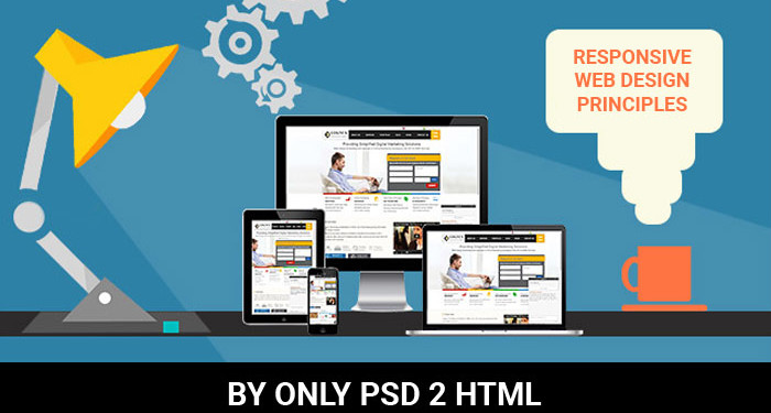
Bootstrap is the most popular JS, HTML and CSS framework that creates responsive plus mobile websites on the web to give an alluring feel to the users. Bootstrap 4 holds a strong position in the market as the latest version with fresh features like new customization options, dropped IE8 support, improved grid system and a remarkable journey from Less to Sass.

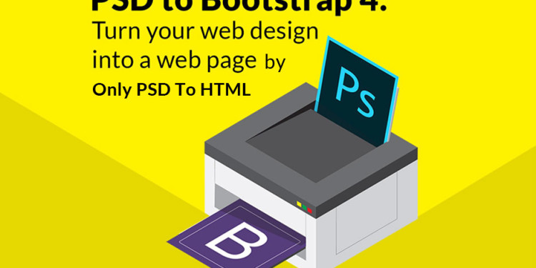
onlypsd2html, a leading name in the web development offers rich PSD to Bootstrap 4 conversion for making bespoke website solutions. There is a continuous improvement with better features in Bootstrap framework, such as flexbox options, grid layout, alignment utility classes, and better utilities and components.

Bootstrap 4 framework has extensive features and single code base for every device. With PSD to Bootstrap 4 conversion, these features can be easily built into the design for better design and performance.

Striking Features of Bootstrap 4

  • Use of Sass
    Bootstrap 4 will compile easily and rapidly because of the Sass preprocessor as compared to previous Less. With a vast contributor base, there are chances of much more functionality.
  • Opt-in Flexbox
    The CSS is recompiled here in Bootstrap 4 to get flexbox grid system and components. It makes use of float and implement a fluid layout to showcase these CSS properties. With a flexible container, this design can be flexible enough to be used in the responsive designs in the best way.
  • Updated Grid System
    With an enhanced grid system, Bootstrap 4 focuses largely on smaller screen devices to better target mobile devices.
  • Newer Customization Options
    There is a wide variety of customization level for colors, link styles, typography, gutter width, spacing, column numbers, etc.
  • Better Documentation
    There are few handy plugins with code snippets for easy working of the documents and also enable easy searching.
  • Dropped IE8 Support
    With the dropping of IE8, the best parts of the CSS can be efficiently utilized. With the responsive typography, it also enables easy component sizing.
  • Refactored JavaScript Plugins
    The JavaScript Plugins also contain features like option type checking, UMD support, generic methods, and many more.
  • Auto Placement
    Auto placement of popovers and tooltips in an improved way through a library known as Tether.
  • HTML Resets With The Module Reboot
    It allows more expanded resets like border box, margin tweaks, and other options, all with a single Sass file.
  • Cards For Panels And Thumbnails
    Cards are the new and useful component of Bootstrap 4, which offer the same features like panels do.

Conclusion

Bootstrap 4 is an easy platform for all kind of the skill levels, all shapes devices and projects of the varied sizes. It allows front-end web development to be much faster and easier, which is the reason that millions of adorable websites across the web are made with PSD to Bootstrap 4 conversion. onlypsd2html can be a one stop solution if you also want to use Bootstrap 4 framework for the boosted results.M

Responsive Web Design Principles

Responsive web design is a great solution to our multi-screen problem, but getting into it from the print perspective is difficult. No fixed page size, no millimetres or inches, no physical constraints to fight against. Designing in pixels for Desktop and Mobile only is also the past, as more and more gadgets can open up a website. Therefore, let’s clarify some basic principles of responsive web design here to embrace the fluid web, instead of fighting it. To keep it simple we’ll focus on layouts (yes, responsive goes way deeper than that and if you want to learn more this is a good start).

Responsive vs Adaptive web design

It might seem the same but it isn’t. Both approaches complement each other, so there is no right or wrong way to do it. Let the content decide.

The flow

As screen sizes become smaller, content starts to take up more vertical space and anything below will be pushed down, it’s called the flow. That might be tricky to grasp if you are used to design with pixels and points, but makes total sense when you get used to it.

Relative units

The canvas can be a desktop, mobile screen or anything in between. Pixel density can also vary, so we need units that are flexible and work everywhere. That’s where relative units like percents come in handy. So making something 50% wide means it will always take half of the screen (or viewport, which is the size of the opened browser window).

Breakpoints

Breakpoints allow the layout to change at predefined points, i.e. having 3 columns on a desktop, but only 1 column on a mobile device. Most CSS properties can be changed from one breakpoint to another. Usually where you put one depends on the content. If a sentence breaks, you might need to add a breakpoint. But use them with caution – it can get messy quickly when it’s difficult to understand what is influencing what.

Max and Min values

Sometimes it’s great that content takes up the whole width of a screen, like on a mobile device, but having the same content stretching to the whole width of your TV screen often makes less sense. This is why Min/Max values help. For example having width of 100% and Max width of 1000px would mean that content will fill the screen, but don’t go over 1000px.

Nested objects

Remember the relative position? Having a lot of elements depending on each other would be difficult to control, therefore wrapping elements in a container keeps it way more understandable, clean and tidy. This is where static units like pixels can help. They are useful for content that you don’t want to scale, like logos and buttons.

Mobile or Desktop first

Technically there isn’t much of a difference if a project is started from a smaller screen to a bigger (mobile first) or vice versa (desktop first). Yet it adds extra limitations and helps you make decisions if you start with mobile first. Often people start from both ends at once, so really, go and see what works better for you.

Webfonts vs System fonts

Wanna have a cool looking Futura or Didot on your website? Use webfonts! Although they will look stunning, remember that each will be downloaded and the more you’ll have, the longer it will take to load the page. System fonts on the other hand are lightning fast, except when the user doesn’t have it locally, it will fall back to a default font.

Bitmap images vs Vectors

Does your icon have lot of details and some fancy effects applied? If yes, use a bitmap. If not, consider using a vector image. For bitmaps use a jpg, png or a gif, for vectors the best choice would be a SVG or an icon font. Each has some benefits and some drawbacks. However keep in mind the size — no pictures should go online without optimization. Vectors on the other hand often are tiny, but some older browsers won’t support it. Also, if it has lots of curves, it might be heavier than a bitmap, so choose wisely.

Only PSD 2 HTML Offer PSD To Responsive HTML Conversion At Best Rate. Feel that we left out something important? Let us know in the comments!