PSD to HTML5 Conversion – Best Solution to Advance Your Website Performance

If you have a business website, then your main goal would be to attract as many potential customers, in order to achieve your business goals. Therefore, it is of the utmost importance to have your website upgraded to the latest W3C standards for web design and development.

Features of HTML5 websites:

HTML5 is one of the most advanced web standards, which has revolutionized and simplified the process of creating effective websites. Unlike in the PSD based websites, you won’t need to have the whole web pages made of various images, because they will simply slow down the page loading, and annoy your visitors.

On the other hand, HTML5 uses CSS3 codes which eliminate the use of images in unwanted parts of the pages. That helps in making your web pages load faster, thereby creating an enjoyable experience for your web visitors.

Of course, you can use images in places where you need them, but it still does not mean that you will need to create whole pages in PSD image formats.

You could also use videos with the help of ’<video> </video>’ tags, which means that you will not need to specially develop flash based videos. Similarly, there are many other tags which have been included in HTML5 to create robust web pages. Also, some of the old and redundant tags have been removed.

Now let us look at some of the reasons why conversion of PSD to HTML5 can help you in improving the performance of your business websites.

Compatibility across all different browsers and screen sizes:

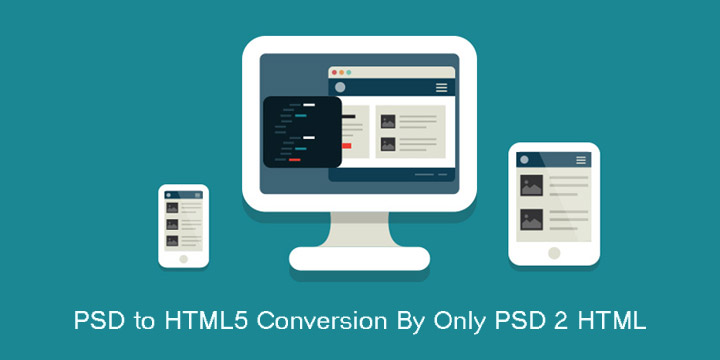
Most websites are being converted from PSD to html5, because these websites are responsive, and can adjust to the varying screen sizes of tablet PCs and smartphones. In addition to making your website responsive, the web pages which are developed with HTML5 offer seamless compatibility across all different types of browsers.

If your business website has to be effective and attract more customers, then it is of prime importance to ensure that it runs smoothly on any browsers, which your customers will be using, be it on their computers or on their smartphones.

Choose right Content Management System:

You can gather a lot of useful data about your customers, and about their shopping patterns, by collecting data from your websites. It means that your website has to be integrated with an effective CMS system. It helps you in managing you database more effectively.

Such data can be very invaluable, especially when you are analyzing your business performance, and planning newer strategies. If your website is still working on the old PSD format, then it becomes imperative for you to get it converted from PSD to HTML5.

In addition to the above mentioned reasons, there are various other technical reasons which clearly a put the websites with HTML5 on the driver’s seat.

You could contact any dependable service provider who specializes in PSD to HTML5 conversions to help you in improving the experience of your visitors on your business website. Make your move today, and enjoy the benefits of increased customers. Only PSD 2 HTML Offer PSD To HTML Conversion Service in $59 USD


PSD To Responsive HTML

A responsive website is the demand of every business, these days, that wishes to engage with customers. Bootstrap is an effective solution for getting rid of the tangle of designing a responsive website. It is a combination of HTML, JavaScript, and CSS developed by Twitter. This open source framework can let you create user interface components and add some advanced featured to your site. It uses a dynamic style sheet language called LESS. With an impressive website, it can get easy to impress the visitors too.

There are few css framework that help you to create responsive websites.

  • – Twitter bootstrap
  • – Responsive 960 grid system
  • – Gumby Framework
  • – Foundation

These are best CSS framework that help to create responsive web pages.

For many developers, converting PSD To Bootstrap HTML websites that are highly responsive and cross platform compatible is not an easy task. A maculate written CSS code is required but with bootstrap that requirement can end. It can let you create a CSS code that can provide the exact level of responsiveness to your website. PSD to HTML is a common phrase used for explaining the process of taking the design of a website in any common format preferred by the web designer and converting into a code so that it may be functional on other web browsers. This is all what PSD To Bootstrap HTML conversion do.

Reasons to choose Bootstrap

  • Bootstrap lets you create responsive layouts in a better and easier way than any other tool
  • Provides cross browser compatibility
  • Makes the code pattern easy to reproduce and understand
  • No complicated setup required for upgrading the framework
  • Provides an elaborately documented CSS code

Bootstrap can let you build a responsive website. It is much more than a collection of tools and templates. It can let you develop any type of website whether it supports Content Management System, customer CSS, Joomla, Word Press, Drupal, etc. or not. The best part is that this framework is supported by all major web browsers.

PDS to HTML conversion with Bootstrap
Bootstrap has all major HTML components within that can be used in any website. These components include navigational tabs, dropdowns, tool tips, button groups, typehead, accordion, progress bars, and more. The language written in bootstrap is JavaScript so it is easier to understand this language.This is one of the benefits of Bootstrap. Neat functions from the language can be used for making better designs.

Creating responsive website is not easy. Responsive HTML experts are readily offering PSD To Bootstrap HTML services to develop the most flexible and responsive framework for the website. For those, who wish to convert PSD To Bootstrap HTML, might need professional assistance and Responsive HTML experts can provide everyone that assistance.

10 Benefits of PSD To Responsive HTML Conversion

PSD To Responsive HTML Conversion  is the approach to building a website so that it responds to the end user’s viewing environment, platform, screen-size and viewing orientation. The practice consists of a mix of flexible grids and layouts, images and an intelligent use of CSS media queries.

Now a day’s users view websites on a multitude of devices including PCs, Tablets, Laptops, Smart Phones and even their TV therefore a Responsive Website should now be the default mode.

Over the last few years, Bootstrap has become an increasingly popular front-end development framework. More and more developers and designers continue to get on board. Evidently, there’s a reason for that.Most of developer is using bootstrap for Convert PSD To HTML.

1. Increasing Tablet and Mobile Audience

With 40%+ traffic on a majority of our customers’ websites now coming from mobile devices you would be excluding a large proportion of your potential new customers from having an enjoyable browsing experience with your website.

Traditionally users have been redirected to separate mobile websites however the latest web technologies allow us to serve different resolution-specific content without having to reload the web page or redirect the user.

2. Return on Investment

Well, actually with Hostpipe’s packages, there is no additional investment for making your website responsive.

Our core philosophy surrounds ensuring that we adhere to Web Standards Compliance, and with the addition of a simple plug-in (BootStrap) and a few tweaks to the code it can be as simple as producing a different stylesheet for print.

3. Increase Sales and Conversions

Your website is a sales tool and in many cases will provide the first impression of your company to potential new clients, therefore a well polished, responsive website will ensure that you give the best first impression.

Not only that but when the client visits your full website they will see a consistent brand and image, with the resulting positive impact leaving a trustworthy imprint.

4. Search Engine Friendliness

There’s no doubting that Search Engines now grade websites on how responsive they are, and so with well organised content being served to the search engines through a well equipped responsive framework you are more than likely to get a few bonus points from the Search Engine’s complicated algorithms.

Not only that but Search Engines are more likely to display mobile content when you are on the move and viewing searching for stuff via 3G, so if it receives a search query from a mobile device it is more likely to give preference to mobile enabled websites in its search results.

5. Save time Managing Site Content

A truly responsive website means that you can create one set of content within your content management system (CMS) and then leave it down to the template your website developer has created to determine how that is handled. No more writing two sets of content for mobile and web.

At the end of the day why should you have to change your marketing and business logic just because the website framework doesn’t allow it? One product = one page of content. Shimples!

6. Stay Ahead of the Competition

Many websites are still not paying attention to the changing requirements and the need for responsive design. Therefore if your website is responsive, the likelihood is you will be one step ahead of your competition.

7. It will Future Proof your Website

Basically a truly responsive website will adapt the content to fit on any screen size and resolution, therefore your website is likely to work on the next new-fangled, crazy device which Apple or Google throw at us.

8. Keep your Analytics in one place

Simple really, a single URL means a single set of analytics to look at and decipher making it easier to examine the goals you’ve set and the funnels your site visitors have travelled through to reach those goals.

9. Additional Features of Mobile Devices

Mobile devices make great use of their in-built technology such as cameras, compass, geolocation GPS and accelerometer. The benefits of responsive website design in relation to this is that your company can use these features to enhance the mobile user’s experience.

10. Daft not to Take Advantage of any of the above

OK, so I couldn’t actually come up with a tenth benefit because all of the above benefits collectively will have such an impact on your website it simply seems daft for you not to make your website Responsive.

Only PSD 2 HTML Offer PSD To Bootstrap Conversion in $99 USD & PSD To HTML5 Conversion in $79 USD.