Our software gives remote teams the ability to be more productive by giving them the tools to manage their time.
And we, at Only PSD 2 HTML, are our own customer. Every single one of our more than 50 employees use our tool.
Like I said, it’s not only what we do, it’s who we are.
This obsession leads us to constantly search for more tools to help us, and our customers, be more productive.
Below is a list of tools that we have found to help remote teams to collaborate and be more efficient.
Table of Contents
- Communication Tools
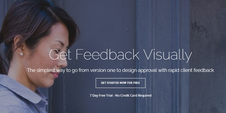
- Design Tools
- Documentation Tools
- File Sharing Tools
- Project Management Tools
- Software Tools
Communication
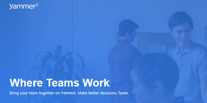
Yammer is a private social network that helps employees collaborate across departments, locations and business apps.Yammer is a social network that’s entirely focused on your business. In order to join your business’s Yammer network, your team member must have a working email address from your company’s domain.
In order to segregate relevant information to specific team members, you can create groups that will help reduce the noise in the Newsfeed.
Users can share posts with specific groups simply by utilizing the drop down menus below the Update box (which is similar to Facebook’s Status Box).
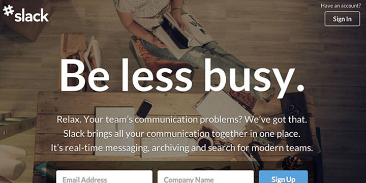
One of the fastest growing startups today, Slack is the powerhouse messaging app used by remote teams. Its powerful integrations, numerous bots, and the ecosystem being built on top of the platform have quickly transformed it into one of the most flexible communication tools on the market.
At its core, Slack operates in channels. A company can create channels to track and archive conversations around teams and projects in order to get things done. Slack’s search feature ensures that you will never “lose” a conversation about a project.
HipChat is a private hosted chat service that is designed to help your team collaborate more efficiently.
As a business owner, you can set up a group chat with your team that you can always access and review.
Because of this HipChat ensures that your organization can avoid any miscommunication and redundancies. Unlike having a face-to-face virtual meeting using Hangouts where the entire team has to be present, Hipchat saves the conversation so that you and your team can upload and collaborate on documents and tasks at each person’s own convenience.
Hipchat also features a video chat that you can utilize from any computer or mobile device so you can converse with your team members while “on the go”. While you can use many other services to chat online, HipChat is one of the few that is intended strictly for business use.
One of the biggest reasons that Skype is the most popular communication tool is that it’s free.
Skype allows audio and video calls between multiple devices. In other words, one person could be on a laptop and another can be on their phone. One of the most prominent features we use here at Time Doctor is the group call. We routinely have 4, 5, and 6 people on a call from time zones all over the world.
And yes, if you’ve ever used Skype, you may have run into reliability issues. But for the longest time, it was the best bang for your buck. (Now rivaled by Google Hangouts. See below.)
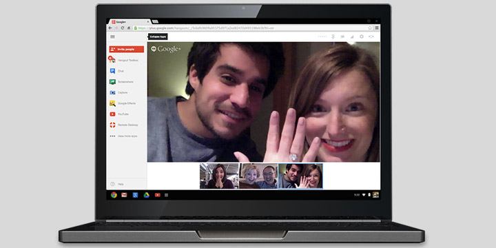
There are times when you’re going to need to gather your team for a meeting. If you’re running your business on a budget, Google’s Hangouts might be the tool for you.
If you want to record your Hangout to view later on, you can use Hangouts on Air. This feature will reduce the amount to time you and your employees spend taking notes and make sure that you don’t miss anything. (Note: There is a privacy setting where you can choose not to display your Hangout publicly.)
Designed specifically to meet with colleagues and customers, GoToMeeting has everything you need to, well, host a meeting.
You can launch a meeting from anywhere, whether that is email or instant messaging tools or project management tools.
GoToMeeting has other features such as the ability to hand over control of your computer and one click recording that make hosting a meeting more productive.
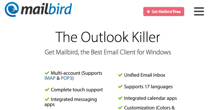
Mailbird is an email client for Windows.
With Mailbird, you experience a seamless experience managing your online communication. Mailbird’s third party integrations allow you manage messenger platforms like Facebook right from the email client.
One of the biggest assets to Mailbird is it’s learning curve… or lack thereof. Unlike more complicated client’s like Outlook where you may never learn the entire application, Mailbird alleges that a user can learn the app within 5 minutes. It is designed for folks of any age and technology literacy to be able to learn it fast.
Design Tools
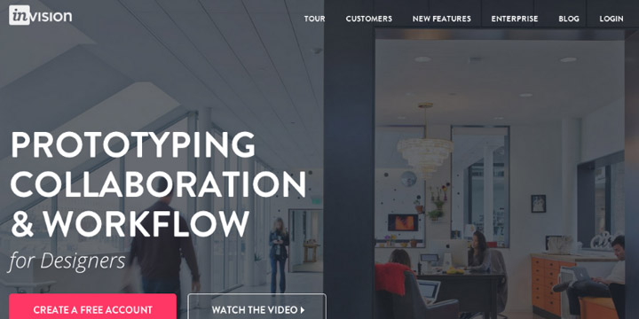
Invision is an enterprise grade prototyping tool that enables users to upload designs, create actions such as button clicks, and gather feedback seamlessly from colleagues and customers right from within the app.
With Invision, you can manage your projects from a single dashboard. The dashboard will show you a breakdown of project status as well as comments collected. You can also integrate with various platforms to create a seamless design environment.

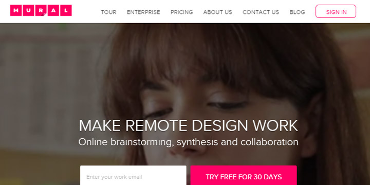
Mural is like a digital white board. It allows designers to post sticky notes, images, and videos on a wall in order to gather quick feedback about a specific idea, design, or prototype.
It allows you to seamlessly work within the same space, an analogue to having the entire team in the same room with access to the same whiteboard.
Keep your collaborators in the loop with comments and live conversations no matter where you may be.
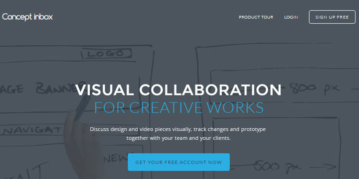
Another visual design collaboration tool that allows you to keep everyone up to speed, Concept Inbox ardently keeps track of versions so that team members and external stakeholders can return to a particular design at any point in time.
Project leads can get real time feedback on prototypes with in-context annotations and email notifications when someone makes a comment on a design.
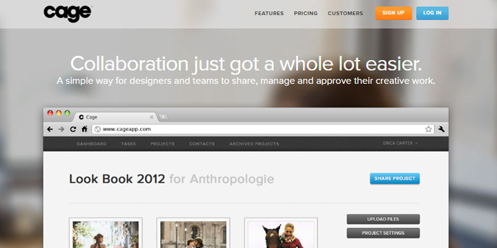
Designed for smaller businesses, Cage allows freelancers and small teams the ability to share projects with clients and other collaborators.
Like the other tools, Cage will allow users to leave visual comments on the design. Cage also has a powerful project management tool that will enable you to assign and manage tasks with both clients and colleagues.
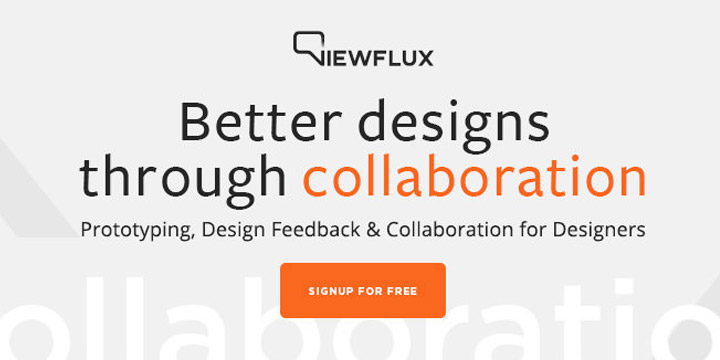
Another tool designed for small businesses and freelancers, Viewflux allows you to see all of your projects in one place.
Viewflux provides visual feedback from colleagues and clients as well as version control so that all stakeholders are on the same page throughout the design and prototyping process.
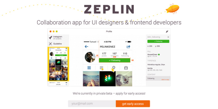
One of the chief goals of Zeplin is to eliminate the friction between designers and developers. The tool automatically creates style guides and other “resources”.
Through its Slack integration, you can notify the team easily when there is a design change.
Zeplin is priced for small businesses and freelancers and leverages a freemium business model.
When you’re a designer, you eventually have to present your designs to your clients. Prevue allows you to create beautiful presentations and receive feedback from the client in real time.
Prevue is priced to be affordable for small businesses. Plans start for as low as $5 per month and go up to $25 per month for agencies.
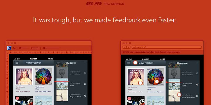
Red Pen is a fast feedback tool for visual teams. As a designer, you can get feedback from your colleagues as well as point and click to explain your thinking.
You can give access to your clients via a private link so that they too can give feedback. And each team member on a particular project will be kept up to date on the version, as well as the comments and feedback that was left by both colleagues and clients.
Another tool for designers to share their creative work, GoVisually is built for small businesses and freelancers.
Clients and collaborators can make recommendations and give feedback without having to log into the system. And if you’re wondering, you can have an unlimited number of collaborators.
GoVisually lets you work on multiple projects, design files along with your team members and clients all from one place.
Documentation Tools
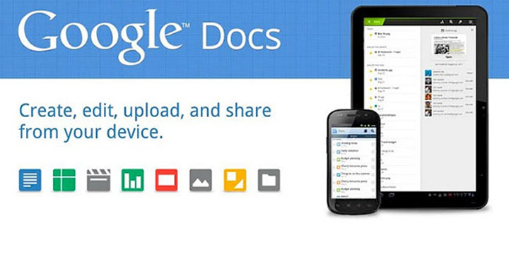
we live in Google Docs. For a remote company of over 60 employees, we have found that Google Docs is the easiest way to collaborate, share, edit, and eventually publish documents of all kinds.
Google Docs allows us to create blog posts (like this one), spreadsheets, and presentations. It’s all for free, which is a blessing for startups and small businesses located in various parts of the globe.
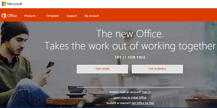
This is Microsoft’s free version of its original Office suite of tools. You get the core of Office: Excel, PowerPoint, Word, and Onenote. When you combine it with Outlook.com, you essentially get the Office Home and Student suite.
There are certain limitations on the features that you get for free, however. For instance, if you wish to add a references section such as a table of contents and add citations, you will need to upgrade to the paid version.
There are also some font and formatting limitations as well. But, if you’re looking for basic documentation and editing tools, the free version will suit your needs just fine.
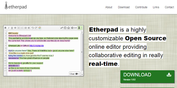
From its website: “Etherpad is a highly customizable Open Source online editor providing collaborative editing in really real-time.”
You can write articles, press releases, and to-do lists, with colleagues and clients all working and editing the same document in real time. And because it is open source, Etherpad is free to download.
Zoho Projects provides you with a set of project collaboration tools which helps the team members involved in the project to come together, plan, collaborate and get work done faster.
It helps you create project workspaces that will enable you to collaborate with teams in various geographical locations. You can give feedback, discuss projects in forums, and share a project calendar to increase productivity among team members.
File Sharing Tools
When you need safe storage for all of your files, this is the app to use. You will have 15 GB of free storage for photos, documents, and any other digital file you need to store for later use. Files are safe, but easily accessible by you and your team, and you can access them from any device. Organize items quickly and easily, and then share them and collaborate with your team.
Dropbox allows you to sync your work no matter where you are or what device you’re working on. While individuals can use Dropbox for free, the Dropbox most affordable business version allows more space (1 terabyte, or enough to store 250 movies) and more features, such as priority email support and higher sharing limits.
With Dropbox, when documents are edited each person on the team will get the latest and greatest version.
Box.com is an enterprise level file sharing service. Well, more accurately, these days it can be considered an intranet.
Inside of Box, businesses will get a file sharing service, collaboration services, a content management system and the ability to manage your business from a centralized dashboard.
Hightail is a file sharing platform that allows for creative collaboration among teams. Hightail is designed to help you manage a project from start to finish.
You can bring clients in on projects, track changes, and ultimately speed up the pace at which your team completes projects. You can also implement admin level security measures to ensure the privacy of specific projects.
While many of the other file sharing sites on the list have evolved to more complicated platforms, MediaFire markets itself as a simple file sharing and storage platform. Media Fire focuses solely on bringing its users the best file sharing service possible.
This is perfect for the users who don’t want to pay for extra features.
OneDrive is brought to you by Microsoft as part of its Live brand. With OneDrive, you get 5 GB for free and if you need extra space, you can get another 50 GB for just $1.99 per month.
OneDrive is pre-installed on Windows 10, and it works on all devices. Access and share files and photos on PC, Mac, Android, and iOS.
OneDrive allows you and your colleagues to collaborate with Word, Excel, PowerPoint, and OneNote from your desktop, mobile device, and the web.
Unlike services like Dropbox, SugarSync allows you to backup both your files and your existing folder structure.
This ensures that no matter which device you’re accessing your files, you will always know exactly where they are. There is no need to “remember” where a document lives on your laptop and in your SugarSync environment.
Project Management Tools
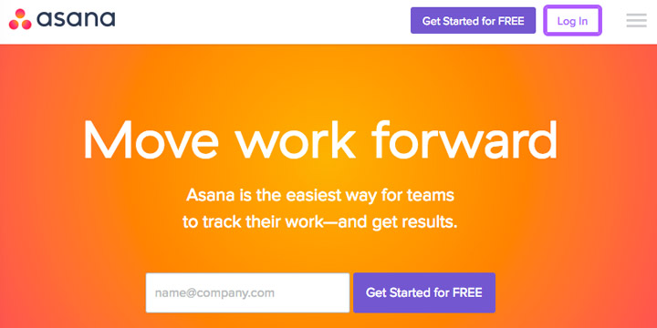
Asana is a cloud platform that enables all of your employees to log in no matter where they are, as long as they have a wifi connection. The dashboard consists of three panels in order to give you all of the data you need on a given project.
As a business owner, Asana will give you an overview to all projects currently going on in your organization. This is the information on the left hand side of the dashboard. Once you click on a particular project, the middle of the dashboard will allow you to zoom in on the tasks associated with the project. And finally, the right hand side of the dashboard will be even more granular. There you can see who is assigned to a particular task and when it is due.
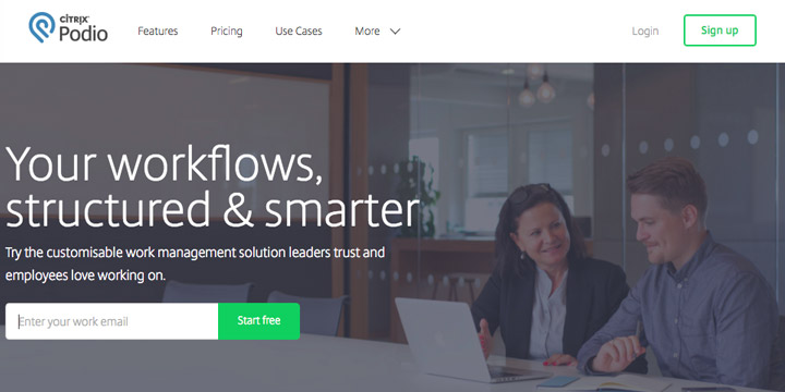
Podio is a powerful tool that helps entrepreneurs and managers operate their businesses effectively.
As a remote team of over 50 employees operating in over a dozen countries in all conceivable time zones, tools like Podio make it possible for for us to get everyone moving in the same direction.
All managers need to know what tasks employees are working on, how employees are spending their work day, and can be assured that employees are able to easily collaborate amongst themselves, no matter where they are located.
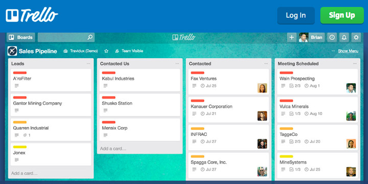
Trello is a web-based tool that allows you to organize your projects using cards that are organized on a board. To conceptualize this, imagine writing tasks on Post It Notes and sticking them in columns on a wall. You can write on them, take them off of the wall, and move them around.
Each column represents a different part of the project. As you and your team make progress on a card, you move it across the board. This lets you see the status of everything you’re working on with just a quick glimpse at the board.
Even though the guys running Basecamp didn’t invent the project management software category, they are probably one of the most loved software companies in the world.
With their simple, easy to use, powerful and very affordable software, it is perfect for small businesses. Its free offer and minimal learning curve mean you can get started without much of a hassle.
According to its website, with ProofHub you get plenty of options to plan everything in your projects and stay more productive at work. From adding people to assigning different roles to them and defining who’s who of the project, you can do it all with ProofHub.
You get a 30,000 foot view on important events with the help of native calendar. And, the option to set dependencies on tasks makes it even easier to plan your project activities.
Wrike allows you to break large tasks into smaller goals and manageable pieces. You can easily track each team member’s progress and individual contribution to the team.
Wrike’s reports provide easy to read data on how much time and money is being spent on a particular project so that you can ensure you come in under budget. This feature is extremely beneficial to agencies and other client service based businesses.
The project management tool designed to serve technology teams. According to its website “Technology teams are continually being asked to do more work with either the same or fewer resources.”
LiquidPlanner is flexible enough to allow developers to use either Agile or Waterfall methodologies in order to accommodate the needs of all users to their platform.
Users can organize projects, collaborate seamlessly, and even track time to see how long projects take to complete.
WorkflowMax is the project management tool for mid-sized client service firms. Think of WorkflowMax as a hub for various services such as accounting, billing, project management, lead management, creating quotes, and a whole host of other services required to run a client service business.
With WorkflowMax, you generate beautiful and robust reports that will allow you to make sure your projects, from start to finish, are delivered on time and under budget so that you can ensure each one of your clients is profitable for your business.
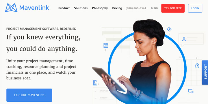
According to its website, Mavenlink exists “To serve professional service organizations with a more efficient, elegant, and profitable solution to manage their project-based business.”
Like WorkflowMax, Mavenlink is a hub for the various processes that go into a client service business.
Mavenlink realizes that projects in the “real world” are dynamic and ever changing. There is no linear progression. Mavenlink’s platform is flexible enough to accommodate the dynamics of projects that come from demanding clients.
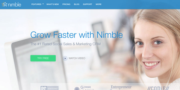
Nimble combines your address book and social media contacts into a sales and marketing CRM solution. All contacts are linked with conversations you have had with prospects and customers, and their records are automatically filled with social information under one record. Nimble also has targeted marketing features such as group messaging for one-on-one authentic outreach and offers insights into who has opened or clicked in your message. Nimble browser extension allows you to work with Nimble alongside your webmail, on social media, or in any website.
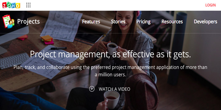
With over a million users, Zoho Projects is designed to help team members plan, track and collaborate with each other, no matter where in the world they are located.
Zoho allows you to plan projects, track bugs, keep track of time, and manage documents all from a single platform.
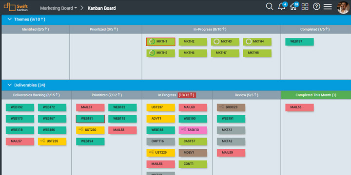
SwiftKanban is a web-based visual tool for project management based on Kanban best suited for software development teams, IT Operations and DevOps teams, project managers or business functions. It offers easy visualization to manage team’s processes and works well for both co-located and distributed teams.
SwiftKanban offers support for Scrum, Iterative and other software development methods and also integrates well with existing Agile tools. With a highly visual Kanban board, projects teams can access a wide range of Kanban metrics and manage the flow of work and identify bottlenecks through visual cues.
Software Tools
At the time of this article, GitHub is the most popular software repository on the web. According to a March 2015 Wired article, GitHub is one of the top 100 most popular websites in the world and hosted 9 million software projects.
GitHub wraps a version control system called a Git where developers can host their projects for free as well as exchange and talk “code” with other developers.
Bitbucket is another large software repository platform and is brought to you by Atlassian, the same folks who own the JIRA and Hipchat brands. Unlike Github, Bitbucket offers unlimited private repositories.
Where Github focuses on Opensource, Bitbucket is designed to help developers within enterprises to collaborate on projects.
Codepen is billed as “A playground for the front end web.”
You can show off your latest creation and get feedback, build a test case for that pesky bug and find example design patterns and inspiration for your projects.
While you can start for free, CodePen will allow you to upgrade to pro features for $9 per month.
Usersnap is a simple, yet powerful bug tracking & user testing tool. With annotated screenshots, it makes it super-easy to communicate change requests, bug reports or user feedback with your developers and designers.
With point-and-click annotation tools, Usersnap helps you report bugs where they happen: in your browser. No need to switch to a bug reporting application or to fill out endless forms. Bug tracking is now a picnic!
Gitlab is a web based git repository service (like Github and Bitbucket) that is written in the Ruby programming language.
According to Upwork “its permissions, branch protection, and authentication features are what really make it stand out. Teams can secure projects on a more granular level, and projects are kept even safer while they’re being worked on.”
Fogbugz allows developers to prioritize issues so that they can keep projects organized.
Fogbugz also makes it easy for customers to communicate with developers on feature requests and bugs so they have all the context they need to solve the pressing need of the customer without switching between multiple products.
And last but not least, Fogbugz takes a holistic approach to building (and selling software). You can collaborate with designers, marketers, and support staff to complete projects, not just other developers.