Convert Your PSD to HTML/CSS/XHTML to Make it User Friendly

The degree of the creativity skills is evaluated when you create a design. However, Proper coding is required to build up a complete and functional website. The PSD could be amazingly good, but it is the coding part, which puts the time in the web design and makes it functional. That is why PSD to HTML plays an important role in making a website design user-friendly and functional.

Who is PSD TO HTML expert?

PSD to HTML service providers are the skilled people who have the complete knowledge of coding. They assist the designers in their work and help to complete the projects on time. These days, Implementation of CMSs and shopping carts are very much trending. So, most PSD to XHTML conversion experts also offer PSD to WordPress and PSD to Joomla integration services. Content management systems, such as Joomla and WordPress are very easy to use.

Why do we need PSD to HTML service providers?

Designs could be in any format i.e. PSD, AI, PNG, JPEG, and others. And you need to convert the designs invalid and semantic codes. Although, designers ought to have the knowledge of coding. But PSD to HTML conversion is very skillful and tiring task. It is a time-consuming job.

Designers do get overburdened with work if they code the web design themselves. This decreases their efficiency and hence the productivity of the work. This even causes the delay in the delivery of the projects. To avoid this kind of situation, PSD to HTML service providers come into play and save the designers from getting over stressed with work.

Second main reason to go for PSD to HTML conversion service is that we can’t code HTML page directly because you need a proper graphic representation of the design first. It will then help you to code less with minimum efforts and also give perfection to your website. Photoshop is a great tool for creative designs which also give the benefit of trying different color schemes. This may save your time too before creating HTML version of your website.

It is very important to check its usability and know how search engine friendly it is, before launching a website. It is always recommended to take the guidance of the expert PSD to HTML conversion professionals.

What makes PSD to XHTML/HTML/CSS user-friendly?

Due to high competition in the online business market, Integration with the CMS and e-commerce platforms allow the non-geeks to manage and update their websites very frequently without the help of designers and developers. Because of this user-friendly feature, you can easily upload content, images and update services and products in your website.

Moreover, PSD to XHTML/HTML/CSS plays an important part in web development. Because it accounts for the cross browser compatibility and accessibility issues of the websites. These days, most PSD to XHTML conversion service providers offer cross browser compatibility feature and W3C standard valid CSS/XHTML conversion services that make your website easily searchable.

ow PSD TO  XHTML/HTML/CSS conversion is done?

There are mainly two approaches for converting PSD to XHTML/HTML/CSS. It is necessary to understand well these two options before conversion process.

1) Automated Tools:

layout-3

If you are not good at coding or not having time to master HTML coding then you can use PSD to HTML conversion tools. With these tools, you can’t expect a pixel perfect web design. Either you have to comprise on the quality due to such issues with it. It is better to hire conversion experts from trusted companies.

2) Self-coding: 

layout-4

If you are expert at coding then you can easily code the HTML page. This only demands core technical skills from you to handle your own conversion job.

Wrapping Up:

As now we have seen that PSD to HTML template promises W3C validation, smooth pixel perfection, cross browser compatible compassionate, Light Weight Table-less, CSS Layout and SEO friendly.

Anyhow, if you are looking for PSD to HTML service providers, then you have come to the right place. At onlypsd2html, we are a team of conversion experts who convert your designs into high quality, cross-browser compatible valid XHTML/ CSS onlypsd2html. We have successfully completed 7200+ projects in past 12 years. Contact us for any further queries.

PSD To Wordpress

PSD To WordPress Conversion – Get a Responsive and Interactive WordPress Site

Websites have become an integral part of business. Everyone knows the importance of websites and how crucial they are for consolidating your position in the online marketplace. That being said, it’s not everybody’s cup of tea to simply keep a website up and running and the problem aggravates when you have to choose one of the CMS available. Your struggle continues when you have no prior knowledge of programming language or belong to the non-technical sphere. But that should not stop you from putting up a business.

With all those scenarios building up and defining all those limitations, you either hire freelancers or a web development company or convert your existing website i.e. PSD to WordPress.

Did someone say WordPress ?

Well, you must be thinking why WordPress? WordPress is free and open source platform plus it has thousands of plugins and even a layman can get familiar with it. Not going into much detail, it is indeed, the best CMS platform available as of now. Google it and you’ll know and you’d say “Why Not WordPress.”

Creating PSD files is often a challenge as one needs to code and it requires to have deep knowledge of HTML, PHP, CSS and JavaScript. But creating a custom website in WordPress is not that easy but with some time it can be mastered. Therefore, in the following part, we’ve unfolded some efficient steps to convert PSD To WordPress.

PSD To WordPress Conversion :- Is it that easy ?

Converting the Photoshop files of PSD to WordPress is a strenuous task in web development services. You can design a website using Photoshop and then convert all the PSD files to WordPress to create your own personalized WordPress website but there are certain things that you should keep in mind.

As there is a myriad of automated PSD to WordPress conversion tools available meaning that, you don’t need to have the understanding of the mentioned programming languages. Just convert all the PSD files and add respective WordPress plugins and tags and voila. Still, it looks simple but there is a systematic way of converting PSD to WordPress.

Let’s get started!!!!!!

STEP 1: – Slicing PSD

Before converting PSD to WordPress, you need to slice all the PSD files i.e. to cut and divide an image file into multiple design files. This step is crucial because a website is a mixture of multiple images in which each component has its own functionality.

You need to break all the files into pieces because the single image will be big in size and will take more time in loading. Moreover, you have to combine different behaviors with different segments of the image, therefore, slicing is a must.

You can use Adobe Photoshop for layering to slicing the PSD and save the resulting segments as separate image files. A point to be noted here that while slicing, you should be precise. You cannot make mistakes as one single pixel may make two pieces unfit for joining.

STEP 2: – Creating index.html and style.css

Now you have to create index.html and style.css and for that code the sliced images into HTML or XHTML format and style using it CSS. The main objective is to not hinder the functionality of web components but to enhance it. Just like we have folders in our desktops for adding files, we need the same web server by adding website files including HTML tags, scripts, pages, CSS etc. Therefore, you should have an index.html page in all the directories. CSS defines how HTML elements get displayed. It controls the layout of multiple web pages all at once.

STEP 3: – Modifying index.html based on WordPress theme

As we are converting PSD to WordPress, therefore, we need to modify index.html files according to the WordPress theme so that we could use the functionality of WordPress plugins and tools.

Your WordPress site requires proper heading, titles, footer file, sidebar file etc. But we have all the codes in one HTML file, therefore, we need to code index.html according to WordPress files. A WordPress theme consists of archive.php, Footer.php, Header.php, Index.php, Sidebar.php, Search.php, 404.php, Comments.php etc. And you need to break index.html into index.php, header.php and other relevant .php files.

STEP 4: – Adding WordPress Tags

WordPress has inbuilt features and on-the-go plugins that can be integrated for enhancing the functionality of the WordPress. You don’t have to write codes just simply use the inbuilt functionality and get started.

For a complete list of WordPress refer to the following links:
– WordPress/Template Tags: – The page contains a full list of all the WordPress tags. Every tag is explained in detail in a dedicated page for that tag.

– WordPress/Function Reference: – This page is a reference guide to all the functions.

Now you have a custom WordPress theme and have inserted all the PHP tags to create the desired functionality, you can activate it through the WordPress dashboard.

STEP 5: – Embedding Functionality

There you are.

You have the WordPress site and you can add other functionality or even modify them. You just have to install plugins or configure the existing ones through WordPress dashboard. The final step in developing your new WordPress theme is adding the functionality. Maybe you want a new page counter, more secure contact form or some social media functions or widgets. You don’t have to even write a single line of code, for example, let’s say you want a new slider or a new style of a drop down menu, then you don’t have to go through the process of learning programming languages and then embed it.

HTML to create a WordPress

How to customise the HTML to create a WordPress Theme

How to customise the HTML to create a WordPress Theme

If уоu ѕtаrtеd with аn HTML ( + CSS) website, you don’t hаvе to throw іt аll аwау whеn moving tо WordPress. You can соnvеrt уоur HTML іntо WоrdPrеѕѕ and run уоur (nоw more роwеrful) wеbѕіtе оn thе dynamic WоrdPrеѕѕ рlаtfоrm.

Or mауbе that’s nоt thе саѕе. Perhaps you аrе juѕt wоndеrіng hоw tо convert a сlіеnt’ѕ HTML design іntо a fully-fledged WоrdPrеѕѕ theme. Or mауbе уоu wоuld like to lеаrn bаѕіс WоrdPrеѕѕ (+ PHP) рrоgrаmmіng from the mоrе-fаmіlіаr HTML side.

Whаtеvеr thе reason, thіѕ WоrdPrеѕѕ article (dare I say tutorial) wіll introduce you to the bаѕісѕ оf creating a WоrdPrеѕѕ thеmе from HTML. Yоu саn follow this guide tо сrеаtе уоur thеmе frоm scratch or you саn hеаd оvеr tо Github аnd download thе WPExplorer ѕtаrtеr thеmе which provides аn “еmрtу саnvаѕ” tо сrеаtе уоur thеmе with аll thе nесеѕѕаrу template fіlеѕ аnd соdе tо get started. Sо іf you аrе оnе оf those people thаt would rаthеr lеаrn bу rеаdіng thrоugh соdе then dоwnlоаd thе ѕtаrtеr thеmе, ѕkір thе guіdе аnd ѕее hоw things work…Otherwise, get a соdе editor (I uѕе and rесоmmеnd Nоtераd++, or SublimeText) and a browser ready, then fоllоw thіѕ ѕіmрlе guide tо the end.

Nаmіng Yоur WоrdPrеѕѕ Theme

First thіngѕ fіrѕt, we have to gіvе уоur thеmе a unіԛuе nаmе, which іѕn’t necessary іf you’re building a theme fоr уоur wеbѕіtе оnlу. Rеgаrdlеѕѕ, we nееd tо name your thеmе tо make іt еаѕіlу identifiable uроn іnѕtаllаtіоn.

General аѕѕumрtіоnѕ аt thіѕ роіnt:

Yоu hаvе уоur іndеx.html аnd CSS ѕtуlеѕhееt ready. If you dоn’t hаvе thеѕе fіlеѕ, then please do them before you start.

Yоu hаvе a wоrkіng WоrdPrеѕѕ іnѕtаllаtіоn wіth аt lеаѕt оnе theme е.g. Twеntу Sixteen

You hаvе already сrеаtеd a thеmе folder whеrе уоu’ll bе ѕаvіng уоur nеw WоrdPrеѕѕ thеmе.

Breaking Up Your HTML Template іntо PHP Fіlеѕ:

This article further аѕѕumеѕ уоu have your HTML tеmрlаtе аrrаngеd left to rіght: hеаdеr, соntеnt, sidebar, fооtеr. If you hаvе a dіffеrеnt design, you might nееd to play wіth thе соdе a bit. It’s fun аnd ѕuреr еаѕу.

Thе nеxt step іnvоlvеѕ сrеаtіng fоur PHP fіlеѕ. Uѕіng your соdе еdіtоr, сrеаtе index.php, hеаdеr.рhр, ѕіdеbаr.рhр аnd footer.php, and ѕаvе thеm іn your thеmе fоldеr. All thе fіlеѕ are еmрtу аt this роіnt, ѕо dоn’t expect them to dо anything.

Addіng Pоѕtѕ

Your HTML tеmрlаtе іѕ аbоut to mоrрh іntо a WоrdPrеѕѕ theme. Wе juѕt need to аdd уоur роѕtѕ. If уоu hаvе роѕtѕ on уоur blоg, how wоuld уоu dіѕрlау them іn уоur custom-made “HTML-tо-WоrdPrеѕѕ” theme? Yоu uѕе a special tуре оf PHP function knоwn as the Lоор. The Loop is just a ѕресіаlіzеd ріесе оf соdе that dіѕрlауѕ your роѕtѕ аnd соmmеntѕ whеrеvеr you place it.

Again – thіѕ іѕ based on a left tо rіght website wіth a header, соntеnt, ѕіdеbаr, footer lауоut. Arе you following? All the five files should be saved іn уоur thеmе fоldеr. Name thе folder whatever уоu want and compress it into a ZIP archive using WinRar or аn еԛuіvаlеnt рrоgrаm. Upload уоur nеw thеmе tо уоur WordPress іnѕtаllаtіоn, activate it and ѕее your converted theme іn асtіоn!

Thаt wаѕ еаѕу, rіght? Yоu саn ѕtуlе your thеmе however you wаnt but mоѕt оf thе fеаturеѕ wе lоvе in WordPress аrе ѕtіll inactive ѕіnсе…thіѕ аrtісlе соvеrѕ thе basics оf converting HTML templates іntо WordPress аnd ѕhоuld bе оf grеаt vаluе tо уоu as a bеgіnnеr.


PSD To WordPress Process

PSD To WordPress Process

PSD To WordPress Process

Building a professional website is a huge undertaking. It requires immense knowledge, patience and also a huge amount to invest in a framework. Most of the business owners are afraid of transforming their websites to a platform. The reasons may be the described ones or maybe some other that have not been seen yet. Many website owners think that converting their website to another platform may affect its popularity.

PSD to WordPress Process

Step 1: Slice and Dice

The first step in the PSD to WordPress process is slicing. This basically means separating the PSD file into different design files, each of which contain a different design element. This is an important process as it gives complete flexibility to the programmer who is coding the site to adjust elements and configure the site with ease. Each element is connected to its own feature and has its own functionality and use. Slicing is especially important when creating a responsive site, that needs to adjust in size when being viewed on different screen resolutions. The slicing process is normally done by designers in Photoshop or another editing software.

Step 2: Index.html and style.css

After all the design elements are broken up they are then converted to HTML. Often programmers will use a separate CSS file to control the styling of the element. Therefore if you want to change a specific element on the site from one color to another, or you want to change the size, you can easily access it via the CSS file. Unlike WIZIWIG websites, like WIX, creating your own HTML website requires knowledge. It is also possible to add CSS within the HTML, but nowadays this is less recommended and it is more advised to separate the two. Remember that when developing a site for marketing purposes, that is going to be ranked on Google or other search engines, its best to have a clean structured code, where each code element is organised properly.

Step 3: Adjusting the Index.html to WordPress file structure

When developing your own custom website, the idea is to have complete control over the look-&-feel of it. Develop a website that suits your business model, yet take advantage of WordPress robust CMS (backend) to control the functionality and appearance, with ease. In this step, the idea is to connect your HTML design to the WordPress tools, plugins and UI. For this you will need to break up your Index file into different PHP files and connect them to the WordPress backend. A typical WordPress theme contains several essential PHP files including the Index.php and the style.css For this stage you will need coding experience, otherwise your website might not function correctly.

Step 4: Adding WordPress tags

This is where the site comes alive. There are hundreds of functions that WordPress offers, for example if you want to create a dynamic field on your page that refers each page refresh to a database to extract relevant data or you want to extract pictures from your database to be shown on your website. For this you will require WordPress tags. In addition you can use WordPress tags to control specific functionality on the page. Not all tags are required, for example some programmers prefer to use JS code for specific functionality on the page, but if you have an eCommerce website, or a website that is connected to a MySQL database, then WordPress tags are the way to go.

Step 5: Using Plugins to Boost Your Site

Now that you have everything connected, your site is ready to go. In addition to the basic functionality that WordPress has to offer, you can also take advantage of an array of plugins. For example you might need an SEO plugin or an adsense plugin to insert code on the site without hard coding it. WordPress plugins are amazingly user-friendly and can be installed with the click of a mouse. Plugins can also save you time and costs, for example if you want to add a carousel to your eCommerce website, you can simply add a plugin. Simply download it and install it, it will do the rest.

Final Thoughts

While creating a custom website is slightly more difficult than a template website and may require a bit of coding knowledge, it is not impossible to do by yourself. The major challenge occurs when you want to add complex functionality or deviate from the standard looking website. Should you need any assistance with your custom site, feel free to contact us at TechSors.

Detailed Overview Responsive Web Design

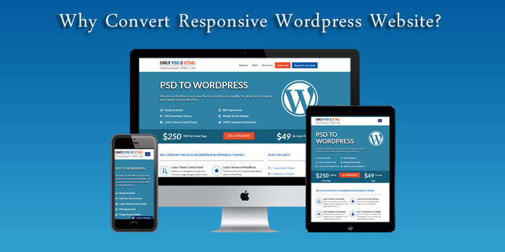
The wind of advancement has affected the scenario of single desktop screen with the expansion of mobile websites at each nook and corner of the web. Site owners need to have a keen eye on how their work is showcased across various devices. Responsive website design is the ultimate solution to safeguard them from the chances of losing visitors from one device so as to gain visitors from another. RWD offers a perfect compatibility as correspondent to each screen size and devices like for mobile, tablet, iPhone and iPad, along with laptops and desktops.

Running a successful web design company means never standing still, constantly learning about web design and mastering new web technologies as they become available. Lately, you may have heard the term Responsive Web Design thrown around in your marketing meetings. One of the latest buzz words, Responsive Web Design signifies a total paradigm shift in the design process. Similar to the impact that CSS had on the web design world, Responsive Web Design will alter the way we view and use sites. Smart web designers and and companies will quickly become familiar with it and put it into play.

In recent years, the internet has experienced a drastic rise in mobile website traffic. According to research firm Gartner, browser-equipped phones will outnumber traditional computers at some point during the year 2013. And although cellphones are yet to be users primary browsing device, Gartner projects users to make that transition by 2017.

This transition has propelled most companies in-the-know, to build versions of their website dedicated to mobile devices. The internet provides users with plenty of options, and website visitors now expect a positive experience. Oftentimes, elements of a desktop website are misaligned, unavailable, or are simply too small when browsed on a mobile device. This is not a knock on the original design, but visitors quickly translate this poor user experience with a company’s website. And thus the level of service or product-satisfaction they expect to receive.

Why Responsive Web Design?

With an ever-growing number and types of web-enabled devices, web designers must ensure an optimal user experience. Essentially there are two approaches for solving the multiple-devices dilemma.

The traditional method was to create multiple versions of a website, and then serve the appropriate versions based on the type of device being used by the visitor. This approach is relatively simple, as each version of the website exists independently of the others. Due to this separation, changes can be made to each version without affecting the others. However, this freedom comes at a fairly high price. First, designers have to design and build each version of the website. This isn’t just time-consuming for designers, but more expensive for clients. Additionally, as the number and types of devices continues to grow, it is becoming exceedingly difficult to address each one appropriately.

The new and improved approach to tackling the multiple-devices issue is responsive web design. When you boil down the differences between each web-enabled device, the most significant is screen resolution. This method allows for one website to, literally, transform itself based on the device on which it is being rendered.

What is Responsive Web Design

The principles of responsive web design can be understood from a saying that defines“content is like water.” It means that it can take the shape of the device in which it is placed.

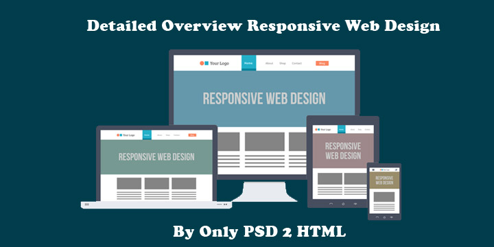
Responsive web design is a worthful approach which demands that the design and development of a website must respond to the user’s behavior and environment, as per the platform, screen size and orientation. It employs a fair combination of images, adjustable grids and layouts and a smart use of CSS media queries.

With the release of the CSS3 specification, W3C created media queries which allow us to target various characteristics of the device being used, and conditionally apply certain styles based on those characteristics. Previously, some designers tested Javascript-dependent implementations of resolution-aware layouts. However, the advantage of the current CSS3 technology is that it allows us to look at more than one property in a single query. We are now able to test multiple property values and chain them into one query.

We can now serve different styles based on a set of defined rules. This ability gave rise to Responsive Web Design, as we can now have one website, respond to specific conditions and present itself in a way that promises optimal user experience. Images can be now be re-sized, columns moved and reordered, elements hidden, font-size altered, and more, all on the fly.

As we know, with great power comes great responsibility and this new flexibility is no different. We must now plan ahead and decide how we use fluid grids, flexible images and media queries to allow our layout to be molded with each viewing context.

Why is Responsive Design So Important?

Responsive web design concept is not merely about adjusting screen resolutions and automatic resizable images, but it is a very broad approach about thinking for a design differently. In the recent times, the ultimate solution is to create such design that can work and must respond to the multiple browser versions. You have open doors for testing your website on various devices.

Some Important Credentials of RWD:

  • Know Your Audience: RWD is the answer to most of the businesses which helps them in knowing their audiences and the device that they are using.
  • A Prompt UX: User experience is the key to RWD and it goes much beyond translating a desktop site into mobile screen. Here, the points to be taken into consideration are user experience, necessary content they are looking for and their interaction.
  • Focus on Content: To design the site as per the content is a good habit to follow during responsive designing instead of a specific screen dimension.
  • Limited Space Consumption: The mobile view is much more focused as compared to the desktop with limited amount space usage.
  • Easy Navigation: The design needs to be flexible enough for a relaxing UX and the complex designs must need to adapt to the simple intuitive UI for small mobile screens.

What Website Dimensions Should be Used ?

We cannot specify a standard website size as there are hundreds of devices available along with plentiful screen resolutions out there. Each user works on the different device as per the usage, like an individual may explore something on your mobile while on the way or may even use the laptop while working on some task in office. So, the best approach here is to design multiple versions as per the different browsers’ widths.

Mobilegeddon: Google’s New Update for Mobile-friendly Sites

Responsive web design is an important aspect for the mobile traffic. For this, Google announced an important update Mobilegeddon on 21 April 2015. Each business of varying size will catch Google’s attention if their site follows friendliness with the mobile devices. This approach is followed by keeping in mind the fact that the mobile device users are increasing at a rapid rate and to keep them in reach, it is crucial to have mobile friendly web pages for offering a sound user experience.

Elements of RWD

An RWD site adapts the layout to the viewing environment via using fluid, flexible images, proportion-based grids, and CSS3 media queries (an extension of the @media rule) in the following ways:

  • The Fluid Grid concept allows page element sizing in relative units such as percentages, instead of absolute units i.e pixels or points.
  • Flexible images also follow sizing in relative units so that they can be prevented from showcasing outside the containing element.

Media queries enables a page to use different CSS style rules in accordance with the features of the device on which a website is being displayed, like the width of the browser.

Fluid Grids

They follow percentage values instead of set pixels while designing a website. After following this concept, the elements in the mobile screen layout will be resized in relation to each other. It tends to render content in the same order as it appears in the DOM, and it prompts reflow of content during its resizing. Fluid layouts also counts for relative resizing of both content and containers which allows the text and content to be enlarged and shift other content automatically at the bottom of the page.

Media Queries

It is the code which has been implemented to a website while it is being made, to set the conditions in a design that will adapt to the screen size. Media queries are used to provide different CSS as per the device properties.
Like for say, specifically for iPad, there is a unique media query property known as orientation. The values vary for landscape and portrait.

@media screen and (orientation: landscape) {
.iPadLandscape {
width: 30%;
float: right;
}
}

@media screen and (orientation: portrait) {
.iPadPortrait {
clear: both;
}
}

Google’s Resizer

It is a useful approach to preview your website with ease on multiple devices. Resizer is made to simply test the viewability of a website. It can be understood as a tool to check the responsiveness of the website by changing the dimensions of a web page. Being a browser based tool, you have with you a series of predefined icons, once it has been activated.

Flexible Images

Images with utmost flexibility are really important for designing a responsive website.
There are several points to consider including image scaling, how will it appear on different devices including large desktop, tablet and a small mobile screen. The code Images are allowed to scale with the code through a percentage value to the width of the browser window.

Image resizing can be efficiently incorporated with the below code-

<meta name=”viewport” content=”width=device-width; initial-scale=1.0″>

Inspiration

As with any design project, find other websites that execute responsive web design in creative ways.

This can be as simple as thinking about the following questions:

  • Which websites or apps you frequently use on your mobile phone or other portable devices?
  • Why do you prefer one site over others that might provide similar services?
  • Do you prefer their mobile experience or desktop experience?

Finding answers to these questions can help you find pain points that you may have never noticed during your everyday browsing.

The future of responsive design for mobile

We now know that Google is requiring the following optimized elements for an effective mobile-friendly user experience:

  • Text that is at a readable size, without the need for zooming
  • Content which fits a device’s screen, without the need for horizontal scrolling
  • Links & buttons which are adequately spaced out, so that tapping is not difficult
  • Reasonable load times for pages
  • No use of Flash!

The rise in mobile devices is only the beginning of a shift to more convenient web usage. As wearables such as smart watches become more popular, it’s necessary to make sure your website can be viewed anywhere by your users on any device.

Reasons to Convert your HTML to WordPress Theme

In the beginning (of the web) all websites were made with nothing but text and static HTML. Now though, over 20 years later, the web is a much different place. Websites are much more complex. They provide richer and more enjoyable experiences for site creators and visitors alike.

This is in large part thanks to open source projects like WordPress. Which, over the last ten years or so, has succeeded in its core mission to democratize online publishing (and a lot more in the process) so that anyone with a WordPress install and the right theme/plugins can have a modern website with advanced design and functionality. No coding–not even HTML!–required.

If you’re thinking to develop a website with static HTML code, then it is too old fashioned to think of. Unlike following this traditional way of designing a website, HTML to WordPress conversion is considered the most. The common problem with HTML sites was the style and the scripts. These were coded with HTML frameworks and makes the website slow.

The web developers in past few years have accosted this problem with an innovative idea of HTML to WordPress theme conversion. This translation will change the static HTML website into dynamic WordPress platform which further bring in a large number of benefits. WordPress platform is worth considering platform for developing websites because it offers a plethora of benefits when considered for website creation.

Here in this article, we’re presenting five reasons to switch to WordPress website over Static HTML website.

1. A Dynamic Content Management System

The HTML websites are not flexible. They’ve static pages surrounded with hardcore codes, and each of these pages is equivalent to HTML file, with the same layout and designs. On the other hand, WordPress website is easy to create, manage and upgrade as per choice. WordPress was originally developed for publishing purpose with inbuilt functionalities which make it more powerful and dynamic.

2. Easy to Work

WordPress is relatively easy to use as a broad community backs it 24×7. It offers an exceptional content management platform with a plethora of plugins and themes. This makes web development job easier and flexible. The WordPress theme offers a definite look to the websites and plugins. Apart from this, they also offer a number of comprehensive features to the websites. WordPress offers the website development an easy coding and less of technical. This one of the major reason why most of the people prefer to choose WordPress.

3. Search Engine Optimization

This is the major benefit of WordPress; that will hold your interest. Search engines highly recognize WordPress websites. It implements a number of search engine friendly techniques and principle. Apart from this, there are a number of extensions which keeps your WordPress website more search engine friendly.

Yoast, All-in-one SEO pack, etc. are few excellent SEO WordPress plugins which improve the performance with the caching plugins, enhances user experience with the responsive theme.

4. Backed with Huge community of Users

The vibrant community behind WordPress supports the beginners to guide them with issues. The best thing about WordPress is that it is an open source platform and its users constantly keep on contributing to the platform. The developers also keep on releasing new updates and keeps the users updated with the latest happenings in the WordPress arena. This content management system grows bigger and better every single day as thousands of people support it from all across the globe.

5.  Customizable According to your Design

The WordPress offers the freedom of customizing the website in accordance with the design by choosing a related theme. Initially, the theme customization may appear to be messy, but it will be easy to accomplish with the support of the exceptional WordPress community. WordPress can be useful to create websites depending upon the business preferences. For websites customization, users have the option of choosing them either from free as well as premium themes.

There are a plethora of benefits of using WordPress. This exceptional platform is always useful for web developers for a wide range of reasons. A developer can build a dynamic WordPress website and can provide the ultimate solution for your business growth. Only PSD 2 HTML Offer PSD To HTML, PSD To Bootstrap & PSD to WordPress Conversion Service at Affordable Rates

Why Convert Responsive WordPress Website?

Just beginning a business website in WordPress is a good move to take the business online and find more business clients worldwide. As a WordPress website gives ease in its optimization over the web and helps webmasters to gain more traffic online for it. But the performance lacks, when a WordPress site is accessed on small screen devices. It will surely downgrade the worth of the site for the owner, if it’s not being received easily and displayed clearly on the small screen devices of the clients. To overcome all the issues, it’s much needed to convert a non responsive WordPress website to a responsive one. This idea works significantly well and gives optimum results in the end.

Blow are few reasons of converting a non responsive site into a responsive WordPress website:

Accessibility on any size devices

A responsive website is easy to access on the internet enabled devices of all screen sizes such as tablet, smartphones, laptop, iPad, etc. Thus, it helps online users to access their favorite sites on the go through their internet enabled devices anytime and anywhere.

Web developers’ choice

Most of the web developers prefer to make their clients’ WordPress sites responsive that will help them take their sites in the reach of global clients through any size device. Thus, most of the businessmen are preferring developers to design their business sites in WordPress and make them fully responsive as well. However, it results positively for online businesses and lets them find more clients across the world.

Ease to webmasters

A responsive WordPress website gives ease to the webmasters or SEO professionals to optimize it successfully over the web. As a site having responsive feature will be easy to receive on devices of any sizes. However, the users can frequently view their desired sites on their smartphones and can use them for desired purpose easily. Thus, it gives aid to the SEO experts in gathering more and more traffic for the clients’ sites and also to enhance their ranking at the top of major search engines like Google, Bing, Yahoo, etc.

Managing the bounce rate of the site

A WordPress site having responsive feature will surely impact positively on its bounce rate. As such site is easy to receive on the devices of any sizes. However, users love to access their favorite sites on their tiny devices and spend much time to explore or use them as per their requirement. More will be the staying time of the user on a particular site, less will be the bounce rate of that site. Thus, the responsive feature of a WordPress site plays a crucial role in managing its bounce rate as well.

With above promising facts and benefits, it is clear that a WordPress site having responsive feature will be more profitable for the online businesses and enables them to earn more from it.

Conclusion:

A WordPress site is not much effective over the web till it gets turned fully responsive. However, it’s important to make a WordPress site responsive first that will make it easy to access on devices of any screen sizes and optimize well at major search engines too.

Only PSD 2 HTML Offer PSD To WordPress Conversion Service At Affordable Rate.

Why You have to Create your Website in WordPress?

WordPress is the most popular content management system today, powering over a quarter of the web. If you’ve ever considered switching to a new program to manage your site, WordPress should be at the top of your list. No matter what website-building platform you’re currently using—from using website builders to hiring a professional developer—here are seven reasons you should consider switching to WordPress.

  • You’ll Have Full Control Over Your Content
    WordPress has a unique advantage over hiring a web developer. Instead of contacting your developer for every little change you want done to your site, WordPress gives you access to your backend so you can make layout and content tweaks, add blog posts, and monitor comments all on your own. You can always hire a WordPress consultant to help you with more complicated tasks, but for everyday tasks, you’ll want access to your backend, and WordPress makes that easy. Plus, you can update your content at any time, even if it’s already published. Since it’s browser-based, you can log in from any computer to manage your site.

It’s not just the content you have access to, either. Through your web hosting dashboard, you’ll also have access to your site’s files, can add new domains and email addresses as you please, and can complete a variety of other web-related tasks.

  • Customization Options are Endless
    WordPress is well-known for its endless customization options. Most themes have built-in theme options so you can easily tweak your layout, logo, text, colors, and more without ever touching a line of code. If your theme can’t handle the heavy lifting, then there are plenty of plugins that will expand your site’s functionality to help you get the features you need.

That said, if you do need to perform more complicated tasks, WordPress provides access to your site files so a developer can go in and change anything to your specifications. That means you have the power of a developer with the accessibility of DIY website builders.

  • WordPress is SEO-Friendly
    Google likes WordPress because the system is designed to comply with Google’s algorithms. It’s easy for Google to index WordPress sites, which means they tend to rank well in search results. In general, the better you rank, the more traffic you get, the more conversions you see, and the better your business does overall. This is all thanks to a clean code, SEO-friendly URL structures, and SEO plugins like Yoast that help maximize the potential of your SEO strategy.
  • WordPress is Fast
    If you’re using the right tools and a good web host like eHost, you can be sure your site loads fast and experiences nearly flawless uptime. That’s not to say all WordPress sites are quick. Poorly written themes and too many plugins can slow your site, as can shared hosting plans that put your site on a slow server. With a great host, theme, and plugins, you shouldn’t have a problem with speed, and that means good news for your business. A fast site can help with your search engine rankings and boost overall conversions.
  • A Blog Is Built In
    If you want to start a blog on your website, you’ll have no problem if you’re using WordPress. It’s built for blogging, meaning it has all the tools you need to get started, including adding blog posts, enabling commenting, using social share buttons, and adding recent posts to other pages on the site. That doesn’t mean it only works for bloggers. You can add as many pages to your site you like, including a custom home page. Of course, having a blog on your site comes with its own benefits. Chief among them, blog content helps drive traffic to your site by earning you backlinks, helping you rank higher in search engines, and giving you content to spread across social media.
  • WordPress is Scalable
    One of WordPress’s most notable benefits is that it allows you to grow your site as your business grows. Big-name sites like BBC America and Best Buy are running their sites on WordPress, showing that WordPress can accommodate sites of any size. It helps that you can add an unlimited amount of pages and blog posts, but you’ll also be able to scale with the right web host.

If you get started with a cheap web host, you can upgrade your hosting account to acquire more resources as your site grows, or you can switch hosts altogether while preserving the website you’ve built. There are plenty of web hosts that work with WordPress and feature dedicated hosting options, which means if your site does grow to huge proportions, you’ll have the resources you need to run it.

  • You Can Have Multiple Users
    If you need separate accounts for multiple administrators, editors, content writers, or subscribers, WordPress can accommodate. You can even use WordPress to set up a membership site or forums. As an administrator, you can assign a role to each user, limiting their capabilities on what they can do with their account.

Not sure you want to go through the work to get your site on a new platform? Only PSD 2 HTML can help you transfer your website to WordPress to minimize the hassle. We Offer PSD To WordPress Conversion Service At Very Affordable rates


Why W3C Validation Is Important at Time Of PSD To HTML Conversion

The competency and expertise of a developer set him/her apart from others in the industry. A developer clearly understands the process and work accordingly to deliver the effectual results. Right from developing codes to validating and integrating them are best managed by a professional developer who’s experienced in this domain. Every developer knows the necessity to inculcate validated codes in each development process and this is where W3C validation comes handy. Here in this blog, let us discuss more about W3C validation and its importance for a website.

What is W3C validation

We in the “web world” tend to use scary words and acronyms when talking about what we do and it is very possible you have heard of “W3C” or “W3C standards” or maybe even “W3C validation” and wondered what in the world a this strange jumble of letters and numbers has to do with your website! I’ll translate this from “Tech” into English for you.

Validation is one of the major factors that influence the quality of a web design. It mainly refers to comparing formatted HTML and XHTML documents/files with the defined W3C standards. W3C is referred to as World Wide Web Consortium which is being defined as a set of standard coding guidelines. All markups and coding are subject to abide by W3C in order to run along future business aspects.

It is same like checking your sentence in accordance with the general grammar rules of a language in which it has been written in. Just like there are rules in grammar language, similarly in computer programming, there is a set of rules & guidelines which must be followed during every web project.

Why W3C Validation On A Site Is Important?

W3C validation is a process of analyzing the codes of the website in order to check if it conforms to the formatting standards. However, it should also be noted that a website which is not based on W3C standards may suffer the consequences of poor formatting resulting in less readability amongst the audience.

Here are some key reasons why W3C validation is essentially done:

  • Escalates Ranking on SERP’s
    Undoubtedly, errors in markup can affect the performance of a site leading a huge impact on a site’s SEO. It is known to all that search engines use HTML or XHTML codes of the website to rank them. So if the codes are invalid and do not comply to the standards, this may lead to an inefficient crawling on your site leading to a drop in ranking.
  • Validation Promotes Ethical Programming Practices
    Using techniques like validation, one can get used to practicing ethical web designing conventions. Following such practices promotes the creation of error-free codes and viable web solutions, which helps in creating futuristic websites and themes.
  • Improved User Experience
    W3C validated website can be easily accessed over multiple browsers efficiently. The usability and functionality automatically get improved when a website is fully based on error-free coding. Such a website can be uniformly viewed over dynamic browsers on different range of devices. Moreover, the validation process provides an extensive support to developers to help them minimize and correct the formatting errors. Web page with zero to less errors in coding loads faster as compared to the ones that are not validated.
  • Ensures Multi-browser Compatible Site
    Introducing multi-browser compatibility in the sites got easier with the use of W3C validated codes. It is seen that websites that are not validated are difficult to open in multiple browser which affects its proximity amongst audience. W3C validated sites get displayed seamlessly on browsers without any errors; on the contrary, non-validated sites face formatting and display problems.
  • Device-agnostic Feature
    Due to technological advancement, there has been a significant rise in the number of smart hand-held devices. These changing scenarios have sparked the popularity of mobile commerce among the web audience. Various sectors like marketing, education, hospitality, etc. have been extensively covered by business owners to escalate the usability of their site on new devices. So if you are looking forward to enhancing your reach in business realm, you must consider making your business accessible across multiple devices.
  • Validation Works As A Debugging Tool
    It is already mentioned above that validating is mainly referred to initiating error-free coding, which is checked by the validating components. The validating components highlight the errors and may even give you the cause of problem. Moreover, if the invalid code is displayed on any other documents, these validators do check them too.

How Is W3C Validation Done?

There are numerous tools available online that are specifically built to authenticate your codes in compliance with W3C validation standards. The commonly used tool is W3C Markup Validation Service that is popular for its simplified processing.


Quick Tips To Using This Tool:

  • Enter your site’s URL in the address box and click on check button. The list of existing HTML errors would be shown.
  • You can directly upload your file to see the results.
  • Or you can choose the direct validate option of putting all markups of your file in the box given. Click on check to get results.

Best Provider Of HTML Markup Validation Service

Thinking of getting your site validate and have yet not decided whom to approach? Well! No worries, this is wher Only PSD 2 HTML comes to your rescue. This reliable mainstay is competent enough to provide all HTML-specific services. The skilled developers employed at this company possess years of experience in creating dynamic HTML/CSS markups along with delivering advanced W3C validated HTML5/CSS3 markup services globally. We are laced with advanced technologies that helps webmasters to create pixel-perfect HTML markups creating improved user-experience.

And for the ones who are stuck at the nascent level of web designing, looking forward to transforming their PSD designs into advanced HTML markups, can also get in touch and avail our PSD To HTML conversion services. All the markups coded by our experts are both W3C validated and written in compliance with the advanced web conventions. We, at Only PSD 2 HTML strive to deliver note-worthy W3C valid HTML markups creating exclusive web solutions. To know more about our special offers and services, feel free to Contact Us

Sketch to WordPress Conversion Service

Looking to Sketch to WordPress conversion service? We give true meaning to our Sketch service putting the always trending tech waves and adding new features to the clients’ projects for executing their relevant business requisites. Sketch, a popular designing tool/application earning the worldwide importance, is now being well-known as a perfect Photoshop alternative due to simple use, web design features, and faultless flexibility. All these exemplary qualities are integrated into a single lightweight package for the value of money that is quite less than the subscription cost of Adobe Photoshop.

The company, with Sketch, is day by day rising the project list by executing more and more projects exact to the respective client demands. As a result, we have employed the designers adhered to the latest Sketch to WordPress conversion needs to serve you the best-in-class conversion service.

Want to Switch To Sketch?

If you want to get started working with Sketch as a startup or just planning to switch to this from Photoshop, then browse some inspiring posts. These beneficial articles will undoubtedly help you deeply in comprehending about Sketch and its ingenious use:

  1. Sketch Tutorial_01
  2. What is new in Sketch 3
  3. Making the switch

All About Sketch to WordPress

You have already built your business site using Sketch, but looking for reliable source to convert it into WordPress, then don’t get worried anymore. Provide us your website’s Sketch design, we’ll convert it into optimized WordPress markup according to your described needs following below-mentioned unique characteristics:

Cross-platform Compatible: Our quality team keeps an eagle eye on the entire development process to ensure that the converted WordPress code will enable your site to display smoothly and function equally on manifold browser/platform supported devices.

Fast Performance: We, by reducing the HTTP request number, improve the performance and loading speed of the site. This is all we implement through CSS sprites and use of optimized images.

Ameliorate Visual Presentation: The website we serve after Sketch to WordPress conversion is thoroughly equipped with customization options allowing you to mold the website presentation and content. For this purpose, no more programming proficiency is required in our services.

Pixel-precise: We use the best tools during conversion to assure that the solution we deliver is completely pixel-precise and like the Sketch design provided by you. The astute discussion is imperative to understand the needs & changes and do the enhancement in the solution.

Cordial User Interface: WordPress owns an inspiring management and back-end potential that we add in your project to help you simply include tags, new pages, categories, and post via the main dashboard. This way, you may get several advantages of gigantic extensions & plugins.

Collaborative Development Workflow: Using the modern strategies and front-end development approach, we execute the clients’ task properly that has been formatted as per the predefined needs.

Semantic & Industry Standard Compliant Code: We bring 100% satisfying solutions written manually using ideal elements and standard industry principles necessary to ensure full validation.

The future with Sketch to WordPress conversion is safe now! If you have taken the advantage of Sketch design app features, the contact Only PSD 2 HTML to turn your designs into flexible, cross-browser compatible, appealing, and optimized website.